The Secret to High-Converting Product Pages (CRO Audit)
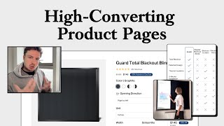
Pedro Loureiro audits a blackout blinds product page and identifies concrete fixes: add lifestyle photos to the image carousel, surface installation guides, highlight benefits like total blackout and heat insulation, and move key visuals above the fold to boost conversions.
Chapters
when people land on your product page, they're always going to swipe through the images first. That's going to be one of the highest, most engaged parts of your product page. So having the images optimized is the most important part of your product page. So I'll be focusing on that first. So let's go through this. What I would say I think is missing from your images is, you know, they're all kind of done on 3D renders and they're all kind of done on this sort of like gray background. But it would be nice to have some photos in here to actually show some lifestyle shots of this. Show some photos of it in a bedroom or in an environment where this would be used and show how good it is at blocking out the light and show and tie in the other benefits of why someone would buy this. Why some— why would someone buy a product like this? Well, they want to have deeper sleep, you know, or maybe they're having a cinema room and they want to have you know, a darker, more ambient environment. So those kind of desires that people would have to buy this product, they need to be conveyed via your images as well. So in your image carousel, you would need to bring out some images that convey that. Okay, so have an image with, let's say, a woman sleeping on the bed. You know, she's got like her eye mask on, you know, and then you have an after shot with the blackout blinds and she's sleeping more comfortable. She doesn't have to wear an eye mask anymore to block out the light. She's actually just be able to relax and sleep and get much deeper sleep with your product. So stuff like that is going to help you to convert a lot more people. And you know, it would just sell your products a lot better than just having these 3D renders. And what I would say, I think, is your, your, your images need to have some text on them to kind of explain what's happening here, because it's not really clear, like this image and then this image. So I'm assuming you're kind of showing the fact that your product is modular, the fact that you can slide it back and forth, I'm assuming, or you can go left to right. But that needs to be a little bit clearer for people to understand. So I would add some text to this, to, you know, just some, a few words to explain exactly what each image is trying to communicate to people. Like some of these photos over here, you could be calling out the fact that it's made from durable materials. So this will last you a long time. You know, it's a premium position as a premium product. You know, what is it made of? How easily does it slide over? You know, does it lock? It won't rattle? All of those different things kind of need to be kind of communicated to people. I like the fact that you're offering different colors. I mean, your product looks beautiful. These photos look amazing. Okay, opening direction. Okay, so here is kind of where you— so you actually— so it's a fixed opening direction. Okay, fine. And then top to bottom. So if someone clicks on right to left, it should only show the product images of it opening from right to left. That would be a better way to show it. Like if I'm clicking on top to bottom, I should not see a photo in the carousel like this because I'll obviously it wouldn't, it wouldn't function like that. It should, or it wouldn't function like this, right? It would function like, I don't even know where the image is of it opening from top to bottom. Where is that even? Because these all look like it's opening from right to left. So that's just maybe something for you to look at, making sure your images are really communicating what they need to communicate. And it doesn't look like they're doing it fully. You need to have photos of your product in all the different styles, opening from right to left, left to right, and top to bottom. And they should be only showing depending on which option people choose. So that's the first thing that I would say that's really, really important for you to address. I like the fact— I have to point this out because I don't see this a lot— I like the fact that you are offering a discount, but you're also giving a reason for why it's on a discount. You're saying it's a Valentine's Day sale. So many times when I do an audit for a brand and I look at their website, they're running a discount. And it looks like an evergreen discount because they're not giving any reason for why their product is on discount. And it just makes their product seem— it loses that little bit of premium nature. And the objective of these founders putting it on discount is kind of lost because they're trying to create that sense of urgency. But because they're not saying, okay, this is the reason why it's on a discount, it's on a sale, it's on a limited time sale, it doesn't create as much urgency. But you're doing a great job here because you're actually giving a reason as to why it's on discount. And look at the urgency that this would build. If I'm coming across your product, and bear in mind, let's say we do optimize the images, and we kind of touch all of this up. Now your, your discount is going to be really potent to people, because people are going to be totally sold on your product. And now that you know, okay, I've only got, you know, this Valentine's Day sale is only on for the next couple of days. Think about how, how much more of a motivating factor that is going to be for people to buy. I'm just pointing it out because I don't see this often being done well. And I think you guys have done this well with this discount. So this stuff here, this is, this is what I was talking about at the top. 100% light blockage, total darkness, blocks heat in summer, cold in winter. Okay, so that's another benefit point there. High-grade aluminum. So all of these— funny, I mentioned these, but all of these 3 points need to be mentioned in your image carousel. So you can come up with some beautiful lifestyle photos in here. What I mean is like, you need to have some photos like this. This is what I mean by lifestyle photos. Some photos that will show your product being used in the environment that it's intended to be used in. And for your product, like I mentioned, it'd be a woman or a man or a couple sitting in their bed, lying down, enjoying more restful sleep, maybe feeling warmer during the winter because obviously, you know, it's retaining the heat, and cooler during the summer. If you're Product, as we can see, is made from aluminum, high-grade aluminum. So bring that and call that out in your, in your images and make sure you tie it to the fact that, hey, this is going to last you longer, it's not going to be, it's not going to be weathered away. If you notice your customers are price sensitive to, let's say, you know, your product, you could also reposition it on as how many, what are they paying for a better sleep per night? You know, like if 365 days of the year, let's say, well, let's just take your full price, that's $199. So they're paying like less than half a dollar per night for the whole year for better sleep. And then you could also talk about energy savings if it's able to retain more heat in the winter. So listen, I may be going overkill with those things here, but I'm just saying that could be another little idea for you to implement. So reducing noise for a peaceful environment. So you can talk about the noise as well in here. So it's actually noise insulating, it's heat insulating, and it's light insulating. So I think that that'd be really, really cool to like call out. Total blackout design. So this stuff over here is what I would mention in your carousel. And I like the fact as well that you're saying it's cordless and child safe. Again, another good call out to mention in here, you know, you could have a photo of like a kid, you know, being next to the blind and happy and the parents at ease, knowing that, you know, there's not gonna be any trouble. Window compatibility, and you've got them all there. I'm wondering though if you can have little icons next to them. Little icons, little photos next to them, just to make it a little bit clearer. Because sometimes I don't think people would be able to understand, you know, like, would people be able to understand by their own window what the actual technical term is for it? I'm not, I'm not too sure. So just make it easy for them. How to measure. So this measuring guide to this link, put that Somewhere in this section, you can even just put it underneath here, just a little bit underneath here, just say measuring guide. Just make that easy for people to get to if they're struggling with that. How to install this. Okay, let's just take a look at your installation guide before I— It's funny, actually, you have what's in the box. What's in the box, I think, is what you also need to have in your dropdown section over here. You need to tell people exactly what they're going to get. And you should call out everything you need for installation is provided in the box. So this should not be on a separate page. I shouldn't have to go to a separate page to find this information. This should be on this page over here. Ideally, you could probably even put this in here. 4 steps to assemble. So you've actually got some nice photos in here. These photos you could put in your carousel photo over here and create a collage. And just say easy installation. That could be the title at the top and do the collage of the 4 images. Again, the principle behind the things that I'm suggesting here is make it easy for people to get the information that they actually need. They need to know how to install it. No one's going to buy this frame and spend $200 if they, before they understand how to install it. So they're going to try and seek that information. If we know they're going to try and seek that information, we need to make it super effortless for them to get that information. So bring it into the carousel, make it easy for them to consume it. And you have some nice images already. So that, that shouldn't be too hard. So all of this stuff, even if you need to like take a few extra photos in your carousel to explain that, that's fine. As long as you're communicating the information. Okay, so below the fold, this is crazy. I actually wouldn't have known that you actually had more information below the fold here. I thought you would, but, but this is the thing. Most people, when they land on the product page, they do not scroll below the add to cart button, just as I wasn't going to do because I thought that was the end of the page. And, and this is why, and you can see here, what do you think I'm going to say about this image? I mean, this is amazing, right? This image is amazing. And it brings a smile to my face because it's like, I'm glad that when I'm talking, I'm not just talking about random stuff. Like this image is exactly what I'm saying. This little video GIF clip, if you bring that into your carousel and you make that your, let's say the second photo in your carousel. That's going to do a much better job at communicating everything. It really just, it sells it in one image. So this beautiful, well done, perfect image. The only thing that you did wrong about it is putting it down below the page. Like no one is really going to see this. So take this image and put it up here in the carousel as well. I think the copy is a little bit too heavy. I would just maybe to keep it to like about 3 to 4 lines. So you have the installation over here, which is fine. So this copy, quick 5-minute installation, put that in the carousel images as well, and then bring in the photos like I told you and make a collage out of them in the, in the product photo carousel in here. Loved by 10,000+. There is— so we have 10,000+ and then we have 351 reviews. So maybe you can say 10,000+ orders, 351 reviews. So you can add that little social proof in there as well. If you want to add a bit more social proof. These reviews, these could be nice to actually bring them underneath your add to cart button underneath here in a little scrolling section. Or just bring one feature review. Or have a collage of reviews in your product order form or your product photo carousel as well. Here we go again. This is great. So this again, another image that you can bring into your photo carousel and just have the, and have some copy next to it talking about it. Just a brief one sentence or maybe two sentences maximum. Noise reduction. I think we need an image for that. That kind of communicates that. So what is this? Certified by global leaders. I'm not sure what this is. This image is nice. It looks cool, but you need to kind of tie it to something, you know, certified by Global Leader. It doesn't really mean anything. If you're talking about quality, just, you know, maybe even bring in their logos. It just, it's just a little bit weak. Like the image doesn't really, I don't know what's going on here. And this is a section that you need to be mentioning the aluminum, right? You need to be mentioning the materials and the fact that it's going to be durable. That needs to be mentioned in here. Leaves others in the dust. The last blinds you'll ever need. So this headline or this subheadline is way better than your, your actual headline over here. So I would ditch this, make this your headline. The last blinds you'll ever need. I like this chart. Again, I'm gonna, I'm, you're probably gonna know what I'm gonna say here, but I would bring this chart into your carousel photo at the top here. So bring it in here. So that more people will see it. This is great. This is exactly what I mentioned, like, but I think it would be even better if you had like a kid in the photo and the parents around and everyone is kind of relaxed so they can see it's pretty safe. This is great as well. If you can show it, you can have a collage of customer photos in like, this is beautiful. That looks amazing, right? Take some of these photos and put them into your product carousel as well, some of these customer photos, and you can do a collage of it. You can create an image as well that has— that you say basically 10,000+ happy customers, and all around that background, around that text, you have this collage of images. And I think that would do really, really well. Great. And I think you've got some really, really powerful reviews here. You have a good product. All you need to do is just do a better job of selling it. And that's the, that's basically the problem where most brands are in. They, most brands, they have a great product. They're just not doing a great job at selling it well enough. And so what I'm suggesting to you and what I have been suggesting to you on this audit is just how you can do a better job of selling it more. How you can do a better job at selling it more is, is taking advantage of where people are viewing your product when they come onto a page. Most people, when they come onto a product page, they're viewing it in the order form. They're viewing it in the carousel images. So if we know that, let's bring up as many powerful images as we can in there that will communicate your product as people are scrolling through. The objective being, once I scroll through your entire product photo carousel, I should understand all the main features and benefits of your product, how to install it, what the main benefits are, and how to use it. And I should have basically my main concerns or objections answered from that carousel, and there should be some social proof in there.










