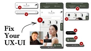
In this tutorial, the presenter walks through a comprehensive conversion‑rate audit of a Shopify store, pinpointing every element that drags down performance and offering concrete, actionable redesign recommendations. He begins by highlighting the chaotic homepage—overcrowded top bar, navigation, search, review and rewards widgets, and a hidden product button—explaining that lack of visual hierarchy confuses first‑time visitors. He advises stripping the top bar to a single key message, adding a clear headline that states the brand’s unique value, and enlarging hero imagery to make it more compelling. The speaker recommends moving the search bar into the navigation, simplifying selectors, adding breathing room through spacing, and limiting widgets to one to reduce overwhelm. Social proof is identified as missing, and he suggests adding trust signals such as customer counts, awards, or longevity statements. The audit then moves to the collection page, where he notes that the announcement bar and navigation push content down, and that products are not visible above the fold. He demonstrates a better layout using bestseller products, a guarantee banner, and cleaner spacing, arguing that reducing scroll effort boosts conversion. He critiques badge overload on product images and advises better spacing and hierarchy. The presenter also discusses proper use of the announcement bar for sales and limiting promotional widgets to a single CTA. On the product page, he points out a cramped image carousel with overlapping dots, tiny text, and no zoom, which hampers mobile users. He proposes thumbnail previews, a zoom button, larger readable text, and simplifying the information displayed per slide. He recommends a clean hierarchy: product title, benefit, reviews, variant selector that updates images, price, quantity selector, add‑to‑cart button, and description tabs. He stresses showing variant‑specific images and usage duration to increase buyer confidence. Finally, he pitches his agency’s service, citing case studies (Snow CarePod, Soloway, Velvet Caviar) and promising a high‑converting landing page that outperforms the current one by at least 10%, with links to book a call.
Chapters
This video will show you how you can optimize your Shopify store so that you can improve conversions, boost AOV, and scale your store with more confidence without burning more ad dollars. So let's dive right in. Look at all the stuff that's going on in your store. We got a massive amount of text up here, the logistical information. We got a massive navigation bar, we got a search bar, we got selectors up here, we got reviews widget, we got a rewards widget, we got 10% off button down here, and then we got your products button down here that almost sort of like cut off by the other stuff. And the problem here is that there's no hierarchy. There's so much going on in such a small space and nothing is taking priority. And because nothing is taking priority, we're not really guiding new shoppers who land on this page for the first time where to look at first and where to go. There's so many options for them to go. It's like they can go up here, they can look down here, they can click on your navigation menu, click over here, click over here, click over here. And the thing, the place that they're not really clicking is going to be your products. Cause you know, the button is going to cut off. So what I would say that you can do to optimize this is not by adding more stuff in here is actually by taking some stuff away. And one of the things that I would say is definitely start with your top bar up here. And what I would say you can do to this is just reduce this down to one, one, one piece of information that you're giving to people. Save some of this information for people who are further into your funnel. When shoppers land on the homepage, what I like to do is make sure that you, what you are selling is very clear to people. So what I would love to see here is a really nice headline that describes exactly what your products are doing for people, exactly what your brand is about and what is unique about your brand compared to alternatives on the market. That way we're giving new people, new customers, new shoppers who land in your store instantly the information about your brand, why they are here, why they should stay here, and where they should go next. So there should be a really strong call to action like shop skincare products, shop cosmetic products. Now you have some really nice imagery. So these, these model shots are really, really nice. And I'm assuming this is your target market as well. So what I would say with this imagery is just make the imagery bigger. You have a nice little big image here, but because there is so much stuff going on around this lady, The image is not as powerful as it could be. So you have all the good assets. You got great products here. I can see you got nice imagery, but it's not, none of these elements are working efficiently because there's too much going on. There's too much conflict being created. So this search bar, I'd be interested if people actually engage with this. And if they're engaging with this, are they actually going on to actually convert? Because in most cases, when I see search bars and search functionality added onto a store like this, it's either 1, not engaged, or 2, it is engaged but it isn't working properly and it ends up confusing people. Stuff like this, I would honestly save that for your navigation menu. Embed that search feature in here. Oftentimes when I'm doing a heatmap analysis for store, I see that out of all the different elements that are engaged within your hero section, the most engaged element is the navigation menu. So you have your little selectors over here. These are nice, but it's just because everything is so squashed together. They're not really doing the job that they're meant to do, which is make it easier for people to see the different categories. Like some of the text is overlapping the image, which makes it hard to read. And because everything is so tightly crammed together, there's not really enough spacing. There's not enough breathing room and it makes it hard to view everything. So what I would say for this is maybe just add them in little boxes, remove or hide or move the search bar into the navigation menu. And then bring up the selectors up to the top here. Reduce the height of the navigation menu and then hide this. And now you're going to have so much more vertical space to play with. You can increase the spacing. So give everything a bit more breathing room, make everything easier for people to actually read. And now bring up the size of your images so that your model shots are bigger. People can actually see the quality of your products. Add a headline that talks about what your brand is and what your unique selling point is. A one-liner. and I'll show you some examples. So this is some of the work that we've done for other e-com brands. And you can see they're like following the same methodology that I'm saying to you. We have just very nice spacing on all these sections. So it's easy to actually read the information. And straight away, when someone lands on their homepage, customers can understand exactly what this brand is selling, what their main benefits are, and where to go next. And that's really, really important. And also we've embedded in oftentimes like a lot of social proof in this section as well. And that's another thing that I think your your brand is missing here in the homepage is there's no, there's no social proof really. So how can people build that trust with you? Now your images do, do a good job of building the trust because they're high quality. But I do think you're missing out on, let's say, talking about how many customers you've been able to serve, or maybe some awards you're affiliated with, or how long your brand has been in business. Those are some good examples of social proof that you could include as well. So let's go on to your collection page and look, take a look at this. So again, your, because your announcement bar and navigation menu, they're the same size on every single page of your store. They're pushing basically your entire mobile experience down. So every time someone lands on the next page, they've got such a small window of content to view. And on your collection page, it's even worse. Like, if we actually look at this, the amount of content that's on your collection page, there are no products being featured here at all in your hero section. We've only got this selector over here. But we've got an image down here of two models, but people have to scroll all the way down to actually see the items in your collection page. Let me go to collection page by row and I'll view it on mobile. And hopefully here you can see the difference. I want to bring up your product page over here and I want to scroll to the top. So this is it. And we've got no information over here above the fold. And what I mean by above the fold is basically above the cutoff point. So above the point where they actually have to scroll down. And let's look at Raw Nutrition, one of our brands. And you can see that we're actually already surfacing two bestseller products in the collection page and giving a lot of information about them as well. And we have a banner in here that's calling out, um, the 60-day guarantee. We have a nice photo. So it's a lot cleaner, a lot simpler, but a lot more effective. Now when people land on the collection page, they're able to click into one of the best-selling products straight away. So every scroll that someone has to do is, is increasing the effort for the shopper. And the more effort it takes for people to learn about your brand, to actually get to where they want to get to, the less likely they are to convert. Another rule in conversion optimization. So I like the fact that you are calling out the savings down here. And I like also the fact that you're calling out the benefit in here as well. But I also think that your product images is— there's also a lot going on in the product images themselves. We've got the Made in Germany badge. We've got the benefit. We got the actual product name, we got the savings amount, kind of a lot going on there as well. And I don't think there's a problem in talking about all those different things. I just think it's the way that you're squeezing them into such a tight space. You can see for Ro, we're including a lot of information in here as well, but we're spacing things out a little bit better just so it makes it easier for people to read. And just because it looks a little bit neater, it's easier for people to read and more people engage with it. So one thing I would like to know from you is why is everything on sale here? Is this because you are running a sale currently, or do you just have your products, let's say, on this evergreen sale? If you are running a sale, this is how you should be using your announcement bar up here. This is where you should be calling out the fact that you're running a sale and that you should have a little CTA up here to like shop the sale. And that can take them to the collection page. These buttons here, these different widgets, you've got the reviews, the rewards, and the 10% off. There's definitely too much going on there. I would only limit that to one. Widget maximum because you're reducing, again, you're just reducing the amount of space that people have to read your actual content. And you're just creating this feeling of overwhelm for people. There's so much going on and people can easily misclick on one of these different things. And again, by misclicking on something like that, you're creating more friction for people. The more friction you create for people, the less people will actually convert. So these are how these elements can actually damage conversions instead of supporting them. So finally, let's go into one of your product pages and take a look at this. So let's go into this product page over here. So this is interesting. You have a product page over here and you've got your images scrolling down, which is fine. That's— there's nothing wrong with that. But you have basically these little dots over here overlapping the images. What I would do instead is put little thumbnail icons of each of the images over here on the left so that people will have a little preview of the image. On the left side, left-hand side. That way they can see basically the entire photo carousel without having to scroll through, and they can click on a certain image that draws their attention. So just makes it easier for people to navigate. I noticed that the text in your images is really, really small, and this is making it really hard for people to read. And I can see that there's no zoom button on any of your images over here as well. So mobile users are going to have a really hard time reading any of this information. And this photo carousel is the most important part of your product page because this is where most people engage with. And so you want to make sure that any information that you are sharing in here is easily readable for people. So basically all I would say that you can do to fix this is either add in the zoom button. So a little button over here that will zoom into the image and allow them to like enlarge it or just redesign each of these images and make them larger for people. Make the text larger, make it easier for people to read information. And I'd also recommend simplifying the information. I think you're giving too much information in each image, and I don't think you need all of that information because people are not going to read all of that before they purchase. Like, for example, this fights visible signs of aging. You can simplify this down to 2 or 3 words each for each different point instead of a paragraph, because no one is going to read all of this. It's way too much information for people, and you're also squeezing in a review in here. and it's just too much, too much information that you're giving to people on each of these different slides. So you've got these 3 steps over here, but they actually look like buttons. And again, the hierarchy here is a little bit confusing. This could be easily mistaken as a button over here for normal skin, because on normal product pages, you don't see something like this, like a big banner going across the top there, and you don't see the steps like that. So when it comes to a product page, I wouldn't reinvent the wheel. This is a page where you want to keep it as simple and as easy for people to navigate as possible. And I'll show you what a good example of a product page is. You can see this very, very simple. We have just the product title, the benefit, the reviews, and then basically the options for people to purchase and the button where they can add it into the cart. And then more information down here if they want to read on. So coming back to your page, I mean, honestly, structure it in the same way. I'd have your product title all the way up here at the top. I'd have your reviews, your benefit. You can put for normal skin down there. And then basically you're, you'd have your price and then you'd have your quantity selector, your add to cart button, and then you'd have your description tabs down here, which you already do. I think again, you're just squeezing in so much information into such a small space and everything is competing for attention. So in your quantity selector, what I would like to see is if I do click on the 3-piece pack or the 6-piece pack, I would like to see that update the image and actually see what I'm getting. Before I'm going to buy. That will help people to shop with more confidence. And the other thing is, I want to actually know how long this is going to last for. How long is the 1-pack going to last for? How long is the 3-piece pack going to last for? You know, giving people that information will help them purchase with a little bit more confidence, and that will increase your conversions. If you're looking for further help, we do offer a service so we can craft a high-converting landing page that is designed to outbeat your current page by at least 10%. Our specialty is designing these high-converting landing pages, and we pretty much do this every day for the e-com clients that we work with, such as Snow CarePod, Soloway, Velvet Caviar, and many more DTC brands, helping them to increase their ad performance and get better results in terms of their conversion rate, average order value, and overall profitability. If you're interested in learning what results we can get for you and how our process works, then check out the description. There are links to our website, and of course, you can also book in a call with me and answer any questions you have. Cool, and I hope you got some value from this video.