This Is Why Most Stores With 100+ Products Fail…
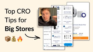
A UX audit of multi-product e-commerce sites reveals why most fail: hero carousels distract from bestsellers, navigation buries popular items, and product pages lack urgency. Moving products above the fold, adding a Bestsellers link, and using seasonal sales instead of evergreen discounts can dramatically lift conversion.
Chapters
If your store has a lot of different products on it, then watch this video because I'm about to explain what you can do to really move the needle in terms of conversions. So the first thing that I would say to you is that some of your cards seem to be okay. Like this has decent font size and it's pretty clear to people. And then I look at some other fonts and the subheading text is like really, really small. And if we look at this slide over here, the text is really, really small and the image text is like really, really blurry as well. So there's a bit of inconsistency across the images. There's different call to action colors and everything like that. What I'd recommend is ditching carousel sliders like this, because it's giving people way too much information. When their first impression, their first few seconds when they land on your homepage, they're really making a decision of, okay, do I want to stick around? Or should I go? And is this brand— will it have something that will hook me in? And just like how a good ad will hook someone within the first few seconds, your homepage should hook them within the first few seconds as well. And so That's why you want to kill all the fluff and just get straight to the point. Who your brand is, what you sell, and why people should stick around to browse your store. So that's what you should be communicating in this section over here. So again, I'd recommend removing the carousel slides and just going with one really powerful slide, maybe showing all your best-selling products. And you could have a call to action saying shop bestsellers. Ironclad warranty doesn't really mean anything to me. You know, everyone can say that. So what is your warranty period? And if you can't say your warranty period because it depends on the different products, then remove that element and just communicate that on the different product pages. Australia's number one choice for water filters. This is good. So if you have this, this could be your main headline of your hero section. So Australia's number one choice for water filters. And then underneath you have your bestsellers. You show like your 5 bestseller water filters, and then underneath shop bestsellers. And then underneath that you could have another button shop all, and that's it. And I think that would make your hero section so much more powerful, you know, because you're leading in with a strong claim, and then you have your best-selling water filters underneath, and you have a link that will directly get them to their bestsellers. So your navigation menu, let's try and get there by going through your navigation menu. So what I would do is I would add icons to each of these different names so that it's easier for people to actually see what each of these categories is about. And I would order them in order of priority of most used. So what is the most popular category? And I would have that as number 1, followed by the second most popular, and so on. You know, that way you're getting the majority of people to where they need to go straight away when they land on here. I would also add a main call to action down here to shop all so that they can go to a collection page. And they can have, let's say, because you sell a lot of products, so, so try and give them another option to navigate your store. And that could be that call to action button that will get— that will redirect them to your collection page. I would also make sure that you're putting in your bestsellers up here. So I would almost create a new category and put it as number 1 in the list at the top and have bestsellers there. And that can be the bestsellers from all the different categories that you have. So that way people can go there if they're unsure about what they're interested in, they can go to the bestsellers and actually see what is popular with other customers and see if they want to also purchase what they've purchased. So let's go into one of your different categories over here. And this is a collection page, but the, the tag series, like crazy, crazy long. So we have Benchtop water filters and purifiers, 25 products. And then it's like a massive paragraph of text. And then we have an FAQ section. And then we have the grid of products down here. Yeah, I've never actually seen a collection page that has this much text and has an FAQ section on top. So I'm very, very curious as to why you've done it that way. And you have this element as well. You know, I just feel like there is so much space being taken up before they actually get to the products. So the golden rule with collection pages is, it's fine to add some text to give a description about your collection, but the golden rule is your products must be visible above the fold. And above the fold means above 650 pixels scroll depth in general. So 650 pixels from the top of the screen to the bottom, your products should be peeking through up here. And we can see that they're having to scroll once, twice, three times to kind of see your first product. And you're only showing one product at a time over here. You have actually two different options for people to see your different products. So you have like a grid option over here, which is already selected. And then you have this list option, but they're actually both the same, I can see. So the grid option in my mind should be displaying them in a 2x2 grid. So it's easier for people to scroll down. And showing less information. And if they want more information, they can, they can filter everything by that list. So these different options over here, they seem a little bit broken. So I would make sure that you're getting them fixed. That's really, really important there. And this above the fold, I would simplify it. I would completely simplify it. I'm, my gut is telling me that you're doing this for SEO reasons to get people to land on the page. But the problem is that is if you optimize your entire site for SEO, you're optimizing it for the algorithm, but not the human. And so you want to make sure that, okay, we're still ranking high for SEO by adding in the keywords, but it shouldn't be at the detriment to your actual navigation experience when they land on the page, because you're just going to be losing sales then. So it doesn't make any sense. So I would make sure that you're going through all this copywriting and trying to remove as much as you can and bring up the products as high as you can. And then this FAQ section, you can put that towards the bottom of the page. Let's go into one of your products over here and look at your product page. So I'm looking at this product over here, the UltraStream. So it has 19 reviews, high ORP. Okay, filter water replacement. Okay. So why is this product on sale? So a lot of stores do this. They give a small discount on all of their products for no real reason, but they're just basically running an evergreen discount. But that means that when it does come to a sale period, the sale period loses all of its potency. Because if you're running an evergreen discount all year round, when it comes to the actual sale, it won't have the same impact, because it won't have the natural urgency that a sale period has. And so you should be pricing your products at full price unless they're in a sale period. And you can run a few sale periods through the year, you can run a January sale, a spring sale, an Easter sale, summer sale, and, you know, an autumn sale, Halloween sale, Black Friday sale, Christmas sale. So there's tons of different sale opportunities you can do. But just reserve them for that week or that 2 weeks that the sale period is running. Because the problem with this is they're saving 9% here during the sale period, but we cannot say when this sale is going to expire. So we can't really make a claim that this sale is going to end soon. And we can't really build that natural urgency. So that's why you shouldn't really do evergreen discounts. So you're offering two different payment plans, I think, over here. I would just stick to one of them. So I'm not sure what this Zip one is. It's probably something maybe in Australia. I'm not too familiar with it, but Afterpay I am. So I would just keep it to Afterpay. That's normally the most popular one, or the most known one. And just keep it to one payment plan. You don't need two. And you have these little buttons over here, but I think this is, this is not so great UI because what you could do is remove these little checkmarks over here. And just make this 0 by default. And so if they want to add this, they can just click add 1 or add 2 and it will add to the cart, you know, instead of me having to click here, add them. And then of course I got to click this button over here, which doesn't really look like a button by the way. And, you know, now I don't think it's even added into my cart here yet. Oh, I've got to, I've got to go all the way down here to add it to my cart. So. Yeah, this is— this I don't think is great. I think you're going to struggle with upselling people here because they're having to figure out how this mechanism works. Keep it simple and reduce friction for people to add this into their cart. So remove this, have all of these to be preset to 0 by default, so none have been added into your cart. And the minute I add one, it will add to my cart. And that should be it. That should be pretty simple. And if I click minus, it will remove it from my cart. It should be that simple. If you're looking for further help, we do offer a service so we can craft a high-converting landing page that is designed to outbeat your current page by at least 10%. Our specialty is designing these high-converting landing pages, and we pretty much do this every day for the e-com clients that we work with, such as Snow, CarePod, Soloway, Velvet Caviar, and many more DTC brands, helping them to increase their ad performance and get better results in terms of their conversion rate, average order value, and overall profitability. If you're interested in learning what results we can get for you and how our process works, then check out the description. There are links to our website, and of course, you can also book in a call with me and answer any questions you have. Cool. And I hope you got some value from this video.










