Top 3 Shopify Hacks for More Conversions (CRO Audit)
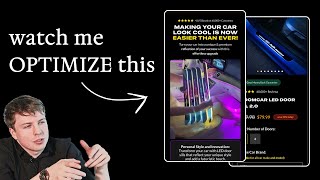
Pedro Loureiro audits a Shopify store selling LED automotive products and shares three concrete fixes: better hero video and headline placement, social proof tied to customer objections, and strategic bundling and pricing to reduce friction and boost conversions.
Chapters
If you're serious about scaling, the only things you need to actually worry about is how can you actually improve your messaging? How can you actually improve your offer? And how can you reduce friction for people on your website to convert? I'm going to walk you through a live SEO audit that I've done for a brand recently. I'm going to show you these principles in action. I'm going to be talking about their offer. I'm going to be talking about their messaging. I'm going to be talking about ways that they can reduce friction for people to buy. Those are the things you need to focus on if you actually want to scale a lot more reliably. Let's dive in. So what I like about your website is that you are showing a video. And the power of a video is that it can convey very quickly what your product is about. Let's say, instead of compared to a photo or compared to a headline. So if you're— if you didn't have a video in the background, I wouldn't have known what your product is. But the cool thing about your video is so good that I can clearly see straight away what your product is, is this LED sort of light strip that you've got here. Now I think that's amazing. The only thing I'm going to nitpick about this hero section is that your headline covers the center of the video on mobile. And I think that's just such a killer because you, if you have such a visual product like this, you need to show it off in all of its glory. So what I'd say, the first tip I'd say is move your headline so it's either higher up on the page or you can move all of this lower down so that So that you're showing that you're showing your LED light strip a lot more clearly. And you know what you can even do is you can make this subheadline one line or just maybe even a couple of bullet points, like two bullet points, and keep them on one line. And that will just save some more space. So I think that'd be pretty good. So you have this section. So you have driven by innovation, powered by passion. What I'd say is you have some social proof here, 60,000 orders, put that in here, you need some sort of social proof in here, I would definitely recommend that. Because if you want to position your product as a more premium product, you want to build this hype, the hype as well around your product. It's one of those really visual— your product is such a visual product that people who are going to buy this want to buy it because of course it looks cool. But people who want to buy this sort of product also want to buy it because they know that they're going to get, let's say, get compliments from other people. They know it's going to give them more attention. I know this is going to be a weird thing to say, but that's really the root behavior of a purchase like this, is those fundamental human emotions. So anyway, without going too deep into psychology, that's what I'd recommend. Just bring up some social proof in here, move the headline and your button down a little bit. Your button, Honestly, I don't normally recommend this, but your button, I would recommend removing the color from it. So maybe just switch to a black button and put like a white stroke outline. So put a border, a white border around it, because I just think, again, your product is so visual, there's so much color going on in this hero section, you don't want to draw attention away from the video. So make your button as minimal and as non-distracting as possible. And just obviously, obviously still make it clear that it's a button. What I would do is just make it black and put like a white border around it and then move all of this a little bit further down, obviously, so it's not going below the fold, but down here, move it down to the bottom of the screen. And that way you can show off your product in all of its glory. This section, I just think, is not really doing anything for me. It's a big fat essay of text. And what does it really say? I think you can really communicate whatever you're trying to say here, which is From what stands out to me is the social proof side of things. You can just communicate that in one line. And like I said, you can bring the social proof up into your hero section. This section, I would replace with just featuring your product, make it— let people have the ability straight underneath your hero section to actually see your product and potentially buy it straight away. So when people click on the Shop Now button, they could actually just scroll down to the next section and learn a little bit more about your product, learn about all the intricate features. Learn about, okay, what different colors that come in? Is there any way I can customize it? Does it fit my car? Like, those are the sort of things I would be leading in with next. Because honestly, you don't— this is not a product that you need to oversell. It's not one of those products you need to oversell. I can tell that instantly. Because again, it's a very visual product. People who buy this, they're not going to spend a week thinking, oh, should I buy this? Shouldn't I not? It's one of those impulse buys. Really, if you think about it, it's going to be like, okay, the people who are going to buy this are the people who've already made it maybe one or two steps into customizing their car with LEDs and with maybe like a custom print or whatever like this. And so this is going to fit into their arsenal of style. And I would definitely lead in with the next section being okay, answering some of their top objections, which the first one is going to be, does it fit? Does it fit my car? Is this compatible with my car? Is it safe? Is it— what is the price? All of those different essential things that are going to lead them to the next step in the purchase. That's what I'd be leading in with next. Next section, In summary, put in an order form down here. And then what you can do after that is show a few more photos. You can bring in some social proof. You have some photos, right, of some of your customers here, but they're so small. Like, you've done a collage, which I think is a good idea, but it's so small that no one can even see this. Do you know what I mean? So what I would have done instead is made this like a scrolling carousel. So a scrolling UGC carousel that's like horizontally scrolling. That's what I'd say. Now, I like the fact— I've got to give you credit here— I like the fact that you're repeating 60,000. Sometimes when people put social proof on the website, there's like a different figure every single time you see it. So when you see it on their homepage, it's like 40,000 people have shopped from us. When you see it on their product pages, 25,000 people have shopped from us. When you see it on their checkout pages, 100,000 people have shopped from us. And then you think, okay, are they just making these figures up? So I I like the fact, and I've got to give you credit, that you're, that you're saying 60,000, you're repeating it, because again, when people see this now, they know you're not making that figure up. You're not just coming up with a new figure every single time. This is another good section that I would like to see higher up on the page. And also, you don't need to make your reviews this long. I think a lot of people think, oh, I need to feature the whole review. Take out snippets from it. Even this, I think your review should be one or two lines. At the most. And what you can do with the reviews to make them a lot more powerful is try to see what your customers' top objections are, and try to pick out a review that will handle each of them. So for example, top objection might be— let's see what a top objection could be. Yeah, a top objection could be, is it really— does it have enough customization options? So you can pick out this review from Jason and say, customization options are great. 'And Bloom Car Service was spot on.' So boom, that one handles that. Another objection could be, you know, 'How easy is it to install?' And so you can pick out this review from David and say, 'Installed the LED door sills, and they look stunning. Easy to install. Customer support, super helpful.' Boom, that's it. You get what I mean? And then another one could be the aesthetics. And so you have this review from Chris, 'LED door sills I installed look amazing, and the entire process was flawless.' So, etc., etc. So that's what I would say for the reviews. And I would also try and bring them— bring those reviews up maybe underneath this next section down here, and then have your photo collage of UGC. I would put that right underneath your hero section. Again, building the hype, weave in the hype that we've mentioned and teased in the hero section, that 60,000 people have shopped from you. That is going to be super powerful. So going on to your order form, I'm not going to do the rest of your homepage because again, I think your homepage is too long. Just from looking at it. There's too, too, too, basically too long of a page here. And I'm not sure if this is powerful, this section. See, in some cases, I don't think it makes sense for your brand to do a comparison chart. I don't think you should do a comparison chart on the features. I think what would have been stronger is maybe doing a comparison chart on, let's say, the price, or on how many models your LED sill door sills are compatible with. So you could talk about, oh, others, they're only specifically made to fit this certain model of vehicle, or they don't have as many customization options as us. So I would have just made it maybe talk about maybe 3 different things, maybe number of models, you could talk about the customization options, and you could talk about the price. Those are the 3 things I would probably have mentioned in your comparison chart instead of 360-degree purchase support, which I'm not really sure what that means. 'And the latest accessories.' Not sure what that means either. As a first-time buyer. 'User-friendly designs.' Again, still not sure what that means. What does that mean, user-friendly designs? 'Much durability.' I get that, but like durability is like such a cliché word. What would have been great is if you swapped this out for like a warranty. You said maybe you have your 3-year warranty or 2-year warranty, whatever your warranty is. Put that in here instead. Do you get what I mean? I'm just talking about how can you elevate and make your messaging a lot more powerful. Amazing deals available at checkout. Okay. So we have this section down here. Okay. So you do actually do other products. So my apologies, but it seems like this LED door sill is like your featured one, right? Now, I don't know what's happening with this section, but it seems like the only thing that's visible here is your price. Anyway, let's click on this first CTA button. Let's actually go through. Okay, so you have the LED door sill, you got the ambient lights. Yeah, those are quite cool, actually, the, the headlight lights. Do you know what I feel like is an opportunity for you is to bundle these together and offer a discount, still sell them separately. But for someone who wants the full experience, imagine someone's going to be like first time coming into this, you could bundle the whole thing together. And basically the selling point that you could give to them is, hey, when you buy the whole set together, you're going to get a discount. Because I'm not a huge fan of you discounting it this heavily. It looks suspicious going from $160 down to $80. Like, it just seems like a ridiculous discount. And again, it just seeds into my mind that maybe this isn't a quality product. So if you want to commit to $80 being your price, maybe just commit to $80 being your price and say it's full price. But the cool thing you can do now though, is you can bundle things together and then offer a small little discount on top. Maybe people get 10% off if they get the the LED door sill and the ambient lights together. And then if you think about it, you're taking your average order value from— if this is your most popular product, you're taking it from $80 up to $100 or something like that. Okay, so let's go into one of your product pages here and see what we can optimize. So, ships in just 24 hours, 30-day money-back guarantee, trusted by experts. I would probably remove trusted by experts. And I would just keep these two. I think these are stronger. I'd remove the little icons and see if you can put in an icon that is just a little bit more premium looking. Like these gold ones just feel off, out of place. And also this bar is taking up a lot of space. So this thing is another thing that's a bit weird is you've got this cart that's like jiggling and trying to get my attention. And then when I click on it, there's nothing even in here. So in this case, I would remove it. You don't, again, like you don't want to add any more friction. For people who are trying to buy your product. You want to just make sure that they're looking at the right thing. And your product is such a visual product that you don't need to distract them with any other colors or any other craziness. Just get them to look at the images and your images are going to sell your product itself more than all of the other copy that you've got on your page. Trust me. So what I'd say is like the first thing is, take your images and make them as big as you can. Like you've got them in a smaller little container over here. I'd make them as big as you can, make it fill up edge to edge. And I like the fact that you've got these little lines, or sorry, these little description points in here to give people education through the carousel. This is great. Again, I would try and make your images a bit bigger. So for example, you could crop this and make it a little bit bigger so that we can actually see the LED light a little bit bigger. So you have a free roof glow with every door. If you're doing any like bonuses like this, I probably wouldn't put them in the images because again, it's just getting a little confusing now of what I'm actually getting. I would, because you've got, you've got, okay, I would probably do this instead. On your first image is where I would showcase what your offer is. So I would showcase, okay, I'm going to get the LED door slip. And I'm also going to get like the LED roof glow as well. And I would basically show that on this image. And you could even put like a black image and just put the actual just product flatlay photos on there. So it's super clear for people. That's what I would say. 30-day money-back guarantee. This information I put always down next to the CTA, call to action. So you could remove all of this stuff down here. Maybe just keep the free shipping and then keep the 30-day money-back guarantee as well. You don't really need the rest. Call to action button again, probably just keep this white. You've got so many different colors going on. It was orange on your homepage, now it's like green over here. So again, I just— small little tweaks. I think there's too much color is going on. I like the fact that you're highlighting this. This is something that I would highlight. So I would keep this in yellow or some other color. So available for all car make and models. Yeah, I think that's good. Enter car model. Yeah, I think that's fine. I like the fact that you're calling it out here. The only issue is it's going to be very hard if someone sees this for the first time. How are they going to see what this actually is? So I would add a little button where they can expand this to actually see what it is in full screen. Or when this popup comes up, when they click on this and expand, they can actually scroll through a few different images of it to actually see what it actually looks like. I think that'd be very cool. Again, I think this is an opportunity for you to— I like the fact that you're, you've got the number of doors here, but I also think this is an opportunity for you. If someone buys the LED door sill, how can you try and cross-sell them or upsell them on the bundle or another one of your products? So maybe that's once they click on the Add to Cart button. then you're doing a pop-up. So I think there's an opportunity there to increase your AOV. I actually think this GIF that you've got here is really cool. I would recommend testing this against the one that you've got on your homepage hero as well. If it's not the same one, I don't think it's the same, but just test that out or include this in your product carousel as well as maybe the second or third photo is what I would say and see how well that does. Again, information below the fold. Are people going to care? A lot of people are not going to read this. This section is actually really cool though. Like this could be a UGC section that you're putting on, on your homepage, maybe down below the fold. What I would say is I do like what you've got here. What would be cool is the way on most websites they have that like social proof section where they're showing like New York Times and like different like publication company logos to say that they're associated with them. You could do the same, but instead of publication companies, you could actually show the logos of the different car models you're compatible with. So Tesla, etc., etc. I'll show you what I mean. Like this, not that page, but kind of like this idea here. This is a page that I did for Glance over a year ago, and I'm doing another landing page for them on their latest product. You can see we have this like scrolling ticker, which is pretty nice, which tells you all the different features that this product does. And yours could be basically the same, but you could have a scrolling ticker, but instead of the features, show the actual logos of the cars you're compatible with.










