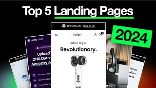
Pedro Loureiro breaks down conversion rate optimization using real redesigns for Lifon, Anthros, and a service business. He shows concrete tactics: put your main CTA above the fold, use pattern-interrupt visuals, stack product comparisons horizontally, and embed trust badges throughout. Simple UI tweaks aligned with buyer psychology can dramatically increase click-through rates and lower ad spend.
Chapters
This Figma file is kind of to give you some insight of how we do CRO and how we approach redesigning pages, creating new landing pages for people to maximize conversion and profitability. So CRO at the core, and like I say on, on many of my tweets, is actually very simple. I think a lot of people kind of overcomplicate it. Really what we're trying to do is just a number of things, but they're very simple if you think about them. All we're trying to do is trying to take a potential buyer who's coming onto your website, trying to take them from you know, somebody is very cold to very warm and then enabling them to purchase. So how we do that is like, just very simply, two things is one, just reducing the amount of friction for them to purchase in the first place. So that's one thing that we do. And the second thing is we just educate them more. So for example, educate them more on what their objections are. So, but that may sound simple, but obviously we need to then figure out what are their objections. So assuming that we know what the objections of your customers are, then of course we can do these two things. We can very easily then educate them, cuz we know what we need to educate them on. And the second thing is then reducing the friction for them to purchase. So that comes in a number of things. That's UI. That's also, you know, the making sure there's no bugs on the, on the whole, on your payment process or on your pages, making sure that it's mobile optimized, making sure that, you know, we have, let's say, a video in there that's at the right section. We have your guarantees, making sure that their objections are handled basically, um, and making things effortless. So with this little document that we got here, we can see some of our before and after designs for a few of our different clients. We've got Lifon here, we've got Anthros, Anthros again. We also have, um, this service-based client that we worked with, um, a couple of months ago. And the reason why I included this one in is just because I know some of you are running service-based businesses or something similar. And, you know, I just want to show that basically CRO can still apply to that as well. So feel free to go through and look at this, and hopefully by going through, you can kind of get a more practical idea of, you know, how we do CRO and, you know, how it can then be applied to your own business. So some of the things I would just recommend is, you know, the very low-hanging fruits. I'm really obsessed with low-hanging fruits when it comes to CRO. Like, what are those simple things you can do straight away that will instantly give you a big uplift in your conversions and profitability and reduce ad spend. And those things are really booting up your website or your landing page on your phone and just making sure that the button here, the main CTA in that hero section is above the fold. So it's not getting cut off. So for example, here, this on their website before, the button is actually below the fold. So it's getting cut off. So that's instantly going to get lower conversions because people people, most people bounce, right? When they, when they jump on a page. So if we just have a button, then people are still gonna, they're gonna be more inclined to click through to learn more. So again, just simple things like that, tidying up the information, making sure it's a lot more readable, adding in like little pattern interrupts here, which is what we did to highlight this selling point because this is one of their main product selling points. So things like this, we call this a pattern interrupt cuz it's like white, white, and then black. So sharply contrast as people are scrolling. And then just making sure that the information is stacked in like a hierarchy. So for example, if the main benefit and selling point you're trying to get across is these light rings on this hairdryer, well then this video should be less important and less prominent because when I look at this section down here, my eyes kind of naturally go to this video and learning more about what this does rather than learning about these light rings. So, you know, just a simple switch like that, you know, change this, this video into a button where it can now pop up and then having this as the, as the main focal point can, can help people to, you know, you're basically guiding people on where they should focus their attention on. Same thing with this. Instead of having information stacked in like a list, which means it's harder for people to like compare the different aspects of the product, have it stacked like this. So like horizontally. Now I still think that we could probably do a better job optimizing this graph even more, or this chart. To kind of simplify it even more. 'Cause you know, the more simple you get is often the better when it comes to mobile users. You know, you just want that information to be so clear and so easy for them to consume. But I definitely do think it's a big improvement over what we had here before. So simple things like that, you can see for Anthros as well, like how we're going about adding in social proof. Like for example, this university trust here, how we're highlighting different benefits in this easy to navigate carousel. We're including a powerful video here that walks through the product. We're showing social proof in the hero section. We're having a CTA in the hero section. And then we're having like a very clear headline that describes what the product is, what the main selling point is, and you know, why people should care basically. And then this is also their collection page. So you can see here some of the similar zero principles that are at play, just making sure the information is tidier, that the CTA is more prominent, easy to click instead of the small one over here. And then, you know, basically just stacking the information a bit better. So I think some of the fonts here are not working properly. I think they should be like this. So let me just fix that now. But hopefully this helps and hopefully this gives you some insight in how we work and how we do our CRO. And then there's also this example over here of like a service-based company as well. You can see how we've done our CRO for them. So yeah, hopefully you will find this valuable and