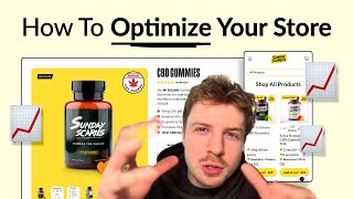
A CRO audit of a CBD gummy Shopify store reveals mobile hierarchy problems and cluttered product pages. The auditor recommends simplifying the homepage to feature only bestsellers, moving the guarantee lower in the funnel, and leading product pages with one-time purchase options before subscription upsells.
Chapters
In this video, I'm going to be auditing a CBD gummy brand website and looking at what are the most important things they can actually do right now to improve their conversions.
Let's dive right in.
I'm landing on your homepage here. First thing I can see is that it seems to definitely be a little bit more tailored to the desktop experience than the mobile, because this image, when I go to view on mobile, it's getting completely covered by your button and your guarantee and your reviews, and nothing is really standing out. So All of these elements down here, it seems that the hierarchy is off. You know, my eyes kind of go to your review at first, when they really should go to the headline, because that's going to be the first thing that kind of hits me and is going to hook me in. This review, I would basically just make this like a subheadline and only take out like a snippet of this. And you know what you can do? You can actually simplify this review and you can say, at first I didn't believe these could help, but now they're my daily go-to for keeping stress under control and sleeping better. Tyler P Verified Buyer. So you can put that in like 2 to 3 lines underneath your headline. And that is your subheadline. Then you can include his like photo and everything below. But I wouldn't have it on a white background. So that's how I'd redesign this. And I think it would definitely flow a lot better. And then your guarantee, I would honestly just remove that and keep that for later in the funnel. Keep that for your product page or your collection page. Your reviews, they're not really standing out because they're covering the photo over here. Then what I think is instead of doing like a scrolling bar with all of these different logos here, you can actually just put them into the image itself. I think put them underneath the image so that way it just creates a little bit more social proof because people are seeing them next to your product and they're creating that connection. So I'm clicking this selector over here and it doesn't actually look like it updates when I click between the first two products. And I'm assuming that's because these first two products are both bestsellers and CBD. So I'm going to think that it's broken even though that it is working perfectly fine, right? So what I would say, instead of doing all of this, instead of putting your categories in a massive, like, sliding grid like this, which I think is going to create a little bit of confusion, just feature your bestsellers first. And then underneath, you can put more categories underneath, you can stack them like that. I would only honestly feature maybe your bestsellers and one other category underneath. So maybe it's bestsellers. And maybe you also feature sleep aid underneath, because The CBD products are basically being featured in your bestsellers anyway, the first two at least. So you don't need to sell everyone everything on your homepage. You want to get them to like your collection page or the next stage on your website to then sell them on the different categories, because trying to sell everything on your homepage is going to be really difficult and it won't create the best experience. Your homepage should basically function like a brochure. So it should give people a quick overview of who you are, what you sell, and then give them a link to the next stage in that funnel. Get them a link to the collection page where they can browse and see the different categories of your products. So you have a quarter of a million customers, it seems. So that is actually something I would put, as well as your review count over here. So let me take a look at your collection page here. So the first thing I can see on your collection page is that there's a lot going on. You've got a lot of yellow going on here, and the text is wrapping onto the second line, which is not good because you're just making it harder for read. What I would say to do with your collection page is I really believe you should simplify this. You're giving people too much information on the collection page. I would simplify it so it's not so overwhelming. The most important pieces of information are going to be the reviews, the product name, the price, and then a little tag on what that product benefit is.
And that—
those are the 4 things I think you need to be servicing here. And maybe a bestseller badge as well. And you can put that in— that's the one that you can put in the image. But your stress relief, and all these other different pieces of information here, and including like the mild potency stuff and everything, keep that for your product page. You don't need to be including everything. If you try and include everything on your collection page, it's just going to create visual overwhelm and people won't be able to actually see the information that they need. So let's go into your product page. So you actually have the Men's Health CBD Awards. This is actually something that I would try and bring onto your homepage as well. Try and bring that into the image. If you've got a photo of this product, which I think you have, I think it is this one. Then add a little badge in there as well. That's going to be more powerful than those, like, those different publication logos, because this is an actual award. You've actually got some decent photos in here. So this is a nice photo. This is a nice photo as well. But because they're so small, you can't actually really see the product. And from my first impression there, I actually thought it was like a stock photo. So I would definitely make these images a lot bigger. So you got a lot of text going on here with different information. And then you've got this horizontal selector. I would recommend doing a vertical selector. So I'd recommend doing something like this instead of how you've actually stacked it. And I would lead with one-time purchase instead of subscription, because normally, if you— if we lead with one-time purchase, we can actually encourage people to spend more upfront, and then we can upsell them on the subscription later down the funnel through email.
If you're looking for further help, we do offer a service where we can craft a high-converting landing page that is designed to outbeat your current page by at least 10%. Our specialty is designing these high-converting landing pages, and we pretty much do this every day for the e-com clients that we work with, such as Snow, CarePod, Soloway, Velvet Caviar, and many more DTC brands, helping them to increase their ad performance and get better results in terms of their conversion rate, average order value, and overall profitability. If you're interested in learning what results we can get for you and how our process works, then check out the description. There are links to our website, and of course, you can also book in a call with me and answer any questions you have. Cool, and I hope you got some value from this video.