What A Optimized Shopify Store Looks Like – MODEL THIS!!
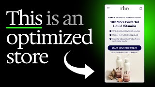
Ash shows how he overhauled Ro Nutrition's Shopify store for conversions, moving the menu higher on mobile, adding bundle options to the product page, and using heat maps to find where customers actually click. Small changes like quick-link guarantees and visual bundle pricing lifted both conversion rate and average order value.
Chapters
Hey, it's Ash here, and I just want to show you today what an optimized Shopify experience looks like. So this is basically a whole store optimization that we've done for one of our clients called Ro Nutrition. I'm going to walk you through exactly what we've done here. So we've optimized the hero section on mobile since the majority of their traffic comes through their mobile, and so they're going to engage with this. We also saw based on heatmap data that most of their mobile users, when they land on the page, engage with the navigation menu. So we optimized that as well. You know, and this navigation menus, I don't see this a lot posted on Twitter, but navigation menus have been for the split tests I've done for my clients, one of the most powerful uplifts that has generated them. Sometimes even better than doing full-blown landing pages, just because the sheer volume of traffic that goes through some stores' navigation menus is even larger than any other page on their website. Keep that in mind, even optimizing just some small things you can do to your navigation menu, such as putting in your customer account, your guarantee, making it quick links to like your best sellers over here, where you know that most of your customers are going to be shopping to. Those things are going to have a huge, huge uplift on your conversion rate and your average order value. Because think about it, you're decreasing the resistance for people to purchase just by, you know, a little bit. But even that little bit, because there's so much volume of traffic going through this one area of your website, more people are going to click through. And of course, it's going to lead to higher conversions. So, that's kind of the science behind it if you want. But then of course, we even optimize their collection page, since this is the next step in the flow where people land on their page. This is really end-to-end optimization for their entire store. The next things we're going to do for them, of course, down the road is optimizing their cart and checkout process. Then we'll basically have everything covered. This is their collection page. We put in a banner again. You may think, "Oh, why are you calling out the guarantee and information on every single part of the funnel?" or every single part of the website. And you gotta remember, like, most people are not gonna read everything that you put on the page. So I think when most people try and build their website, build their store, they're putting in elements thinking that, oh, I'm putting it here, it's super obvious, people are all gonna see it. But the thing is, most people are not reading your page like they're reading a book where they scan everything in a very systematic way. People are not like that. They're, you know, the attention span that people have when they land on your, website is very, very short, very, very short. And if you have a lot of returning customers, their only concern is getting to where they want to go. They just want to get back to that product that they want to purchase again. So your only mission, if it's a returning customer that you're trying to improve their experience of, is to make that experience as effortless as possible, get them to where they want to be as quickly as possible. And that will of course have a big impact on your bottom line. So that's why we're calling out the guarantee and their, and you know, the free gift and basically adding in trust on all these different flows or on all these different parts of their, basically the user journey, because we're trying to remind people. Most people are not gonna even see this when they're coming through, but we're adding in little points along their journey. We're reminding them of the guarantee. We're reminding them of how much social proof this brand has. And that's just reinforcing the trust, reinforcing that they can feel confident buying from this brand. And of course, we took it a step further and optimized their product pages as well. And this is, you know, a big, big uplift because for example, what we're doing here, if we go back and I'll show you what their original product pages look like. So this is basically their product pages from before, which is using, and this, we're still working on their bundles, but this is the Shopify native's way of displaying the information. And the problem with this is, you know, it's not encouraging higher AOV purchases. So this is already a bundle, but this Shopify, I guess you could call order form, was applied to the single products as well. And so it wasn't encouraging people to buy the the 2-pack, the 3-pack, etc., you know, in a nice way. So what we've done is if we go into even any of these products, we've designed the order form to show them the little visuals of what they're going to get, which again reinforces the perceived value. So the 6 bottles is bigger than the 1 bottle, you know, and then we're showing them the savings, how much it is per bottle. Now I'm based in the UK, so that's why it's showing me in pounds. But this store is in the US. We're showing a little subheadline explaining what the product actually does, the main benefit of it. You know, we've got reviews here. Then we've also got the subscribe and save widget down here. And again, we're listing when people click on it, we're listing the benefits of that, or not the benefits, but like more information explaining what that tier is. So, you know, you're going to save an extra 15%, you're going to get free shipping. It's going to come every 70 days. You can cancel or modify anytime, stuff like that. This is a really low-hanging fruit that I think a lot of stores, especially in, you know, if you're selling consumables, Add in bundles because basically I think everyone in the e-com world, at least the last like 5 years, has been crazy on these subscriptions. But the thing is they're so overdone now. You got to remember that a lot of consumers probably have multiple subscriptions already to like Netflix and all these other things. So when they think about taking out another subscription, it's like you're asking them for another marriage proposal. Getting people to subscribe is a lot harder than getting people to pay a little bit more, but for, for like a one-off purchase. You may think that it's the opposite, but this is actually how it's done. Because the thing is, even my own natural buying behavior, I would rather buy more in bulk upfront and save more than having to subscribe every single month. Because every single time you're putting people on a subscription, you're basically asking them to recommit at the end of every single month. And then they're gonna question it, right? They're gonna be like, hmm, do I need to be paying this every single month? Is this really for me? But when you buy it in bulk, sitting there on people's shelves, they don't have to wait for shipping. You know, there it is. And you know, they can, they can consume it on whatever rate they basically want to consume it on. So that's why I definitely prefer bundles for a lot of products. Of course, there are some products out there that subscription works really, really well for them. So it's not without its exceptions, but just something to keep in mind. If you have a product that can be bundled, then bundle it. It's a very, very, easy and low-hanging way to increase your AOV and increase the value that you're offering to your customers, because you're just making it easier for them to get more of your products and, you know, basically to save more as well. So it's a very, very, you know, low-hanging fruit for you to do. Now, the next thing, of course, the next step that we will be doing for ROWE in the coming months is going to be optimizing all of the product images. So this is kind of the flow that I'm recommending for people to optimize their store. First of all, you need to install some heat tracking tool or some analytic tool to actually see where your traffic is going. Are they going to your homepage? Is most traffic going to a product page? Is it going to a landing page? Wherever that majority of your traffic is going, that's the first page that you should be optimizing. Forget about everything else. Put all your attention into that one page or that one section. The next thing is you need to then figure out, okay, what is the flow for people? When they're actually going onto my store. There's two types of people. There's new customers, so they have a different— usually they have a different flow. Then you've got returning customers and they have a different flow as well. You need to cater for both. Some stores, they have a very low returning customer rate, so really you don't really need to pay a lot of attention to it. Other stores such as like ROH and other consumables, you have a higher returning customer rate because people are coming back to purchase and top up. You obviously need to make sure your flow is optimized for that. This is why when I talk about CRO, you know, it's all good to kind of, you know, look at some of the designs that I'm putting out and try and model it for your brand. But you also have to look at how are people engaging with your brand? How is your traffic engaging with your store? And then you basically optimize according to that. So that's really the better way to do it. Cause you're going to guarantee a better uplift if you do it that way. So, so just to reiterate, first install some tracking tool. I recommend heatmap.com. It's, you know, from Dylan Anders. Dylan Anders built it. It's very, very good. That's what I that I basically use for clients that I work with to kind of track where everyone is going. And then for, you can even look at your Shopify analytics to basically see the traffic count per page. And with those two tools, you can really have a lot more insight into your own business and see where people are going on your store. And from there, you can start to see if it makes sense. Okay, do I need to optimize a navigation menu? Do we need to optimize the product order forms? Do we need to, like, your questions will become or your answers to your questions become a lot clearer once you have the data to actually tell you what you need to do. Here's an example of basically a full store optimization. The reason again why you're doing this is because I think a lot of people think that when it comes to, let's say, CRO and everything, you just optimize one part of your store. But if you think about it, there's a whole customer journey when people are coming to your store and your brand, for most brands. Of course, there are some brands out there that just have one landing page and that's where everyone converts on. Okay. But for most, most stores out there, you're going to have a landing page, which brings people into your funnel. And then from there, there's going to be people on the backend, on your collection pages, on your, you know, engaging with your product pages and things like that. And that's why you need to have those optimized as well so that you can get maximum uplift across your whole Shopify store. So just in summary, navigation menus, homepage heroes, collection pages. I would also do custom carts. So optimize your cart drawer when that slides out, put your guarantee in there, show more, maybe customer reviews featured in a testimonial. And then if you have Shopify Plus, optimize your whole checkout flow, you know what I mean? Because that's also where you can see a lot of drop-offs and, you know, empty carts, you know, people who've added to the cart, but then they haven't converted. So that's how you kind of take care of that. But at the base of this, what I'm trying to say is get your data in first, because then you'll see what you need to do. All right.










