Why Simple Landing Pages Convert Better (CRO Audit)
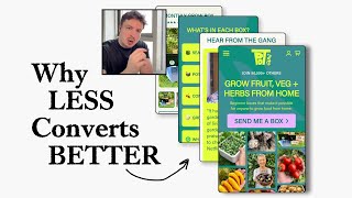
A CRO expert audits a subscription box landing page, recommending it strip visual clutter, consolidate social proof into one video, limit the color palette to two colors, and use larger images for mobile. The key insight: simplicity converts better than complexity.
Chapters
Let's see what we can do here to optimize this. So join 50,000 others grow veg, grow fruit, veg, and herbs from home. Beginner boxes that make it possible for anyone to grow food from home. I quite like the overall branding. The only thing I'm going to say is there is quite a lot of color. And I feel like it's a little bit distracting. What I would say about the images is I do like the fact that they do have a collage. I think it's nice because they're showing all different fruits. But I think it'd be clearer if they showed exactly what they're going to have be delivered to people. And I think this image up here, I'm assuming, is what they're going to get delivered. Again, I don't know. So if this is what I'm going to get, I would have that maybe be, you know, a bigger image up here and then around it, you know, come up with some way of doing a photo shoot where you have the veg and everything around this box. And I think that would make it more visual, like you'd have the fruit and the veg around it showing that actually you can grow all of these different things. That I think would be a lot better. So one main photo showing the box, showing the bundle with all the fruits around it. And with, let's say, a woman smiling in the background, you know, enjoying her fruit and veg box, the fact that she's growing it from home, that I think would be great. This is also interesting as well, the fact that you're mentioning gifting, because that could be a big part of why people would purchase this as well. It's a great gift for someone who, you know, is considering this and doesn't know you know, where to start, this could be the first thing that they can, you know, to push them to actually start this. So this wording, this headline and this subheading, I think is okay. But I do think it could be stronger, you know, your headline, grow fruit and veg and herbs from home. That I think is fine. But I like your subheading, I'm kind of like preferring your subheading a bit more, like the fact that you're calling beginner boxes, you know, or you could even maybe change the language in your headline to say, you know, beginner-friendly 'Or grow fruit and veg herbs from home easily.' You know, I think it needs, it needs to be a little bit stronger. And I think what you're messaging down here is a little bit better, like 'Beginner-friendly boxes with everything you need to grow fresh, delicious ingredients meters from your kitchen.' This, I think, is better. So this subheading, I think, would be a better subheading. You can even replace here. So you have social proof in here, you got a lot of social proof, you know, you've got 50,000 others there's quite a lot that you're trying to push and squeeze and cram into this hero section. You've got like, you know, 3 different forms of social proof. You've got, you know, the, all of these different, you know, publisher logos as well. I would honestly just try and maybe strip it down a little bit more and do a more minimal version because again, the more clutter you add onto your, onto your page, the more distracting it can be and the less people can actually consume the information that you're trying to actually get them to consume. So I actually feel like, you know, by you having in this review widget here or having him, let's say, one or two really, really powerful reviews, like you could use this space down here for these different things to pull out one or two really, really powerful reviews from your customers. So one or two powerful reviews I think could be really powerful here instead of this element over here. This section down here, if you have the quotes from these publishers of what they actually said when they shouted you out, That would be even more powerful than, you know, just having, you know, this scrolling section as well. Alternatively, what you can do is when you are creating that bundle photo, that new photo here with your bundle with your woman with all the different fruits and veg around it, you can put the logos in that photo around it as well. Again, I'm just trying to think of how we can tidy this up for you. Now, your branding, your colors— I like your branding, I like the logo and everything, but again, I just think a little bit too much going on. What I would say for you to do, because it's like there's no real, there's no real brand guidelines here on your page. There's just, there's just, you know, this dark green or whatever you want to call it. This is purple, this is yellow, there's white, and this is dark, this even darker green over here. So there's no real structure hierarchy. I would honestly just pick two main colors that you're going to alternate between. And obviously, I think it makes sense to keep this yellow. This yellow I would keep as your call to action. I would honestly just keep that as your call to action button, that yellow. And what you can do, all the text, just make it white. Just make it pure white so it's easier to read. Maybe choose a little bit more of a fun font if you're trying to go for that, that fun theme. And that's where you can kind of go a little bit more with your branding and being more a bit expressive. Choose a bit more of a funner, more natural more curvy font. Like, this has kind of got sharp edges, so choose like a more natural curvy font that maybe has, you know, it's not like perfect, you know, you know what I mean? Like the more natural sort of font. And I think that would kind of create a more nice, a nice feeling that you're trying to go for. This social proof element down here, I think is great. Like you've got a lot of videos here, but again, you're kind of assuming that everyone is going to swipe through and consume them all, and they're not really, you know, they're not really. So what I prefer to do instead of these is either keep it to— I don't know how many you have here, actually. How many do you have? I think you have about 3 or 4, right? 3 or 4. I would just keep it to maybe 1 or 2. But the 1 or 2 videos you're doing, even just 1 video that you're doing, and in that 1 video, mash all of them together. So you can create 1 video and have it cut and mash, mash all of them together. So you're giving people the, basically the whole social proof carousel but you're condensing it into one concise video. So they don't need to choose between any of these. They're going to click on that video and they're going to get all the best snippets from all these different videos. And it's great because then you can show more of the social proof hype. You know, here we have one person, then we have another person talking, another person talking, another person talking, creating the hype. So I think that would be a lot better, a lot more powerful. So you go from here section into the— so we're going into the benefits. But we don't really— we haven't gone into like what I like to call the problem solution section first, is calling out the main reason why someone will want to buy this. And I can think of the top of my head, a few of the main reasons why someone would want to buy this is because they want to be more self-sufficient, they want to be more natural, they want to be more healthy. Those are the things that you should be calling out in a section. So you're reinforcing in their mind that this is for those type of people, this is for you. This is the product for you. You're kind of painting the picture of where they are now. And that your product is going to get them to where they want to be. It's a solution. That's why it's called problem solution section. That I would honestly put here. Sorry, here in this section down here. Then you go into the benefits, then you go into a section like this, talking about the different benefits that you've got over here. And you're basically, what you're doing with that section, this benefit section is you are, you've already established the product as a solution. But what the job of the benefit section is, is to build basically trust that your product is the best solution on the market, that it's the most effortless solution. So you're just, you're trying to basically create trust in people's mind. Okay, yeah, Pod Gang is the solution I'm looking for. But it's also the best one on the market compared to alternatives. It's the perfect one for me. So that's what you want to do with this section. So you have one-to-one support on WhatsApp, step-by-step instructions, all seats, Okay, so this is nice. I like the points you're mentioning here, but I would ditch the emojis if you're going to go for more natural. This is meant to be a natural brand, and these emojis are, you know, again, they're digital. They're kind of— it's kind of like throwing off the vibe for me a little bit with this. What I would do is use photos. Use photos, as much photos of nature and greenery and these veg and these fruits as possible. And you don't need— this is why I don't think you need to go too crazy with your colors on your page because the fruits and the veg that you're in these photos are bringing all the color. So I say this to anyone when it comes to branding: when your photos are bringing all the color, keep your landing page or your website, your branding muted a little bit so that you're not, you're not trying to scream out for too much attention, not going to conflict each other. One should take priority, and your photos I think should take priority. So that's what I would say there. So reduce food miles, rely less on supermarkets. So these, these are different points here that you're going to be— that I think you're going to be mentioning in your problem solution section. These are the reasons why people would want to try this out and purchase it. So interact more with nature, rely less on supermarkets. I'm assuming it would save them money as well in the long term. Try a new hobby. Perfect for gifting. Those are the things you can mention in your problem solution section. So this I would honestly move above your reviews. Because you need to, you know, I don't think they've been sold enough yet on your products. They need a little bit more education first. And your photos here are a little bit too small. So I would put this section above this section over here. Yeah, the photos definitely need to be a little bit bigger because you can see the text here on mobile is really, really small for people to, to read and to view. This is a nice photo as well. And this actually could be a nice photo you could put as well somewhere. Somewhere up here as well, higher up the page as well, so more people can see it. I think you're going to— you're missing a call to action button down here. I think always put that there. So what's in each box? This is a good section to have. So again, you should have a photo of the box in this section so they can see everything they're getting. And then underneath here, this section is like a breakdown of everything that's included. And keep the first tab open. So keep the first tab open just so it's, you people, people know intuitively that, and there's more information here. This is interesting, you add the WhatsApp support. Yeah, that's, that's crazy. So that's a, that's a really interesting added benefit that you offer. But when I first read that you offered WhatsApp support at the top of the page, I assumed that was just customer service type questions if you have a question with your order or anything like that. But I've I understand now from reading it, that's actually to do with the growing. So it's basically— so my concern with this is, it's amazing that you're offering this, but I don't think you're doing a great job at selling it well enough. Like, it's— you're calling it WhatsApp support, but it's more like growing support, you know, one-to-one, like, it should be called personal growing support. Don't include the word WhatsApp there. Lead in with the fact of what it actually is. And then here in this, in this description, when people read more about it, they can actually learn, okay, it's done through WhatsApp, the support, you know, and you call it the potline. Okay. Yeah, that's good. Yeah. So I would call it like growing support, or one-to-one growing support, you know, or something along those lines where it's more so it's clear to people, okay, this is not customer service of have an order query. This is this company going the extra mile and actually helping us or helping me with any questions that I have along the way. And this is huge, because this is really, really making it so beginner-friendly, the fact that you're offering this. So I think that's a really, really big value add that you've got there. I just don't think you're really doing a great job at selling it well enough, because I thought I had assumed that it was going to be customer service. You also have, you also have a WhatsApp icon down here, right? So, you know, it's kind of a little bit confusing, you know, customer service, this is customer service, right? And yet we have WhatsApp as well, which is not customer service, but it's to do with the order or to do with the growing. So a bit of confusion I think could be— is created there. So let's go down. So this banner over here, I know it looks cool, and I know people do on their websites, they have these big banners, but I personally don't understand the point of them because, you know, they're cool, but like no one's— no one's going to sit around here and read this. And it's broken as well, it's kind of like jittering all over the place. So again, every single bit of vertical space. I know I'm going crazy with this. You know, I'm being really, really picky here, but every single bit of vertical space is counting and you just want it. I'm of the philosophy that every single element that you should add onto your page should be getting people to where they need to go. It shouldn't be distracting. It shouldn't be there to make it look cool. It should only be there for a very specific purpose, either to educate people or to, you know, push them to sell, push them to convert. And this is not really going to educate people because it's taking way too long to get the words across. And it's not really there to like sell people. So I would remove that. So, so who we, so I think this is a typo here. Hi, hi, hi, Sam here in lockdown. Tried growing. Okay. So this is your story, right? This is your story section. This needs to be called your story section. So, and you know what I would say is I think this section you should put below your order form, put this monthly grow box above this. Okay, because I think with all the optimizations I've suggested to you and the tweaks to your sections, that's going to be enough to sell them on your, on your box. I think your product is amazing. I think your service is amazing. I think all the value that you're squeezing into this is amazing. So I don't think you're going to have any problem selling people. It's just educating people. That's the problem here is getting, you know, it's making it, it's making your product shine as best as it can. That's what I'm trying to do here on this audit for you is kind of show you how you can position things better. So this story section, keep it like a story section. I don't know why you've broken it into different boxes over here. Does it It seems like you've cut up the story into different parts, make it seem personal, have a bigger photo of Sam over here at the top, you know, and I wouldn't reuse this photo of the, you know, I wouldn't keep on reusing the same photo. So if this is going to be in your hero section, try and see if you can get another photo of you. If it is you, Sam, who's watching this audit of you, you know, maybe at the early stage setting this up or showing the WhatsApp support or showing the community, like, you know, have, have more photos in here that are to do with, like, almost like behind the scenes, so it seems more personal. This is cool. I like this as well. But I think this would be great as well with photos of the people who are buying this. So like customer photos in here as well. I think that'd be a little bit more powerful. And you can have maybe this is like a small little photo in the corner that's showing the map, but then in the background, the bigger photo in the background is a collage of all the different customer faces. Smiling and being happy. And I would merge this all into one section. So it reads like, like a little mini little article, mini little article. This is my story or our story. So we have this rating section down here, 4.9, 50,000 happy growers. I'm being really, really picky here because, you know, I always check these numbers to make sure they're right. But I know that most people when they come onto the page, they're not going to do that. But it seems like that number is consistent with what you have above, which is fine. So this is, this is actually great. Like, this is a really nice photo that you have here showing the box. And what I would do is this. I would honestly maybe try and make this your first photo in the carousel. Keep this photo over here. Where is it? At the start. Keep that as your hero section photo with the woman in the background, all the veg around it, right? You know, retake that photo. And then this photo over here could be the second photo in your carousel. And just add text above all of these different elements, make sure the text is big enough. But in that, call out exactly what all these different things are, because your carousel photos, the goal that I like to say to people is, I should understand your entire brand, your entire product, exactly what you're selling from your carousel photos just by swiping through. If I'm not able to do that, it means that you're not really giving people enough education with them. So That's what I would say there. These are great. These are some of the customer photos as well that you can put up here. I think these look amazing. Yeah, so that's what I would say there. So no pots, saucers, saucers plus 3. I'm already confused by what this is. So I'm assuming, is this the pots that you have here? So what I would say is you need to have 2 different images. This is why it comes— the images that you use are really important. You need to have 2 different images like this. If I click on this, it should show me exactly what I'm getting when I have this. If I click on this, it should add on whatever items you're adding on with them. When I click on this, it should be so easy for me to see and understand exactly what I'm getting when I click on these little buttons from the photo. Shifts within 24 hours, pause, skip, or cancel in time. I think that's good. Okay, this is nice. Yeah. I'd be careful with this. You got a phone icon over here, but they cannot phone you, right? I know, I know I'm being really picky, but just to make sure it's super clear, like one-to-one growing support, you can just keep it to that because you've already provided context above. And then you can have more context down here. Access to the potline. You know, this is good. I like that. I like that you have a name for it, but if this is the first time that someone is reading that, will they understand what it's about, the potline? So maybe just keeping it a little bit simple. Access to Tom or the Pot Gang team member for one-to-one growing support for any questions you have to help you along your way. Or obviously what I'm trying to say there, but you need to make that a little bit more condensed and a little bit more better worded. Seasonally planned seeds. So this section is a bit just awkward to interact with. There's kind of a lot of elements that I'm kind of having to Scroll through quite a bit to interact with all this. So this, I think, needs to be better optimized. I think you could probably do a better job at this by displaying it in one image. This could even just be one image in your carousel photo over here, showing that actually, you know, the different months of the year, so you could have the first 6 months, the next 6 months, or sorry, the by season, isn't it? So just be 1, 2, 3, 4, and showing actually what they get. Just very easily, very simply, very clearly. This, I think, is just a bit laborious to, like, for someone to, like, scroll through, and they're probably not going to scroll through all of this and read it. Now you have— this is what I mean about the reviews. You have more reviews down here. So this review widget, I would honestly put that above your monthly grow box, move your story down, but in that review widget, put all of your reviews in there. You've got reviews up here, but you've only got 3 of them. So I'm not sure what the strategy is behind this. Is this maybe your best 3 reviews? Is that why you separated them? I'm not sure. But I would personally just merge them into one or keep it as your top 3 reviews. And then underneath your monthly Grow Box, you have your review widget in here. And that's where people have the, you know, the more genuine reviews, like your— it could be your Etsy reviews or your Google reviews all embedded in there, you know. That I think would be create a little bit more authenticity. There's a lot going on on this page. I'm going to say that again. You've got everything here. You've got like, you've got a graph, you've got off the press. So this stuff over here, you can tie that into your story section. So that's perfect for this story section over here. And that's why the story section I think should be, you know, towards the bottom of the page, you know, get the lowdown. Okay. So this is your FAQs. Keep it simple. I would really keep it simple. So get the lowdown, change that to FAQs. Every single time I'm doing a landing page or something for people, I do not change the wording of the FAQ section. Because it, you know, people naturally, when they're coming along to Amazon, or they're coming onto a website, a lot of the times, a lot of them are going to the FAQ section before they purchase, you know, so, and obviously, it being written as FAQs is a really You know, important UX/UI thing for them to understand where that section is. So don't change the wording. Don't make it awkward for them to find it. Keep it simple. Keep it straightforward. I don't like the fact as well that you separated them out into different categories. I would just list them. Just list all your FAQs in one stack. Don't have them in two different things over here. You know? So again, you're just creating more friction for people. Gang snaps. This is great. You know what I would honestly do though? Put this into— you don't even need a massive section. Look how big this section is. It's taken up like the entire screen. Just have like a little box and have it as a scrolling ticker, just a scrolling box that scrolls all across. And you could have that, you could even have that in your, in your monthly Grow Box section. So instead of this WhatsApp support section over here, what if you have the photos in here, just a little bit smaller, but scrolling across, you know, and that could be really cool, that could build up the hype a lot better, a lot better than this information over here. Pot to plate. See other recipes. Again, I think this is maybe a section that you need to put in your carousel, your photo carousel. Like, this has not been mentioned anywhere before on the page, I don't think. And you're assuming that people are going to scroll all the way down to the bottom here to read this, and they're not. Most people are not going to— are going to miss this. So, and I would assume this is pretty important. So, like, this is such a big selling point, I think, for your brand, is that you're also— you're not only giving people the kit of of how they can grow their own ingredients and food, but you're actually giving them amazing recipes as well. So this could tie in as well to another benefit of living a healthier lifestyle, you know, feeling like you've done the whole process now, you've grown your own ingredients and you've actually cooked your own meals. And you can even tie that and say, well, this is how you can impress your friends. Think about all the dinner hostings that you could host in the future and how you can make them different to anyone. In your neighborhood by actually you cooking the ingredients and you cooking the food. So that could be an amazing benefit. So I would add this, you know, maybe further up in the page. I don't know about adding it as its own section, but maybe you could tie, restructure this section over here, make it a little bit longer, add in images, and have the ingredients as another point in there. That's just one idea. It definitely needs to be higher up on the page. This graph. I don't think it's necessary. I don't, because I think you're at this point, you're overselling. I think this is overselling. You know, I think, I think it's pretty intuitive for people to understand the difference between pot gang versus traditional gardening. You know, I don't think anyone's really looking at this craft and thinking, oh yeah, that, you know, you know, I, I can see the difference now. So I would remove that. I think that's everything. So I'm going to check out your Instagram. Oh, wow, you've got 90. Wow. I mean, this is crazy. You have 94,500 followers on Instagram, which is wild. That's, that's obviously a lot of followers. And look, you know what's funny? And I don't know if I'm speaking to him, I'm speaking to Tom here or Sam. Sam, I think is, yeah, you're Sam, right? Your Instagram creates more of the natural feel like I'm looking at your Instagram and look at all these amazing photos here. I can't do it because I'm not signed in. But look at this. You know, look at this. You know, I like the photos as well of you, Sam, in here as well. Like everyone's smiling, looks happy, looks like community, looks like a vibe. This, this is the feeling that I should have got from your landing page. I shouldn't have got this feeling from your Instagram page. So we need to like transfer that feeling onto your page. And all that, all you can do to get there to do that is is just have more of these images, use more of these images from your Instagram on your landing page. And also I would be calling out the fact that you've got 94,000 followers on your landing page as well. And you see how sometimes people do a better job at writing copywriting on their Instagram than they do on their website. And this is, I think, a good example of it. Like it's nice and short and sweet, monthly fruit and veg herb growing boxes. Like that, I think is a better headline than what you have over here. You know, I would test it out and see, but I also like the subheading that you had down here as well. Where is it? Yeah, this, this is good. So maybe you can combine them in a way. So those are the tips that I'd recommend to optimize your page.










