Why You DON'T Need A "Better" Shopify Theme (CRO Audit)
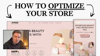
Pedro Loureiro audits a Shopify store's conversion problems and finds the real issue isn't the theme. He recommends clarifying the hero headline to show what you sell, reorganizing the homepage, testing product shots over lifestyle imagery, and adding bundles to boost average order value.
Chapters
Some things I can see. I'm gonna look at mobile since we all know that mobile is the primary area for people to, you know, convert and navigate and shop through, right? The thing, the thing that bothers me about this hero section, right? Is that it's not really telling people actually what you sell straight away. Like, you know, you have gentle skincare, right? Down here. But this, this headline, effortless beauty that moves with you. It sounds nice, but it doesn't really give people any information about what you actually sell. right? And this, this word active beauty, I think that's a little bit better. Like, and this section down here is funny, right? Your second section on your store is giving me more context about what you sell. You know, and, and, and what I'm actually gonna get like by shopping through you. So that's, that's just to call that out, right? So, but the thing is, it's like you don't just sell skincare items. You sell. This is why I think it's a little bit in the headline that you need at your top. It needs to be a little bit more, um, clear for people exactly what you sell, you know, and, and, and what your unique selling point is. So for example, your unique selling point, and we can try and see if we can figure that out from a Loom here, but like your unique selling point could be the fact that you are basically, you know, a brand that's built by like a woman founder. If you don't want to, you know, let's say position yourself behind it, but you could position your partner behind it. Built by a woman founder who gets it. You know, she gets it. She's been to the gym and she felt like she tried all these other brands and nothing really, you know, did, you know, got her the results that she was looking for, you know. And, and your products are made in the way that they're meant to be portable. So you can pack in your gym bag and you can have all the essentials that you need. And that's what Aprez Active Beauty is. It's giving you all the essentials for your gym or active lifestyle to keep you, keep your skincare on point, keep your health on point, keep you feeling good. Like that, what I just said there, we need to wrap into a headline and maybe into like a short subheadline, and that needs to be communicated to people. And then what I think your shop experience needs to be is you need to have a shop all button down here, but then your second section, instead of having the find us at amazing retailers down here, because people are not sold yet on what your brand is. The next step should be shop by category. We should have the different categories for people to shop by. The first section should be bestsellers. Have a bestseller section so that people can immediately— returning customers or whatever— can come back and immediately get to where they want to go. But the second section underneath that should be shop by category. And those categories should be like, well, we need to figure out what those categories are. But like, accessories is not really a name for a category. On your, on your store. So we, we need to figure out a way that to wrap these into different categories here. So for example, I would probably put, I would probably put like face and skin maybe as one category and we can have the towelettes, maybe the eye masks and things like that. And then we could have workout essentials in a separate category and that's where we could have the bands, maybe the weights. I think you sell weights, right? I saw them up here. Or maybe this is not. A product that you sell. I'm not too sure, but we need to basically figure out a category system that is easy for people to understand, um, to get to, get to where they want to go. So that's what I'm going to say here. And I'm wondering if these little points here, um, are just taking up a little bit too much space. Maybe there's a better way that we could, uh, communicate this. Um, so you have gentle skincare. Yeah. Workout set accessories. So maybe those are the two different things. That we, maybe there's 3 different categories basically for your store. Skincare, workout accessories, and then the third category is like bundles. And that's the bundles of the skincare with the workout accessories together. You know, to give people like the entire kit. Your navigation menu should be catering for that. Like, you know, I think I post about it a lot on my Twitter, but like a lot of stores, they have a great theme and everything. They got like good design going on. But the thing is, like most people, most users, mobile users engage with the navigation menu. And a new navigation menu that we've designed for one of our clients recently is ROW. Is kind of like a similar flow to, I think, what you need to like do. You can see if I click on ROW, we've done two of their main bestsellers up here, and then we've done shop bundles. But for you, this could be the three different categories. We could have workout skincare essentials. We could have workout accessories. And then we could have shop kits, you know, that's what I think we could do. And then shop all, and then have your secondary links down here. So a similar flow to this. I think this navigation menu would definitely be a lot better than what we have here, if that makes sense. Yeah, I would avoid putting quotes in the navigation menu. Again, like the way I look at a navigation menu is people are not going to spend a lot of time in the navigation menu. So we need to kill the fluff, kill the clutter, and this flow You know, what I want to get across to people is I want to just make it so easy for them to understand exactly what you sell straight away. That should be communicated within like the first few seconds and then how to actually get to where they want to be or how they can actually learn more. So that's where the navigation experience comes into. So those things that I'm talking about, man, I think will give you the highest uplift. Another thing that you can test is I quite like this image that you have here, cause I think it shows the whole thing. But another thing you can test is maybe doing like a full, like model background image for your hero. So let's see if we can find something like that. A press beauty. What I mean by that is just giving your hero section a little bit more of a color, a little bit more of, you know, something going on. Yeah, maybe something like this. I mean, this is not really that great because it doesn't show any of the products, but, um, this is cool, but it only shows one of your product and one of your products in here. This is maybe another cool one. This is a cool photo that we could, that we could try and test out. This one's also nice as well, but this is like your old branding though, isn't it? Basically I'd have to like look through your images and see if we can pull out a better one. I'm not saying that your existing one is bad, but I think it'd be, it's always like a high leverage thing to do is like to test instead of having just a product shot, test out like a model shot in the background. And what I mean by that is like, I think, yeah, Rose is not really a great example, but what would be a great example for this? This. I don't know if I have any great example off top of my head. I'm just talking about having a nice background that covers the entire screen. I guess I can just show you something I'm working on. None of these will be relevant. What would be relevant for you? all right, I'm not going to show you anything because I can't think of anything. Um, I know what I'm trying to say, but I can't, I can't basically communicate it. But what I'm trying to say is like just having a different background, like color and a model shot and being in the environment of like a gym or something like that with your products. I think that would be a little bit more compelling. But anyway, um, your social proof bar I think is, is fine, but I think it's a little bit too wordy. I would honestly do just do something like if I show you a recent project over here, Regenepure, like I think their hero sections that we've done for them are pretty nice because they're just super simple and straight to the point. Like you can see, yeah, it's about hair loss, but like the social proof that we have here, look at it. It's just wrapped right around the call to action button. So you almost like can't miss it. But it's nice because we have like the photos of people in here. If it will load, my internet is being a bit slow. Here we go. Yeah, there we go. You see what I mean? Just a little bit nice. Keeping it simple and everything like that. And that's honestly what I think your theme needs to do. I feel like your branding is nice. Don't get me wrong. The colors are nice, but I feel like it's— there's a little bit too much like visual things going on. And I honestly think you guys would just benefit more from like, from stripping it down and making it a little bit more minimal because the, like the design principle that I'm talking about here is if your colors have a lot of color, And you're, and you're using model shots for like model imagery and things like that, then your website should be really minimal and clean and clear to like not conflict from it. But right now you've got colorful images and models, like with a lot going on. And then you also have a website design with a lot going on. And I think the two things clash with each other, personally speaking. Um, let's go through your flow here very quickly. I think your shop page, this collection page, a little bit too long, a little bit too wordy. Like look at the, look at the collection page that we've done for Ro. Really simple, like just an image banner and then we go straight into the collection page. That's honestly something that I think would be a little bit better for you guys. So yeah. And then let's just go into a product page. I think your product pages actually look quite nice, to be honest with you. They look nice, but you have like different color buttons going on here. So we got this. Um, this color over here, and then we've got like a green color down here. I would just commit to one, whatever one you want to go for. Um, some people like it— this is a bit of a controversial thing, but like some people say, oh, you need to have your add to bag button above the fold and like a product page. I personally don't agree with it, man, because on a product page, people are not going to add to cart straight away until they read a bit more information. So I honestly don't— on any of the product pages that I design for people, I don't do like sticky call to actions over here because I want people to like see as much of the screen as possible, see as much of the information as possible. And then once they've consumed the information, then feel like they're ready to like purchase, you know? The biggest thing, I think we talked about this when we were last working with you. The biggest thing you can do, man, for your towelettes is offer the bundles. Like this is definitely a huge sales opportunity for you guys. If you're just selling single towelettes on its own, it's just going to be super difficult for people to, um, like, you're just making it harder for people to shop from you. Because if someone loves the Pres Beauty, they're having to pay like $12 every single time for like a pack of towelettes. When if you offered like a 3-pack or a 5-pack or a 7-pack, now they can like shop with you once, have enough supply to like last them like 2 or 3 months, save on shipping costs, and also get like a nice little discount from you as well. And you benefit because you get more money upfront and you're able to like actually drive traffic now to your product page directly and actually profit directly from your ads. Like actually turn a really good ROAS from your ads. So you see how like the mechanism is like working there. And that's what I'd say. So this biggest thing, biggest leverage here in your product pages, add the bundles to your tablets. And then what I would do below is honestly like right below your order form, I would offer your kits. I would offer them straight away and be like, wanna bundle it? Like, wanna get the complete kit and save? And you know, the tablets are in there and all the other essential products are in there, like the skincare kit. Maybe you could have the workout kit. Maybe you could have the complete Epresse kit where it's like the skincare and the workout, you know, things like that. Your images, I would maximize them. I don't like the rounded edges. I would just maximize them all the way to the edge so that people can see them straight away. Your product images themselves are beautiful. Like you guys have amazing images. Like the image quality of these is, yeah, is next level. So I think some of your images though over here are getting a little bit squashed. I can see this one is compressed. Like you want to avoid stuff like that just because, you know, you know, obviously it just doesn't look as good, right? What I would do here instead, I would just have the product name. I would have the 3 3 benefits of it. I would keep the text right below in the description. I would tidy all of this up. You know, I would tidy all of this up, to be honest with you. I think there's again, like a little bit too much going on here. The how to use section, I feel like should be in your order form. And I feel like you should be putting in like a little slide or a couple of images in here with the text in there. Like maybe the third image in here is like how to use, and you have the how to use text on the left. and then you have the image on the right. Do you get what I mean? All right, man. I'll, I'll, I'll stop there. 'Cause maybe, maybe this is going on for a little bit longer, but, um, yeah, man, happy to jump on a call with you and we can dive deeper into this and I can answer any questions you have, like follow-up questions to this Loom. Um, yeah, either way, man, I think your branding and your product images and everything like that is great. All I'm saying here is like, what are the things that you can do to like take things to like the next level?










