Every Trading Indicator Explained in 10 Minutes

Jesse Rogers ranks common trading indicators from S-tier to F-tier, arguing that volume and order-flow tools like VWAP and Volume Profile are most reliable, while lagging price-only indicators like Moving Averages and RSI produce false signals. He explains each indicator's calculation and why it fails in trending markets.
Chapters
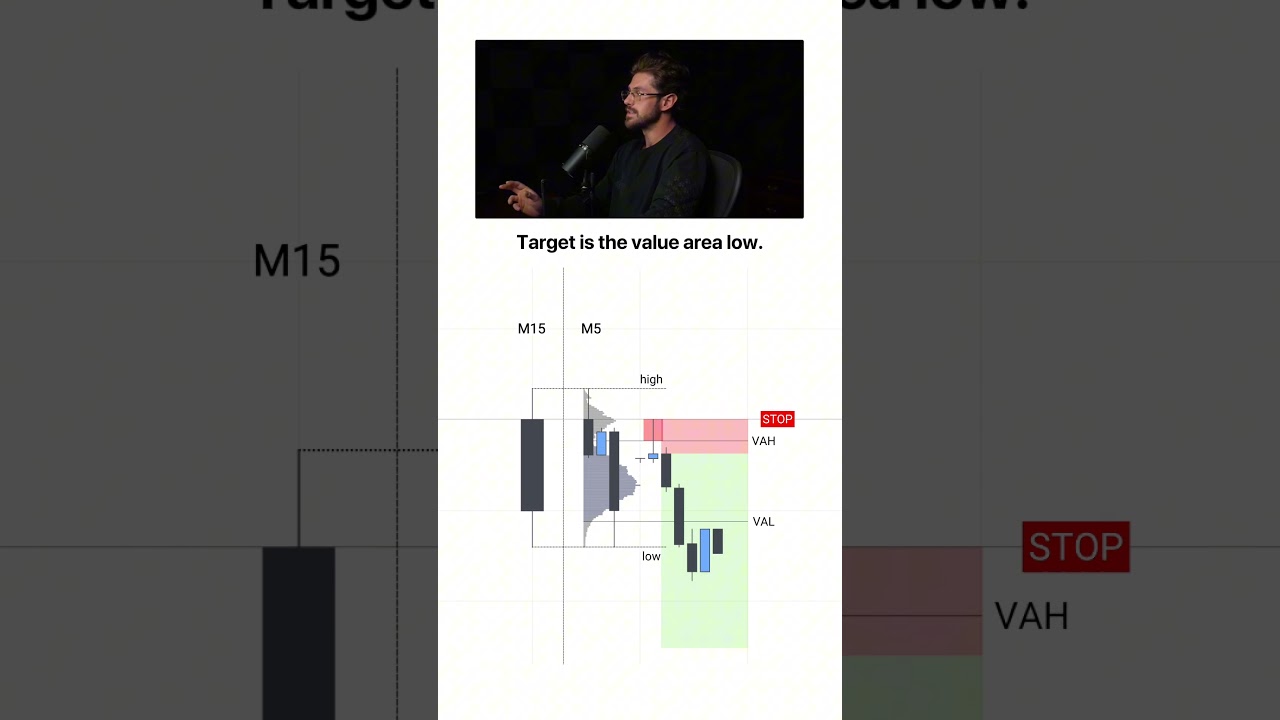
Moving averages. A moving average is the average price over the last series of candles drawn as a line. Above it is bullish and below it is bearish. You can select how many candles it's calculated based on. The larger the number, the longer the trend, but it lags by design. Since it's calculated from past prices, it tells you what already happened, not what's next. It's fine for reading direction, but it's not a good signal for trading. It's good for the higher timeframes, but don't use it intraday. B-tier. RSI. So RSI measures how fast and how far price has moved recently on a scale from 0 to 100, and traders use it to call the market overbought or oversold, and they use 30 or 70 to mark the top and bottom lines. But in a strong trend, RSI can stay above 70 for weeks while price keeps climbing, and in a very strong bearish market, it can stay well under 30 while the market keeps bleeding. So you end up shorting the market the whole way up, waiting for a reversal that doesn't come, or trying to buy the bottom that isn't actually the bottom. F tier, please don't use this. MACD. MACD takes two moving averages and plots the gap in between them as a line, and then it adds something called a signal line, which is just a moving average of that gap. The standard signal is the MACD line crossing the signal line. But both inputs are moving averages, so they both lag. And by the time the crossover prints, most of the move is already done. D-tier, not as bad as RSI, but it's nothing more than a way to overcomplicate moving averages. Volume. Volume is how many units were traded in a given time period. A breakout on heavy volume and a breakout on low volume are two very different trades because volume shows us how much participation was really in the move. Price alone doesn't tell you this, so volume is extremely valuable. S-tier. This is one of the first things that I check on any move to confirm it, but there are even better indicators to track volume, which we'll get into later in the video. VWAP. VWAP is just the average price that everyone paid in the session weighted by size. A lot of hedge funds will use this to benchmark their own fills, so it's a level that large market players actively reference. And price tends to reflect this. The reaction that you see is driven by real order flow, not just random patterns, and it's extremely useful for day trading. If you're above it, bullish. If you're below it, bearish. And you can also use it as support and resistance. Absolute S-tier. This is on my chart during every session. Fibonacci retracements. So you anchor this indicator on market structure from low to high or high to low, and the tool draws lines at different percentage retracements of the move. So if the move came back 50%, it would have hit the 50% fib line. Now, the idea is that these levels are going to act as support or resistance. But if you mark this on every point of structure, you'll see very quickly that it actually doesn't work consistently. It's far too subjective, and usually you're going to see people marking how it worked in hindsight, but it's not consistent enough to actually use. F tier. Order block indicator. An order block also known as a supply and demand zone, is a price area where a large move originated. The idea is that price often reacts to these areas when the market revisits it. And alone, this concept is okay, but using an indicator to mark every single one of them gives a lot of false signals. I'll give this one a Tier C, as it's great in hindsight, but it doesn't provide many opportunities. And when it does, it's only about 50/50 odds. If you've enjoyed this video so far, go ahead and subscribe to my channel. Bollinger Bands. Bollinger Bands plot a moving average with an upper and lower band that are set 2 standard deviations away. The bands expand and contract with volatility. Now, the lines are useless as they just move with price. Now, it looks great in hindsight, but in reality, it's just moving as the move goes up. So you never really know when it's gonna reverse, but the contraction is actually pretty useful. When the bands get very narrow and pinched, a larger move is likely going to follow. I'll give this one a D tier just because it can predict volatility, which is important, but there are other tools that do a much better job at this. Support and resistance. Now, support and resistance are just price levels where the market's bounced before. And usually it's taught that we can use these levels to find trades, and if they flip, then trade the breakout. And this is kind of true, but the method that you find the levels with is important. Most traders just draw lines on the screen based on where price bounced around before, and this doesn't work. However, it can be an S tier when you pair it with the next tool on the list, Volume Profile. The Volume Profile shows volume by price instead of by time. It shows you exactly how much volume was traded at every price level. That means you know exactly where the most trading activity occurred, which is where the most positions are concentrated. And it has 4 key levels: the point of control, high volume nodes, low volume nodes, and the value area. Use the value area, high volume nodes, and point of control as support and resistance. Absolute S-tier. All professional traders use this. Pair this with the last tool that I'm going to show you in this video and it gets significantly stronger. If you want to learn more about the volume profile, I'll leave a link in the description to a full free course that I put here on YouTube. Stochastic oscillator. The stochastic oscillator measures where price closed relative to its recent range, and when the two lines cross, this is supposed to tell you that momentum is likely to shift. But it has the same problem as RSI and it signals reversals in markets that just keep trending. It's arguably worse because now it's even more confusing than just using RSI alone when neither of them really work. F-tier. Same problem as RSI, just a different way to display it. Ichimoku Clouds. The Ichimoku Cloud indicator is made up of 5 lines in a shaded cloud that is built to show trend, momentum, and support all at once. Now, above the cloud, you're bullish and below it you're bearish and inside it you're supposed to be neutral. The line crosses add more signals on top. Now, this may work for some traders, but for most it's just 5 lagging indicators bundled into one. Adding a bunch of complexity never has made any positive impact in my trading. So I'm going to give this a D-tier because simpler tools can do the same job much better. It's just another spinoff of moving averages that make it more hard to look at. Fair Value Gap indicator. To find a fair value gap, look for a large candle that leaves a gap between the candle before it and the candle after it. And the idea is that this gap becomes support or resistance. And this is true sometimes, but the problem is when you apply the indicator, it marks every single fair value gap on the chart. And before you know it, you have 30 levels and have no idea which one will work. And as you can see, most don't. So instead, just use the Volume Profile low volume nodes. They show you an imbalance, which is what fair value gaps are trying to do. But instead of just guessing based on patterns, it does it with real volume data. I'm going to give the indicator a tier F. Now, the concept alone, yes, it can work when paired with context, but when you just mark everyone blindly, there's no way that you're going to be profitable. Volume Footprints. A volume footprint opens up a single candle and shows you what actually traded inside of it. Every contract split by price. It shows red for aggressive sellers and green for aggressive buyers. Instead of just showing the open, high, low, close like a regular candlestick, it shows you the actual transactions that occurred inside of it. Delta is the difference between aggressive buyers and aggressive sellers. Now, all this shows you is really who was more aggressive. It doesn't necessarily show you who's in control, as you'll see in the next indicator, but I'm going to give Volume Footprints an S-tier as order flow tools are the only indicators that are actually based off of live data rather than retroactive or past price action, which is why you see professional traders using them. Cumulative Volume Delta. Cumulative Volume Delta, or CVD for short, is just a running tally of aggressive buying minus aggressive selling. So if it's going higher, buyers are getting more aggressive, and if it's going lower, then sellers are more aggressive. Now you can use this as confirmation of a move. When price and CVD push the same way, that shows that the move is real. But when CVD makes higher highs or lower lows and price does not, it means that the aggressors are trying really hard, but they're getting nowhere, which means the other side of the market is absorbing them. You can see that absorption using the next indicator on our list. CVD is S-tier. I use this anytime I'm looking for a reversal. I always want to see some kind of CVD divergence. Liquidity heatmaps. Heatmaps are the live order book. The bright bands you see here are resting orders. Above price are resting sells, and below it are resting buyers. The brighter the heatmap, the bigger the order. The bubbles show the trades hitting those orders. Large bubbles mean more volume. Red or green show who is more aggressive. If the bands hold, that means that the resting traders won and a reversal is likely. Pair that with CVD and you've got a high quality setup., but if price moves past them with volume and aggression, meaning CVD moves with the move, a breakout is likely. Liquidity Heatmaps are 100% an S-tier. This is the closest thing to having full confirmation that you're ever going to get in trading, and understanding this will change the way you trade forever. Let's take a look at the top ranking indicators, all of which are based on real live data, and then all of the bottom indicators are based on past lagging data. One question can tell you whether you should use an indicator or not. Is this indicator based on live data or is it based on lagging data? So stop collecting these random indicators that just give you buy and sell signals. If trading was that easy, everybody would be profitable. Focus on what you see real professional traders using, like order flow, because there's a reason they use them. If your favorite indicators landed at the bottom, that's the first thing that you can go and fix. If you want a full beginner's guide to trading, I made a video where I break down everything from the basics and my full trading strategy. All the way to risk management and how to structure your career as a trader. I'll leave a link to that video on the screen. Thanks for watching and I'll see you in the next video.