4 Most Common ClickUp Views Mistakes (And how to fix them!)
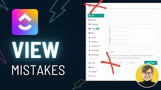
Sam walks through four mistakes people make setting up ClickUp views and how to fix them. The video covers naming conventions, subtask management, and workspace organization habits that slow teams down.
Okay, where did I put that? Was it in here? I know I finished it. I know I worked on the task somewhere. Is it in this spot? Oh, my gosh. Which of these things did I see it in? It was in one of them. Oh, there's more. Okay. Does this feel familiar? Yeah. If you have used ClickUp for more than a minute, you've probably experienced this sense of confusion and getting lost when it comes to the ClickUp hierarchy and when it comes to views in ClickUp, this sense of being lost is pretty darn common, especially when your workspace is making some of the most common mistakes that I see when it comes to ClickUp views. So today we're going to work on a few solutions to solve the four most common mistakes I see when it comes to ClickUp views in ClickUp accounts. My hope is that by the end of this video, if you implement the tips we go through, you'll be able to avoid that kind of confused scenario and ensure that your users can actually find what they need to find and feel just that much less overwhelmed when it comes to ClickUp. So, as always, just keeping this really simple for this video and not trying to conquer any big issues at all with that, let's not waste any time and we're going to go right ahead into the first mistake I see happening with ClickUp Views. These guys in here, and that is having all of your default views on. Okay, what this means is, well, something like this, I go into someone's ClickUp account, whether it's someone I'm consulting for, someone in a membership who's, you know, asking for some feedback, and they're telling me that they're having people getting lost in their views. And then I see activity Gantt box, list board. Every single view that ClickUp offers, which is a wide variety right now, this person has added into their ClickUp account. Most likely this has happened because at their space settings, they have required all views to be enabled. So right here, they've checked all these boxes. And so when someone actually goes into their ClickUp account, they see countless views that they may or may not actually need. This, fortunately, is a very quick thing to solve. So when you see these kinds of generic views with generic titles, and they don't really have anything set up in them, the way to fix this is to disable the views you don't actually need. So your solution here, quite simple. With admin permissions, we're going to go into our space settings, go to more and all space settings. From there, we are going to disable all default views that we don't actually want to require. Okay, so people tend to enable all of these because they think, oh, of course, you know, I might want a timeline view. I don't want to limit my people. But what they don't realize is with this, we aren't giving people the option. Everything that you set here is setting requirements for your team. And in almost every circumstance, it is better off to not require a view and allow people to add it when they need it versus requiring everything and causing more confusion. So again, to fix this, we're going to go through and we are going to disable every single view that we do not truly want to require for our team, which for most teams, I would suggest being something like this. Now, just to throw a pro tip at you here, if you're not sure whether or not you should require a view, a good rule of thumb is, do you have a view template for it? Okay, so if I was sitting here thinking, hmm, should I require board view? Should I make that something that we always have on, well, if you require this view, go over to the next tab. The view templates. This is where you can define default settings for views when they're created. And if there's not a particular view style that you like to have, if you've never even set this up, odds are your preferences and your reasons for having that view are not strong. Like there's not a really a good case for having it. And if you don't have a good view that you like to see, then you probably don't need that view. At the same time, if you're someone who says has a list for every client, say, say that's your situation and your list for every client is always set up the same way. You always want your views to look like this. That could be a great instance where requiring views and setting those default view types could actually be a huge time saver. But this is again, just like many areas of ClickUp. Do what actually is going to work for you. And if you do not know what I'm talking about with view templates, or if you just don't want to get into it, the best starting point is to go like this. Get rid of all of those other views that you don't necessarily need and look at how much simpler this looks. We went from having tons, a whole wall of view options that I could click around in and get lost to just the two that are here that are purpose built for this particular list. So the second mistake I want to talk about when it comes to ClickUp Views is not setting up your views in the most efficient way because the first step we were consolidating junk. But sometimes we create views for reasons that we think are good, right? We create views because they want to make sure that Jane can see her tasks, we want to make sure that John can find his tasks. So we create all of these different views to filter and segment and make sure that people can find what they need. But again, when we're trying to think about consolidation here, when we're creating views that are person specific, that's usually an opportunity to leverage a feature called Me mode rather than having everything segmented out by person. So that's your next tip here. If you are someone who's creating person specific views, let's swap that out and start incorporating Me mode into your views. I promise it's a lot more efficient than creating one thing for John's and then assigning it where anything is John, then doing the next one where Jane and everything's for Jane and setting up all these different views. That is a lot of time. Instead, we're going to create a generic view called My Tasks and we're going to have it say my because whoever is looking at that view is going to see just stuff assigned to them. We're going to do that by altering our view to always force things into Me mode. That's right here under More settings and default to Me mode. What this will do is not just look for tasks that are assigned to a person, which is what our other methods were doing. So you saw back here I had it filtering for assigned to John, to whoever else, maybe Layla. Here we had it filtering by the assignee. With Me mode, we are looking not just at task assignments and subtask assignments, we're also including comments and checklists. So it's a more comprehensive filtering and it's going to make sure that nothing gets missed accidentally. This having one view called My Tasks is way more efficient than having 15 views, one for every member of your team. That is my second tip for you here. If you are someone who finds yourself making person specific views, see if you could maybe swap that out for something that's more useful to everybody. Because unless you're creating personal views that only you can see, which I assume is not the case here, you are adding a lot of clutter to everyone else's life when you create these kind of, you know, long, very many options kind of situation. This is confusing. Like which one am I supposed to go into? I don't know. Oh shoot, I was in John's this whole time. I totally forgot. All right. The third mistake I see when it comes to ClickUp views is completely forgetting about your subtasks. So folks who are new to ClickUp often don't realize that when it comes to your views, you have options in terms of how you actually view your subtasks. You have three, to be clear, collapse all. Which means when we have subtasks, and I'm going to get rid of this filter here, when we have subtasks, they're collapsed, meaning they are smushed in like this. You also have the option to expand, meaning you see them all underneath the parent task. That's this guy. You see the sub tasks underneath it. And there's also the option to view separately. So this makes our subtasks look almost the same as the parent task and allows us to sort things individually. Each of these sorting mechanisms has their place place. But the biggest mistake I see is people ignore this setting all together. It is really important when you are designing your views to think about how your data is organized and organize your views and your use of subtasks in those views accordingly. So in this example I might say, you know, tell Mark about fix, proofread, fix. All this is for Mark's project. This stuff right now is showing two different types of of data. I've got one overall project and a bunch of tasks to work on in that project. So if I was to be creating views for this, I might break apart the overall container from the individual tasks because this is a project, it's a container, whereas these are things that I actually need to assign to people to do. I hope that makes sense. I know that's a bit of a mind melter there. So if that doesn't make sense, if the idea of using tasks to mean something more like a container is confusing, I have a whole video on this side over here about ways you can use different data in ClickUp and I think that'll make this make more sense. But for now leave it to say when you create your views, think about subtasks. Do not leave this as just the default option of collapse all actually question what is going to make the most sense? What's going to be the most helpful? If I was just looking at overall deliverables, you can bet that I am most likely going to want all of my subtasks collapsed because I just want an overview of all deliverables. But if I was trying to create a view for the doers to focus in on what tasks they need to do on a given day, the opposite is true. I would want to create a view where I only show things that are not a deliverable and only show tasks and perhaps group them by due date. And in this way I am showing data in different ways because of what the information needs when you are creating your views, look at this. Think about this. Treat this as a very important variable that changes the entirety of what your view actually looks like. If you have questions about this view equation, you might want to watch this video next because we do have a few example views that can demonstrate different ways to mix and match these features together with some real life use cases. So go there if you need to. Okay, mistake number four when it comes to ClickUp, views is fortunately a much simpler one. So if there are some of you out there who've heard me talk about data types and subtasks and you're new to ClickUp and you're like oh my gosh, I thought this was a beginner tutorial and it's really feeling like an intermediate one. Here's an easy one for you that you can take away and implement Right now the mistake here is having views inherit the names that are set up by default. Notice a trend here. By the way, most of these mistakes are just when you leave the default settings and don't question them. Yeah, not rocket science, but it is something to be aware of. So in this case we might have things like a board view called Board, a calendar view called Calendar. It's like a little kid naming their pet mouse mouse, right? We can do better than this. This is not overwhelmingly descriptive to see. So to fix this I want you to start treating views as reports almost. I should be able to know based on the title of the view, what it is showing me and why I would want to click on it. So if we had a view called My Overview Web Design Tasks. Okay, cool. I know what I'm signing up for when I click on that. If I had a view that was called Overdue Tasks, I can guess what that view is going to tell me what it's going to report. If we just leave our views default yet, maybe we add some cool filters. Let's just imagine we do this. Let's say I set up all these cool filters that I have. Anything in due dates in the next seven days grouped by priority flags sorted by assignee. I'm doing all this cool stuff, right? I've made this view gorgeous. I save my work down here so that my view settings are saved. But now nobody knows they're going through their workday and they go to this board view and they see no tasks and they think, okay, there's no task to do. Moving on, we need to be clear in what our views are doing. So in this case, I would want to label this Upcoming tasks by priority doesn't have to be a whole lot, but this is showing me that it's only upcoming tasks and it's grouped by priority. And that's what I'm going to see when I come in there. So if I'm someone who's trying to get to work, I click on this view and I don't see any tasks there. I can say, oh, this is only upcoming tasks. So there's probably somewhere else where I can see overdue tasks or current tasks or so on. It is really important that we name our views to make sure tasks are not missed and that cool things you create, like a cool view showing you upcoming tasks by priority can be seen by other people and can help other people on your team so they don't have to then create that view for themselves. One thing I really hate to see is when people create tons and tons of great resources in personal views. Everything's personal. They create a personal dashboard, a personal document, a personal wiki, a personal sop. Let's share the love, right? The whole point of process and systems work and ClickUp at the end of the day is to help you do work more effectively. And if you figure out a way to help you do work more effectively, there's a good chance that other people in your orbit could benefit from that as well. Don't hoard share. And so naming your views is one step towards that. Now, I promised you four mistakes, but as we typically do, I want to overachieve here and throw you a fifth because I think it is a good one. So the fifth mistake I want to talk about here is, well, using your views, you sense a theme here. If you've watched my Other Mistakes video, if you find yourself doing what I did in this mockup where you were touring your workspace and you're like trying to find something and you're clicking and you're clicking and you're clicking, that is a sign that something more than just your horizontal hierarchy is incorrect. Okay, what I want you to start thinking about when it comes to ClickUp is that this whole area, the vertical hierarchy and horizontal hierarchy as we call it here at ProcessDriven. You know, we created those terms to give you a framework to start thinking about how ClickUp is Organized. I know this is kind of an extended metaphor, but when I see people going through their ClickUp hierarchy again and again searching for views, it feels like somebody who goes to the library, navigates all the shelves, randomly browses, finds a book, opens the book right in front inside the library, and starts reading a few pages, puts it back on the shelf and leaves and does that every time they want to read a book from the library versus What I would suggest you do is go to the library, find a book you like, and check it out. How do you do that in ClickUp? Well, go to the library here. Go to your vertical hierarchy and horizontal hierarchy. Find a view you like that's helpful that you're going to be needing to reference in the coming days. Take it and favorite it. You can find that under the three dots and favorite that view. You can do the same thing with an entire list if that's easier for you, which will just favor the default view. You can do the same thing with docs, same thing with Dashboards. Whatever it is, favorite it, add it to your favorites with a name that makes sense to you. I don't know, do this first. That could be your favorite. That's totally fine. It will then appear in your Favorites bar at the top of your screen. Or if you don't have it pinned on the side of your screen. Notice I'm using that little pin here to switch where it appears. But now, no matter where I am in ClickUp, if I'm in a dashboard, if I'm going somewhere else, this whole Favorites bar is going to be with me. It's like I took the book and I checked it out of the library. That is a whole lot more convenient than going back to the library every time I want to read a page or every time I need to find the view. So when you're starting your day in ClickUp, almost everything you need should be in your Favorites bar. If you find yourself going in here and going, oh, where am I going? Okay, click, click. Oh, I know. There's a lot of jokes about click up being the tool that you click a lot in. It's like a click addiction. Let's bust that. Okay, start using your Favorites. Check the book out of the library if you're following that metaphor. And keep the things you need at the ready so you're not wasting so much time looking for information. That is a huge time waster. It's partially a view mistake, and it's just partially a workflow inefficiency. But I want to call your attention to it because you guys are here because you want to improve your ClickUp skills. One of the best things you can do is just change your own daily habits. When you start your day, go to your favorites to find the resources you need. We have gone through five different view mistakes, five different solutions, quite a few pro tips along the way, and probably like at least five metaphors. I apologize for mixing them together, but hopefully at least one of them landed for you. If you are who I think you are, by the time you're watching this video, you might be wondering a little bit more about how do you actually implement some of this. So I want to draw your attention to some of the videos we have on the screen right here, which I think would be a very good part two to this video, but I also want to highlight the fact that views are just one piece of your overall ClickUp strategy. So if you don't have a good ClickUp strategy, creating views is going to feel really hard. But if you have a strategy for what ClickUp is doing, where it's helping, what its job is, the views equation becomes a whole lot easier. So if you're thinking a little more big picture and you think that might help you, I do want to invite you to check out our webinar in the description below. It is free and it's not fluffy. It's from us, so it's going to have a lot of content in it. But the Blueprint webinar in the description below is kind of my big picture framework, talking about what I view as the main pillars of ClickUp strategy. It gives you a lot of action, items you can implement right away, as well as some stuff to kind of chew on for the future. If you want to check that out, link is in the description below. It is really, I think, a great training, so if you'd like to learn more about the strategy component of ClickUp to help all these little pieces kind of connect the dots. Check that out. Now I know five mistakes is barely just scratching the surface on some of the common hiccups when it comes to views, but so if you have your own lessons learned along the way, please do share them in the comments below. I would love to hear what you have learned and I'm sure it will help other people as well. But otherwise, hope to see you in the Blueprint webinar and I'll see you in the next video. Until next time, enjoy the process. Sam.










