Build a PRETTY Client Portal in ClickUp + 5 Mistakes to Avoid
Step-by-step tutorial on building a branded client portal in ClickUp with custom widgets and images. Learn five common mistakes that break the design, from poor widget placement to clashing colors.
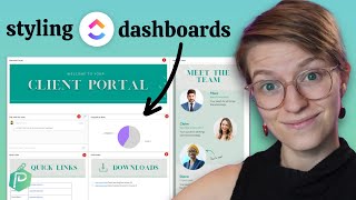
In this quick tutorial, I'm going to demonstrate how you can use a ClickUp dashboard to make a slightly prettier overview for external stakeholders, clients, or just people on your team who would appreciate a prettier overview experience. In this example, we're going to be going through building out all of the widgets you see here on the screen, using custom images, which are very easy to create, putting them inside ClickUp, and stacking them all together to create one comprehensive dashboard that you might actually enjoy going into. As we go through today, I'm going to be assuming you understand the following things. So if you don't maybe want to pause, I'm going to assume you're going to understand what a dashboard is in ClickUp. Generally, I'm going to assume you understand what a task list is in ClickUp. And I'm also four three. And I'm also going to assume that you understand what is a dashboard widget. You don't need to know all the intricacies, but those three basic pieces of understanding are going to help you get through today because I'm not going to go too much into those beginner items in this video. If any of that sounds like a foreign concept at this point, check out this playlist real quick. It's some videos that go through the weeds of dashboards and then pop back to this video when you're feeling ready. All right, so with that, let's get to building to build out this client aesthetic dashboard. Like you see here. What we're going to do is start off with a blank slate. So just an empty dashboard. You can create your own dashboard by going under dashboards and then clicking this little plus sign here to add a dashboard. Once you do, you're going to see something like this. And for the sake of this tutorial, we're going to click Start from scratch together immediately. ClickUp is going to ask you, okay, we're starting from scratch. What do you want to add to this blank canvas? Now, just quick recap. We're going to be building this out. Which piece do we want to build first? For the sake of simplicity, I'm going to suggest we're going to start off with the most important pieces of information. For most dashboards of this kind, talking with the team is the most important piece of information. So we are going to create a talking area or a chat room first. To do that, we're going to select the chat widget on the side and give this the descriptive name of talk with the team. This is going to build a chat room that we can use to communicate with our stakeholders and anyone else we choose to have as a watcher on this dashboard. This is very important, guys. If you are using this dashboard with multiple people, you're going to want to share that dashboard with those people and then make sure everyone you want to be notified about communication in this thread is set as a watcher Pro tip. Okay, that is our very first dashboard widget. We're just going to move that around and we're ready to start off with our second one. So. So, going back to our example here, the second dashboard widget I want us to put in is actually a bit out of order. We're going to put in the client tasks one, because I think this is often a common one I see on new dashboards, which is we want to have some way to let that other person see what we're waiting on them to do. So back here in the Add widget, we are going to create either a task list or an embed widget. Okay, either of those two. The task list is what we're going to choose if this person also has access to other areas in ClickUp. If that's the case, we're going to choose Task list. Otherwise, if we don't want the client to have access to anything else, we just want this dashboard to be their only spot. In that case, we're going to choose embed. Okay, so two options here. If you're not sure about those two options or why the heck I'm presenting them, have a whole video on that right here that breaks out the difference in detail. For the sake of my example here, I'm going to assume that my person does have access to ClickUp and I'm going to share whatever area they have access to right here. I'm going to name this widget Client Tasks or whatever is relevant and I'm going to filter it to only show tasks assigned to my client. Now, I don't have a client in here, so I might just leave this blank for now. Then I'm going to click Add Widget and I'll see my task appear just like every other view or area in ClickUp. I am going to hide whatever I don't need to see. But in this case, assignee and due date seem like good ones. So I'm going to take this widget and move this to wherever I want to have it move to. Cool, there's that. Now back to our example area. The next piece I want to build here is going to be our pie chart right Here that's reporting on overall progress on the project. This is going to be a nice visual way to let folks know where we're at on the project. So I'm going to go up to Add Widget, select Custom and then select Pie Chart here. I'm going to choose the location relevant to this client or this external stakeholder. So that could be the project folder, that could be the overall company, whatever this person cares about. I'm going to just go ahead and select that. We'll select this one and group it by whatever the person needs to see. In this case, I'll choose status type. If you use time estimates or anything like that, you might want to select that to use as the value, but otherwise we'll leave it as tasks, subtasks or not. You can choose to include based on your preferences. I'm going to include Closed here and I'm going to include all of my things that are in multiple lists. At the end of the day, I'm going to click Add Widget and we'll see this pie chart roll up. Now, I just chose a random area in my ClickUp, so it's going to not make a lot of sense. But this is going to show us a pie chart of our overall project for whatever area you selected. There we are. So now we have our pie chart showing up here and the colors on this pie chart in case you are color conscious. These are based on the colors of the statuses which I'm grouping by here. So you could change those if you wanted to for all except closed. But anyway, we've got our pie chart here, we're good to go. Let's move on to our next element in this aesthetic dashboard which would be this portfolio widget. I'm choosing all the easy ones from the get go. What we're going to do in here is to go up to Add Widget and if your plan has this enabled, I'm going to install a portfolio. This is one of the only ways we can report easily in ClickUp on lists and folders and. And what I'm going to do is click Add List to summarize progress on all of the lists in a given space. Once I select my area, whatever it is I want to report on, I'm going to include subtask, not include Archive, and leave these both as off. Then I'm going to click Add Widget again. I picked a different random area in my ClickUp so the numbers aren't going to make a lot of sense. But now I've got my fields here and I'm going to drag this to wherever I want it. So now it's starting to come together. We need to now look at the remaining widgets which are where we start to incorporate our visual elements. For each of these areas where there's a visual element being included, I'm starting off with a text widget. That's how I'm kind of giving myself a flexible canvas with which to build. This isn't the only option, but that's the one that I'm going with. So for each of these four, including these ones right here, I'm going to copy whatever information is text and build out a text widget around it. So text block right here is what we're going to need. And we're just going to add these widgets in here and add them to the right size. Even if there's nothing in them yet. I'm just going to get them added so we have something to work from. All right, now I'm adding in my last text widget here, which I just need to drag into position. There it is. Great. Now we can continue to resize these to shape. But before we do all of that stuff, I want to paste in names for each of these blocks to match my template to give myself kind of a meaning. So they're not just saying text block for that. I'm actually just going to copy and paste the information we see on the screen here. So I can save ourselves a little time. Feel free to pause the video here and do the same using what you see on the screen. Alright, now that we have the widget names copy and pasted in here by just clicking and pasting. I'm also going to paste in any text based information in the same way, copying and pasting. All right, I think that is everything we have here. Everything is copy and pasted over except for those images. The stuff that adds a little bit of glitter and glam into this dashboard. How do we add those in? Well, for all of these, as I said at the onset, we're actually just using images which are resized and adjusted to be in the proper shape. Shape. To create these images, you can actually use any kind of graphic tool you have at your disposal, whether that's PowerPoint, taking a photo of a doodle you have here at ProcessDriven, we actually just use Canva because it's super easy and cloud based and we use this design, these kind of graphics. So all this is, is a. I think it's a generic header template I found somewhere on Canva. And then I modified it to kind of fit the theme that we have here. And I just created four pages that have the information I want and we can brand this however I want. So maybe it's a different font, maybe it's a different color that we want to have. And this is kind of how we can give ourselves this branded look without having to do a whole lot of fancy design work. And the way I created this is just by creating a new file in Canva and sizing it to be 1000 by 250. Now, this is actually a little oversized for what we're using it for, but whatever, it works. That ratio seems to be about right. And. And you can always adjust this bigger or smaller by resizing in Canva or just creating a new file. But once we've created our images in the appropriate kind of proportions, we can then just download these images to download them as well. Images. And that's how we're going to start to build out our portal. So selecting all these, I'm going to download them all as a PNG and click Download. Cool. That is that downloading. Once we download it and unzip the file, we see three, three graphics here ready for us to use and add into our ClickUp. We can repeat this for any other images we want to add into our dashboard as well, such as the meet the Team image we have here. This is sized at 400 by 800 and this is just pulling in a bunch of different images and text that we can adjust however we want and then again, download this file. Whether you're using Photoshop or anything else, this is about the flow that we want. The end result that we need is just a JPEG or a png, a file of some kind that we can then put in in to ClickUp. Oh, and a quick pro tip, if you are a member of the ProcessDriven membership, both of these Canva templates I'm showing you and the designs that I have here are available to you to just click Install in one click from inside the membership. So check that out. Save yourself time if you're interested. Okay, back to the tutorial. So all this here, once we are done, we've gotten four images. This one, this one, this one, and this one. How do we put those in ClickUp? Well, go into your dashboard where you have those text widgets and then use the attach functionality. Okay, so how I did that was on a blank page, put the little slash symbol and then type the word attachment or attach. You'll see this show up here, you can then browse or select your images to drag your file in and create your portal image. You want to then click on the image and just resize it so it fits the shape. Maybe get rid of any empty space space you have, resize it appropriately, and then move on to the next one where you want to do the same thing again. That slash, attach, enter, and then browse your file and just add that right in. Bam. There we go. And we'll do the next one as well. This is not the most pretty aesthetic here, mixing fonts and clashing styles, but the important thing is that it gets the look across and you can rebrand it to however you'd like. Moving forward, once you paste all those images in, you're going to see something that looks like this and you kind of have that dashboard you want. So that's how you can go about building a aesthetic client dashboard inside of ClickUp. Before I go though, I want to wrap up with two pro tips that you might want to keep in mind for moving forward. Pro tip number one, don't obsess too much about the spacing. Because the spacing on one device might look different when you're at a different proportion or on a different size screen. So you really don't need to make it perfect. It just needs to make sense for the screen that you're on or that most of your clients would be on. Unfortunately, that's a trade off of the image approach if you wanted to avoid that kind of issue. You also have the option to use embed widgets instead of graphics. So rather than an image, you could design a webpage or custom code, a responsive design, and embed that into ClickUp if you really wanted to make sure it was always looking perfect regardless of the screen size tends to be overkill for most people, but just wanted to share. Now, the second pro tip I have for you is that if you wanted to stick with images, but you want to make it a little nicer or one nice touch you can incorporate into this aesthetic. Dashboard idea is to actually add your client's branding into your portal. So let's just say we were using something like this and this is what we used for every single client. We could add a frame into our design to always include the client's logo and always include their name right here. This would, yes, require us to kind of redesign our templates each time a client comes through, but it would allow us to personalize the graphics and colors and images we have to to the actual person that we are serving. Just make sure you don't mess this up because showing the wrong person's name or the wrong person's picture would be a little weird. So that is one way that you could also spice this up. If you want to stick to just using images when you're duplicating things, just swap out those images for something custom for each client. The third bonus pro tip I want to throw in here is that once you build a dashboard like this, you can just go ahead and duplicate it in the future. You do not need to create it from scratch again. So so congratulations. By following this tutorial, you now have it. Just make sure duplicating this dashboard is a part of your client or stakeholder onboarding experience. So that's how you can build an aesthetic client dashboard inside of ClickUp. If you are interested in seeing more examples like this, of course drop me a comment below. Or if you're a member of the ProcessDriven membership, go check out the Dashboard gallery we have built. It includes 18 other example dashboards much like this one to help you get inspired as to how you can use ClickUp dashboards in innovative ways ways. And if you're not a member and you'd like to check out this resource, maybe consider becoming a member. Maybe. Link is in the description below. I'd love to see inside, but otherwise, thanks so much for watching. Please do like and subscribe and until next time, enjoy the process.










