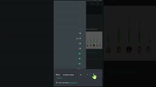
A walkthrough of building a ClickUp dashboard with a bar chart widget to track custom field changes over time. Shows how to set up reporting on field modifications directly in ClickUp's interface.
Marianne wants to be able to report on changes to a custom field over time. To do this, we want to create a new dashboard from scratch. Locate the custom widgets and add a bar chart widget. Once in here, we want to choose the relevant location, give it a descriptive name, and in the X axis, meaning the cross, the bottom, we want to choose time. For the Y axis, we want to choose tasks. To say, show me the number of tasks that meet the criteria I define. Scroll over to the right and you should see these options. First of all, we want to turn on the option to show changes day to day. Then we want to adjust this filter to make sure we're only reporting on the statuses we really care about, such as not right now. Once it loads, you'll see a bar chart showing the net changes in that given criteria, whatever you set over the period of time you selected. So in this case, I had one new task have this condition be met on the 2nd and two new ones on the 10th.