How to Use the ClickUp Mobile App
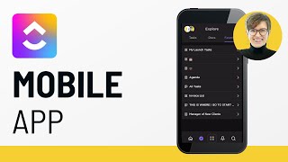
A walkthrough of the ClickUp mobile app with Norman, covering navigation, features, and how the new version differs from the old one. Learn what the app can and can't do, and how to use it effectively.
Today we're going to be talking all about how to use the ClickUp mobile app. We're going to cover which app is the right one, because there are multiple. What can you do in that app? And walk through some of the most basic features you would need in order to be a basic user of the mobile apps. Now, because I have a prop for today's video and I don't have to be at a computer, I thought it made sense to bring a special guest into today's video. So. One moment, please. So today I have a special guest with me, and. Are you ready to get started, Norman? Yeah. Come on down. Okay. All right, so the very first question before we dive into the mobile app, which mobile app are we even talking about? So, if you're not aware, there are actually two different ClickUp apps. So if you search ClickUp in your app store, you're going to see these two here. The very first one with the white background is the newest version of the ClickUp mobile app as of the time of recording this video. The other app, which is the inverse color scheme, is this one here, aptly named ClickUp Old App. If you're looking to follow along with this video, though, you're going to want to use the first app here, the white background. That is the mobile app that we're going to be talking about. If you hear me mention old app at any point throughout the day here, I'm going to be referring to this inverse color one. The second one here. If you cannot find these links inside your app store, you can also go to ClickUp.com apps and download them directly from that site. But if you just search ClickUp, you'll find them there. So to go through this app tutorial, as you might have guessed, we actually need to open the app there and go through each of these steps. So the first thing I want to talk about when it comes to this mobile app is how to find your way around. By default, when you open the app here, you're going to be starting off in Home. The icon matches the web version, so there shouldn't be any confusion. And you have to do comments. And done mirroring the My Work section in the web version of Home, so you see My work there at the top. If you're looking to focus on just what you need to do with the least amount of clicks possible, Home is where it's at to make sure that this view is working effectively. Make sure that you're assigning tasks to yourself and giving them due dates, because those due dates and Assignees are what determines where that task shows up in home. If it's not assigned to you, it will not show up. And if it doesn't have a due date, it'll show up but all the way. But all the way in the no due date section, which is kind of not very helpful. Inside the home area of the mobile app, we have these three dots in the top right corner and this opens some additional options we do not see inside the browser. So. So inside this area we can choose to have tasks on multiple lines. Let me show you what that looks like. If I turn it off. Turning it off, it just makes everything one line and it kind of gets hard to see if you have long task titles. If you make it multi line, it kind of spreads it all out so that you can see everything that's going on. Task Breadcrumbs shows you the location of tasks. Trending shows you a selection of tasks that you've recently been to, even if you're not the one assigned. So if you're someone who's frequently collaborating with others, that could be helpful to turn on to enable that additional section at the top. Similarly, you can turn on Favorites, which works a lot like trending, except it shows you your favorited views. Favorited areas inside ClickUp. When I have them all on, you see that Home looks like this where we have Favorites trending. My work and calendar. Calendar for me at least is not currently working in the mobile app at the time of recording this video. This calendar should be showing us our daily calendar in ClickUp and it should also show us any integrated calendars, but like I said, not currently working at the time of doing this video. That is just our look. So we're going to delete those two sections and we can adjust our calendar settings here if you know it was working. So up in the top left corner of our screen we can actually switch between different workspaces inside the mobile app, just like you could. Please stop. Oh, this is a mistake. Just like you could on the web app. So if I click up here, I can switch between different workspaces and switch into different accounts. Inside settings, I also have the option to follow dark mode, so it could be off on or auto, meaning it follows what your phone is set to and a few other options here as well. So let's flip over into our demo account and beyond Home, let's look at some of the other areas. The first one is the Explore area. Here we can see Tasks, Docs and Favorites. So Tasks works as you would expect. A bunch of expanding areas. And when you click on a list, it kind of swipes to the left and shows you all of the tasks you have within that given list. Notice you're able to access views now inside ClickUp this. Not all views are supported, but most of them are there. One downside here, and you're going to notice this pretty quickly on the mobile app, is that when it comes to fields and different things, you're used to being able to see at a glance, you don't get those on the mobile app. So the ability to scroll left and right and see different columns without having to click inside a task not there on the mobile app. So you're going to do a lot more clicks to see the level of detail that you're used to seeing in one click on the web version, which is a common complaint right now. So, for example, in these tasks here, I can't just expand the subtasks. I have to click inside, scroll up, and there I can see all of the subtasks and sub subtasks inside a given task. Upside is it's really, really fast. So you saw I just created a sub subtask there on the fly without much of an issue, and now I have these additional expanding areas. It just takes a little bit of getting used to to go inside the task to be able to do all these things that you'd normally be able to do from the overview level on the web version inside the task itself, we have things like the locations of, so we've got the list that it's on and we can even move the task to a different list up at the top. Then we have the overview section, which is kind of a combination of the top bar and the left side. If you were looking at the web version, this allows us to change the status, change the priority, set the assignees, set dates, and even track time, all from the mobile app. Below the time tracking, we have the description, which is basically a blank text area. Then we have the tags where we can add different labels onto a task. That is it for the main overview area. If we swipe to the right or if we just click on comments, we can go to the comment side of the task, which works pretty seamlessly, much like texting. It allows you to send messages back and forth in almost real time. Finally, we have attachments. Now, this is a pretty useful feature and one of the ones that I feel like people who are primarily in the field make use of a lot. So if you are someone who's a service rep or you're out on the job, taking a picture and uploading it directly to a task is the final piece is the watcher's eyeball in the top right, where you can add different people to be watchers on a task. And finally the settings. So this includes sharing the link, moving the task, adding to favorites. Unfortunately, it does not include, which is kind of frustrating, permissions here. So in the old mobile app, which I told you I'd mention, you were able to adjust permissions and have a fully functional experience in the mobile app. But in this mobile app, permissions are not yet something that you're able to adjust on the fly. So if you're someone who's looking to share a task with somebody, or when you're not at a computer, you still might want to have a copy of the older app on your device. So you can switch over, go to that one and share that task. I will say I actually had to do that earlier this week because I was in that situation where I needed to share a task and I couldn't do it in the new app. So just a little note there. I'm going to just highlight one thing that is not in here, which you would expect to be in here, but it's still not at this point, about nine months into the new app, and that would be the Dashboards. Still not seeing our dashboards inside this new mobile app. So again, if you are someone that uses Dashboards, like I do a lot, I, um, you're going to want to have the old app available. You want to be able to go down to Dashboards and use them here. Because, for example, we use our team chat all the time and without having that in the mobile app, it makes it pretty difficult to use. So we still keep the old app on our phones for that reason. Then over to Docs. So this is kind of what your docs area looks like. Just a bunch of docs, kind of each as a mini preview. If you click the plus, you can create a new dock on the fly. And if you click on a dock, you. You can actually go in and start editing it. It shows you the location of the doc in the bottom left corner, like this one's at everything. And you have the ability to go through all of the pages on the right side. But at this point, once again, you can adjust those permissions on the go. Last spot I want to just go to is the favorites. So this includes favorite views, favorite docs, and favorite tasks that you could have favorited. They will all show up here on the mobile app, but not favorite dashboards. So again, if you're relying on dashboards, that's not a wise choice if you are a mobile first team. Unless you really want to use that old app. But these favorites can be a nice way to jump to a certain section. Just keep in mind that not all view types are supported on this mobile app either. So if you wanted to say add a box view or a timeline view or a gantt view, they simply do not show up on this mobile app. So if those are your favorite views, you are a little bit out of luck. What you are seeing here are the available views for this mobile app at this point in time, List, board, calendar, doc and chat. So anything beyond that we are a little bit out of luck for having those favorited views. But on the good side of things, we do now have the ability to group our tasks in a few different ways. Not everything, but a few ways, as well as order our tasks in a chronological order with a nice little editor here keeping track of what is going to be our top priority and what will be our tiebreakers. So that's pretty much the overview of our Explore area. In the center we have our Quick Create menu, which since our first video talking about this mobile app, has expanded quite a few, quite a bit to include both tasks and reminders as well as tracking time, which again I've talked about already super helpful. But if you're not inside a task and you want to track time, you can do so here. You can either select the task that you worked on or select a recent task and there you go, your time is being tracked. If you start tracking time on the mobile app, you'll be able to see it on the desktop, vice versa. So no matter where you're tracking time, it'll all sync up and you can edit it all from any of the places. So inside here I can actually go inside and edit these entries from from the mobile app or the desktop or the web. You know what I mean? So that's a really nice feature that just recently came out here. Next up we have notifications. Notifications works much like it does on the traditional versions of ClickUp, where you can actually use the filter in the top right to cut down your notifications or to see your cleared notifications. But one main difference, which you've seen across the board already as we've been walking through this, is that you're able to swipe things away rather than having to click inside or click a checkbox. You, you can just swipe, swipe, swipe and go through Each of these notifications, the last feature, and one that's gotten a bit of flack lately from ClickUp and is getting a major overhaul from what I gather is the search functionality. So search is the last icon there on the right. And search, what's up? You're going to go to my desk? You're going to make the leap? I can make you make the leap. I don't know if you want to go up there, though. I think you're going to regret that here. Maybe. Maybe on the pillow. Is that good? The final element here is search, which I will get to before he gets too antsy here. And search is just allowing you to search for what you're looking for. It's not the most functional search function. It's a little bit slow, and it doesn't always seem to show you what you think it would show you. Like right here. I would think the task called test would show up before the intensive test test type. Not really sure where the thinking goes into some of this and what ends up showing up on top, but this is a feature that's getting an overhaul in general with ClickUp, so I'm sure it'll get an overall here as well. The other thing to keep in mind about search in the mobile app is that tasks, files and docs are exclusively your filters, unlike the web vers where you can filter by chat and so on. Just a few fewer, a few less. Just fewer options here. You know what I mean? Yeah. So those are the main areas inside the mobile app here we can do some more mini videos talking about specific things that you might need to do. But in terms of starting your day, you're probably going to start inside home or notifications, and once you're in home, you're probably going to click on a task and get to work. Just make sure you remember about this kind of hard to keep track of to do area on the bottom. Man, I just wish that was a different color or something so it jumped out. Um, but that is how you're going to actually find the to dos and specific subtasks and checklists that you have created. If you want to just mark something complete, you could do that from this window. But if you want to create a subtask or checklist, the button is just a little bit off the frame. So you have to actually expand this whole area by swiping up and click new checklist item. You give it a list name and then you can actually add your specific items here and so on. Makes it pretty easy from that point, but the actual creation of them can feel a bit clunky because it doesn't automatically open a new line. But yeah, so you've got these expanding lists and this is where you'd be managing most of your day to day work. When you're looking to communicate with others, you'd probably be in the comments of a specific task or you'd be in dashboards in the old mobile app, which would be where I would be. But you cannot get there in this mobile app. So if you're someone who is going to be mobile app centric, you're not going to be using the web version, you're not going to be at your computer all day. I would definitely download both versions of this app here. Just remember that this one that I'm moving around here, this, that is going to be the main app that you're going to use. And this one with the inverse colors is going to be kind of your backup in case there's ever a feature that you don't need, but is only in that older version of the app. The older version was much, much slower, much slower. But it did have more features than what we're currently up to. But ClickUp continues to add things into this newer app and I'm sure it'll get ahead of time. Trust me, Norman, it'll get ahead. So fingers crossed on that one. The final thing I want to share is that there is a ClickUp widget. Look up your specific device to see if those widgets are supported here. Here I'm on an Apple device, so I can actually add widgets, little shortcuts on my homepage to add a task, add a reminder and add my view of today. So maybe I'm going to go with let's do the smaller one here. I can add that on and add that to wherever I want on my page. Once you add these widgets, you need to press and hold in order to set them up and tell them which workspace do you want them to report on, since it can only report on one at a time. So here I'm going to do my demo enterprise space and I'm going to also allow me to create reminders here and that will show me what I have on my plate today. In this case, it's just the qualifying leads piece. So now I'm able to create reminders on the go, or if I go back here, I can change it to allow me to create tasks on the go. I get to choose what that button's going to be. If you're not sure about the difference between tasks and reminders. We have a video on that up here. I know it can be a little bit confusing, but ultimately this is what you would need to know in order to use the mobile app on the go. It's a pretty good app. The reviews and the feedback they have on it pretty much reflects this. If you go on the app stores and look at the reviews, there are just some features that are still coming out that we're all waiting for that I think would take this to the next level. I do still think if you're a primarily a field based team, meaning you're always out on job sites or always traveling, it would be very helpful to have somebody who is primarily working in desktop or on a computer because being able to see all of the stuff that's going on on web is just better for managers. But if you're a worker, I do not think you're going to have much of a difference in experience of mobile or web. But for admins who are looking for those reporting features who are trying to get overviews, I do feel like the mobile app is a little bit more restrictive, very head down focused, and may not be as good for those managers or admin types who would prefer to see everything. For those folks, I would definitely still stick with the web desktop app which we talked about here, or the actual web version of ClickUp which is the main way that people use ClickUp@app.ClickUp.com if you guys have any questions about the mobile version of ClickUp, please do leave them in the comments below. Thank you guys so much for watching and until next time. I enjoy the process. Right? He says enjoy the process too. Come here. Come on.










