NEW ClickUp Whiteboard View -- Can ClickUp replace Miro?
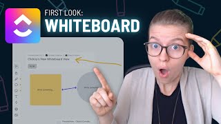
ClickUp just released a whiteboard feature. This walkthrough tests whether it can do what Miro and Whimsical do, showing what the tool can actually handle and where it falls short.
So ClickUp just released a brand new whiteboard view. Yes, before Level up has even happened, they have released a new feature. This release seems to be an extension of that one app to replace small philosophy where ClickUp is trying to replace features that other tools use and build them into their own platform. This literally just dropped in my account while we were sitting here waiting to get ready for Level up. So I'd love to have you join me on our very first look inside the Whiteboard feature. So when I click on new view here I saw this new whiteboard option pop up and this is is what we are seeing. This is our new whiteboard on the left hand side, much like what we're seeing in other whiteboarding apps. We have a few quick commands that we can do and immediately from the icons you can tell this is going to be a whole lot different than the other views we were looking at. Unlike our typical task views which are showing tasks in different format like we have with say Mind Map, the whiteboard is falling under the page view sections which is letting us know that it is not going to be showing us task related data, but instead give us a freeform place to work on other types of ideas. However, do you see what the second option is here? Tasks. Just like Docs, which are also page views, this view does allow us to take tasks from throughout our workspace and add them into this whiteboard. And interestingly, if I zoom in just a bit here, you'll see that they also have the option for you to link entire lists and documents in this view. That'll be a huge step beyond just the linking and mentioning of tasks that we've seen to date. I'm very happy to go through here and see how quick the load time is on getting tasks into this view. That's often an issue that ClickUp has with their new features, but this one is snappy right out of the gate. I can also hold control and zoom in and out, although that is a little bit jerky. I wouldn't be surprised if we saw views follow that because this would be consistent with what we've seen inside docs of being able to mention entire lists or spaces or views or documents. But still, that's really exciting to see in our first release here. Next up we have the marker. This seems to be just a freeform marker tool. It's a little jerky as you see me drawing here and it kind of shifts as soon as I finish the drawing and probably needs some stuff still worked out here, but we do have a few Options around colors. And, you know, it's nice to have if you have a reason to need to kind of draw in that way on your computer. But especially if you're using ClickUp on a laptop or with a touchscreen, this just got a lot more useful. Below that we have shapes. So if I scroll out a little bit, you'll see these shapes that I'm adding here that can be resized and have words added into them. At this point, we are just adding words in one font size. There are no options around that like you would see in other tools like Whimsical or Miro. But that's okay, I guess. That's our first pass. You see these little small icons here on the right hand side, letting us know what color these are defaulting to. So now you see this is red. Below that we have a notes area. And this is a little bit more freeform. And at first glance, this notes area is working very similarly to our actual shapes because we are still prompted to type something into it, just like we are with these shapes here, where we can create them and then type anything we want. Not sure what the key difference is between notes and shapes in this interface. I know in other tools, the notes actually look different, more sticky note like. And on this one, you can kind of see there is a drop shadow behind what we have as our notes, whereas our shapes are not showing any drop shadow. And I can just throw them right on top of each other and they blend right in. Beyond notes, we also have a text area here where we could go ahead and just write quick thoughts. Below the text area, we also have a connectors. Now, this is a little confusing, and I don't know why ClickUp kind of always does this when they release something new, it's like they want to recycle their old icons to save money. I know that's not actually the truth of it, but they'll always add this thing where they'll take old icons that have a whole separate meeting and reuse them in a new way with their new features. Just kind of silly. We're seeing the icon we associate with relationships and rollups being used here as connectors. So I wouldn't be surprised if we see that change in the coming weeks. But this connectors area should be letting us connect different areas inside our account. And indeed, it is doing a little bit of a snapping measure. So as I. So as I click around here, let's just go ahead and try to connect those ones. It is snapping. So you saw how it was kind of off the grid, and then they connected them back together in a V. And we see even as I move shapes around, the grids stay more or less fixed and even reposition themselves on the other sides of things. So that's pretty nice. But I will say, when I'm actually using these connectors, it's a little bit funky to know where it's going to snap to. We don't have that nice repositioning like you might have seen in things like Miro and Whimsical, where it kind of retraces its line. But even in this early stage, when we select select these connectors, we are getting the options around thickness as well as the line style. So whether we want it to be a straight, you know, point A to point B or we want it to be bowed across, as you're seeing here. So that's kind of nice to see In a very first rendition of this tool. We do not have kind of the curvy, wavy option that you're used to seeing in other tools, but again, it's built into ClickUp, so we can have some concessions there. Below the relationships icon, which actually represents connectors, we have the bookmark option. So we could take a website like, let's just say, processdriven. Co. Oh, there it goes. It did go through. Okay, great. So tiny up here. This is super, super zoomed out. I am having a hard time getting this to zoom at a proper level. It's either crazy zoomed or crazy not zoomed. I don't know if that's my mouse or this new feature, but that's a little weird. But you can see, if I zoom in here it is pulling in our information into a tiny little card. It's interesting to me that this doesn't look anything like the bookmarks that we see in other areas in ClickUp. They've gone with a much smaller, more concise look. For example, if I go into a task and create a bookmark, I'm going to see this much larger preview, which to me is actually the level of preview I'd want to see in whiteboard. But in Whiteboard we have a nice concise preview. I don't know. I hope those eventually change that we can swap them out because I really like the way these are appearing here as very nice and simple. Be great if this was replaced with the actual avatar and or the featured image for the page. But again, great first draft and nice to have this in here. So this will allow us to take website pages and connect them using our connectors. I assume. Let's see if it'll work. Connectors connect. Maybe. Let's see if it'll go. Nope. Maybe. Come on, you can do it. Come on. Let me connect. Okay, so maybe. Oh, there he goes. Okay, that was a little bit difficult to see because we're not seeing those little nodes that we're used to seeing in other whiteboarding tools. It's kind of unclear as to where you have to connect and drag these connectors to actually connect them. Let's hope that in future renditions of the tool we are going to see those little dots in the four sides to let us know where exactly our connections can go to. That's currently kind of missing in this, which would be a small update that would make it a lot easier, particularly with these connectors, which seem to have a bit of an attitude. It's really easy, as you're seeing from me clicking here, to try to connect things and it not to actually connect to the object you were trying to go to. So, yeah, maybe no. Okay. I don't know what's going on. So, connectors, maybe not your best friend quite yet. The next thing we have on here is an upload file where we can upload things from our own computer. So I'm just going to pick a thumbnail of one of the recent videos we're going to have coming out here. Oh, and there we go. Now, once this image is in here, does it let us resize it? Maybe. Maybe no. Okay. It cannot be resized, even though. Oh, there it goes. Okay. It was just giving me an ado. There we go. So now we have this. This image in here and it is letting me resize it, which is fantastic. And can I connect it? The ultimate test. All right, cool. Just to note comparing this to other whiteboarding tools, we are having to upload our own images here. We cannot just browse stock art like you might see in something like Miro or Whimsical or Notion. You actually need to upload the files yourselves here and only in their supported formats. Now, over here on the right hand side, we do have two additional areas in the whiteboard view, one of them showing who's online right now. So I would imagine I don't have someone else awake at 7am here to do this with me, but I would imagine if we have more people on this view, we're going to see their faces pop up just like we see in something like Mural or Miro. And then we have a question mark which goes over all of the hotkeys that are built into this view. And as I'm looking at this, I realize even though I did Control center to scroll in and out and that was working for me, it's looking like it wants me to use the plus sign, but when I try to click the plus sign, no, nothing, nothing does not work. So maybe that hotkey needs to be changed. But hey, I mean Control scroll does work and that's more consistent with what we've seen in other tools. Space is our Move Canvas option, which differs from tool to tool, but that's still pretty consistent. V going back to your select key, meaning going back to this one here, that's a pretty standard option. And glad to see that creating a new task is holding true with T and Ctrl Z, Ctrl C and Control V all coming through as well and being consistent across the board. So I don't think any of these hotkeys are going to be particularly uncomfortable for you, except for perhaps the zoom in and zoom out, which don't quite seem to be working at the time of recording this. But this feature is brand spanking new, it's still in beta, so not going to hold that against them. Overall, happy to see these things in here and let's just go ahead and do a quick test of the alt bracket. Okay, maybe it does not work. Let's try alt bracket. Maybe none of the hotkeys work yet. Well, hang on on those hotkeys and we can all test them out together when they come through. But for now we'll just delete things and move things around the manual way. And it looks like our layer order is fixed. Last quick test I want to do is to see is whether we can take a task from outside whiteboard and paste it into whiteboard. That's going to be an interesting test. Let's give it a try. All right. It does not look like that is currently supported because I think that would be a real game changer if we were able to take tasks, copy the link from side and paste it right into this canvas. For now I'm imagining we could take the link and paste it in here. Okay, so that will work. So you can paste the link in the add task button but not directly on the canvas. Still pretty low friction, but creating multiple tasks here, multiple task boxes, is going to be quite a drag and take a hot minute. So if you are someone who is looking to bring in a bunch of tasks and organize them in this kind of grid way, you might still be better off with the mind map view than this whiteboard because at least with Mind Map, it's going to pull in your tasks automatically, even though your options for arranging them is much more limited. Right now, these whiteboards cannot be shared with the web, which is pretty common. We'll see that for new features. Eventually this should come and it'll be really interesting to see what that sharing looks like because one of the beauties of existing whiteboarding tools is that you can take that link, share it with an audience and have a live collaboration with ClickUp. They've always been a little bit more closed down. It's basically guest or bust for a lot of things in terms of interacting and I think that could really hurt them here when it comes to these kind of whiteboarding tools which really rely on quick and short term collaborations. My first impressions of the whiteboard feature is that it is, you know, it's a step towards the app to replace them all philosophy, which is one that I haven't been a huge fan of because I'd rather use a few tools that are really good at what they do versus get one tool that kind of distributes their energy into a bunch of tiny little things. But that said, I could see this being a great gateway tool to get more people into the world of process and mind mapping and thinking through their ideas. Even though these features are relatively basic compared to other tools, they have these essentials that you would need in order to flow out a quick process and have that process directly in ClickUp, especially as things like this connector become a little bit more reliable and actually, you know, connect things. Seems like it could be a nice feature for folks who need only the basic features of something like Miro and Whimsical. And they don't want to go on the free plans of those other tools to get those features. They instead want to have everything into ClickUp, particularly if you are someone that up until now has been using the Mind Map view and you've always wanted to have it be a bit more freeform. I feel like this view is going to really solve that issue where you'll be able to take the nodes that you have in Mind Map, pull them in here one by one and really go to town on brainstorming in a way that fits your creative flow versus having to stick to the strict task hierarchy that is the layout inside Mind Map View. I wouldn't say this yet is a competitor of Miro Whimsical Mural, any of those. I mean, this isn't even close in terms of functionality, but it's, you know, throwing the glove and saying we're coming for you. It's definitely that, but it is not there yet. I think what will be really interesting to see is what additional features you're allowed to bring into this, how we see bookmarks interact in this canvas, and perhaps most importantly, how we can actually use these whiteboards throughout the interface. But overall, this is still a pretty exciting release and I think this will be really helpful for those who are more visual thinkers and to get their thoughts out in a different way. I know for me, this hasn't sold me on using ClickUp for Whiteboarding yet. I just love the convenience of either Whimsical or Miro, which I'll use side by side, and my whiteboard. And those are my three different whiteboards that I'm using. Physical Whiteboard, Miro and Whimsical. And to me, this isn't giving me enough convenience of being in ClickUp yet to make it worth leaving those tools that are just objectively better at what they do. So this is a first look at the Whiteboarding feature. If you guys want to talk a little bit more about this or see a follow up feature as more and more updates come out, just let me know in the comments below while you're down there like and subscribe. We'll be back with updates as this feature evolves and until next time, enjoy the process.










