A walkthrough of SmartSuite's chart view feature, showing how to build visual reports from your tracked data. The speaker covers available chart types, which data fields to use, and how to generate reports that actually show what's happening in your workspace.
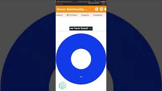
This is a chart view. When you have a new view name and we can choose our privacy settings, our chart view generates a chart. This allows us to take the information that we have tracked in our app and report on it visually. The types of visual options we have available to us are kind of like what you might expect in a spreadsheet. We can add bar charts, stacked bar chart, bubble charts, scatter charts, area charts, and so much more. Any way you could expect to see information in a typical spreadsheet, you would expect to see inside of SmartSuite using, say, a donut chart. We could report on the information we have based on the values that we have tracked on the records. It's very important to know that when it comes to these charts, we are limited to fields that are broken out AS fields. In SmartSuite, we've got choices like amount, designation, donation, id. All of these things are our fields. What the heck are fields? These are the things that we have viewed as columns in a grid view or show up as fields inside the record itself.