This is a YouTube video titled "Weekly Review: How to Visualize Time Capacity" containing a monologue or instructional talk from August 18, 2023. The speaker discusses planning workload visualization using custom bar charts to track time estimates and task assignments over a year. The content focuses on project management and time capacity visualization techniques.
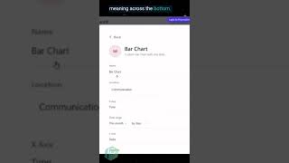
Hey, can I take on two more clients this month or do I need to delay them and have them start in six weeks? I think it's going to be more effective if we try to use a different view to supplement that bigger picture planning. Now, we're going to start from scratch together here, and we are going to build a custom bar chart. We are going to look at our communications location. Our X axis is going to be time, meaning across the bottom. We want to show past to future. We want to look at this whole year, which is perfect because that includes the future. We want to look at it by month or week, whatever you prefer. However, and for our Y axis, we're going to use time estimates as our volume. You can also group by assignee to give us that same kind of look as a workload view. Include subtasks. We'll skip close. Actually, we'll include closed because that way it shows us ones that we've already done. But what this should show us by the time we're done is this. So it's not very interesting because there's only one assignee, but imagine it would be multiple colors if we had multiple assignees where this shows total per month of how much work is scheduled.