Superstore Demo using Tableau
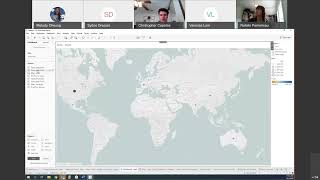
Natalie walks through Tableau's Superstore dataset to build visualizations three different ways: auto-create, Show Me recommendations, and manual construction. She uncovers a money-losing Tables subcategory, maps sales by region, and shows how discounts hurt profit before assembling an interactive dashboard and publishing it to Tableau Server.
Questions this video answers
$12,000,000 (‘‘$12 million’’ shown when sales was double-clicked).
About 3% (presenter: "my average discount is pretty low, somewhere around 3%.")
Tables (presenter notes Tables are losing money).
Chapters
Oh, we're going to be playing the role of an analyst. And this analyst is new at a company called Superstore. Superstore is sort of like an office works. We have lots of different stores across the US and the world. And in this data set we're looking at, we have all of our orders for all of our customers for those locations. So because I'm new, I want to get an idea of how well we're doing overall. So we're going to start off in desktop. And here we are looking at the first sheet. And there are three main ways to interact with Tableau. We can ask Tableau, we can ask Tableau for help or we can do it ourselves. So first we're going to ask Tableau and we're going to do that just by taking our sales over here and double clicking. And you can see it builds out a visualization for me showing that we have $12 million in overall sales. I want to see that over time. I can double click on order date as well. And I can see how that's broken down over the years. Like we're, we're growing pretty quickly. One thing that you'll notice is that Tableau changed that visualization to a line chart. And the reason it did that is it's applying visualization best practices on top of the data. The Tableau knows the best way to represent numbers over time is with a line. And so it's applied that if I want to go and ask Tableau for help instead, I can use show me. Show Me is the most common visualization types. It's not by any means the full extent of what Tableau can do, but it's the most popular ones. I can go through different visualizations and see what best represents the story that I'm going to. I want to tell. The Tableau recommendation is highlighted here in orange. I'm going to stick with that. If I want to take it a step further and build it out myself, I can use the Marks cards. The tableau breaks down visualizations into its parts using the columns and the rows and the marks. And the Marks is actually using pre attentive attributes. Our ability to visualize and understand data using our natural instincts. So when we use color and size, we just naturally get that and understand that as Melody showed you earlier. So here we're going to switch the years to the month using little Carrot. And it looks like we have a lot of seasonality and we vary month for month, but it's hard to see what sort of trend that is. I'M going to take order date and add that turmeric's correct color. And now it's going to overlay each of those. Those years on top of each other. So I can see that we seem to be growing and we definitely are growing. 2019 is much higher than previous years in 2016. And I can see there's definitely a seasonal trend. The end of the year is really important to us. We start off slow and we've got this dip in the middle of summer and jump back up when back to school shopping happens. So that can really influence our marketing strategy and the sort of campaigns, the discounts that we run. One other thing that I wanted to highlight is the difference between the green indicator here and the blue. So blue represents discrete values. So our in most cases are dimensions, things we like to slice and dice data by. Whereas the green for our sales represents continuous values. So these are typically numerical and can be. They don't really have a start or an end. And tableau does different things with different types of data. So how I represent discrete and continuous in visualizations is different. And dates are actually quite unique because dates can be both discrete, like this month or it can be continuous down here with the month year combo. So now let's jump into sales by different categories. So we can see we're growing and we seem to be doing pretty well. Let's take a look at how well we're doing from a category point of view. I'm going to create a new visualization here and I'm going to take my sales and drag that to columns. And then I'm going to take my products and add that to rows. I'm going to drill into this. You can see here I've got this little plus sign, and that's because I've created a hierarchy. So the hierarchy allows me to drill down and continue to analyze for the information that's related. So here my product hierarchy starts from category subcategory and then goes all the way to individual product names. So it looks like we're selling in the furniture area, a lot of bookcases and chairs and tables as well. Let me just sort that. But how profitable are we? So here we're going to take our profit, we're going to drag it onto color, and again use those preattentive attributes in order to help data stand out for us. So here it's really clear that even though we're selling a lot of tables, we're not actually profitable in the tables category. We're actually losing money for Tables. So let's drill into that a little bit more. Using a math, We'll jump over and start to build out a map. So on the left for all of these little icons, you can see that there's these indicators. ABC Globe. This tells us what type of data tableau is, recognizing that value. As ABC is a text field and country is a geographical data point, that means tableau automatically recognizes that it's geographical and automatically creates latitude and longitude points to go along with it. I'm just going to double click on country, and here you can see a little blue dot for each of the countries that we have in our data set. We want to get an idea of how well each of those countries are doing in terms of sales and profits. I'm going to take my sales and I'm going to drag it onto size. The bigger the dot, the more sales there are. The United States is bigger than the countries in Latvia. And then I'm going to take my profit and I'm going to add that onto color. Because we used color to show profit in the last visualization. We want to be consistent and use color here, too. And then I'm going to filter. So if I take my cat category down here, right click on it. I'm just going to click on show filter, and now I can focus in on different areas. So if we're only concerned with furniture, wanted to look at tables a little bit more, we can see that overall, the United States is profitable for furniture, but some of our smaller regions, like the Dominican Republic and other lands, and profitable for furniture as a whole. With maps, too, we can get a lot more granular in how we're displaying things. So this is the default map. But if I go to map and the drop down here, click on map layers, I can change how it looks, and I can also turn on the layers for what's being displayed as I start to filter in or drill into something more detailed. So I can add land streets, points of interest just by clicking on those map layer options. Another thing that a lot of my customers find really interesting is I can add a data layer for the US at least, this is pulling census data, and it can add things like household size, households, age, demographic data, as well as income data. I work with all of the marketing agencies in the US and for them, this is really important to compare their campaign data against the sort of demographic areas that they target. So if I'm targeting something that maybe like a more expensive mattress company, by using the what color occupation and then starting to break that down you go all the way to zip code. I can get a good idea when I'm overlaying those campaigns and geographic points, who I'm actually able to target without having to go and actually find that data. But since we're looking at global data, I'm going to turn that off. Okay, so we took a look at each of our different regions. Now let's take a look at the profits in a little bit more and see some of those things that might be causing issues with our profitability in the table area. So, like a lot of stores, Superstore offers discounts to customers. So let's take a look at our discounting strategy across different product lines and locations. I'm going to take profit, I'm going to add that to rows. Then I'm going to take my discount, add it to columns. That's going to create a scatter chart, very boring one. At this point, I'm going to take our categories. I want to see what I'm actually selling and add that to color. And then I'm going to break this down by our orders. So by adding order ID to detail, I'm going to get a dot for each of the individual orders across each category. So if I have an order where I purchased two things, it's going to break it down into two dots. And then where it sits on my scatter chart shows me that combo of the profit and discount. So I can see as my discounts go down, my profitability goes up and down here at the end where I'm offering higher discounts. Looks like all of those are actually unprofitable. So we found some interesting insights here. We saw that seasonality is really key to us. We follow trends where at the end of the year and back to school period is important and we really need to do well there, do well for the year as a whole. We also saw that we had profitability issues with tables and this is for the entire world. So they probably have a lot more issues when we go down to individual regions. We took a look at our profitability overall for each of our countries and then we saw that our discounting strategy is really important to our profitability and the more we discount, the less profitable we are. Now we're going to bring these together into dashboard and allow us to interact with each of these to get more granular insights. I'm going to go over here to my dashboard. I already changed it to automatic. Usually it starts off at a fixed size. I like to switch to automatic so that it's Responsive and automatically fits your screen. I am going to start by pulling that map out and then I'm going to take my. Yeah, this one here, my sales and profit and put it down at the bottom. And my sales seasonality will go on the right. And then my profits and discounts will go over here. And I'm just going to mush it a bit. You can see some of these don't quite fit. So I'm going to have it fit to the entire view so that my bars is filling the space. One thing that we can see here is we kind of made a mistake with our colors where we're using colors here to identify each of the different categories our office supplies and our furnitures. But on the other vizz colors mean profitability. So it's going to be confusing for people for if not to not be consistent. So let's go back and we're going to change that. Instead of category on color, we're going to make that be a shape. Okay. Another thing that I want to modify is that right now the filter only applies to the visit was set up with, but I want it to apply to everything, which is hard to see because of the map. I'm going to go to the dropdown, say apply to worksheets and all using this data source. So now if we focus in on furniture, everything updates to represent that. I'm also going to get rid of some of these icons here and I'm going to make this floating so that I can bring it over to the map that it's associated with. Okay. So one thing that we saw before is that we had an issue with tables in the East. Let's just focus on everything for now. Start out by looking at the US So I'm going to click use as a filter and then I'm going to click on United States and that's going to update everything to just look at how we're performing for the United States. I can see here that the tables is still a problem. I have some issues in other areas, but tables really stands out. And one thing I forgot to do as well is to add an average line. So I can see an average of my discounting. Okay. So it looks like here when I'm in the US my average discount is pretty low, somewhere around 3%. See if that varies for some of our unprofitable areas. I click on tables, I can see that that actually increases quite a bit. So we're offering a much higher discount for tables than we are as a whole. And that's Making a big difference to our overall strategy. So one area that we can really focus on going forward is reducing the discounts, especially in the tables area, and that should help increase our profitability for tables. So now that we've created this dashboard, we've found some insights. We're going to go and publish that to server. So you guys would go to public. I'm just going to publish server because I'm signed in. And when I click on publish, It's going to make that available for others to interact with it. And the same sort of insights that we found. Eventually. Okay, so once it's pushed that up, I'll have that same sort of interactivity that I had in desktop, where I can click and filter and drill down, but it'll be able to be done completely on the web without having to actually install software. Usually I use a data set that's just the us, which I guess is much smaller and faster to publish. So that was the quick demo of taking our tableau data set and building a few different visualizations to find some insights and ultimately creating a dashboard to share with others. Melody, do you want to open up for questions or.
Yeah, if you guys have any questions for Natalie, feel free to ask them now. It looks like it's going to take a little time for that to publish to the server. Does anyone have any questions?
It doesn't normally take that long.
It is a pretty big data set with global.
Yeah, you're right on that.
Does anyone have any questions? It could even be about tips for presenting data, talking about data, doing demos, anything like that.
So a few nice things to keep in mind when you're doing a demo is it's helpful to tell a story. So instead of just like, I click here and I click there and then I do this to set more of a business story, to get people thinking about how they could actually use, makes it seem more kind of straightforward and realistic. Also, summarizing what you showed them and what you did, going back and reviewing that common thing that people will say is like, tell, show, tell. So to tell them what you're going to do, do it, and then explain and summarize what you did, be a helpful way to make sure that the things resonate. People tend to like this cliff of people paying attention, especially now that we're all remote, where the beginning and the end is when you get that most significant attention. And in the middle, people lose a lot of the content. So the more you summarize and help them understand what they saw, the more they're likely to remember and keep and of course publish on my other screen. So normally I would then go back to the dashboard and show that same sort of interactivity. Any questions?
It looks like we haven't got any in the chat. Oh, we just have one. As I said that.
When doing a.
Demo, do you think doing a brief PowerPoint about the steps that we will go through would be best or just jumping into the demo and explaining as you go?
Normally it's good to jump into the demo if it's a larger presentation having like a slight give the agenda or if you're changing this one's pretty simple but if it's a bigger one, sometimes you'll change characters. So having a slide to give that overview. First we're going to be this guy, then we're going to, we're going to go in and do that. Then we're going to be person number two and we're going to take a look at what his day in the life would look like if it's a more in depth demo. We've worked for in Pre Sales for 15 years and worked for a few different software companies. So if you're doing something that might take more than 30 minutes, more than an hour, you typically want to break it down to different users and set the stage with an agenda. Perfect, thank you.
And then I'm just going to read one more from Gurjunt. Do you recommend any resources for learning how to weave a story with the data we have and make it more appealing for people?
Good question. I'm pretty sure that the video on the tableau training page, that first getting started video, that's like a 20 minute overview of tableau. I'm sure that one does include more of a story and how it's set up. The script that you'll, you'll beginning later doesn't have a huge story with it. So if you just give some thought to why you're creating that visualization, what it is you're trying to find out and highlight that it's a helpful way to weave it in.
More from Grace











Climate Connect, [3rd Place Overall & Best Use of CockroachDB, SimpliHacks2.0]