Create Attention Grabbing Images With Canva 🚀
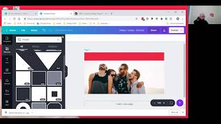
Mark Simpson and Chris McLachie walk through Canva 2.0 to build social media images that stop the scroll. Use bold fonts and high-contrast colors, grab free images from Pexels, and set custom dimensions at 1200×628px so you can reuse designs across platforms.
Questions this video answers
1200 pixels by 628 pixels.
Pexels (pexels.com).
Allegra Sans Black.
£9.99 / 9.99 a month (as stated in the session).
Chapters
If you're watching back on the replay, say hi. If you're tuning in live, say hi as well. I'm just trying to make sure that I can see everybody in on the group. So when you first come in, say hello, introduce yourself, let us know where you're watching in the world. We're going to be talking about Canva today and we're also going to be announcing the details of the next Facebook competition training. So if anybody is ever done how to run a perfect Facebook competition before then, you will know how effective it is. But we're gonna tell you about the dates, I'm gonna tell you about how it's gonna work and I'm gonna let you know on a website you can go right now to get access to all the training videos that we're gonna be doing about it. Right, let me just see who's in. Make sure you comment when you come on in so I can see you. Hi, Claire. Hope you're doing well. Let's see who else we have here. Lovely. All right, for whatever reason, my Facebook app is not telling me who is in, so we're gonna have to do this blind to an extent until I can figure it out in a little bit more detail. But what I'm gonna do is I'm gonna get Chris on the call, let me just mute him and we're gonna start the video. Alright, Chris, how are you doing? Can you hear me okay? Here he is.
Yeah, I can hear you fine. How are you doing, lovely?
Very good, thank you very much. Alright, so what I would like for you to do, just to start off with, if you could please go and introduce yourself a little bit about you, what you do, why you are an expert in Canva, and then we'll get started with the interview.
Well, cool. My name's Chris McLachie. For the past 18 months or so I've been designing social media images for people. Before that I run a print business, a newspaper. And before that I was 20 years advertising sales for newspapers and magazines. The most horriblest job in the world.
And what made you go in to do this, what you're doing now? What made you start up a business helping business owners with. With digital and online images?
Honestly, I just fell into. It is the easiest, the easiest way to say, you know, Dan Meredith. I kind of fell into his world and it kind of exploded from there, but it gave me a good idea of so many people marketing themselves all in social media. So your social media feed is awash, people selling this, that and the other thing. And four or five years ago, it was fairly easy to stand out when you're doing that, but it's a lot harder now. The market's become more sophisticated and there's so many more people doing it because it's easy to do.
Yeah, yeah, definitely. So we've got Sarah in here. Hi, Sarah. We've got Hayley, Nikki, Isabel, Claire and Valerie. We've got people tuning in, which is amazing. I know that there was a lot of interest in this, just simply because it's something that we've spoken about in a lot of detail over the course of the year. And the reason why I wanted to get Chris in here is because he is one of the best people I know when it comes to Canva and images and how to get people to look at your business posts, which is one of the main things that, especially with a competition that we're going to talk about later on, is why it's so key. So, all right, so in the most simplistic terms.
Good.
Chris, explain to me and explain to everybody watching what Canva is and why it's one of the most simplest and best platforms to use.
The easiest thing about Canva is it's drag and drop. You don't need any design skills, you don't need any programming skills, you don't need apps or special knowledge, as it were. You can just go and drag and drop and you can make images really easy, you can export them from Canva really easy, and you can upload them on your social media. You should be able to do a decent image in five or ten minutes, whereas before that it was Photoshop or a whole host of more complicated design programs. So Canva really came out of nowhere and has just taken over that level of the market. It's just so easy to use. You can use it on your phone, although it's a lot clunkier on the phone, or you can use it on your desktop or your iPad and you can create designs wherever you are.
Nice. And obviously there's so many other platforms you can use. Photoshop, which is obviously what you're accustomed to. There's plenty of others. But the reason why I encourage Canva, and we've spoken about it so many times in the past in this group, is because you can access it. It's drag and drop, and within minutes you can have a design done. All right, Ray, Julie, Stuart, Gloria, how are we doing? Jerry, Brenda, Steve, We've got plenty in here. So what we wanted to do today, and we're going to spend about 10 minutes, 15 minutes on this max is we want you to ask questions where you struggle with Canva. Chris is going to attempt to share his screen and he's going to open up Canva and if there's anything that you would like us to focus on, then let us know. But Chris, what I'd love for you to do is if you could just open up your Canva and just show us one of the simplest ways of creating an image for a Facebook post that is going to attract attention. So if you can go into the right template to use and just focus on any of that, share your screen floor is yours.
Before we do that, it's more about thinking about what you're doing and how you're going to be doing it before you sit down and use Canva. Because there are so, so many people using social media to market themselves, it's really, really hard to stand out. And the way that we use social media as a population has changed. But now we've been on social media when we're bored, when we're waiting on a bus, we're waiting on a coffee, we're waiting on our friends. And we're doing it to pass time. And because we're doing it to pass time when we're on Facebook, we're zoning out. We turn into zombies, if you like. And it's catching people in that zombie state that we're trying to do. And I've coined a phrase of thumbstopper. And what you're trying to do is produce an image that is different from the rest and stands out. And if you do that, it takes about half a second for somebody to flip past a post on social media. So you don't have a lot of time at all. If you can produce an image that's bright enough, colorful enough and different enough from the rest of the noise, then you'll stop a thumb. Once you've got the thumb stopped, then you can market, sell, etc, educate on your post. It's more thinking about that as opposed to thinking, right, let's get an image up. Because if you do that, you're then going to just put an image up that's exactly the same as all the other images are out there. And you'll just blend into the noise. You won't stand out. And that's what we're trying to do is stand out.
I like that. The phone stopper. And you're 100% right. When people can just imagine now everybody who's watching this, when you go onto the Facebook, you're Right, you're doing it because it could be an advert break in a tv, it could be waiting on guests to arrive or just in a zombie state. So with a right image, with a good image, stand out. And obviously the reason why we're doing this today is it's in preparation for what will be the next round of how to run a Facebook competition. So with a good image, we can get them to stop, we're going to get them to engage. I'm going to give you the floor here if you want to share your screen while you're doing that. Anybody, if you've got any questions on the Canva, please put it in the comments below and I will pick them up and relay them onto Chris here. But if you could just walk us through. And Obviously this Canva 2.0 that you're.
Seeing right now, yeah, it's Canva 2.0. It's less. Because it's an online thing, Canva can be Quite glitchy. The 2.0 is less glitchy, it's more user friendly. It's just easier to use. Just a sort of next evolution. Canva 2.0.
Yeah. So if you could then just walk us through the recommended route that you would do for a Facebook image, just so people can watch. And don't worry if Chris goes too fast. This is being recorded so you can. You're going to be able to watch this back at any point in the future. So if you could just walk us through the basics of what people should be looking out for and that would be amazing.
For Facebook, I always put custom dimensions on and the sizes I would use for Facebook would be 1200 pixels by 628 pixels. And I use that for two reasons. One, it fits Facebook perfect. And secondly, you can also recycle the image and use it on LinkedIn, Twitter. So you can use that one image in three different social media sites, which save you having redesigned the image three times. So we'll pop it open like that. And really, for a social media image, I like to look at this as a headline. So if you've got a post you're trying to promote, a push or a message you're trying to push, get a nice punchy headline and then start with a headline and then work backwards through that. Yeah. So what would be a common post for you guys? Let's take a suggestion from the group.
A comment. Well, let's judge it on the fact it's going to be a competition. Competition post that is coming up because that's what this is all about. So if you could base it on that you want to get somebody's attention from for potentially a competition that's going to be coming up.
What would the competition be for?
Let's just say if it's the one that I'm thinking of doing for me, it would be win a three night stay in a bed and breakfast.
Cool. So if you're looking to, if somebody's looking to win a free night stay, you could do what everybody else does and you can stick up a picture of your hotel room and that's just going to blend in with all the other hospitality owners, bed and breakfast, etc. Hotels are pushing the similar sort of thing for something like this. Using an emotion is really, really good. So if you can get an image that has an emotion that you would want people to have when they win the free room, joyful, happy, then we can use that as opposed to going down the standard route of a picture of a hotel room. Now online, there are a good number of stock websites that are free. One I really like to use is pexels. So it's pexels.com. i use this site because the images on it are free to use on social media. You're not going to shoot yourself in the foot by using somebody else's image and getting out of your copyright. So what we'll do is we'll look at half of people and there's a ton of really useful images. When you're looking at stuff like this, what I suggest to do is look for images that have enough space range about them for your text. So an image like this would be hard to put text in because there's not really a lot of space around about it. And image like this here is perfect because there's tons of space around about it. And when you're flicking through sites like this, look at an image that stands out to you and amongst all the images. But if you see an image that stands out and amongst images, you can guarantee it's going to stand out on social media as well. I quite like the first one that appeared here also quite like past there.
Would you recommend not everybody will have this, but if you've got a photo shoot that was done in the last year of people arriving at your property, you know you've done like a proper photo shoot with guests or staff posing as guests. Would you recommend that or is this basically an option if you haven't got people at your property feeling happy, you know, and enjoying it?
It's just an option for A different type of image. If you're looking to stand out and you're looking to do something slightly different from all the other people on social media, if you've got an image of people looking happy, joyful, etc. The process is exactly the same. So we'll use the likes of this one for an example. I'll just download it just now.
I like the title.
I know, I just saw that. It's kind of. I'm not going to say what it is. So the process is exactly the same. So just drag it onto the image and you'll see there it is there. It'll appear in the left hand side there. Just click it and it'll appear on the design there. And all you're doing is resizing it to fit and actually got it there. And what you're looking to do now is really just think about the headline, what's going to get people in. So to get the text to stand out, I like to put text and color backgrounds. So if you knock in the elements and then go to shapes, You've got all the different type of shapes there you need. Click the square and then just make it the size and shape that you want. Put it on top there and make it a nice bright color. Nice bright colors stop people in their tracks. And then it's just whatever text you want to put on it. So just add a text box, move the text up there. All you're really doing from there is thinking of a nice snappy headline that's not the snappiest of headlines.
But yeah, I get what you're talking.
About here with your text. On all your social media stuff, if you look at somebody who's got half a second, when they flick past it, if they see a text that's hard to read, as in handwriting, they'll flick past it because the brain's unconscious, they're going to say that's going to take too much effort to do. So you want to keep your text nice and big and chunky and as uncomplicated as possible.
Yeah, and that's a big thing as well. I've noticed that now is a time of the year when a lot of hospitality owners are redesigning their website. And I've seen a lot of websites and it works the same with social media, where the text is hard to read. When you're redesigning your website and you're looking at a font, you want to keep it as simple to read as possible. Just like what Chris is doing here with this. Because we've Got a very short attention span.
People are lazy. They don't want to ask when they're on social media and they're flipping through. They're not doing it to be entertained, they're doing it to be entertained. They're not doing it to seek out information. They're doing it because they're bored. And if they come across something that is hard to read, then the brain subconscious is going to say, nope, go on to the next one. And you've lost that chance if you've put up a font that's kind of harder to read, as it were.
Yeah, 100%. Alright, so with the post like this and these images, so the one, the place that you got the image from, are those images totally license free? So you could even use it on your website if you wanted to, or is it just for social media there.
It says they're free for personal and commercial use. You can use it for social media, you can use it for your website, you can use it for leaflets, flyers, business cards. Doesn't matter what you're using it for, you can use it. The reason I like this website is everything is free for personal and commercial use.
So watching this, whoever's watching this, now, if you could do me a massive favor and just type in the comment box below pexels p e x e-l s.com that is where you go and get it. If you could do that. So Valerie actually asked a question just as you were doing that. Can Chris demonstrate what he thinks catches people's eye based on the designs? So I think you've just labeled it perfectly here. Nice image from pexels.com. make sure that you got wording in there. And again, something that stands out. Make sure that the font is easily readable. What font are you using there? Which is the one that you had that was.
Let me see, let me go back. Can't even pronounce that. But yeah, yeah, Allegra Sans Black. There's a load of them. But the ones you want to avoid are things like this. It's just instantly it's harder to read, it's more complicated and confusing for the eye to catch. The very, very worst ones are the handwriting ones.
Yeah, cannot stand them.
I mean they look beautiful and all the rest of it. But it's there for a reason. The reason is to stop people and get them reading your social media post. All the image is there for is to get to stop someone and have them read your post. We don't use images to sell, we don't use Images to really tell a massive story. It's more thinking of an image. How can I get them to stop their thumb on that image and then read my text? That's more the psychology behind it, as opposed to making an image that would fit on Vanity Fair or something like that.
Here's a good question that's come in from Sarah. How do you link elements together? For example, the text and the background shape?
So we'll put the text in the background there. All I do is I take my cursor outside it, drag it across, and then you'll see the selection elements, but both of them, and then hit group and then you can drag it about and do what you want.
Nice.
And at the same time, once you've got it and you want to change something in that, you just hit ungroup.
Nice. Does that answer your question, Sarah? All right, so I can see lots of things on the screen now. For example, file, resize, undo, redo, spacing, ungroup elements, background. It looks like it could be really busy, but. Or somebody who's using and coming into Canva. What's the main areas that you would recommend? Then focus on canva.
If you come into Canva from scratch, one thing that would save you time over anything else is to build a template and use that template to meet your images going forward. Now, a template can be as simple as a box at the bottom that has your web address and your contact details on it and a logo on the top. Right. So all you're having to do then is drop in your picture and drop in some text. It will save you time and it gets you further forward in this design process, as it were.
So how do you save a template? Sorry.
So you basically save the image. I've got my images. And there. So lights up. For a testimonial, click the image. Pardon me, and then hit user's template.
Nice. So when you've got the template ready and you can just change it. As simple as.
Yeah. So for my crush at the Canva, Here we go. It's all going all glitchy.
Sorry.
So we can drop that right out. Drop that right out. And that's a basic tech. That's a basic template there. So it's got an image already there. It's got who I am. And more importantly, on the bottom here, it's got where to find me.
Yeah.
And always put a web address on a webjata. I do that for two reasons. One, if somebody steals your image, which is likely to happen, then at least you get some kickback from it further down the line. And number two, my website traffic went up noticeably by putting web addresses on my images.
I can see that it was strange.
I always put Facebook tags on images and I changed the web addresses. Just thought it looked cleaner and I got fairly big kickback on my. It wasn't life changing or anything, but it was noticeable.
That's awesome. There's loads of takeaways that I'm getting from this and I know that everybody that is watching will get takeaways from this. But one thing that I'm instantly linking it back to last month in the Boostly Academy, which is obviously the paid training that I do, we've been talking about branding and think about the posts and the images that you're using every single time on Facebook. Like Chris says, it's ones that you could easily scroll by. But if you took the time once to come in to Canva, create a template, even if it is just a case of getting your colors in, whatever your colors may be, and anybody who's part of the Boostly Academy will instantly know what that means, then you could just reuse that template. Whatever image or topic you're going to be discussing, you come in and quickly add it to Canva, save it and use it. You're going to give yourself a chance. More than 80% of the other businesses, not just hospitality, but any business page on Facebook that is going to be potentially on a scroll. And again, if you then couple that with Facebook ads, putting it in front of the right people, especially when we're going to be doing competition training in a very short while, this is some really good stuff.
You can take that a stage further and create yourself a brand and document. And what that means is you've got, you know the fonts that you use, you know that the colors that you use and all your stuff, and you know the images you've got and the types of logo. And it just means that if you've not made an image for three or four weeks, your brain tends to forget what you've used in the past. And it's really easy to have this as a sort of reference to keep your images looking consistent further down the line, because people will look for that consistency.
Okay, so you've obviously got Canva, the free version, and there's Canva, the pro version. Is it worthwhile upgrading in your opinion, or can you get by with the free version?
The main difference in the Pro version is you got a lot more folders to put things on and you got a magic resize you can resize images from one size to another, but the magic resize isn't that great. Now it's 9.99amonth. The only real benefit I can see here is you get more images, you get more free images and whatnot, but you can get most of your free images from the likes of us from. For a business owner, everything you need is in the free version of Canva.
I think instantly there, Chris has saved everybody around about 140 pounds by not having to get Canva Pro. Just in case you were thinking it, a question from Tanya. Can we use these Canva images on our website? Would you recommend it?
Okay. Yeah, definitely. I mean, all you're doing there is going to create a design using the custom dimensions. Now you know what size image you need from your website and just put in whatever size it is there and then hit new design and then you can use that image on your website. All you're doing to get it on your website is you're hitting download and you're downloading it as a PNG.
And.
It will download and then you just do a normal image on your website.
Another question has come in and it's about colors. Nikki has said that she notices that you use red and she was told that red is one of the most attractive background colors. When scrolling on Facebook, do you mirror that quote of red is the most attractive or why do you use red? Or is there any other colors that stand out?
I'll be honest, I used that red on Crush at the Canva because the original image had that as a background color. I just loved the way it reacted with us. In terms of colors, you're looking at contrast. So colors that work really well together are black and white, black and red, black and yellow.
Yeah, I love black and yellow. That's my personal.
Just get because it stands out. You don't have to have any brain power and you can thread social media to read that three or five word headline because it pings right off the page at you. So you're just looking at contrasting colors.
Yeah. Best class. All right. I think that there's loads of people watching this and there's going to be loads of people watching us back on the replay and they will have questions regarding Canva. What I've asked Chris to do and he is in the group. He's going to be in the group for like a week so people can ask questions. There's going to be a build up to the competition. So tag him in. Chris McCookley on the Facebook. But what I've also asked is I've wanted him to put in a link because I think we can all tell here that Canva is going to be very important, not just for the competition, but for your social media in 2019. Everybody who has heard me bang on about anything when it comes to social media is that your page posts are going to be seen by a lot less people. So what you need to do is when you are putting a post out, you don't have to be putting out a post a day that's gone now. You can get away with one post a week, but you've got to make sure that that one post has got a really good image and some good text behind it. So Chris is going to put a link in to his website and you can go and ask him questions there. But also as well, please send him a message if you've got any questions. And if you want to find out more about Canva, if this is something that you want to get better is your images and how to stand out on social, please, please, please reach out to Chris and he'll send you a link on how he can help you a little bit more. There's loads of questions coming in 3D, all that sort of thing. But what I'll do is I'll get Chris tagged into the post after this live video and then you can go in, ask him and he'll be able to respond back there. But Chris, really appreciate that. Is there anything else that you want to say before I mute you and let you go? Or have you pretty much covered everything on the basic level that you want to tell people?
It's just really thinking about the psychology of people on Facebook are bored, they're there to be entertained and they're there because they're just waiting on something or not or avoiding something and then thinking the image I'm putting out, is it different enough from all the other images? And you can see on Canva has a load of pre built stuff, pre built templates and if you're using something like that, it's still easy to do. You can guarantee there's another 10,000 people use that as well.
Yeah.
So try and be original in terms of what you're doing so you don't blend in at the sort of noise.
Yeah. All right, everybody, I want for you to comment below with your takeaways from these videos. Like I say all of these is there's so many videos that we do and there's so many trainings that we do. You got to take away Just one thing. If you can take just one thing away, I want to know what that is. Because for me, Pexels.com is a fantastic resource. Number two is how to use some of the most basic functions of canva that I've never even known about. You know, I want to know what you, everybody that's been watching and we've had a real steady flow of people. So first and foremost, say thank you to Chris. That is amazing.
One more thing. When you're looking to design your images, do them one or two ways. Do the headline on the top, picture in the middle, and your website at the bottom. Or like this one with the pizza here, do the image on the left hand side with your text on the right, and then your website at the bottom. The reason that we're doing this is people read from left to right, top to bottom in the western world. Now, it may seem odd, but if you've got the text on the left hand side, an image on the right hand side, then it's a lot more uncomfortable subconsciously to read. So I like to put images on the left hand side, all the text on the right, and it flows from top to bottom to get the headline, any text, and then the website. And it was a lot easier for people to read.
Nice. All right, I'm gonna let you go. Appreciate it, buddy. And anybody who's got any questions, let Chris know. I'm stop your video and I'm gonna mute. And if you could just stop sharing your screen, that'd be amazing. All right, let's finish this off now with what we've been doing this all about. I mentioned that there's going to be.
More from Mark





I Tested AI Search SEO for Rental Hosts... Here Is What Happened [Live Training]