How To Fix Your Landing Page To Increase Conversion (Real Funnel Review)
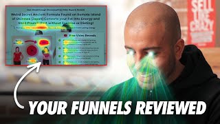
Sabri Subi reviews a keto-niche landing page and gives tactical recommendations to improve opt-in and VSL consumption. He praises the page’s visual design and readable copy but criticizes headline originality, above-the-fold clutter, unclear CTA phrasing ("video report"), use of cartoon thumbnails, and non-compliance of before/after images for Facebook. Key suggestions: emphasize a unique, novel hook in the headline; simplify above-the-fold elements (use one strong headline, animated GIF/real-person video thumbnail with play button), change CTA to a clearer phrase (e.g., "Watch video"), consider hosting the VSL inline for certain traffic sources, and run split tests focused on two-step opt-in vs direct VSL.
Chapters
Even though you say it's unique, they've already seen it before, then it's not unique. It's something that they've already seen and heard about before. Hey guys, Sabri Subi here and I recently put a call out on my Instagram to you guys saying if you want me to review your funnels or your ads or landing pages or whatnot, just send me the links over on via DM and I will do my best to take a look at them. And that's exactly what I'm going to be doing today. So this one comes in from Mehdi Hassan and we're going to jump on. He's in the keto space, so let's jump right on in. And we will be ripping through his funnel. So as you can see right here, here's his page and it's pretty good. It's visually very nice. Custom keto diet created by leading nutritionists, personal trainers and chefs. Keto meal plan that you can customize according to your body type, age, taste and lifestyle to make your body lose exc weight on its own, a faster pace without giving up your favorite food and starving yourself. Cool. And we've got this little regular lady, this keto diet lady here. Free video reveals what you should eat to lose weight without giving up on your favorite foods or starving yourself. Number two, four common diet mistakes that sabotage your chances of losing weight and how to avoid them to lose weight and stay healthy permanently. Four, how to customize your meal plan accordingly to your body type, taste, age and lifestyle so you can lose weight permanently without causing your body to rebel against your efforts. Watch the video. I'm assuming it's gonna be a pop up. Yep. Cool. 95% of people who try to lose weight, fail and even regain more weight. The page is good because it's just very easy to consume. The font is nice and big. The headlines are big. It's just, I don't have any questions on where I should focus. Right. It's just very, very clean. There's a natural flow of attention down the page. You've got, you know, font size, it looks ariel nice and big, nice line height, all of that kind of stuff. A lot of the times I see people when they use long form copy is that they just try to hide all the copy and put it in like a really small font size when it's like images don't convert people, copy converts people. So you need to make the copy really easy to consume. And you've done a great job on that in this page. Then You've got the before and afters. So this is not a compliant page. It is a good page but you're not going to be able to run this page on Facebook. So I assume that that's prob. Where you're going to be getting most of your or your traffic is you're getting it from like emails or affiliates and this will be fine. Having your before and afters. You got lots of proof on the page all round. You've done a great, very, very solid job with this. Now if you look at the biggest guys in this space, right, the big like 800 pound gorillas that just dominate this market, you know, you can't really go any further than not mentioning guys like Golden Hippo. And when you look at those people and Dr. Gundry and all the kind of that are in the health space, you know, you'll notice a typical theme that they do and it's headline vsl, nothing else, right? No button, no alluding to what the product is. It's all about consumption. And that's the thing that a lot of people get wrong. You have to get people to consume your sales message first. And what you've done is, you know, you've got all of this like it's a long form kind of landing page just to get the opt in. That's the only other thing that I would split test running, right? And then you've got this image of the regular diet with the keto diet and then you've got a play button. It doesn't really strike me immediately that this is gonna be a video training or either I'm gonna be getting like a free report or a white paper or an ebook. I know that you do say multiple times throughout the page like the free video reveals, right and watch the video report. What is report? I don't know, I've never heard of that term. It's a little bit confusing to me. I think that probably what would outperform this is to remove this free video reveals on the right hand with the bullets. Hopefully this VSL is not just a cartoon because those things are played out now and I hope that it's like a real camera direct or it's, you know, it's gonna have some B roll footage of real human beings in there of some description and I would you the traffic is going to be on mobile anyway so you're not going to see that right hand column. I would do a animated GIF video thumbnail right on this page with the play button in there. Ideally use real people in that thumbnail. And then when I try to click play to watch it, that's when the pop in pops up like you've got right now. So the pop in and all of that is fine. I would change the CTA from Watch video report because for me that is just, I don't know what, what that really is about. I don't want to don't know what a video report is. And I'd probably just get rid of all of the other information that is below the fold on this page because all you're trying to do is get that opt in right now, right? And get them to go through to the VSL that's on the next page and you've made a big and bold enough claim above the fold to really get away with not putting that rest of that stuff under that page and just stripping it down, keeping it super bare bones. And I think that that will give you a big uplift across the board. And ideally, like it looks like this traffic is going to be probably coming through from affiliates now. You probably have the numbers around what your funnel converts that after you get the opt in. And it would be beneficial just to have straight up the VSL on this page and not to have the button or any of those things below. Again, it just depends on where the traffic sources. I'm huge on two step funnels and getting email addresses. If you're running it out to, you know, huge cold audience, you know, running lots of advertising, if you're running it from the affiliate list and you're just trying to make as much cash as possible, then you might want to split test just having the VSL directly on that page. But by and large you've done a very, very good job on this page. So well done. They're the small tweaks. You've also given me one of your other offer pages that we will take a. The only thing that I will say before we move on from this page is that the keto market, you know, is fierce, the waters are bloody with competition. Everybody is up on the keto niche, right? So you've got some of the sharpest marketers in the world, excuse me, that you're competing with. And as such, the first thing that people are going to want to understand when they come to here is how is this new, unique, exciting and how is it different from anything that they have seen or heard about before? Because they've seen lots of different offers about keto. They've probably heard the same promise that you're making right now. So why is this new? Right? How is it unique and why is it unlike anything that I've ever seen or heard about before and why should I pay attention to it right now? And you haven't addressed that. There's no new, there's no, like it's not a new discovery that's come out or it's not the shocking information, you know, that people are hoping that you don't find. It's just a very straight down the line offer. So I think that you need to look at making something new and unique and novel in the headline and that will increase the pulling power dramatically in combination with those other changes that I've just given you. Alright, now this next one, this does have a lot of all of those ingredients that I've just mentioned. So let's take a look at the copy on this one. New breakthrough discovery reveals. You got, you've got free video report reveals. Get rid of that, right? It's, it breaks the flow of me reading it and I don't know what a video report is, so I don't want to know what that is. You can say free video reveals or you know, training, but free video report. No, I would just get rid of that altogether. New breakthrough discovery reveals weird secret agent formula found on a remote island of Okinawa, Japan. Converts your fat into energy and sheds pounds fast without exercise or dieting. I can see that that has been swiped and deployed. That headline, I've seen that headline many times. Turn your body into a fat bur machine. Boost metabolism and build lasting energy. All really great claims, all proven claims. But I think that you've had a look at what of a few other people are doing and you've tried to basically just put more of the same in there. And what I mean by that is weird secret ancient. You, you're using all three of them like yes, you know, you want to have intrigue and have power words but it's just a bit too verbose. There's too much going in there. So you know, you can get rid of either one of them. Like it could be secret ancient formula or weird ancient formula. But it can't be weird secret ancient formula. It's just too much. You're going, you're trying to dress it up too much. But you know the whole. Found on a remote island in Okinawa. That is a very widely mailed and used headline. So it's very good and it's a proven winner. But has it been juiced already? Has all of that, Is there any juice left in that orange or has that already been put out there so many times that it is not new and it's not a new discover anymore because people have already seen it. Right. There's lots of people doing native ads spending hundreds of thousands of dollars a day on offers like that. So you need to be also aware of that. How can you make your offer truly unique? Because even though you say it's unique, if they've already seen it before, then it's not unique. It's something that they've already seen and heard about before. And even though that you slapped the word new breakthrough discovery, it's not a new breakthrough discovery because I've already seen this offer thousands of times if I'm in that market, which you are talking to people that are in that market. So it's just something to be aware of. But overall, very strong headline, complex, very good. Then again, you're using cartoons here and you've got the pop up on the right. Overall, above the fold, there is just too much going on. There's lots of different font sizes, lots of different colors. You've got the graph of this cartoon lady here, one overweight. And then there's too much going on. So I'm going to pop this in to our predictive heat mapping software. And what this shows us is that, yeah, this is basically where people are focusing on. So most it's kind of not on the headline. And the main focus that you do want is on the headline. Let's look at the attention map. Okay, so a lot of that is on the video. Not horrible, but you do want the headline to be the dominating central point of focus. And it's not on this page right now. And that's because you've got all the bullets on the side. You've got the, the ey eyebrow copy the headline, the sub head. Then there's text on the thumbnail, text below the thumbnail and text on the right. Right. And what it's doing, it's just breaking up the overall focus right. Of the page. So let's have a look at some of the design metrics. Yeah, and as I thought, so you're only getting a 23 out of a hundred for a clarity score. And the clarity score is basically how clean and clear does your design look. Right. Lower scores indicate too much clutter. And that's exactly what the data is showing us as well, is that there's this way too much going on for the average consumer to know where to focus on. So you want to have bold, big fat typography and you want to have a very good clear clarity score because that's going to lead to consumption. Right. And again, if we look at throughout this page, it's a very well designed page and I'm sure that it probably converts good. I'm just looking at how you could get it to convert better and it would be by cleaning up a lot of that activity above the fold, split testing, you know, all the stuff below the fold being removed and also using an in line video that someone can either play on the page or if you want to get the opt in, have it as an animated gif on that page that then people will go on and they will watch after that. So they're the changes that I would make. I would also have a look at, you know, are the biggest competitors in my space using this same headline and this same hook because I've seen it lots of times and I'm not in your niche. So I only assume that a lot of the people that in your niche have seen it lots of times. And while it's good to model things that are winning, if everybody's doing the same thing, you're not going to get the cut through. And 101 in marketing is to do something different to what everybody else is doing. That's how you stand out as being something new and unique and that no one has ever seen or heard about before. So they're the changes that I would make to those funnels. I hope they help you. Please make those changes and keep us posted on the progress. Hey guys, if you're enjoying these videos, please like subscribe and hit the bell button as we're dropping a video like this every other day on YouTube. And if you've got any questions, just leave a comment below with hashtag heysubree and I will do my best to get to it.