Boca Raton Tribune paywall conversion improvements
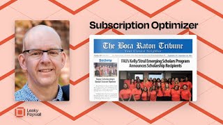
A video review by Pete Ericson offering actionable recommendations to improve Boca Raton Tribune’s subscription funnel and reader experience. Key points: reduce intrusive ad/pop-up behaviors, simplify menu and subscription plans, tighten leaky-paywall meter to encourage registration/payment earlier, improve on-article related-article placement, and optimize mobile view and subscription page flow.
Chapters
Good morning, Douglas and Philip. I'm going to run your website through a subscription optimizer protocol that we have. What I do after launch with publishers is take a look at the leaky paywall installation on the site and suggest improvements in order to help you build your email list and paid conversions. I appreciate you sending in a question about how to improve things. So I have quite a lot to share in this video. This is going to be a bit of a nurturing, focused approach. Just as a reminder now that you're really getting serious about digital subscriptions, this means that you need to take care of the reader experience when they land on your website and I'm going to help you through that. So the first thing I notice, and this is not uncommon as you have a very heavy ad based experience on the site. I understand that's where the revenue is currently coming from. Ultimately it's a balance between reader, the reader experience to generate reader revenue and to build your email list and the balance of having ads on the site. I understand that takeovers like this that you're looking at here, these kinds of pop ups are probably paying some money, but they do chip away at the nurturing aspect of the website. So let's do this. Now, I, I don't have my ad blocker running, but I just want to mention a quick thing. You do have a ad blocker detector and I was on a different machine and I noticed that as soon as I get to the website I get a pop up that says ad blocker detected. Please, please turn off your ad blocker. And absolutely what you need to do is turn off that feature. It doesn't really, it doesn't really work that well. You have about 40% plus of your readers run ad blockers and if you want to nurture and convert folks into paying subscribers, that's something that really needs to go away because it shows up on every single article. You can close it, but it's super annoying and it, it doesn't want to make you stick around, which is really the whole point of this. Try not to, try not to tick off those folks that do have ad blockers. All right, now as far as the rest of the site goes, I like the layout. This is a sort of a classic news theme. There's a lot of content here on the homepage. This all looks good. I'm going to jump into, in no particular order, we're going to talk about a few things. One is the, the menu layout. Just a quick note on that. Right now I don't have I don't see any content here until I scroll down. So if I scroll down, then the menu switches to your content categories. Now this is great, but this should be your main menu. So when I'm back at the top here, I'm looking for. There are two types of readers. There's the sort of the scanner who's scrolling down looking for something interesting and then there's the person who knows what they want. They want their. They want sports, they want business, they know they want arts. So they go to the categories. You can't find those categories here. They all eight of your major content categories need to be here in the main menu. I would push these down towards the footer and make sure that people can click to the next piece of content because that's what you want. You want people to stick on the website and click to the next article. These are really important to you. Push anything that's non content like privacy policy down into the footer and all these essentially maybe not events since that's technically part of your content. Okay, enough about the menu. I like the fact that you have a persistent subscribe button. I would add a login link here next to subscribe. That's fine. And I also noticed that. Let me hop into an article here is that you're giving away. Let's see, I'm reading one article here. And by the way, quick note this. More stories. This is. You can remove this. This is not as effective as having related stories inside the article. So the, the best way to keep readers sticky on the site is to have an insert. And there are plugins for this where you can pull in related articles, let's say from the same categories. So if I'm on sports, I'm going to get more sports articles right inside the article. This is an unnecessary pop up. So again, remove this. It makes the experience just that much nicer. All right, let's go to the next article here. And I think you're giving away two free articles before you're asking folks to register. Okay, here we go. This story is free for you. This is great. And what I would recommend is go to one free article. If you look at your analytics, you'll find that the average reader will spend 1.5 1.7 article views per visit. Which means on that second article view you really need to pop this registration. So I would adjust your the leaky paywall meter to 1 instead of 2. And then beyond this, beyond this story. And I tested this works well, just pull over. I did register and for free and log in. And then I think I read four or five more articles. Maybe this is the fifth article that then triggered the upgrade message here. That's way too many. Our most successful news publishers are running one in one and that means the meter is set to one. So I can read one article when I land without being bothered. Then I have to register in order to read the second article and then in order to read a third article I have to pay for access. Giving away four or five articles after registration. Folks just won't see this. They won't see the upgrade message. So I would tighten that up to one and maybe two free articles as a starting point and then eventually you'll tighten it down to 1 and 1. But at this point we're fine tuning so let's focus on that. Now this upgrade message here, this should be filled with the benefits of subscribing. This is a pretty cold. You must upgrade to read the rest of this content. But what if I want full. Like it doesn't tell me that I'm going to get full access to your big archive and I'm going to get on your, your newsletter. Maybe there's a, maybe there's a subscriber only email newsletter. It doesn't tell me that I'm going to get full access to anything. Any other benefits that you provide. So this is a little sparse. Need some content here and what I would do is run something like just pull up some reporter here real quick so you can take a look at this. And let's see, I'm just logged in as a free registered reader here. So I'm going to pop in here to a second article and trigger the upgrade message on this site. And you get something like this. So this is a, this is a good approach if you want to write something up. You can just model your benefits copy based on this. We're happy to install that for you if you need help. But something, something like this is a little more compelling in terms of offering reader benefits. Okay, so let's go back here. Now let's talk a little bit about your subscribe page. So let's say I'm going to, yes, I'm going to upgrade my account. Click that and it takes me here. This looks pretty good. The big thing I would focus on here is simplicity. You don't want to make your potential paid subscribers think too much because anybody that has to think about can make a decision on which plan to pick lowers their chances of actually picking a plan. So what you have here is you have your initial promo $2.99 for two months and renews for 4.99 per month. That's fine. Unlimited access to the archives. That's a good feature. Okay. E Newspaper, that's a feature. Daily newsletter, that's feature. Okay, fine. But you also have some other choices here. So this is a monthly plan. This is essential digital yearly. So that's the annual plan. This is Digital plus monthly and Digital plus yearly. Now, the Digital plus plans I believe are the addition of the E Edition now or the Flipbook version of the site. The problem with Flipbook versions is digital subscribers, generally speaking don't care about them. They don't really want them. It's not a benefit to them. So you're adding a subscription choice here that doesn't really add much value to for the digital reader. And then you have Digital plus. So you're essentially offering four plans. And it's making me think pretty hard about what I really want. Recommendation. Just include everything, including the Flipbook in your digital plan monthly and digital plan yearly. So you really should only have two plans. And that simplifies things. It will boost conversions and keep life a little bit simpler for you. Okay, so let me just check my notes here. I do want to make a mention on the. Oh, I almost forgot. When you do remove these the the let's call it subscription clutter here you will have the ability to add back a gift subscription which is a really important part of your revenue stream. You can actually set a target for about 20% of your digital subscription revenue. For gift subscriptions. They are, they are really that important but they promoting gift subscriptions around the holidays is an important piece of piece of this and you definitely want that as an option down here. Okay, last thing I want to mention is the mobile view. So if I go let's go back to your homepage here and let's just shrink this off to your mobile view. Now on a phone this looks a bit different because what it on the mobile view on the phone prioritizes the E Editions. And this is the top of this is all loaded with E Edition content that nobody really wants to read on a phone. They want to get right to these articles. So what I would do on the mobile version is maybe you have something different loading for mobile that's pulling those E Editions in there. Just remove that and let the website simply be responsive like it is here in my browser. And this is what you want. You want your latest articles to show up right at the top of the mobile view. Most of your traffic is probably on mobile. And if you. This looks good, right? You have your content, your ads are interspersed between your content. This looks. This looks really quite good. Now the other thing too about the mobile view is that the menu is not. The content menu is not available. So if I want to look for more sports content and I click on the menu, I'm getting. I'm not quite getting the content layer that I need. So what I really want is back here are these content categories right here. Now the sub menus are working too, which is great. So on the mobile view, make sure that your readers can get to these content categories. Okay, I think that's it for now. Lots of low hanging fruit here, I'd say. Bottom line, you're giving away way too much free content after free registration and try to look at the pop ups that are getting in the way of the experience. I did notice that sometimes, not all the time. When I did go to the subscribe page, I got a pop up here or a slide in or something. Make sure that on the subscribe page that it that nothing happens because you want people to convert. Let me just go hit subscribe now. Okay. And then at this point this experience is good. I'm not having any trouble here, so I hope that's helpful. Please reach out with questions. Happy to chat about this and that should help move the needle forward.
More from Pete



From Donations to Subscriptions: How KB Independent Built a Sustainable Local News Model