Pete Ericson reviews Andover News' subscription flow and recommends replacing their paywall message with Leaky Paywall's Quick Registration to boost email signups. He suggests removing redundant cards, adding a Subscribe button to the menu, and hiding confusing popups that appear after registration.
Chapters
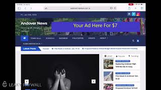
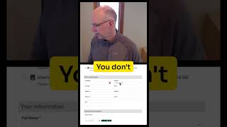
Hey Dave, it's Pete from Leaky Paywall. I thought I'd take a opportunity here to review your subscription flow. Now that you've launched LeakyPaywall on your site. The idea is to make some tweaks to what you have going on here to boost your email signups and your paid subscriptions. So let's dive in. Now I have viewed one article and then on the second article that I'm looking for, I am running into the stop here, which is the message from Leaky Paywall that says there's no content remaining. What I would recommend is instead of having this message here is I would turn this off and use the default subscription message. So the message would show up in content and you would have the ability to offer the free registration right in the message itself. So the way that would look is, and I'll show you in a second here is you would have your message just like this here, right? But we have this new extension called Quick Registration and what it will let you do is it'll let you put a short code right in this in the message box. And it would allow you to output an email address and a password field. So just two fields and then the, and then submit. And that would let you, the reader, register right in the subscription message for the free registration. Once they fill in their email address and once they fill in their password, then they'll be registered in your system at the free level and this page will reload and they will have access to this article. So that's the way to go, the pop up that I've seen before. So get rid of this. This unfortunately doesn't really give the reader much choice. They don't know what happens if they click subscribe. They don't have a login. There's just not a lot of feedback here. So I would remove this in favor of our new Quick Registration. Okay, so let's go back. The next thing I'm going to talk about are, is the actual subscription cards themselves. So if I go up to subscribe, which is up in the menu here, and I'm going to make a quick mention about this menu, what I would do is always make sure you have a subscribe in the menu as a button. So what you want to do is you'll want to make this a button and then have a login link right next to it, just a simple text link. This subscribe menu item should be styled with some color that pops to match your, your brand here. And I don't know what that color would Be maybe red or orange or something that really would make it pop. So it's always there. And then there's a plugin called User Menus which will let you hide that button if you're not using it. When someone is logged in, it would change to say my account and then the login would go away because they're already logged in. It's a free and very useful plugin. So that's a tweak I would make to them to your menu. Now once, once you get to the subscribe cards, let's click that. I'll hit subscribe. Because you're taking folks to your because you're taking folks to your free registration or you're registering them right away in the subscription message. You don't need to have this registration card here. So what I would do is simply get rid of this card here that says registered and then you would end up with just two two options. It's a little easier on the eyes. It's one less choice. Your free registration is already taken care of in the subscription message and off you go. Let's lastly take a look at what it looks like when someone actually registers for free for that limited access to your content. So I'm here and I just brought Chrome up. I've already registered on the article and I hit submit and what happened here is I am carried back to this article. It tells me thank you for registering up top. But I get this pop up that says sign up and get news about Andover. So make sure you remove this pop up because this is really confusing. I feel like oh geez, I have to fill out my email again. Didn't I just do that? Which I did and so you can just get rid of that. I'm going to close this and then now I'm back to the article that I was reading and that's great. If you look up top that you have the word admin bar up there. So there. If you check our help docs under recommended plugins you'll see that there's a plugin that will help you remove this admin bar for non admin users. So you can get rid of that. I would also recommend you install a conditional display notice extension and what that'll do is it will let you message. It will add a little header bar. I like the black bar that's up top but a little bigger and you can choose the color and then your message there should be thanks for being a reader upgrade for full access and the link to your subscription cards. And that's it. Just leave that as a persistent message up there. That's called the conditional display notice. And that is a subtle way to always tell your free registered readers that they should upgrade and pay for full access and all the other benefits. So that's it. Hope it's helpful and we'll catch you next time.