Relevant Magazine subscription setup review
Pete Ericson and Tyler review Relevant Magazine's subscription setup and identify three fixes: remove the bottom ad bar blocking the subscribe page, add free registration to capture emails, and simplify pricing tiers. They cite a 5-10% conversion rate from free to paid and reference Modern Drummer's pricing strategy as a model.
Chapters
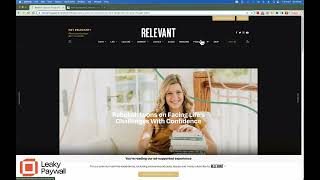
Hey Cameron, this is Pete from Leaky Paywall and I have Tyler here from Paywall Project and we like to take a look at our publishers websites after launch some time and give a little feedback in terms of what we think might help your paid subscriptions. This is a little bit of an experiment because what we decided to do today is for Tyler and I to review your site independently and then come up each come up with three things that we think are priorities for helping your group build paid subscriptions. Hey Tyler, how's it going? Hey Pete. Good, good, excellent. All right, so we're just going to dive right in again. We have not collaborated at all so it's going to be interesting to see what each of us come up with. So I'll tell you what, let me start. And I have my one, I have my one, two and three. We call this the subscription optimizer. And that's exactly what we're doing. I'm going to save my biggest one for last. So what I'm going to start with is, and if you're looking at the screen here is the footer. There's a strong call out for paying getting rid of ads in the footer that is displayed on every single page. And while I agree that you have to annoy your readers a little bit on your website to get them to act, I think that this is hurting your ability to start the relationship with your readers just quickly. You have, you have a hardcore group of readers, they're going to subscribe pretty early. You have some readers that are going to come to the site and just go away. They'll read a couple articles once in a while, they'll never pay. And then you have your, what I call them, super casual readers in the middle. That's your biggest opportunity. And the goal with those super casual readers is to start building a the relationship. And how do you do that? You don't do it by annoying them right up front with this, this ad supported experience. And what you do want to do is you want to capture their attention early on. And I guess I'll give away some of what I'm going to talk about last. And that's usually done through a free registration to really turbocharge that free list. But even on the subscribe page, if I go up here and I hit subscribe, this message presents itself on the bottom which is actually cutting off the view of your subscription cards and the gift subscription. And this by the way, I should have opened with this. But the design of this site, the sort of clean content Presentation, these subscription call outs, the features and benefits at the top. Really good. This is really nice looking site. I think the challenge here is just to is to tweak the messaging and the flow so you can create that that seamless relationship with those super casual readers and turn turning them into subscribers. So I will just open with my number one as let's remove this. We're going to to show you a better way to slightly annoy your readers to actually build a relationship. But that's my number one is to get rid of this. This, you know, absolutely should go away on the subscription page because it's getting in the way of that and okay, that's it. That's my number one. Yeah. Tyler, over to you.
Yeah, that was also on my list. I noticed the bar at the bottom and then I also noticed it when you get into the subscribe card page which is a little too much. People are already here, they're already thinking about subscribing and we don't want to hide that that information with additional offers. And even the offer that I'm seeing, I'm not quite sure is the 2:50amonth like yearly plan.
Maybe.
So in any case just move the bar at the bottom, maybe remove that from the site entirely and then yes, my other Pete mentioned it feedback would be a free registration setup. There's. This is doing two things at once but I noticed that there's a lot of free content. I don't know how many times I went through different articles and never got prompted with anything other than the bottom bar that you have.
Right.
And I think you can do better by having a free registration. Just ask for an email. Even if you you're not really into making people pay for content, at least ask them to sign up for free and that gets them on your newsletter. That gets them registered inside of leaky paywall and WordPress. And when the time comes they'll be able to pay for your content for that ad. Free experience if that's what you're going after.
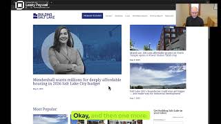
I totally agree that that is the point of friction that you want to focus on is the free registration. Here's how it plays out on T Journey. If I go here and I'm reading this article, I think they only give away one article before asking for to register, which I would recommend doing. And then here we have a new feature called Quick Register. So they're asking for an email address, a password. You hit register and that logs the person in and gets them access to this article. And this messaging works quite well. Read because that's the motivation of the casual readers. They want to read the article. So yes, the free registration, it's really critical. It is. We've been working with quite a lot a number of publishers getting free registration set up on their sites. It's night and day. What'll happen is if you know right now, like Tyler said, I read 10 articles but the site didn't tell me to do anything. So I just read my 10 articles and went away. But if you had stopped me at the first, after the first article and then said, hey, keep reading. If you register and I'd recommend offering your maybe three articles a month, I would call it a few. Publish a few free articles plus your newsletter, which is a value in order to register. What you'll see is you'll see these, that little piece of friction there will start bringing in free registered subscribers and then those will shoot those to your newsletter. It'll grow your newsletter and then what you'll find down the road is you'll find actually a ratio between your free registrations that are coming in and the ones that convert to paid subscriptions and there's 5 to 10%. Some publications are higher, much higher, some are lower. But 5 to 10 is pretty average in terms of conversion over time. Sometimes it happens right away. Usually it takes a few months for that to happen. So yes, that if you do one thing today or tomorrow would be to set up the free registration offer a little bit of a benefit that starts the relationship that takes that super casual reader from Google or from a social share. They say yeah, free is good. They'll register and then that'll get em into your newsletter. Your newsletter pushes them back to read more content and then they'll get the upgrade message after a few extra articles to subscribe. Bingo. All right, that's one and two. I'll jump in with my number three, my third one which is pricing. So let me go back to the website here. And by the way, just before I forget, so you have your subscribe button and login button. Make this login a link. The subscribe is great. That should always be a button. Buttons convert better than text links. So make the login a text link and that'll give it a little differentiation from the subscribe. And I see you have, I see you have get relevant here, but let's go talk about pricing real quick. The data on pricing is pretty interesting. The simpler you can make things, the better. Now you have three choices. That's great. We are, we as humans are conditioned in threes three is a good amount of choices. But what's working even better is you have. If you slim it down to one choice, maybe you can't do it. I realize you have a print the product as well as digital, but what I'm looking at here, If I look at 3.99per month and then I look at 29.99 per year and I'm not sure if this is print or digital. By the way, at first thought this was print only, but I wasn't really sure. Clarify what, what annual means. Is it annual digital or is it annual print and then premium annual? Does feel like I get print and digital. Oh yeah, here it is. Print, digital and then most popular. Just clarify what that is. But you're making me do math. So I'm looking at 60 bucks a year versus 30. What's the difference? What do I not get here? And then four bucks a month. That's digital only. I think I get that what's working is not making readers do math. I would, if it were me, I would have your a digital only subscription for 59.99 and I would have a print and Digital subscription for 59.99. Same price, same different delivery method. Readership is split. Some people want print. That's really all they're interested in. They'll pay for the print. Some people don't want print, they don't want paper laying around. So they want digital. And your content is your content, whether it's in digital, whether it's in print, it's the value is in the content we have. I've talked to a publisher recently who was thinking about doing a print publisher who's doing a print and digital single option with an opt out of print afterwards. So if I actually did not want paper in my house, then I could do that. Gift subscription's great. This is great. Nice clear call out for the gift subscription. So those are my. Those are. That's my thought on pricing.
Yeah, I like that. It reminds me of we had a publisher. I can't remember who it was. Maybe you know who it was, Pete that did a similar pricing strategy and found that people were. Oh actually paying more for not having the print delivered to the house.
Yeah, yeah, that. Okay. So that was actually Modern Drummer magazine. So if you, if they're not doing it anymore, in fact not sure what they're up to these days. But what they did is when we launched with them years ago, they set their digital price higher than their print and digital price. So their print digital annual was 30 bucks and their digital only annual was 60 bucks. Which you think that is insane. Why would you do that? They needed more revenue on the digital side because the ads carried the print side for them. And I'll put it this way, over 10% of their subscriber base paid for paid more for digital subscriptions just to not have paper in their house. Which blew everybody's mind. But they did it. But today really the strategy is focused around simplicity and keeping pricing the same regardless of delivery method. Yeah. Yeah, that was a pretty, pretty interesting one. All right. Hey Tyler, anything else you want to.
No, I think of all just my three points were just a bit too generous on the number of articles.
Yep.
Not having a free option sign up registration and removing that bar at the bottom. If anything just if you want to keep it elsewhere, just make sure to remove it from here at least at the very least. So that when people do come to hear they're not trying to calculate. Because now after seeing it now I do realize that the 250amonth is your annual plan would be the math shakes out to 250. Just adding that bar I think hammers your point home. Pete on there's too much calculation that people have to do and less is more for sure.
Yeah. And that free registration that'll pre populate your checkout. When someone's actually ready to pay, then it's a little extra bonus. All right, that's it for today then. Hope. Hope that's helpful. Please reach out if you want to talk about this or other strategies. Always happy to chat and Tyler, thanks and we'll catch you next time. See up.
More from Pete



From Donations to Subscriptions: How KB Independent Built a Sustainable Local News Model