Seven ways to make your website publication more reader-friendly.
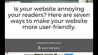
Pete Ericson and Tyler Channel walk through seven fixes for publisher websites: cut pop-ups, use ad space to pitch subscriptions, limit subscription options to one or three choices, strip distractions from checkout pages, speed up your site, and ditch browser push notifications for email instead.
Chapters
Welcome to the Paywall Podcast. This is episode number 30. I am here again with Tyler Channel from the Paywall Project. Welcome, Tyler.
Hello. Hello.
Today we are going to talk about the fact that your website is annoying your readers. It is, I promise. Now, you might have just redesigned your website and it's beautiful. And I have seen some very beautiful websites recently, but I'm going to bet for the most part, you, the publisher, have not looked at your site in a while, have not experienced your site in a while, and you quite possibly have been adding features to your website over the last couple of years that makes it look a little bit like the kitchen sink. Website clutter is something that we all deal with. Our businesses change, our publications change, and we add new functions, we add new features, we add new ads, we add all sorts of new things, but we don't step back to take a look at what we're actually doing to the reader experience. So what we're going to do here is we're going to talk about seven things you can do to make your website more. What's the right word? Smooth.
Less annoying.
Less annoying. Right? Stop it. And have a. And have really a better reader experience. You're in the business of taking digital subscriptions. That means you're. When somebody lands on your website, you're asking them ultimately to pay.
Right.
And your goal is step one, get them to register for. For free on your site, to get on your newsletter to give them a little extra content to capture that email address. We talk about it all the time. We talk about. We'll never stop talking about it because it works. So you're going to grab that email address and you're going to start sending folks back to your website with your newsletter and then goal. The main goal, of course, is to convert those on your newsletter and others to paid subscribers. So you are in a premium experience business. Now, if you are taking payments for content, you need to offer a premium experience, a clean, smooth, integrated, seamless experience for your readers. And we look at a lot of websites that fall down on this, but the truth is very little. It takes very little to clean up. So we're going to run you through these seven things that you can do to clean up the experience and boost your conversions. All right, what do you think, Tyler? Should we do it?
Let's do it. Let's start from the bottom.
Okay, here we go. So we're going to talk about seven things. The last two are the most important. So we're going to save those till last because you know what we're going to tease you a little bit. Yeah, don't skip ahead, but let's get right to it. Okay. We're looking at the registry. This is a very successful publication in the San Francisco and Elk Los Angeles area. They know real estate in this region. They publish it. They have a huge mailing list. They have leaky paywall running. They've been running leaky paywall for about five years now and doing quite well. But yet there's loads of opportunities here. So we're gonna, we're gonna pick a little bit on, on the registry. I'm gonna jump right to one topic, which is the hot topic, and that's pop up ads. Advertising in general. I'm not gonna get into it too deep. You have, it's the thing you have to have, right. You have revenue from advertising on your site. If I say something like remove your pop up ads, then you know people are going to come after me with a knife.
Right. It.
Because I'm removing income from the website. But yeah, pop up ads are annoying. You are, you are essentially looking for subscription dollars which have a much higher value than ad clicks by a thousand to one.
Right.
The average user needs to click on an ad a thousand times in order to pay for, to, to equate monetarily what a paid subscription would generate for a publication. And you're going to have ads. And if you look at this website, there are ads interspersed. It's not too terrible. They do a pretty decent job of not completely horrifying you with ads. And so it's, I'd say it's probably a decent example of not crossing the line, getting to the line, but not crossing it with advertising. It's quite a lot in content up in the header. If you look on mobile, it's there as well. But it won't send you screaming. It's close, but it won't send you screaming. So not bad. One thing I will say though is why not take one of your ad zones and promote your subscriptions, right? This is something I don't see. This is, I don't see it happening very often sometimes. But you have, you have room in content. You have room like in a header bar, footer bar. Why not promote subscriptions, get the benefits out there, get people interested or at least promote a free registration, which you should be doing.
Okay. And the value is super high. When people do click on your ads and they go right to subscribe, they pay for it. Whereas a traditional banner ad might take you, like you said, thousands of views and Clicks to make any money from it. Your in house ads can certainly drive revenue a lot faster with a lot less effort.
Yeah, that's right. The revenue is there for subscriptions by a long shot. Last thing I want to say about pop ups or slide ins or whatever flavor of ad you're using and the registry does lots of slide ins up top and at the bottom is don't make users play whack a mole on your slide ins and pop ups. So if I close a pop up, it means I don't want to see it. I go to the next article, I get another one, I got to close that one. I go to the next article, I gotta close it another. You're making me work. I'm sweating trying to close pop ups. You have premium content, you're selling premium paid subscriptions. Whack a mole is not the goal here. So if you're go to your website, click around your articles, are you constantly doing the work of having to constantly click and close things? So I would say display your ads in a way that they're not closable, they're just in content and they're just in sidebars and they're just part of the content experience. When you're sliding things in and popping things up and you're making your readers close things, they'll get real tired real fast and they'll go away. Okay, enough about necessary evil. That was the word I was looking for, but yes. Okay, subscription cards. This is. I'm gonna click take a look at subscription cards. Too many subscription cards. So publishers can have a lot of products, that's fine. But look at the New York Times. You, when it's time to pay, they give you one option. They have a lot of products.
Yeah. If you didn't know any better, you would think that they only had one plan. At the New York Times when you go to sign up, you actually wouldn't realize that they have a lot.
Yeah, they're pushing game subscriptions right now. You know, they bought wordle and, and they have, they have all sorts of. Of course the crossword was the original and several other games, but they don't hit you with that until down, down the road. Once you become a on the site and you show that you're. That that's where your interest lies. But let's talk about options here. So I was chatting with the publisher yesterday about subscription options and they agreed. Yeah, we have a lot of cards here. There's a lot to look at and they have a weak access for the PR types that need a. A quick view into their premium content. But they're not gonna be long term subscribers.
They're more in the.
This is a B2B publication. They have quarterly subscriptions, which is popular. They have an annual subscription, which is a duplicate, but it's annual instead of quarterly subscription. And then they have our multipass installed. So it's three websites. You can buy one subscription and access all three websites through the multipass. So that's cool. So you have a lot of things happening here.
So.
So if you can't just do one paid subscription, which would be the ideal, not making subscribers think, go to the classic three options model. Right. So you have three cards. So in their case it might be the annual, quarterly just sits on one card and then the person can choose. Or you just stick with quarterly or stick with annual. The one week access. Make that a text link below the cards for the PR types that need a quick access. So now you're a multi pass. Maybe your quarterly or annual and lifetime subscription might be your three choices and that's it. And then if you have corporate subscriptions, that goes.
Goes.
Get in touch. That goes underneath the cards. Right. You have this 1 week quick access for a specific reader segment.
Great.
Make it a link below that and put your most popular card in the middle. Make it a large card. Clean it up. So that's the card layout. Now what else do we need to do on this page?
Tyler, I am seeing some advertising over there on the right catching my attention. Perhaps we could remove that just so we're not distracting our potential subscribers. Not only are we giving them a lot of options, we're also displaying ads that might cause them to go somewhere else. Unless you're getting paid $50 or $40 for that ad. When people click. We want to take that ad off of there.
Yeah, it's all the funnel.
Right.
You have a subscription funnel now that you're taking paid subscriptions. And if you're interrupting the journey in this funnel, then you're going to send people away instead of paying you.
Yeah. And the same goes for like your menu bar and other places. If you can remove. If you have a developer or someone who knows how to do that, remove the menu bar for your subscribe page, take out things, remove distractions and send people directly to what you're trying to get them to do. And in this case it's subscribe.
That's right. So no menu subscription options. Three of them in this case. Or one if you. If you can get away with it.
Yeah. If you can stomach one, please do that.
Yes. Yeah. Ads down the side, ad on the bottom.
So they're everywhere.
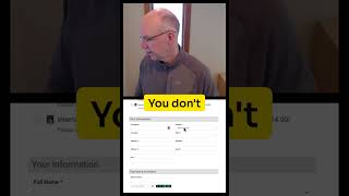
So I'm going to click into a quarterly subscription and now I'm on the registration page. Same deal.
Right.
We have ads running down the side.
Yeah.
When we really want people to not be distracted and to fill out this form. So what I would do, all it.
Would take is one mishap of the mouse in this case and you'd be gone.
Yeah. We were looking at a site that had a two column layout similar to this, but instead of ads they actually had the benefits of subscribing.
Yeah, yeah, yeah.
If you. I forget who that was, but yeah.
Yeah, it's simple. A full page and a column in the blocks and put the short codes in and boom. That's right.
Yep. If you're using blocks, just use, use a two column block. Have one, the registration form in one block and have your benefits in the other block. And that cleans it up and it sells. It sells. Why I should subscribe through the whole funnel, the whole experience that the reader's coming through.
Cool.
All right, so that's that. Let's talk a little bit about. And here's another, another quick thing that annoys readers. We hear it all the time. I actually, it wasn't that long ago when publisher said, hey, my, my readers don't know how to log in. Simple thing. How do I get into the, to the website. And they had like they have here the My account link is visible. And yeah, if you click on my account it's going to ask you to log in. But people don't know that. Not everyone knows that. True readers don't know that. So there are really two things you want the casual visitor that's not logged in to see. One is the login link. Very important, simple and important. And the second is the big subscribe button.
Right.
You want your subscribe button in your menu. So you have the two choices, I'm an existing subscriber, I log in or I maybe I want to subscribe down the road and I just click the subscribe button. I don't have to look for it. And buttons, as we know they increase conversions.
No.
Now how do we, what do we do when somebody actually does log in or actually does subscribe? What do we do with them.
When they log in?
What happens to menu when they log in? Does it change?
Yeah, for sure. Yeah. So if you've got a login or sign in, we, we want to show my account. Maybe we want to show a subscribe button, perhaps that goes to a particular subscription level. You could do that through the conditional display. But yeah, you want the experience to be customized a bit for the user, whether they're logged in or not. And showing them different options based on that.
Exactly. Yep. So there's a plugin you can use for WordPress called user.
User Menus.
User menus. That's a good one. It's free. You can install it and you can then change the menu based on the login state. Basically, you set it so that if you're not logged in, you have the login link and you have the subscribe button. And if you're logged in, you have the My account. At the very least, just the My account showing. So that's it. Super simple. You'll stop annoying your readers and.
Yep. And they'll finally figure out how to log in and stop annoying you.
Okay, so that's the navigation. That's a quick one. Let's talk about browser notifications. This one we won't spend too much time on, but I am impressed by the amount of browser notifications that I'm still getting. It's less than it used to be. I think it's dropping. Yeah, but they are something like one more thing you have to whack them all on to. To drop. The one thing I will say about that is what's going to be more important to you as a publisher or somebody who signs up to be notified through their browser or somebody who gives you their email address. So the email address is your direct marketing tool of choice. It's really the only one you have unless you have apps and, and app notifications. You can also set up SMS notifications. That gets a little more complicated. But the email everyone has and, and it works. Your newsletter is your sales tool for your content to get people to subscribe. So the browser notification says, hey, it's taking that reader down a path that you probably don't really want them. Yeah, okay. They set up to be notified. That's fine. But it's annoying to the rest. And how, you know, if you guys have some experience of browser notifications actually working really well for your publication, I'd love to hear it. I've been asking that question. I haven't heard any good, positive, tentative feedback on it.
Yeah, yeah. If you're thinking browser notifications, just. And if you have money to do this, just get an app instead. If that's what your concern is like being able to reach people. But in that notification like way, the browser at least for me. And I can't speak for everybody else, but it's. It is a game of whack a mole and stop invading my privacy. I don't want to be notified. That's what happens to me.
That's good. Get an app. Yeah, yeah, for sure. Yeah. And you can. We have a integration now with mobile out and it's cheap. It's 200 bucks a month. And you get apps, iOS and Android apps integrated with WordPress and leaky paywall and notifications. So you can provide an even better reader experience through that, which is what it's all about. Not annoying your readers. Better reader experience, more subscribers and that becomes a benefit. Okay, let's stop with browser notifications. Check your website on mobile. You mentioned Tyler, you mentioned this earlier, but it's probably been a while since you've been on your own website on mobile. Make sure I've seen like menu, hamburger. Menus get hidden by ads or banners that show up in block a third or more of the screen and you can't read the content and it's just infuriating and somebody's really mad at the website. What's their chance of paying for a subscription or even registering for your newsletter?
Yep. Check it out. Make sure if you're. Especially if you're in the market for a new theme or something like that before you purchase a new theme for your site. Check it out on mobile, see what it looks like. Make sure it's a good experience before you make the leap. I think all too often we look at the desktop, look at this beautiful presentation of what the site looks like. But in reality, only about less than half of your audience will see your desktop version on average, maybe even lower than that. Yeah.
So this is actually one of the most important things to do to check out the kitchen, the. The annoying kitchen clutter, you know. Okay, last one. Promise this is going to be pretty. The last one, the worst offender, the most annoying thing that you can do to your readers. Drum roll please. Is to run a slow website. This is. You can just. You can read. There are. There's reams of articles about what a slow website does to readership. It sends them away. If you're not. If your website's not loading in a couple seconds, forget it, you've lost your reader. And of course, the culprits typically to slow websites are third party systems like ad networks, like social networks, things that have to come in from the outside if you're not compressing your images. There is. You can automate Image compression. You can recompress all your images in WordPress with. With easy tools, you can do lots of things to speed up your site. Talk to your hosting provider, see what they say. Caching, of course.
Probably the biggest thing you could do when implemented properly. You can. You can recite. Will fly regardless of the host in many cases. Yep, that's a big one.
Yeah. And so not only are we not patient with slow sites, which will hamper your ability to grab email registrations and pay subscriptions, but Google won't rank your content as well either. And that's a huge part of Google's algorithm is PageSpeed. So you've got to get it right. It's so important if you have a slow website. If you're waiting for anything, you're suffering on all fronts. The user experience, your Google search, that impacts sharing. It impacts everything. Subscription.
Yeah. One last point too. If you have someone who's techie on your team and you're serious about subscriptions, get a vps, get a dedicated server, get a proper hosting that's dedicated to you and not on a shared environment, and fine tune the system. Do what you need to do.
You'll get your money back so fast.
Oh, you will. I know a hundred bucks a month might sound like a lot for a dedicated VPS or dedicated server, but the benefits are it's super fast. There's no noise, you don't compete with other sites, and it's just a better experience for the end user.
Yeah. And you can scan and they're easy to scale up as you grow. Okay, so those are seven ways to clean up your kitchen sink of a website and not annoy your readers. In order to build paid subscriptions. Build email list. If 1. If you do implement one of those seven, you're winning. See if you can do. See if you can do one a week. Challenge yourself. Get that website tuned up. You're in the premium content business. You need a premium content experience on the site, all departments. And these are easy things. You don't have to redesign your website. This is really just a cleanup. Don't worry about your design so much. This is Tyler. I know you preach this all the time. Don't get hung up on your design, but do get hung up on those annoyances that really affect the reader experience.
Yep. Yeah, people care. People care about that. And like we were talking about off the podcast, people care about the content. So make it easy for them to get to that content. Don't make them fight for it. Make it easy.
That's right, all right. That's it. Go to work. Thanks.
Holiday challenge.
Yeah, exactly.
Right.
Exactly.
All right, see you.
See ya.
More from Pete


From Donations to Subscriptions: How KB Independent Built a Sustainable Local News Model