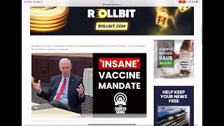
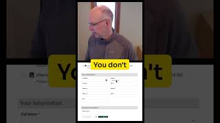
Pete Ericson from Leaky Paywall reviews The Counter Signal website (video dated Feb 7, 2023). He navigates the site as a casual reader, demonstrates the current leaky paywall (one free article then a prompt to register or subscribe), and gives actionable suggestions to increase email signups and paid conversions. Key recommendations: make the gate text match branding and list benefits, use a single clear CTA/button on the gate, split registration/subscription pages into two columns with benefits listed alongside the form, use bullets for scannability, adjust CSS to match brand, convert newsletter delivery into free vs paid tags (e.g., Mailchimp) and use WordPress plugins (user menu) to improve account UX.
Chapters
Hey Kian, this is Pete from Leaky Paywall and I'm checking out your great looking website here and thought I would give you a little bit of feedback on your Leaky paywall installation. What I like to do after Leaky Paywall is launched is take a look through publishers sites and see if I can offer some easy to implement advice to help you get email signed up to your newsletter and paid subscribers through the door. So let's just jump right into it. First of all, great clean layout. You obviously put some time into this. The brand looks good, the colors are great, everything's nice. On the eyes I love the subscribe button. Up in the top right you have a convenient login button. Hopefully once I log in, the button turns into a My Account button, which you can easily do with the user menu plugin for WordPress. And I also like to look at websites from the eyes of the reader, so the casual reader that might land on your website and have an experience with you and which really is the start of your relationship with the reader. So let's just jump into your first article here. And I've been here before, so I know that I get to read this article. I get one free article before I have to pay or register in your case and so I'll just hop into another one and then on the second article I get stopped and I see the subscription message here. Read this article for free. I can make a free account or I can also subscribe for unlimited articles. This is a piece here that you can probably work on doing just a little design work too to make it match your brand. I would add some benefits in here. I know you have a newsletter, so include that if you register you'll get access to this article and you'll get a few extra articles per month plus our newsletter, something like that. Use a button. This is really important at this stage of the relationship with your reader. I would recommend just having a button that says register for free and it's the only button in here and it gets them right to the free registration page. BUTTONS INCREASE CLICKS okay, so now on this free registration page, what's great, I love that you're just focused on capturing the information here for that new free registered user. Only thing I would suggest is to split this page into two columns and you have your registration form here in the left column. That's great. And on the right you end up with benefits like bullet points for benefits. Right. And you would have. So if I register, what am I going to get? So in other words, I Might just stare at this form and say oh, I don't really want to do this right now but if you have some benefits listed I might. I'll read them, I'll take a look and I'll say oh, I'll get the newsletter and I'll get a few free articles each month and else you do to help make your readers lives better and so work. And that's just a. You can in blocks. It's just two column block in WordPress. Boom. Done. Easy. Now that also works for your subscription page. So if I click subscribe the button here. Again, I love the fact that there's one option. It's simple. You're not making me do math. I have one choice. That's it. Again, just go here. And do the same thing. Just your benefits and your subscription. And take this. Take the opportunity to just have your developer do a. A little. Just do a little CSS here and get this to match your brand a little bit more. Newsroom Insiders gain unlimited access to all stories and newsletter content on the counter signal. So I would suggest maybe some bullets here instead of something I have to read because we love to scan bullets. So Newsroom Insider, you get unlimited access to all your great story. Second bullet, you get the news. And I would suggest calling it a. Call it a premium newsletter. Maybe there's no advertising on it. Maybe that's a full text newsletter. The lawyer I don't have to click to go to the website. It's super easy to do. You can use mailchimp or anything else. You just send the free tag to the free registered users. They get the free newsletter and then you say send the paid tag to the that tags the paid subscribers and they get the quote unquote premium newsletter. And that can be right here. Okay, so that was a little more than I thought I'd get into, but I think that's helpful. So hopefully you find this helpful. Just a quick little overview. Happy to chat if you want to take it to the next level and see what we can figure out. Hope things are going well.