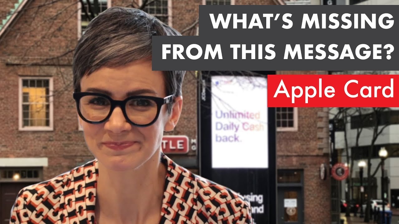
Tamsen Webster breaks down an Apple Card billboard in Boston, showing how its message order and low contrast undermine the pitch. Moving "unlimited daily cash back" to the end and boosting contrast would make the ad work harder from a distance.
Chapters
In the continuing saga of finding what's missing from messages out in the wild, it's another advertisement, and this time for the Apple Card. What's missing from that message? Hmm. A proper order that leaves us with the message that Apple wants us to have. I'm Tamsen Webster of TamsenWebster.com, and that's what we're talking about on this episode of What's Missing from This Message. The other day I was walking around downtown Boston when I happened to spy this outdoor advertisement, probably 50 feet away. And what caught my eye was the fact that they were spending a lot of time and effort. The message that was super clear was the message on the bottom of this ad that there was confusing points and rewards. And from a distance, I couldn't tell what the ad was for. And so I thought to myself, well, that's kind of weird that they'd be advertising confusing points and rewards. What's going on here? Because it seems like something might just be missing from this message. So I went to take a closer look. Now, if we go and take a closer look, then we see that, oh, it's an ad for Apple Card. And let's look at how it's laid out. So up in the upper left, it says Apple Card, kind of a rainbow font. And then it says unlimited daily cash back. Rainbows, white light. Yay! Positive benefit. And then down in the dark blackness of the thing below, it says confusing points and reward, not Apple Card. Now, at heart, this is a really good message. And so as always, what I'm trying to do is figure out how do we make a good message stronger? And full disclosure, I'm not a graphic designer, but I do know a thing or two about how people, or at least I, read information when it's on a sign. And something about how humans more broadly tend to remember things in general. Now, I as a human tend to read top to bottom on something like this. So if we read this ad top to bottom, which starts with Apple Card Unlimited Daily Cash Back, Confusing Points and Rewards, Not Apple Card. Okay, so it works fairly well, but at the same time it means that we're ending on a message that isn't associated with the brand. And I'm not sure that that's the best thing to do. And here's why. Because where the research backs me up on this is something called the peak-end effect, that we tend to remember the things that give us emotional peaks and what we remember last. Another thing that backs this up is something called recency bias. You're going to remember best and favor those things that you heard or read or saw most recently. So from that point alone, the One thing I think that would make this particular message stronger is to simply flip the order of these two. So the last thing that we're reading is actually something associated with the brand. We're saying confusing points and rewards, but unlimited daily cash back. So we're contrasting that. Not Apple Card, you get confusing points and rewards. That's at the top. And then, but at Apple Card, you get unlimited daily cash back. Just that little flip makes that intention actually come through. Now, again, not a graphic designer, but the other thing that I would fault this, this message for is the contrast, or actually the lack of contrast, and how that does or doesn't help this message. So we also want to make sure that wherever somebody sees a message, it's not just hearing a message, but sees a message that even when they scan it, that the message comes through clearly. But go back, let's go back and look at what that thing looked like, you know, 50, 100 feet away. It's actually really hard to read that top part where it says unlimited daily cash back. The thing that's really easy to read, however, is confusing points and rewards. Now I know some folks would probably say, well, if people were intrigued or potentially confused or curious, maybe they would go forward and look for it. Okay, folks, I think I'm pretty much the only person that's like, hmm, let me explore why this thing doesn't make sense. And I'm sure I'm not the only one, but the average person passing on the street is probably going to go, mm, doesn't make sense to me, and keep walking. So be thoughtful when you are putting your messages together, even a simple one like this, about two things: order and visibility. And remember, visibility can happen with what you say as well. You can set something apart with not only where you put it and what you say, last, for instance, but you can also set it apart with the contrast that you put around it. So, for instance, you're not gonna listen to something I'm saying when it's in the middle of a major point like this. I just gave you a major point and I kept on running and da-da-da-da-da. But if I stop and I'm talking and I'm giving you this normal thing and I'm like, but this, this is a major point, and then I can keep going to something else, you're gonna hear and feel that difference. So to me, that's the auditory equivalent of giving something visual contrast. So there wasn't really much missing from the intent of this message, but in the delivery of this particular message, even though it was visual, there's a lot that we can do, or at least two simple things we can do to make it much, much stronger. Change the order and put the contrast where you want it to be. Make the message that people see the one that you want them to remember. And that's true for what they hear too. That's this week's episode of What's Missing from This Message. I'm Tamsen Webster of TamsenWebster.com. If you enjoyed this episode and the others like it, feel free to like and subscribe. And if you want your own message reviewed this way, or if you spot one in the wild that you want me to take a look at, send it to redthreadme@TamsenWebster.com.