In this demo video, Alden Morris showcases LiquorChat’s new AI‑powered analytics feature that can generate industry‑leading sales reports without any POS or technology upgrades. By feeding the system with basic data—customers, orders, and products—the AI can answer simple queries such as the top 10 products, top 10 customers, and the busiest day of the week. The system fetches the required information in real time, synthesizes it, and presents the results in easy‑to‑digest visual formats like sparklines, bar charts, and pie charts. Morris emphasizes the focus on visual clarity and the ability to quickly understand key performance metrics. The feature is currently in beta with a limited set of merchants, and the team is preparing for a broader public release.
Chapters
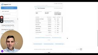
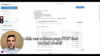
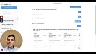
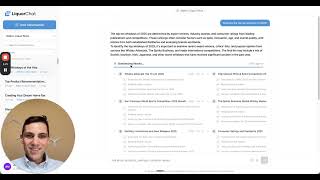
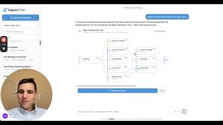
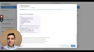
What if I told you you could get industry-leading analytics reporting XYZ without needing to upgrade your POS or any of your other tech? So that's what we're doing at LiquorChat. Really excited to be releasing just overall our advanced analytics with— once we have your customers, orders, and products, you can do really cool things like, what are my top 10 products? Again, super simple, easy question, but let's not get ahead of ourselves. So if you wanted, you can look at, you cannot look at what's going on in the background, fetching all the information, our little agentic flow going here, synthesizing everything together. And again, our big thing is always showing just really to digest, easy to digest information. And then we can do something like, who are my top 10 customers? Again, on the products, the, uh, the usual suspects in this particular case, Tips, which is going into third-party delivery vendors. Again, you can see what it's doing in real time, which is, which is pretty cool. And then you can see the top customers here. And then let's try something else. What's our busiest day? So this is going to go into orders over the time of day over a period. And it's going to fetch for us by the days of the week. And again, our biggest thing is always just how can we make it visually pleasing? How can we make it visually just easier to understand? So we have just dynamic, the ability to do sparklines, charts, graphs, pie charts, XYZ. So that's really cool. And we're testing the bounds of this. Right now it's available to our beta testers with some of our merchants. So we're, pushing to see how this goes and really excited for this to go live for everyone.