30-minute Challenge vs. Real Design Process: Which One Wins?
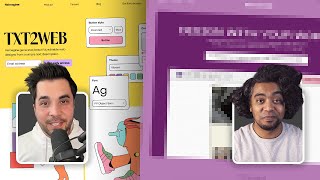
Dan Mall critiques the Reloom Design League's 30-minute landing-page challenge as a poor reflection of real client work. He walks through how he'd redesign the AI tool Reimagine with strategy and polish instead of speed, comparing his rushed comp to teammate Tommy Gioko's approach.
Chapters
One of the things that bothered me a little bit about it though is seeing in the comments of the live stream people saying it's so cool to see the process of these designers and see how they actually design. This is not at all how I design. It's a competition of speed, not necessarily a competition of good design. So one of the things that I thought would be interesting is to do the Reloom Design League challenge again, just removing the 30 minute time limit. I had a chance to participate in the Reloom Design League challenge where I went head to head against another designer, my friend Tommy Gioko, to design a landing page live in 30 minutes. It was a ton of fun. Hats off to the Reloom folks for putting together something so fun and exciting for the design community. One of the things that bothered me a little bit about it though is seeing in the comments of the live stream as some of the other competitors were going, people saying it's so cool to see the process of these designers and see how they actually design. I want to make one thing clear. This is not at all how I design, and I would wager that this is not at all how the other competitors design too. This is a competition. It's a competition of speed, not necessarily a competition of good design or design that serves a particular purpose for a client or for a customer or anything like that. Creating a design that serves a particular purpose and finishing a design in 30 minutes and being as complete as possible aren't necessarily the same thing. So one of the things that I thought would be interesting is to do the Reloom Design League challenge again, but just remove the third 30 minute limit from this challenge, I think it'd be a lot closer to what I would actually do for a client or a customer. In trying to design something that's not as fast as possible or as complete as possible, but actually serves the particular challenge. I'll take the same assumptions as the actual design challenge itself, which is that the wireframe that the Reloom folks provided to us is the wireframe that is approved content. I'm going to assume that there is research to back up all the things that are in there. And really my job would be to make design decisions that support the actual goals of the page or the site or the actual product. So let me walk you through what Tommy and I originally did. This is the arena that we competed in, where his design was over here on the left and my design was over here on the right. If you haven't seen that video yet, if you haven't watched the original. I highly recommend you watch that first to give you some context into what the competition is and what we actually did. I'll put a link right here so that you can go and watch that video in its entirety before you watch this one. So this is the arena. This is the stuff that we came up with. The prompt, the brief here was to design a landing page in 30 minutes for an AI design tool in the style of a colorful and illustrative art direction. So Tommy came up with this stuff over here, I came up with my stuff over here. I'll walk you through my design here. And really, just to be clear about it, my strategy was just to finish. So. So I wasn't necessarily working on something that was well designed. Honestly, I wasn't even working on anything that made sense. I was really just trying to finish and make sure that I finished all of the elements on the page. So the challenge was that the reloom folks gave us a wireframe, the same wireframe, and we were to reinterpret that wireframe in the style of colorful and illustrative. So this was mine, and we had a bunch of assets given to us. We have a mood board here with lots of different samples and images of websites and other things that we could use as inspiration and influence in the work that we did. We also got a bunch of different product assets. So here we had some screenshots of tools that were actually custom designed for this match. We have some UI elements over here. We have some photos and photo assets that we could use. And then even cooler, we actually had some custom illustrations that are all vector, all vector based and actually individual here can be kind of broken apart and modified. And so we had all these really great illustrations and assets to work with. So I'll kind of walk through my design here. And like I said, my goal was really just to finish this. So what I did was I just went down the page from a wireframe standpoint and tried to design the easiest, most familiar versions of of the things that I knew how to design. I was really relying on what I had in my bag of tricks, what I've designed plenty of times before, what I've seen and what was very familiar to me so that I could design it very quickly. If I was designing this for a real client or for this actual application, I would approach this totally differently because I wouldn't have the pressure of time to figure out what to do. It wouldn't be like trying to make a decision very quickly and then stick with it. I think a lot of the process of design is making decisions, seeing how they look, seeing how they feel against other decisions, and then modifying and revising from there. That that 30 minute challenge just removes all of the revision part of it, which I think is a really big part of the design process. The same thing is true of Tommy's. If I kind of walk through Tommy's version, slide over here to the other side of this, you know, Tommy had. I was working with a lot of the same elements. He had a slightly different art direction than mine. While mine was on this kind of yellow background page background, Tommy had his on white. And he was really playing a lot with these blobs as a way to create some visual interest on the page. And again, same thing for Tommy. I can't speak for him or what he was thinking, but a lot of this was really just to finish, to find a quick style that could look good and, and just complete all of the elements on the page. How would I do this differently if this was something that I was doing for a client? Well, let's look at the wireframe and let's start there. The brief here is to create a landing page for an AI design tool called Reimagine. And so the. One of the first things that I would do, and I'm making some assumptions here, the research has been done to. To really reflect that this is the proper content and that will compel users and compel the audience that this product is designed for. So I'm not going to question those as much as if we were starting a project from scratch. I'm going to sort of take that for granted. And I'm also going to try and use all of the other constraints and requirements of the Reloom Design League challenge, except for the timeframe. Otherwise, I'm gonna try to use the same assets, I'm gonna try to use the same theme style, you know, colorful and illustrative, but just removing that time constraint instead. What I would think about first is what is the most compelling way for me to promote this product. This is a landing page. That's the job of this landing page is to get people to sign up for early access for this tool. So I wanna try to put as much as I can on this page to get people to sign up for early access. So let's go down this wireframe and see what else is here. So over here we've got some promotional sections like Generate Web Design Concepts in Seconds and then conceivably some image that helps illustrate that Idea copy designs or to figma or export as png. And again, some illustration that accompanies that idea, of course, some examples. So showing some examples of a particular prompt that you might put in and then as some, a carousel or a slider that allows you to cycle between different prompts. And so if I abstract this and zoom out from this, the idea behind this is that we really just want to show this product in action. So I assume the research says that that's something that compels people to want to use this app or sign up for early access. Some testimonials here. So we've got a testimonial from Johnny that says Remagen is a great place to start my design process. All I need to do is press a button and I have a bunch of designs I can build upon. A lot of this is about speed. That's one of the things that I'm noticing in the wireframe. It's about speed and how fast you can do these. So in my mind I'm starting to think about, well, I wonder if there's a speed theme that I could incorporate. And one of the things that I'm tying together just now is the mystery item. For this particular challenge, the audience were given a choice between whether or not we could use blur or whether we should use noise. And most people picked blur. I wasn't sure what to do with that theme, especially on top of a 30 minute time limit. But now that I have some time to think about it, blur comes a lot when it comes to speed, when things are fast, you know, when the flash runs, he becomes a blur. So I wonder if there's something that I could show in here. But I can start to design some things for animation that make things go fast and blur as they whiz by. Maybe there's something in that motif that again, sells the concept of this. And that's one thing that went missing in the reloom design challenge is we just didn't have time to think about concepts like that, you know, so the closest we can get was just visual motifs. But now that I have a little bit of time, I can slow down, I can think about some themes to tie through the design that aren't just about a color or a button or something very simple. I can actually work with maybe a more complex theme like speed and see how that might influence the design. I don't know if that's going to work out, but just some early thoughts. Again, I don't have the luxury of thinking these kinds of Thoughts when under a 30 minute timeframe. But if I was doing this for a real client, these are the kinds of things that I would be thinking about. All right, so testimonials. And again, cementing that call to action of signing up for early access. So if I put those things together, I have to design something really colorful. I have to use the illustrations. I want to get people to sign up for this early access. And maybe I could communicate that maybe I could convince people to sign up for early access because I can show them how fast this tool is and how quickly it can help you design as opposed to designing manually or designing without this tool, you know, this AI design tool. Now that I've looked through the wireframe, now I have some basis for what I might actually do from a thematic perspective. And that affects to me the copywriting. You know, I might edit the copy, I might change some of the positioning of these things to really go deep on that theme of maybe speed or maybe just this is a tool that helps you. So that's the first thing I would do just looking through the wireframe. The second thing I would do is now I would go and look for some influence. I would go look at other websites. I would go look at other things that maybe inspire me or make me think differently or think a different way or with a different perspective around some of the content that I have here in my wireframe. So let me go back up to the top. This reminds me of software as a service and that reminds me of a couple of popular motifs that end up here, like websites. Put the software front and center. The most popular one for me is Linear, you know, the linear app. So that might be a place that I start. Just let me look at that website. That's a very popular app. I know a lot of software as a service sites are copying this style. So I might not necessarily look at this for style because I don't want to rip off the style again, it doesn't even fit with the theme. It's not colorful and illustrative. You know, it's kind of this darker thing, which I think when I think about colorful and illustrative, I think of brighter things. And in fact, if I jump back to Figma, the mood boards sort of indicate that a little bit more as well. There's not a lot of dark in here. A lot of this is these yellows you see can, you know, these kind of bright neon colors, you know, in that warm palette also, you know, and something like this. So I don't see a Lot of things like the linear website. So I'm not looking for this in terms of influence for style. I'm mostly looking at like, how do they, how do they do the same job? How do they actually help people to sign up for the app or convince people to sign up for this app. And like I said here, it's similar here. Instead of sign up for the waiting list or early access, you know, this is open for registration. So they want people to actually get started. So front and center they show, you know, here is what the app looks like. So maybe that's a thing that I might do in mine is just let me just show what the app looks like back to my comp. I didn't even have the luxury of thinking that. So what did I do? I just picked the illustration elements that I had and just dropped them in the hero. Now if I were to do it differently, maybe the HERO should be, you know, kind of like it has here. Maybe I should just put the app front and center. Maybe that's the first compelling piece of, of content that I should put on here. What else is on this linear site? As I scroll down, we've got some social proof, right? So here are all the logos, here are all of the different companies that are using that. I don't have that in my wireframe, but if I was doing this for a client and it didn't come to me in a wireframe and I thought this is a good idea, I would insert it. So that might be something that I actually do as I'm designing is I might insert this section again in a 30 minute challenge. I'm definitely not inserting sections. In fact, I'm trying to remove a bunch of. But if I was doing this for an actual client and actually trying to design this, I would say, hey, here's some content that I think would actually help the thing that we're trying to do. All right, some proof points here. Unlike any tool that you use before, and this is the kind of thing that I think would never show up in a reloom design challenge just because of time, you know, doing something in 30 minutes, the amount of poly like this is a custom animation that is built just for this. One point built for your keyboard. And there's a custom animation here, same thing here, you know, breathtakingly fast. So they're taking all of these highlights of the product and really illustrating them at a fine level of detail to show you something about the level of polish that might be in the app. I think one of the things that this kind of makes me think is if they put this level of detail on the landing page, I wonder what kind of level of detail is in the app. Now, I know some apps have glitzy marketing and really bad products. It could be that. But again, when I see this level of polish, I'm at least curious enough to go, I wonder if the app has something that level of detail, that level of polish in it. So now that I have time, I might be able to put that kind of level of polish into my landing page that I definitely wouldn't have even attempted in a 30 minute challenge. Issue tracking you'll enjoy using. So again, they're doing a lot of the same things that I have in my wireframe here, where there are some points that want to be highlighted, generate web design concepts in seconds. And here, issue tracking you'll enjoy using. So again, they're illustrating and they're using some UI elements which I have available to me in my mood board and assets. So I wonder if there's something like this that I could do in my, in my site, in my version. Now that I have more than 30 minutes, let's scroll down. There's some features in here. So I like this thing. I think this could work really well. They're pulling out these big features and using big type and big illustrations for some of the more important things. And then some smaller features, you know, go in here in smaller type. So they're definitely here on the landing page. This is something that, that is not high in the hierarchy but still exists. Again, now, because I'm doing this for a client, if I'm doing this project for real, I might actually insert this kind of section onto my page. Something where I'm listing all of the features out. You know, maybe small in a small way, but I might actually add this to my page, add this to my wireframe. All right, what else do we have? I mean, really just showcasing the features and the, and what this app Linear would help you do. There's a lot of that on this landing page. It's very feature focused and outcome focused. What else is here? And then the footer, I mean, that's really what's on the linear page. So it's a beautiful page. The details are really well done. It's not actually very complex, which I think adds to how compelling it is. It's very simple. Here are all the features and here are some things that we are making shine about those features. So definitely a lot to learn from this kind of page. Oftentimes I'LL go to look at other websites. I like browsing siteinspire.com I think it's a good site where I can find some good influence and inspiration. I like browsing the godly website, also a good place for inspiration. I have a couple of other websites that I found that I can pull up and use for inspiration Here I found this site, usekernel.com and I think there's a lot of elements on here that are actually pretty close to what I already have partially in my 30 minute version and then I think I could reuse in my. In my longer version that I'm doing here is a lot of, a lot of this stuff. I'm using a lot of the rounded corners and that was something that I was trying to do in my design because I thought that would be easy to design. Maybe I'll keep that around for the more detailed design but that's something, something that I could use. Another thing that I like about this website is like we talked about earlier, they are leading front and center with the. A screenshot of this is what the app is. So again that's something that it's pretty straightforward. It's not relying on any tricks or things like that to trick the viewer or the user. It's pretty straightforward. You know, that might be a good thing that I will do. I'm probably going to start there and see how that goes. There's some really great ways in here to highlight and showcase some of the things that we have in the wireframe. So again, some of these big features like generate web design concepts in seconds. I could see, you know, design 10 times faster these kind of insets as a way to. And it has the same structure too. We got a headline and text here and then an illustration or a diagram to the right. The same thing here, headline and text, a diagram to the right. So I could use that style, can use that as influence. And then coincidentally, kind of a similar structure to what I had in my 30 minute comp. This kind of two up pattern where I've got headline and text, headline and text and some illustration below it. I did that in my 30 minute version, you know, headline and text, headline and text, illustration above it. These illustrations don't actually make sense. I just want to drop something visual there. But now that I have some time, maybe I could still reuse that structure but use it in a way that actually makes more sense. Like you know, in the same way like this where it's showing some diagrams or some animations even for the product itself. Then some, like, almost literal diagrams here that might be something interesting to show some testimonials, right? So that's something that I have on mine. I just designed one for. For time, really. And that's in the wireframe as well. It's just one. But, you know, over here, there's multiple testimonials, and so that might be better to add is just multiple versions of that again in 30 minutes. I want to reduce the amount of things I'm designing, but past that, if I have more time, maybe some more testimonials is actually a better way to go. Now we got some roadmap or kind of new items here. That's kind of cool. Like, I might add that to my page. So, again, like, this is a thing that in a competition, I'm trying to reduce the amount I'm trying to design, but if I was actually doing this for real for a client, I might increase that if I come up with new ideas of things that I think could be better or help to sell the product a little bit better. A big part of my job as a designer is to use all of the things at my disposal. Not just design or UI design or visual design chops, but just ideas, content, you know, all of those things, you know, to add to the canvas. And then same structure here. We've got kind of this big call to action at the very bottom to join the wait list that's here in the wireframe. I also did that over here on mine. You know, sign up for early access and then a footer at the very bottom. So the structure of this page is actually really good and really close to what I'm actually trying to do in my design. So I could actually use that. So really good influence here. And then there's one more website that I want to walk through, and this one's a bit problematic. So I found this one called Equals, and this is a great reference for what I'm trying to do. And in fact, and why I say it's problematic is it's actually too good. And so sometimes when I find a website like this, and this is the downside to looking for influence, it actually is so close to what I'm trying to do that I could literally steal this website, every single part of it. It fulfills the brief that I have, and that's a problem, because I could rip this website off and it would be perfect for what I need, but I don't want to rip a website off, so the temptation is too great. That's why it's problematic. And I'll show you what I mean by this. So, first off, it already has the theme that I'm looking for. You know, the style. In terms of the style, colorful and illustrative. You know, we don't see a lot of illustrative here, but in the. In the details, we do. So there aren't many big illustrations, but there's a lot of really small details that really check that illustrative box without being too over the top about it. I mean, if. If I were to critique my design, I was so over the top and so, like, distastefully here, you know, and I used a lot of them and I sized them really big. And most of that was just due to time and the fact that that was the most visually interesting thing I can come up with. I could get. I could make the illustrations do a lot of the heavy lifting, but this website does it much more tastefully. It does it in the details, it does it very subtly. So as an example, a couple of examples, just the shaded style on this button. It's almost like a cell animation style on this button.