Dan Mall explains how to structure a design system reference site. Lead with finished products and live examples instead of component lists, like Google's Material Design does. Include source code, demos, and contributor credits to help product teams actually use the system.
Chapters
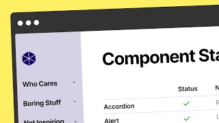
The first things people should see when they come to a reference site are examples of the kinds of things that could be made with that design system. That may be an odd thought, though. If you're thinking about a reference site as a technical documentation site, it is, but only partially. Don't forget that a reference site is a marketing site too. In the suburbs of Philadelphia, there's a store called Andy's Brick Shop. It's a store full of Legos, and it is a perfect analogy for what an ideal experience of interacting with a design system should be like. The entrance of the store features a showcase of all the coolest and most expensive things people have made. With Legos for sale already assembled, the first things you see are a $360 Star Wars Y Wing, a $368 Star Wars Snowspeeder and $100 Space Shuttle Orbiter, and an $80 assembled Millennium Falcon. As you get past the higher end assembled pieces, you see some lower value assembled pieces, like these $8 houses and storefronts toward the middle of the store. Lining the walls are different universes that show assembled sets, from Star wars to Tolkien's Middle Earth to DC and Marvel Comics and more. As you move past different universes, you start to see collections by type instead of by theme. This is where you'll find armies of batmen, supermen, chewbacca, C3PO's and more. Further back in the store, you'll find the organization gets more granular as parts are separated into types like gears, connectors, sprockets, flames, pots, wheels, and more. There's even a whole bin of heads. Lots and lots of heads. Farther back still, once you pass the categories of parts, you'll find parts not organized into categories. These are big bins of random assortments. Some of these parts will be categorized one day, while others won't be. Lastly, at the very back of the store, there's a trash bin for fake Legos. If they exist, Andy's Brick Shop acknowledges it and makes room for it while still letting you know that they're different from everything else you'll find in the store. Here's the full view. They occasionally host classes and meetups where enthusiasts can convene, learn from each other, and just play. What an amazing place. Most design system teams could learn a lot from the way Andy's brickshop engages its customers and community. Many design system teams do it the complete opposite, mostly to their detriment. Most of the popular public design system reference sites lead with the least compelling parts components. It's not that Components aren't important, they are crucial to a design system. But highlighting components first misses the opportunity to present what's even more appealing to the audience of designers and engineers and product managers that could use the system. It's the same idea behind the mainstream marketing mantra. Nobody wants a quarter inch drill, they want a quarter inch hole. The biggest mistake most public design system reference sites make is that they don't lead with the results that can come from using the design system. Highlighting components first would be like Andy's Brickshop putting a bin of heads at the front of the store. It'd be a really weird signal to send to customers to communicate that this is just a store where you can find parts, instead of a store where you can immerse yourself in universes that you love and expand your ability to play and to match your imagination. Of course, it is a store where you can find parts, but the context and the opportunity is much larger. The first things people should see when they come to a reference site are examples of the kinds of things that could be made with that design system. That may be an odd thought, though. If you're thinking about a reference site as a technical documentation site, it is, but only partially. Don't forget that a reference site is a marketing site too. The website for Material Design, Google's design system, would be much more powerful if it led with how consistent interfaces between products like Gmail, Search and Maps make Google users more productive. Putting the Millennium Falcon at the front of the store makes more people lock in. On that note, one of the best reference sites that I've seen is not actually the Material Design website. It's the Material Design YouTube channel. It shows in a simple and fun way how to use the design system to make the stuff that you need. Which is exactly the point of a reference site. Focusing on end results also opens many doors to additional opportunities. ASTRO is the design system for the United States Space Force, and they highlight a few examples of the kinds of products that can be and have been made with the system. But it doesn't stop there. The team uses the opportunity to show how the page has been constructed, breaking down the anatomy of the page and the components used. They link to a live demo of the application so you can see for yourself how the components all work together. As if that wasn't enough, they link to a BitBucket repository so you can see the source code behind this whole application. This is a design system at its peak. It's more than just plug and play components. It's more than assembling parts into a layout, it's more than documentation. As dry as an instruction manual, it is a whole ecosystem that describes a way of doing things, shows you examples as starting points, and gives you the ingredients to try it all on your own. Another big reason to focus more on the products that can be made with the system than the parts that make it up is that it signals that the people using the system are as important, if not more important, than the people making the system. Components are the work of the design system team, but products are the work of feature teams. If products are nowhere to be found on a design system reference site, the idea that digital products can be made from a combination of the components actually gets lost. At that point, it's really just a portfolio for the design system team. The team at Eventbrite does this to perfection with the site for their Marmalade design system. On each component detail page they feature a wall of fame which shows examples of components in the context of the products that use them. Taking it further, they even shout out and celebrate the specific contributors who partnered with the design system team to build and test the component. What a fantastic signal of how user centered a design system can be. Don't miss the chance to give the users of your design system every advantage to make their jobs easier so that they can give their customers a chance to make their lives easier. It's a cycle that keeps on giving, but it starts with reminding your design system customers that using your design system is going to somehow improve their lives and that they are a crucial part of that formula. Sure, they'll find components here, but the context of it is to make their work lives easier, faster and overall better somehow. Otherwise, your design system is just a bin of heads.