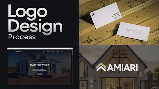
A designer shows a real branding project for a construction company: logo iterations with typography tweaks and bridge treatments, type trials for business cards, a fast website built with a Refit template and Fig Tree font, and a brand guideline delivered via Bravemark.
Chapters
So I had a client, he saw in my YouTube videos and he needed a new brand. The brief was for a construction company that does whole different range of services when it comes to like building houses or extensions. We start off with having this type of icon here, as you can see with the A and the word amiari. The type needed a bit of help because it was just a bit too thin and spaced out and the icon was really, really big. And so it just didn't feel balanced. I personally wanted to have like an idea where I customized the typography. And I really liked this, having sort of this bridge for the A. I just felt like it added some uniqueness to the logo and to some of the letters without making it too abstract. I also did a version here, as you can see, with the A and the R connection. That's always a nice way to connect those two letters together. And then cutting the crossbars off the A's was something I had an idea I had, but not sure if it would work well. And then here was a different version with a thinner bridge section. Then you can see my artboard, just me exploring some of the ideas, applying it, then seeing what it looks like on like a business card. As you can see here, playing around some patterns. I thought this one was really nice with the black and the white. That contrast is really good. Then that pop of gold. So I did a few different versions here and then as you can see here, what the pattern could look like. Two ones here, just really easy to do that in Illustrator. And then testing out some. Some of the fonts and the colors there, which I felt suited the business really well. And then just did a couple of small templates there, say like an invoice template or something like that. So this was the first round of just playing around. Now once I moved on from the logo design part, the initial stages after discovery, I moved on to presentation, presenting the logo. So you can see he was the presentation, went through it like this, kept it really clean, simple and minimal because that's what we decided in the direction to go on. My client really liked sort of a thinner font here and there was the bolder. So I like to present light, medium, bold in this example so we can fine tune the text. So we ended up going with the medium version because I felt the bold maybe was a bit too bold and the light just. I don't know, the light didn't. Was what wasn't working for me. Felt a bit because the icon was very bold. So you always wanted to balance contrast Type usage and the colors in play here. And then did some quick mock ups Business card as you can see. Some contract templates there. Some other third party websites where people like do jobs and stuff. Yelp for example and showed some icons and some imagery. Some of these were AI images. We ended up changing some of these. I thought they were really nice and then like a simple pattern with a nice stroke. So this was because it was. So it was a smaller project but I really liked this style. I love the colors and fonts for this project. Once all done we're just refining that identity. Then we move on to the website. For the website we decided to go with a template and we decided to go for refit this one it was nice one pager with animation and everything we needed. Had FAQs and testimonials section. It was really clean and nice. First created styles. So if you look at my assets we've got, you know all the stuff that comes, all the components that came with the template which is good. And then I made some. We had some text styles, link styles and color styles. So I updated all those with the right fonts. I used Fig Tree and updated the colors. Then I went in and started adding all the content. So I changed the text, updated some images, updated some icons as you can see here. Simplified those and just made it look really clean and minimize some of the sections as you can see. And we were able to get this done really really quickly. Now I like to show you how it turned out. You can see here I did this animation and I'll show you how I did that because I think it would be useful for when you're doing client work adding those extra, extra layers of detail. I actually use Luma Dream Machine to create it. So I typed in a white Hampton style house family home being built. Like a quick time lapse of construction to finalize product. Cinematic dynamic lighting, realistic 3D. So it's just a quick five seconds. But it was pretty cool how it came out. It was. It did needed some upscaling. So I did end up upscaling it. There was a couple other versions I created like this could see different versions. We ended up going with something similar to this one here. A great video compressor tool is this one video compressor from Rotato. So if you go tools Rotato app you just drop your file here and it should compress your video. Now if you're probably wondering how I generated some of those images, even though final images did end up being all real images. But initially I started to create some images like this. And you can see my prompt on the right side there. I started creating some images. For example, a bright modern bay kitchen renovation with clean lines, natural wood cabinets, stone countertops, large windows, natural lighting. The scene feels lived in and polished, photographed, realistic daylight. So got a lot of really nice images here because it's in a modern area where it's more like mid to upper class, high incomes families. Then I started adding people in some of the shots, make it look real and natural. And then I was playing around with some other images here too. This one's like cool style. Played around with the different art style there. And then try to make it a bit more realistic, less stylized. So yeah, just by using simple prompts I ended up generating a few images like that. And that really helped, you know, get that first iteration of the website up. And then as soon as we got feedback, we just got the website done really fast. And then finally I did a brand guidelines. And for this I use bravemark. I do have affiliate link. You can check it out in the description but it makes it easy to upload all the logo files and colors and you can click the little download buttons and the client can just download it. But the colors here, typography and then some of the examples. So it's just. This is a simple. It's more of a quick guidelines that they can come here and just see the codes and download the main logos. Cause it's just a small startup. This is one way to have a link that you can just send to your clients. I thought that was really cool. So yeah, I hope you enjoyed this quick video. If you don't want to see more of me designing a logo for a client, you can actually check this video here where I do the whole process. Cheers.