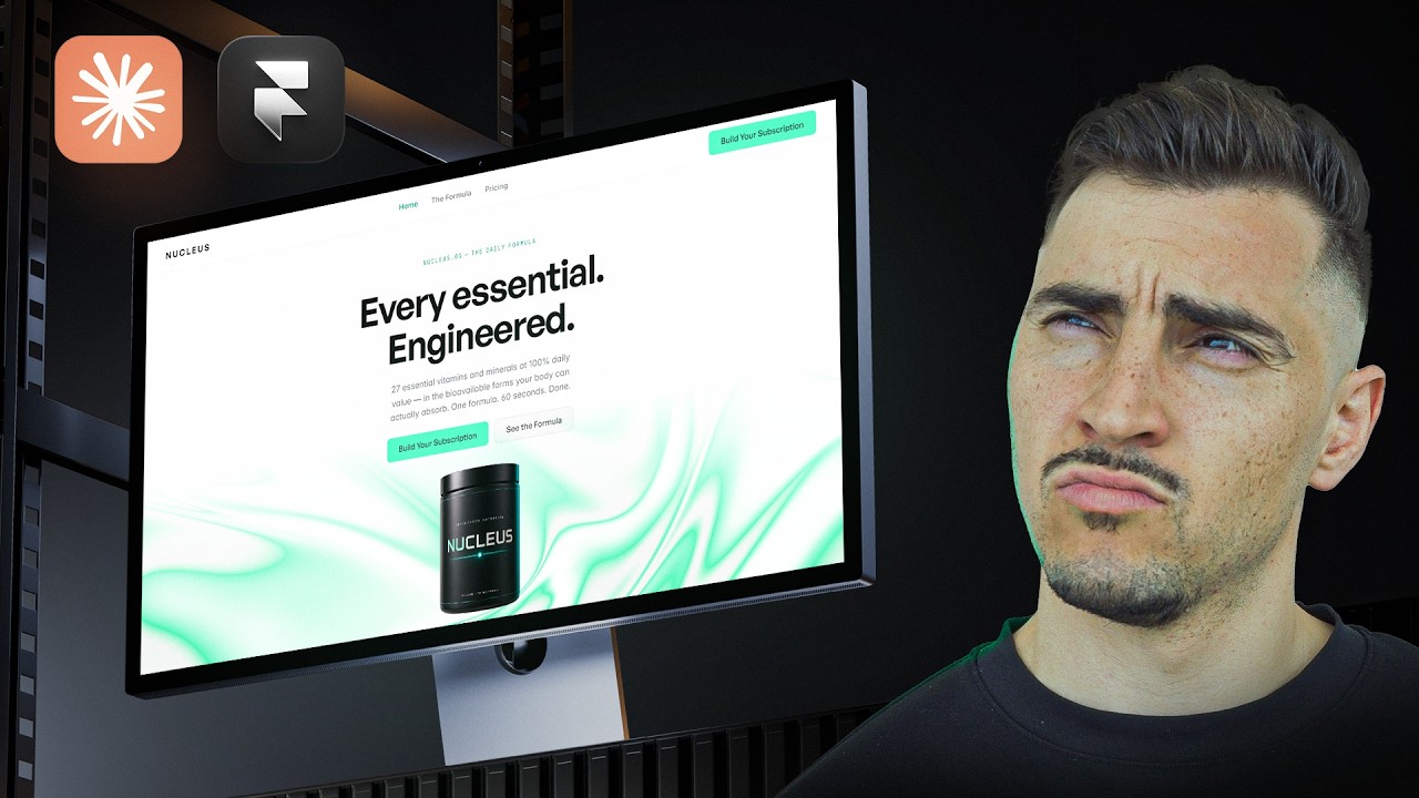
Jeremy Mura uses Framer's Fable 5 model to generate a complete three-page website for a vitamin brand from a single markdown prompt. He iterates through design choices with Claude code, switching from dark to clinical themes, adding product images and testimonial tickers, and refining typography for trustworthiness.
Chapters
Fable 5 is back and it's insane how fast you can create creative websites in Framer. And thanks to Framer for sponsoring this video. I've created a brief with a product called Nucleus. It's a vitamin brand. I've got this MD file here, just all with all the brand brief, the instructions, brand story, bit of the product, target audience. So I'm gonna go to Framer and I'm gonna change the model to Fable 5. Keep in mind that it will take double the tokens. We're gonna see if we can one-shot a, 3-page website. So I'm going to paste in this prompt, and I'm also going to drag that MD file in. And I'm just saying, I want to create a 3-page website to advertise, advertise this business. Implement a hero section and 2 other sections beneath it that advertise service in a relevant way, relevant manner. I'm leaving all the design decisions up to you initially in terms of color, typography, etc. I use— and then I was specific about using Framer's new interactive shaders. Um, they just did a new update, which is cool. So I'm gonna add that in and also add motion into the site. So I'm gonna click Send. All right, so it's created the site. Now let's see what it's done. I'm gonna preview and we're gonna take a look. Go— we've got the nice dark theme. I really like the colors that pop and got this nice shader in the background. I don't know if we can— the mouse doesn't interact with it. Fonts look very clean, very simple. I like the use of the fonts and the colors. This text is a little bit hard to read on that dark background. We'll go through. Got a nice table, clean hover effect. I don't like how it like sort of underlays on that, the, um, the side there. If you click View Formula, test the formula page. We've got this nice clean table, nice hover effects. Scroll through, you got Clean animations. And then if you go build subscription, we've got a few clean sections and then we've got a button here, buy once. And it came up with all the text and everything. Let's go back to the home page. Yeah, wow, it's looking really good. I really like it. And it's not— it's just on desktop mode, so not responsive yet, but I think it's pretty good for just one-shotting the website. Just by giving it that one prompt and the empty file. Now what I'm gonna do is I'm gonna use my Claude code 'cause I've connected to this project. And I think I wanna go a bit more of a light theme. The dark theme feels a bit like it doesn't feel as like healthy, feels very techy. I don't know, less trustworthy. I'm gonna ask to do a light theme and maybe just tweak this hero section a little bit. Now here's the iteration that it did. I really like how it made it more airy. It's got the white background now, and it's also added those icons that I asked it to add. And it just makes it a little bit more professional and stands out, and this feels more trustworthy as well. And because it's like a biotech company, it just has that more of that, um, yeah, clinical feel to it. I think it's really clean. And let's check the pricing page as well. Beautiful. This looks really good. Now one thing— now let's just quickly preview this, and we can see everything is working. Got some clean animations here, got some hover interactions, which is really cool. We've got the formula, and then we look at the pricing page. Beautiful. Love the clean look. Looks really good. Now one thing I want to do is I do want to change this hero section. And the interaction wasn't working with the new shader. So I'm going to go down, click on the shader, and I'm going to click on mouse. And we've got these new interactions here. We can increase the push and the radius. So now if I go preview and put my mouse over it, you've got this nice liquid effect, which I think is really cool, one of the new updates they've done. And I'm just going to adjust the header size, is a bit too big. I think that's really good. Now what I'm going to do is I've got this image here that I've created from for the product. And I'm going to ask, I'm going to bring that into Claude. So I'll drop that in. I'll say add this main hero to the site also. And one other thing, there wasn't any testimonials, and I think that's good for social proof. So I'll tell it to add like, let's maybe do a ticker. I want some testimonials. I also want to add like the, when you have like Afterpay or Klarna, there's some things on the payment page. So I'll say add logos. Here's the result of the next iteration we've done. So it's added the product in there and, uh, just looks really clean, simple. And it didn't do the ticker right. I don't know what's happening there. And I just added these logos, um, for the pricing. Yep, cool. Secure checkout. I think that looks really cool. I just need to fix this ticker there, and, um, I think we, we could publish this and this would be looking really good. Thanks so much for watching. If you want to see more about Framer, I've got another video right here that'll teach you everything you need to know about creating a agency website.