CD COVER DESIGN Illustrator + Photoshop Tutorial
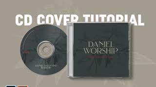
Jeremy Mura walks through designing a minimal botanical CD cover in Illustrator, from sourcing vectors to arranging them, setting typography, and exporting to Photoshop mockups. He shows how to create a center cutout at 477 pixels, use blend modes, and bend text along the CD's circular edge.
Questions this video answers
477 pixels
Multiply at 50%
Chapters
So I'm going to show you how to make this cool mock up. And first we need to go into Illustrator. Nice. Just very simple, very minimal. It could be for like a band or maybe there's a solo instrumentalist or musician or artist and they need some really cool design. Then this is going to be awesome. So this is the design I have. You can actually go to envato elements. You can go to free pick things like that to find like botanical illustration. So I just search up botanical in the graphics section. And if you want in body you can check a link in the my description below and you can check out the subscription there. But for example, like if I click one of these ones, you can see comes with like flowers and I can use this and multiply it on my colors. So just download a pack online, look for a free one. I'm going free pick and you'll find one. So you can see here is what I did and I've actually created the same size for the actual mock up. And for the mock up I downloaded these from Zippy Pixels. These a professional bundle ones. So you can see here. And if I just jump into Photoshop, you can see it's already there. So what we're gonna do is start to create this out and it's gonna be super, super awesome. So I've just opened it in Illustrator file. You can see I've got this pack, 29 branches, twigs and leaves. You can see all these different files. So for example, if I download one, open one, you can see it's like a vector file there. And then what I can actually do is I can, you know, copy this. I'll probably go for this one. So I can just select it, make sure it's grouped and then I can paste it in my Illustrator document, as you can see like that. And now it's ready. And I'm just gonna start to play around with some of my colors. And you can see I've got this cool palette. You can actually download colors from Colors Co or actually Adobe Color. And I kind of like this green, this cream and this like nice monotone, like sort of greeny color. So I'm gonna start to lay out the background. I'll press M for the marquee tool. I'm going to select my dark color because I like that contrast. I'm going to duplicate it and bring it like this. Once I'm cool with that, I'm going to just lock these backgrounds. I'm gonna drag my flower that I've created. I'm gonna bring it forward. And then you can see I'm gonna press Ctrl H to hide the points because it's too many points in the way. I'm gonna just hide that for a second. I'm gonna scale this down like this, which is beautiful. So now we can do a few things. I can actually change the color to this nice cream color. I can put it the same color as the background. And then what I'm gonna do is around with my transparency panel. So what I like to do is like do a multiply and put it to 50%. And this gives a nice effect where it multiplies the color on top of each other and just has a nice detail. You can also do overlay as well, which works fine. Soft light as well. So if I just bump up the opacity, you can see the effects there. It's very similar in effect, but the way it works is just a bit different. If you want to go the lighter route, you can do color dodge. Just make sure that the color is the same as the background and you can get this light effect. You can see for this one, I added the multiply. So I'm going to stick with that for now. So I'll go to multiply and I'll put it to 50%, which looks great. And maybe we can, like scale that up a little bit. And then I'm going to paste it on the this side as well. As you can see there, get across for the CD there. And you can see with the cd, I pretty much copied the size in the Photoshop document. So I opened like the CD and I figured out what the size of the middle is. So that's 477 pixels. And then all you have to do is just make a circle. And once you know the square as well, the overall size, you just make a circle in the middle. And then I put it on a different layer. So you can see there's a circle here. So I know not to create inside that circle. Like it's gonna get cut out anyway. So that's a good tip there. So now what I'm gonna do is start to type out some text. So I'm just gonna go back to my Layers panel. I'm gonna press T for the Type tool and left click once and bump this up. I'll bring my type tool up here. And what I like to do, I like to use the Filter tool. So I'm gonna click Filter here and look for a serif font that I like. There's heaps of different fonts. I Have got. What do we have here? Bundani. That's probably too high class. We've got Brillon. I like this brilliance. Pretty good. So I'm gonna go here and for this one I typed like my friend, he's like does like a sort of worship music, which is cool. So typically that's what I did. For that I'm just gonna stack the text and you can see if it's not really readable. What you can actually do is like drop down the opacity of the back of the bird of the birch there with the illustration. So just so that the text pops a little bit more. So maybe go 40% should be fine. I'm going to bump you see how there's a lot of space on this side because of the L here. I'm going to left click on the D and then press alt to bump the kerning. When I hold alt and shift just to bump it like that and put it center it. I feel that looks really cool. And it worship. Then you. You could put like maybe like 2020 or something. 2020 collection. Something like that. Something neat. And I'll probably like change the color there. I think that's cool. I could probably even find a font that could go with that. Maybe a need like a simple font here. Config. I don't know about that one. Go Montreux Jazz. And I'll probably go like book. And then we'll go type change case to uppercase. And then maybe it's too thin. So I'll go regular and then just make it heaps more bumpy. Kerning a little bit, make it smaller. Let's give it some space. Boom. I think that looks cool. Amazing. So we have that ready. I'm just checking back here. So now we're going to create this side which typically has like the names of each track on the cd. I want to start to create that. So I could get another birch flower or typically what I'll do, I'll just like duplicate it by holding alt. Then I'm going to like rotate it just to get like a sort of interesting effect. Now leave it like this. Then what I'm going to do, lock the background. I'll press P for the pen tool. Left click. And I'm just going to make a stroke. And then I'm going to select my swatches colors here. So shift X to make sure that it's on the stroke. And then what you can do is if you select this, go to the top on the left corner. You can see like the stroke section, and maybe bump that up to, like, five. Then what I'm gonna do, I'm gonna copy this here, and then I'm gonna call it the names of the tracks. Breath. And then I'm gonna make sure that it's aligned to the right there. I'm just gonna use my eye to roughly snap that. You can also press Ctrl R and drop like a ruler there. So I know. So I'm just going to just make sure there's enough space. I can select all these, and then go the top. You can actually align it so it distributes the weight evenly. Then I'm gonna put the numbers here as well. So I'm gonna get my font here, the Montreal Regular Jazz. And then I'm gonna. You can see my smart guides are turned on the glyph Smart guide. So it snaps to the bottom of the X height there. Then what I want to do is just to, like, do a one to represent, like, number one. Or you can boot, like. You can do that. It's up to you, really. When I press Ctrl D just to duplicate like that, and I'll do, like, four, three, two. The red's a little bit hard to see when it's, like, small, so I'm gonna bump it up to maybe demi bold. Tighten the kerning. I can do this nice yellow color if I want, or I can just, like, do cream. I think we just want to go minimal, guys, and I think that's nice. So it's nicely aligned. Looks minimal. Looks super, super clean. Beautiful. So we've done that side, and then now for this, what we can actually do is we're gonna play around with the shape of the cd. So I'm going to locate the center roughly. The smart guide should help you out with that. I'm gonna hold alt and shift. Scale that up. And then what I'm going to do is press Shift X. I'll get the Eyedropper Tool Pro pressing. I select the same size as the other stroke, and I'll get this, like, stroke up, right? Then I'm gonna delete the bottom one. So you select the point and press delete. And then I'm probably going to delete this side as well like that. So we've got, like, this cool stroke. And then I'm going to press C for the scissor tool and probably cut somewhere, like, halfway or something. Cut like here. We're gonna cut somewhere here. Then I'm gonna use this as my type path. So I'm gonna press T for the type Tool. And then we want to right click on the left on the type tool and select type on a path. And then I'm gonna left click on the actual path itself as you can see here. Then I can call this 2020 collection like we had on the other side. Like the same as this. I can eyedropper it and make sure it's the same size. And then probably scale this. But obviously I got to drop the size down. Just bump the kerning well. So you can see that. And now we've got sort of this cool rotation here. And then I'm just gonna actually move this stroke out a bit. Or I could move this like this. So just to make it. Because you can see it's like on the line. But I just want to make it that it's like sort of the lines like hitting. It's sort of like hitting the middle. So you just bring. It's better to actually bring the words down there. And I think that looks nice. And I'm just gonna maybe make it a bit bolder that cleaning correction. Awesome. I'll roughly move it as well. Doesn't have to be completely accurate because obviously we're going to put it on a mock up. So we've got 20 collection. I'm also going to grab his. His name like all the things on your Worship. Obviously he has his. His last name. So. Valentino. I could probably change this one as well. But I'll just leave it and scale it down a little bit. Then I want to do like four tracks. And I can get a little bit creative with this one. So I want to just do this. We'll go like all caps. I'll make it this and I'll make it like really ultra thin. And then we can like play around. Maybe go overlay or something. We can like put it somewhere. Somewhere we'll figure it out. It's probably a bit too light using overlay. I'll just leave it on normal for now tracks. Actually I might make it the same as this just to simplify. Four tracks included the bumper kerning up as well. Like that. And then I can probably make that red. I think red's cool. And I think there we have it. And now let's go add this onto a mock up just on a. Quickly save it guys. Make sure you always save your work. So I'm going to unlock everything by pressing Ctrl Alt to make sure everything's selected. Press Ctrl C jump into Photoshop real quick. I'm gonna go to. There's. I got like two Mockups here, but let's just use this one for now. I'm going to go to the CD cover. Wait, let me just make this smaller. I'll click on the CD cover layer, double click on the design, press Ctrl V to paste and then I want to make sure it's a smart object. I'm gonna scale it up and then find the square and just snap it in there. I'm gonna press Enter, then press Ctrl S. And now I'm just gonna close this for a second. You can see there. That looks amazing. I want to go to the background and you can see it sort of has a color there. But what I like to do is add a solid colored layer and then I can just select this color or the cream because it's already in the background there. Depends however you want to do it. So maybe the cream is probably the best I can press. Ok. Then I can click on multiply and it adds like this nice tint because this is like red here. I can do like overlay. Play around with this another second. Put my own like texture in the background. But since in the background off for now and then I'm gonna go back and then we'll select this and then I'm gonna go to the cd. I think the color was locked. We can always just add a color layer in Photoshop. But I just like copying pasting, it's just faster. Do it in one go. I'm just gonna hold alt and scale it from this and hold shift, scale it from the side. It should snap relatively well. And I press Ctrl S and it should add it to that and you can see, yeah, that it doesn't, it doesn't add the middle bit. But that looks, that looks awesome. That looks amazing. So there you have it, guys. That's how you add a cool CD mock up design, you know, for a music label, a cd, whatever. And if I can, if I go to this one, I can do the same. So for example, this is like the open case. I can quickly. I'll just quickly do that. Control Ctrl V, paste that in and obviously like if you put clipping masks in Illustrator it will make sure that this is not like this. But for this tutorial it's fine. Scale that up, press Enter Control S to save that and that should be sweet. Let me see. Make sure we go to the right mock up. Copy this. Well, I'll copy the background layer, color fill and just paste it in this on this one. And now you can see, you can see the nice texture there. The nice mock up looks beautiful. Love it. Awesome. And there we have it. Guys. Thanks so much for watching. Hope you guys enjoyed this tutorial. I hope you can create something cool for your new cd or maybe an album cover or something like that. Hope you guys have an awesome day. Smash the like button. And, guys, remember to subscribe because I post design content all the time. If you're a beginner, if you're a growing graphic designer, you're gonna excel and expand very fast.