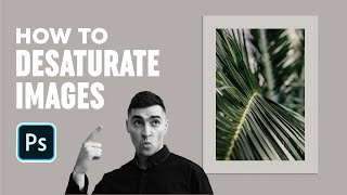
A short Photoshop tutorial by Jeremy Mura showing how to desaturate an image and add subtle grain for use in client work or a Stylescape/mockup. Key steps: open the smart object, add a Hue/Saturation adjustment layer and lower Saturation (example around −50) and slightly reduce Lightness (about −8); use the Hue/Saturation dropdown to target and desaturate Yellows; then add grain via Filter → Noise → Add Noise (example 2% Gaussian) applied as a Smart Filter. The clip shows before/after toggles and saving back to the mockup.
Questions this video answers
September 7, 2020.
Approximately −50.
About −8.
Around 2% (mentions 2–3%, chooses 2%).
Filter → Noise → Add Noise.
Chapters
Hey Jeremy, here I got a cool tutorial and I'm gonna be showing you how to desaturate your images and add a bit of grain, especially when you're working on client projects or even in the Stylescape. So I'm gonna show you how to do that in Photoshop. So I've been doing a Stylescape for a client recently and I created this image, nice mock up to add on to the Stylescape. But I had a palm tree image in the back, but it didn't originally look like this. So I'm gonna double click on my Scroll Smart object file and it will open up the other tab and you can see if I turn off the hue saturation layer and also the grain. As you can see, there's a bit of green. I can turn that off. This was the original image by itself and just ignore the color background. That's just a white background there. This was the original image there. So what you can do to desaturate it is you want to add a human saturation layer. So let's drag these other layers over here. And what I want to do is go to the bottom right click on the effects drop down menu. It's the little circle with a half ellipse in there. And I want to click it and go down to hue and saturation. You'll see you get this box pop up. So the properties window. So what I want to do now is desaturate it so you can see the saturation menu. All I have to do is drag the slider to the left. If you go all the way, it will go black and white. And we don't want that. We want just to make it subtle. So instead of going the opposite, which makes it like heaps messed up and colorful, we don't want that. We want to make it go down to about like minus 50 or you know, maybe minus 30, something like that. So I want to drag it, desaturate it. I kind of like, yeah, minus 50 looks kind of nice. I can drop down the lightness a little bit. We don't want to make it too bright. So we drop down the lightness a bit, maybe minus eight. And then what I want to do is I can keep the property panel here. What I can actually do is I can desaturate certain elements as well. So I'm gonna click this drop down menu. So we desaturated the overall image, but I want to get rid of these yellows that I have in this palm tree here. So I'm gonna Click yellow and you can see. Just pay attention to this section here. As I desaturate it, it should get rid of those yellows, you can see that. So it goes a bit more gray. So if I zoom in here, you can see before it was heaps yellow like it was up here, but now I got rid of it, desaturated it, it makes it a lot better. And it's gonna be a good subtle image for a web design or a website or like a background image for text to be overlaid. I'm gonna drop these properties here and then what I'm gonna do is add a bit of a grain to make it a bit of a more, you know, grungy hipster feel a bit more organic. So what I'm going to do is I'm going to double click. Sorry, I'm going to click on my image, I'll just get rid of. And then what I want to do is go to filter, go to noise and click add noise. So now you can see if I zoom in, this is what the image will look like with this noise here. I want to play around with it though. I don't want to just leave it. Right. So if you go heaps, it's going to go heaps grainy and look like an old school tv and we don't want that. Right. So we only want to add a little bit. So I'll probably add maybe like 2 to 3%. I'll put it on 2% which looks good. You can always add it like a Gaussian or make it uniform. It depends. I like kind of like both. So I'll leave it on Gaussian for now and I can click off the preview, but that's fine. And press. Ok. And because I already added a noise before it doubled on each other so you can see the layers and I've got two there. But let's just see with the one noise. So you can see with a bit of noise it adds a bit of grain effect. If I turn it off, you can see it goes back to normal. So I can turn it back on. As you can see, it's a smart filter on the right side. And then if I add on that extra bit, you can see it makes it even more nicer. So you can redo the smart filter on top of each other so I can go again add noise and it will just add it on top of it as well. So originally we just had this and now by adding desaturation and a bit of grain, we get this cool image. And then I can save that image and I go back to the mock up and then it should automatically save and you can see we've got this nice palm tree effect which looks really cool and then there's even a shadow as well. So I can turn that on and we have this nice vibe to it. So thanks so much for watching guys. Hope you guys enjoyed the video. Let me know in the comments if you want to see more tutorials like this. Smash that like button and remember to subscribe for more design content every week. Hope you have a great day. See you later.