How to make INSTAGRAM CAROUSELS - Illustrator Tutorial 2020
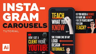
Jeremy Mura walks through designing Instagram carousels in Illustrator, starting with a 10-artboard document at 1080×1080 px. He covers setting up layers and guides, choosing condensed bold type, masking images, composing layouts with shapes, and exporting for upload.
Chapters
Hey, it's Jeremy here. And right now I'm going to show you a tutorial on how to create your own Instagram carousel. I know you've seen it trending and you've seen all these really good designs, and I'm going to show you how to create a full carousel in Illustrator. I'm going to show you the whole process of what I do and I'll try and keep it short as possible. So you can see here, if I zoom in, I've done plenty of carousel carousels by now. And you can see here that I have. You can. It's very consistent. I have the COVID designs, which is one of the key parts, and you know, all the message and the text and everything, and the imagery and all this stuff. So typically I design it all in Illustrator. And what we're gonna do, I'm gonna show you how to set up the file and then where I get my images and how to place the text and stuff like that. So let's get stuck into it. So once you go into Illustrator, what you want to do, you want to click on file, you want to click on new, and want to create a new document. So Instagram sizing, the best sizing is 1080 by 1080. So you want to make the width and the height the same. You can leave it on pixels and you can leave it on the orientation because it's going to be a square anyway. Then what you want to do, you want to select the art boards and Change it to 10. So you want to have 10 Artboards like this. And then we'll call it new Carousel. And then once you've done that, make sure it's. If you click on Advanced, make sure it's rgb because it is going to be digital. You're not going to be printing it, obviously, so keep on RGB. The screen can be 72ppi. That's fine. And you want to click Create. So you can see we've got all these artboards, but right now they're stacked. And you don't want like that because we want the images to flow across the carousel and make it like a slideshow. So what I want to do is bring up my Artboard window. Go to window. You can click on Artboard, which should be at the top here. And then what I'm going to do, I'm going to click this drop down menu and you want to click on Rearrange Artboards. So what I want to do now is I want to add. Make sure the spacing is at zero. I also want to make sure that there's 10 columns, because we got 10 apples. You want to have 10 columns going across. So once you do that, you just press ok and you can see what it has done. It's shifted all the artboards like this. You're super cool. And then a cool trick to duplicate them quickly because if you're going to keep doing multiple carousels later on, you just press shift O, hold shift. I'll select all of these and then what I'll do, I'll hold alt and shift and drag down and I'll just duplicate like that. And that's how I create like heaps of carousels. So cool. So now we have our carousel here. Now, obviously you want to use your own fonts and your own brand colors. Don't just copy people, you know, make sure it sticks to, you know, your personality, your branding and what you've done. So I'm just gonna stick with my branding for now, just to show you this tutorial. So I'm gonna delete these swatches real quick and get my colors up. So what I typically do is get a box and I'll drag it all the way across and just do black. And then what I'll do, I'll put that on a lower layer. So if I make a new layer, you can click that button there. And then I'll name it BG for background. And then I'll select this little blue color which will select the black box and drag it. And all I do is drag this to the lower layer. Now you can see it's on the bottom layer. And typically I'll just lock that layer for now, just so it's easier. And then I'll rename this design. And then. Cool. So typically, I have my content in my notion. So what I'll do, I'll if you have trello or something like that, very similar. And what I'll do, I'll create the boards. And then what I'll do, I'll write out my content here. So I do all the writing before I do any design. So I've breaking down all these points here so you can see. And so let's work on this one here. How I built 7k YouTube channel. And we'll start off with that. So first up, I'll get my type tool. So I'll press T for the type tool and just click. Then what I'm going to do is select my font. So I use BW Stretch. Typically, the reason why I use this font is because it's Bold. Not only that, but it has many weights. So if I, I could, if I go and change it, you can see it's got thin, it's got lights, it's got medium. And you can see the range of weights there, which I really like. Not only that, but it's very tight. So you can see it's very condensed. So if I, I can make it really big and it's not going to go like it will fit within the box because if I choose another font, right, so let's just go this one, you can see how it's more wider, it's more. The width is further out. I typically use Ridley Grotesque as well. You can see it's a wider font. But this one is very condensed and it fits. So you want to pick a bold font, make sure it's similar with your branding and your identity and to make it fit. So what I'll do, I'll make the color. So I'll go how to. How I got 7k YouTube subscribers. Make it the same size. Just like that, just to start it off here. So what we're gonna do, we're gonna add guides now. So I'll press Ctrl R or Command R if you're on a Mac. I'll just move the toolbar here because it's a bit too close. Just close that. So you can see on the right hand side, I'm gonna drag. You see where the little black bar where the ruler is? I'm gonna drag that, then drop it like this and I'll drag at the top and drop it like down like this. All we do is click and drag. So you can see from the corners there where the rulers are. So I'm gonna use this as a guide for my text. So I can place it here just so I have consistency across. So when I duplicate it and go across, it's. It's gonna be consistent. And same thing when I go down. And what I can typically do as well is I'll unlock the guides so you can go view guides and you can go, you can lock them or clear them there. And what I'll do, I'll press Ctrl C and then I'm gonna paste it on the other artboard so you. Ctrl C, Ctrl V. Typically if you paste it in front, it should work. As you can see there, I'm pressing Ctrl F to paste in front. Just make sure you click on the artboard so it works. So there we have a consistent grid. So now we can make sure that it's all aligned. So what I start to do, what you want to do with, for the covers, you want to find good imagery and you want to have nice text. So once you have a nice font, you want to lay it out, you want to make sure that your most important words are the biggest. So I'll make this really big. I'll make this font bit smaller and put it a lighter weight. So you can see this is on regular and this one's on heavy. And then I'll make subscribers really big. And then what I'll start to do, I'll highlight the main, the main words. So typically I got orange or sometimes I use a secondary color like a yellow. So if I go to my color glide up here, you can see I can find, you know, different complementary colors and things like that. So like, yeah, this is looking cool, but we want to have some imagery here to make it look more appearing appealing. So what I typically go on is I have a subscription with Envato Elements, which allows me to get photos. So if I click on photos and I can type something, so if I type maybe video, because the topic is on YouTube, so I try and keep it relevant. But if you're storytelling on a specific id, then you'll get similar imagery about that. So what I can do is I can download a camera photo and then I'm gonna go on Photoshop and cut it out. So I'll just stick with this one for now. I'll download this. I can also go to 22 because it's part of the subscription as well. I can find images here. Another cool way is to go on Pexels, Pixabay or Unsplash. So if I type in video here, these ones are free stock sites. My subscription is a paid one. But you can see here there's plenty of options that you can use here. Yeah, so there's plenty there. You just might have to do a better job of cutting it out, but that's totally fine. So once I have it downloaded, I'll drag it into Photoshop and you can see I'll get this image here. So once I have this, typically I go to select and click subject. So what Photoshop is going to do now, it's going to automatically find the main object of the photo and cut it out. So what I'm gonna do, I'm gonna go to my right hand side with the layers are on the bottom. You'll see vector mask, you'll click that. You can see we've made a mask. But what we have to do is we have to fix it because some parts are cut out when we don't want them. So what I like to do is I press the Brush tool, make sure my vector mask is selected. So you see the black and white mask. And then what I'm gonna do, you can see that if it's black, it will hide things. But if you switch the swatch to white, it's actually going to reveal things. So I'm going to start painting here. You can see that some of the backgrounds there. I want some of the guy here, which is. We didn't want to rub him out. So rub this out. So I'm painting on the master, which is just hiding the layer. Pretty much any, any part I paint on, it's going to. Just going to hide that layer. And you know, this can take a bit of a process. If you're not familiar with Photoshop, then you'll have to do it. You know, you have to figure it out the quickest way for you. You can use Remove BG as well. That's pretty, pretty fine. And yeah, so I'll just cut this out slowly. I'll use the Pen tool. I'm just doing it quickly just to show you guys so I don't spend too much time. And shortcut is Ctrl Delete. To fill that space that I just selected. I'll make another selection using the pen tool. I'll go to my paths. So you see the paths. It made the selection Ctrl click and then it will make a selection, go to my layer, click the Vector mask and press Ctrl Delete. Make sure it's on white and it should delete it as you can see there. And obviously there's orange bits in there, but I'll just leave it for now. So what I'll do is I'm just going to save it. So I'll go file export and you can go save for web. What you want to do now is you want to have it on png, you want to have it on transparency. You can see it might take a little bit to load because the image is so big. Try and save it like as a medium resolution. I drop to the resolution. I'll probably put it on like 40%. So 1000, 1600 by 1000, that's fine. So I'll save it and I'll locate my downloads file. Now just call it Digital camera. Looks like one of those new Sony cameras actually. And what I'll do, I'll go back to Illustrator, I'll open my downloads folder and I'll Drag that picture PNG we just saved into Illustrator. And because the PNG is transparent, you can see the background's all cut out, and I can start to play around with this imagery. So you can see. What I like to do is I try and make it big, or I can make it maybe go over two slides like this to make it even more, like, emphasize that image if I want. Or typically I would just do it smaller like this. But you want to make sure that you can see the font and the type and the text. So if I scale it down and maybe I bump up the tracking there, maybe I have to break the grid and I'll bump up bar, bump that up, and you can probably see it there, which is cool. Typically, I like to have my little tag there. So if I go here, copy that, and then I'll paste it here just for now. So typically, I like to keep it small. You want to tag your Instagram and, you know, you can put your website or whatever you want. And for this one, I can just group them together and bring it really low like this, Keep it in the corner. So that's kind of a nice little section there to keep it. But remember, we want to highlight the main text here. That's the most important. And the image, as you can see here. So cool. It's looking nice. Obviously, you can see there's some white spacey. We could fill it with color or we could make this bigger. You know, we could play around it and see what. See what's working on the best. But that's a good start for now. So what I'll start to do, I'll start to get the content and then I'll start, you know, copying, pasting some of the text or just, you know, I used to. I usually paraphrase. So I'll get a grid because it's not there, and I'll just eyeball it. There we go. And then what I'll do, I'll just duplicate this by holding shift and alt, dragging it across, And then. And then I'll start to type out the content. And I'll make it my bold font. So I'll put it on black or heavy. So you want to try and keep it personal, personable, and relevant and to your story into your experience. That's how I try and do my carousels. You know, be. Be real, be raw, and, yeah, talk about your experience. Don't just copy other people's content or IDs, make sure, like, you know, it's about you and what you've Experienced. And so typically what I like to do is make. Yeah, I'll type out some things and then I'll start to highlight some interesting parts. So I can highlight the word just with the type tool. So if you have t selected, you can just select. And I'll start to color important words so you can see that, start to color that. Sometimes I'll add some elements, just put my toolbars on, for some reason they disappeared. And I'll start to, you know, draw a box. Maybe I want to do an arrow. So I'll just use really basic shapes so you can see here I'll use a block, a rectangle, and then I'll use a triangle like this and I'll try and connect some parts to it. So this color helps lead the eye to the other page and maybe. And what I'll do, duplicate this, go back, I'm just going to drag this content over here so I can see, type it, Make it white. And then what I'll do, I'll start to go back, find some imagery, maybe even of me. So I actually have some images that I use as well, which is pretty interesting. So if I find it, if I find this one, same thing, I went in Photoshop and cut it out. But I start to add some imagery and it's okay. You can overlay and a cool trick, you can see how this doesn't have a shadow. Cool trick to add a shadow is I go to my appearance panel, I'll go to fx, stylize, drop shadow. I'll click preview now bump up the percentage there and I'll just click the offset so you can see the shadow there, what it's doing. So I'll drop the opacity down, make the blue about two or three and the offset a little bit, drop it down like that, maybe 50% works good. Now I can zoom in and see. You can see how the shadow there, it adds a bit of dimension. So if I put it like over text, you can see it looks more realistic and looks visually interesting. So that's a quick tip there. And obviously, you know, I'll continue to go along and add images and just add text and just duplicate it. And to make it look interesting, you've got a lot of basic shapes here on the left hand side on your toolbar. So you can see with Illustrator, there's so many shapes you can use. So if you want to use a circle, I can hold shift and alt, make a circle here. Maybe I want to put like a point in the corner or something. Because People only they swipe very quickly. So you want to keep it fine. So may I want to highlight that? You can also use like little stars if you want maybe. So I'm just going to increase the signs there. This maybe you want to do like highlight points. So like four keys. And then I'll just duplicate that. So four keys to grow and then I'll just put them here, niche down, Consistency. Actually I'll click the slide, aim for quality. And it's okay. I might have to make them smaller. So I'll just use one shortcuts there and listen to audience. So you can see it starts looking interesting and you know, you can do so much stuff with the carousels and then you pretty much just create all that and then in the end you want to have like a call to action. So once I'll get a drag one of these images that I have already. So if I go here, portrait images, so I've got some more images here that I can actually cut out. I typically go to my other carousels here and I'll just copy paste this and I have like a nice image of me because that's my branding. I like have being, you know, positive and friendly. People know me as that type of guy. So I'll just copy, I'll see if I can copy these parts, just these shapes, turn the guides back on. And then I'll just have like comment with your thoughts. That's what I'm doing at the moment. So yeah, it's pretty interesting and yeah, obviously it will take a while to finish it and do it properly. But I'm just showing you guys how to create a carousel that works well. And you know, there's so many different things you can, you know, overlay things you can make do whatever you can change the background as well. Typically I like switching it up and then maybe highlight things in black. Like that by just using simple cut bold colors, bold typography shapes and you know, having a clean message and writing it out beforehand. So something that you're confident in teaching and your strengths, you can create something visually interesting and that will get clicks and that people will share. So yeah, hopefully this tool was quick. This is how you set up your, your art boards and everything. You can also do similar in indesign as well. But I just find Illustrator to be, be a lot quicker just going back and forth with, with Photoshop and stuff like that. And you know, once again you can see some of these old ones here. So like this one I did, you can see it's Just one image laid on top here and I put it in a clipping mask. You can see on here. I've done like textures here. Just chuck that in the back and they all were clipping masks. This one was an image and I had to cut it out. You can see there if I zoom in. But keeping it all consistent and using bold everything. I just like everything bold, to be honest. You can see this little bunny image. That's cool. But you can do so many different things. You know, it's up to you. Be creative with it, be fun with it. But obviously try not to have too much text, because if you have too much text, you know, people swipe very quickly. So you want to keep that in mind as well. You can see this one was one of my recent ones as well. Adding a bit of photography here, some arrows, some texture, then text playing around with different sizes as well with some images. So you can see it's just a PNG and then having the call to action at the end. So once you're happy with the carousel and it's all sweet and done, what you're going to do is you're going to save it and export it. So a shortcut is control alt E and this will bring export for screens. You can also go file export and export for screens, as you can see there. So once you've done this, what you want to do is you want to go to your right hand side and you can see you got the scale. You want to keep the scale at one because Instagram, you've already set the app was at the right size. Typically what I do is save it as a JPEG 100. If there's not that much images and it's just like shapes text, what you can do is just save it as a PNG as well, which is totally fine. If you want to upload it to LinkedIn or maybe you want to do a presentation or something, you can save it as a PDF so you can just add a scale and do a PDF so it will save another version and it should save it together. But typically I save it as a PDF doing the other. Do you doing file save as separately? Because sometimes the artboards don't connect. So typically I'll save it as JPEG and then, you know, I can save it. I save it to Dropbox and then I download it on my phone and pretty much that's how I do that. So if I select downloads and make sure everything's selected, I don't really name the outboards because it doesn't make a difference to me. So I'll export it and you can see now I'll have all the the photos there. If I just as you can see, then I'll up go to Instagram and on Instagram when you select it, the plus button, you just go to your library and you click the little button where you can do a multiple carousel and then you just select all the pieces there and then you're sweet. So I'm pretty sure most of you know how to do a carousel. But yeah, that's, that's how I create them. And hopefully this was helpful. But yeah, remember to subscribe, leave a comment and I'll be creating more tutorials. If you guys like this type of tutorial, then let me know in the comments. Maybe I could show you how to add some animation, how to do some videos in the next tutorial. These tutorials can be long, so that's why I try and keep it short. So I had to cut this one a bit short, but I hope you guys got something out of this. So awesome. Catch you in the next one.