How to make Youtube Banner Art Tutorial 2020!
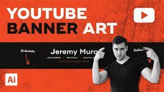
A step-by-step YouTube tutorial by Jeremy Mura demonstrating how to design a YouTube channel banner in Adobe Illustrator. Jeremy covers planning (branding, typography, photo choice), Illustrator setup (2560×1440 artboard), creating safe-area guides, arranging layers and text, applying textures and blending modes, importing a cutout photo, adding drop shadow, and exporting a JPEG for upload.
Questions this video answers
Width 2560 px × Height 1440 px.
423 px.
Ctrl+5 (Cmd+5 on Mac).
Ctrl+Shift+Alt+S (use Cmd on Mac).
JPEG, quality ~90% (optimized).
Chapters
Good afternoon. Hope you're having an amazing day. I want to be showing you how to create my new updated YouTube banner, which I designed the other day. And my few friends on Instagram wanted to know how I did it because I shared it on my story. So, by the way, if you're not following me on Instagram, you can follow me at the Jeremy Mirror if you want some fresh content on there. But, yeah, they want to know how I created this. I wanted to keep my theme, you know, make it creative and designy and also keep my brand colors, which is like those charcoal colors, and also the orange color as well, which I love using. And. And I'll just break down this, this banner a little bit and then I'll show you how to create it. So I wanted to keep the topography bold and modern because that represents my personality. Very confident. And also, you can see here, I focus on putting now on the main things I do. So I focus on logo design, branding and graphic design. So those are my key things. So when people come onto my channel, they can expect that when they. All my content is going to be that related with that. So they can say, okay, this guy's, you know, focus on design. Then I just put my name so clearly they can know who I am. It's more personable. Also putting tutorials every week, so it shows. Oh, I'm consistent. I upload every week. Obviously, it's been New Year's and Christmas, so I've been chilling for a couple weeks, but now I'm back. And also with my photo here, you can see I love just keeping it, you know, positive with my smile, my happy attitude and keeping it black and white, because if I had a color picture, then it would actually conflict with the background because the background is very bright and orange. So the color, if it was colored, it would conflict, which wouldn't be too good. But prop from that, I have a bit of texture in the back as well. Just adds a bit of grunge, makes the color a bit more. Less harsh and also adds a bit of creativity as I'm a creative guy. So, yeah, that's a bit of a breakdown, but I'm gonna show you guys how to create this all within Illustrator. And, you know, once you know what your channels about and you have a bit of a strategy and overview of what you produce, what your content is and your idea of your banner, then once you keep it really simple, it's relatively easy to design as long as you know the basics of Illustrator. So first up, we're going to create a artboard. So if you're making a new file you can go control n for a new document. So that's the shortcut. And what we're going to do we're going to name our file called YouTube banner and I'm gonna call it Tutorial and we want to make the width 2560 and the height 1 double 40, so 1440 so it's like a 2K resolution and we want to make it landscape. We want to make sure the upward is at 1, don't need any bleed. RGB is perfect and we want to press create. So sweet. So now we have our artboard here. So I'm just going to delete my swatches because we don't need that stuff and I'm just going to load in my swatches really quickly and. Alright, so you so got my colors here. At first up what I like to do is I actually make it like to make a couple layers. So I'll go double click on the layer and you can rename it and I'll just say BG for background. So just keep it simple, you know. And I'm gonna make another layer call it design and then I can make a extra layer for guides just in case I need that. So first I'm on the background layer so you can see I select my layers, I can press M. I'm gonna drag out a box. So M is the shortcut for the rectangle tool. I'm gonna make sure I'm gonna make it black or dark gray, something like that, nothing too harsh. And then I'm going to lock the layer so I can click this little lock button as you can see here my layers to lock it. So now I can't select the background. So now what we want to do is we want to make a guide. So if you can see in the other document here you can see how I've got this guide in the middle. That's just the safe zone of where I need to keep all my text and my content in or else it will get cut off. So if I go to YouTube youe can see how it's like a long banner. So if we go outside that zone things are going to cut out. So that's why I had to make that grid so it won't get cut off. So you can see everything within here is shown on the banner and it and it's relative. So what we're going to do we need to make this. So I'm just going to copy and paste this, make sure it's on the right layer, so I can put it on the layer guide. So I'll paste it and I'll show you how to create one as well. So I can actually do that. You can paste Guides from another document. You can also make it as well. So if I press M and I can drag a box, right, and we want to make it 423, so go to the top right corner. You can see where my mouse is. You can see there's like a box there. If we type 423, you can see it will make it the right width. And then what I can do is select it, press View and go to Guides and you can click Make Guides. The shortcut key is actually Ctrl 5. If you're on a Mac, remember, you press Command instead of Control. So you can press that and it should make a guide. And you can see the guides are always like light blue. You can always change it in your preferences, actually, which is interesting. So once you've done that, I can keep this up here, just back up that little guide there. Once I've done that, I can actually lock this layer as well. So I know. Okay, this is like the part where I have to keep everything in. So what I'm gonna do now is start to add some of the elements. So I'll click on my Layers panel, make sure I'm on the top layer, and I'll start to create. So I'll press M for the rectangle tool, click and drag a box, and I'll make this orange my orange color. I'll press Ctrl 2 to lock it, so you can see it's locked now. And then what I'll do, I'll start to type out my stuff. So I'll just type in my name, Jeremy, Mira, and I'm going to make it white and I'm gonna choose my font. Oh, sometimes I go too quick and things just like, disappear or something. I press the wrong button. So I'll make it really grotesque, which is my font, and I'll make it bold. I'll sort of put it in the center, but maybe a bit off center because you're gonna put my picture here. I'll hold Alt, which allows you to duplicate this. I'll go to the bounding box so you can see there's little white squares. I can just click it, hold, shift. And whilst I'm holding my mouse, I can click and drag downwards. And that's just a quick way of scaling the text. So what I'm going to do now, I'm going to type logo design. I put my caps lock on because it's smaller, it's easier to read at that size that I want. I'll hold alt and shift and click and drag once again. You can tell I do that a lot in my tutorials, but I'm gonna make that branding. And then I'm going to type out graphic design. And obviously you don't have to put three, like titles like these or topics. You can put. Don't have to put any topics. You just make the banner really simple. You can put your name and just put like design or whatever like you want. Make sure it's like relative to you. And then to break up the. The white. The white a bit because you can see it feels very white and it feels like these. This text is floating a bit. So what I like to do is add like a little line. So I'll press P for the pen tool. Left click, left click. So I've got just. It's a path. I'll press shift X to fill the path, that which is the stroke key. So you can see it's white. I don't want it white. I want it to be like this brownie orange color, like that. And then I'll go to the top left. You can see I've got my stroke menu up here. So you can make it very thick or you can make it very thin. Obviously I don't make it too thick or too thin. So I'll go like 2 points, which looks cool. And then I'll just duplicate this, holding alt and shift once again. And bam, we got a line. We've got our main header there and which is looking really cool. Then what I'm gonna do, I'm gonna hold alt and option, drag this one down like this. And what I'm do, I'm going to type in tutorials every week. And then what I'm going to do, I'm actually going to bump it down a bit. So I'm going to hold control shift and then I'll press the comma key. So that will scale it down. Maybe I'll scale it up. So press the full stop instead of the comma on your keyboard. I'm going to hold alt now and tap my right key which will bump up the tracking there. Tracking and kerning. Then what I'll do, I'm going to change it to the same color as this stroke, which is like this brownie orange color. And I'm going to drop this down. Instead of a bold weight, I'm going to Go down to semi bold and I might scale it up one more time and then I'll. I'll roughly eyeball it, put it in the middle somewhere there. So if I can zoom out and take a look. Looking super cool. And I could scale that up right there. Beautiful. It's looking amazing. Looking crazy good. So what I can do now is I can get some texture so you can download textures on Freepik. I have some textures that you can buy on my creative market shop, which is cool as well. There's plenty of this vectee as well. Plenty of free sites so you can download stuff. So I'm gonna go to my creative market. One of my products here, 2018, I'm going to go fine Grit texture. So these are tiffs. And tiffs are great because they're bitmaps and I can change the color in Illustrator. And because I'm just working with digital, I don't need to. They don't need to be vector textures. So I can just use one of these. So what I can actually do is I can use this one. I'm going to drag it and drop it into my Illustrator file. So you can see it's like a spraying, dusty type of texture. I can scale it up really big as well and it won't lose the quality. As you can see, I'm gonna scale it to the whole artboard, make sure it's scaled all the way. And then what I like to do is actually I'll go to my blending mode. So click on your transparency panel. You can always find your boxes here. So you got appearance and everything else you need is all here. I'm gonna select multiply. I'll change the color to orange and you can see if it's the same color as the background. It's going to multiply the colors and stack it on top of each other so you get an orangey feel. But if I don't want that, I'll change it to like a darker brown slash orange color so it's not too harsh. And then what I'll do, I'll drop down the opacity so it's more subtle as well. It's in the background like that. And then I'm going to bring this to the back so you can go object arrangement, send to back. Or the shortcut is Ctrl Shift. And then you press the square brackets to go up and down. So I'll send to the back and I bring it up one so it's in the background there so you can see. Got a Cool texture there. And you can always play around with other textures. So I think I use this one. It's like a rusted metal sheet. So I can. I'll show you what this one looks like. I think this is the one I use as well. So I'll do the same thing. Select the brown color, select multiply so it makes it look better. So you can see it multiplies the color on the orange so it flows better. Drop the opacity down maybe 50%. And then I'll bring this to the back like that. You can see that looks pretty fresh. As you can see, I don't want too much because it'll be too harsh. So you just want a little bit. And I don't have to make. I don't have to make a clipping mask. I can actually just leave it like this. So I'll look that. And if this text is a bit hard to read, I'll make the color a bit darker and same as the strokes. So I'll select them. You can hold shift to select multiple objects as well as you click. And that's looking good, looking sweet. So what I'm going to do now, I'm going to duplicate my name and I'll type in subscribe. And I'm going to pick a nice script font. So I'll click on my fonts on the right here. I like to use the filters because you can click filter and select just by scripts. And I think the one I selected, I think it was steak and cheese or something. Yeah, I think it was this one. And I don't want it to be capitals because script and caps, they work well. So I'll click type and go change case and click title case. That's the quickest way to change your cases in Illustrator. Like, don't bother retyping it just too long. So I'm gonna scale this up a bit. And what I like to do, I like to skew it a bit. So I can just like do this with the transform box, bounding box, or I can go to my skew tool. So on the left here you've got the skew tool. If I right click on top of these two, like squares and then I can like skew it like that if I want. So it's up to you how you want to make it look. So can do that. Then what I'll do, I'll press P for the pen tool and just left click and then left click at a point I want and just hold it and drag. I'll get Rid of the white there, because I don't want that. I just want the stroke. And then what I'll do, I will click like this and then I'll click click. Another interesting way to get out of a selection is press V and then click off somewhere. So if I selected this, I can just press V and then click off somewhere. It just helps if you're on the pen tool or on a selection or whatever. And then I'll change this stroke. You can see I'll round it off like this and I'll just make sure that it's aligned there so you can see it's aligned. And I want to keep the brush very simple. You can use a brush and you can use a custom one. As you can see, for this serial, I'll just leave it simple like that. I'll group this together and then I'll literally just hold Alt Shift, duplicate this and I'll show you a cool shortcut as well. You can go to transform, click the Hamburger menu, which is the three lines. Make sure these are all selected. Click it and go flip horizontal. And you can see it flipped. Everything, obviously. Maybe I don't want this type flip so I can flip it back and I can maybe scale it. So I press V and I'll maybe do this just to do it on the other angle. Then I'll type follow me. So it like points to my social links so people can't say. It's just like easy to tell. So cool. I have all that and now I'm just going to add my image in, which is super cool. So what I did is I'm going to go to my brand photos. So you can see I took a fair few different photos here. Took it on my camera. So I put my tripod up and just took a photo in my room with simple lighting and then I took it into Photoshop and I actually cut it out. So I could show you guys how to do that. But then the tutorial would go longer. But you can. There's plenty of tutorials. I'm going to do a tutorial soon on it as well. But I cut out my image. You can also go to remove BG as well. That's kind of. That's probably easy as well. I'll show you guys that. So I got removed BG first. I'll just drag and drag my image in here because it's a png, so it's transparent. So here's remove BG so you can upload any image you want and it will cut out the Background for you. So it's like super useful. You can get free but the free is very low res. So that might not be as useful. But if you pay like I think it's like 20 cents an image or something, you can get like a high res one and you can cut that out. So if I go to my photos and I'll show you them so you can see I took all these photos just with my Sony camera. You can do it with your phone as well. It doesn't matter if you have a decent camera on your phone, you can do it. So you can see if I double click, I had like a, like a JPEG like this and I would like drop it in. Maybe I should drop in the right one. Oh, I'll just drop this one so you can drop it and it'll do all the work for you. So you don't actually have to jump into Photoshop as well. Even though learning in Photoshop is, it's actually better because it pays off in the long run. Sending a water break. Okay. Oh my gosh. It did a great job. So you can see a full image will be like very high res. It did a very, very good job. So yeah, you can down click download and you'll download it and it will be this size, which I guess is all right because the YouTube banner is pretty small anyway. So yeah, that'll be cool. And then literally if you want to make a black and white, you can go into Photoshop or whatever. Then you just drag it into your banner and I'm gonna scale it up. So I want to utilize this full space so I don't want my person to be too small because then it will be like a look weird against all this. So I try and like scale it, make it look relevant and then beautiful. It's looking great. So what I can do now is actually save it. So. Oh wait, first I got to put a shadow so you can see here. He looks like you want to make it look dimensional, a bit realistic. So I'll select him, I'll press, I'll go to my appearance panel, click the FX button, which is a drop down menu. And then I'll click stylize and go to drop shadow. And now what I can do, I want to click Preview so I can see what's happening over here so you can see. Got this cool shadow. I'll leave it on multiply which is always what you want. Gonna drop this opacity down. I'm gonna hold shift so I can drop it down quick. Maybe 40% and the blur. I can maybe leave the blur at 5 is fine. Maybe drop the offset. Maybe put it on six. Maybe. Actually I'll put a lot. Maybe 60%. Yeah, that's fine. And then I'll just quickly show you. You can turn it off and on so you can see what it looks like. If you like the difference it makes, then you can change it. So. So I like it. I love playing shadows. So that looks awesome. Now what I'm gonna do, I'm gonna go control shift alt S and this is the shortcut for saving for the web. So what we wanna do is you wanna save it at JPEG, you can save it at 400%. I just put 90%. Just makes it the file a bit smaller. You can check everything here. Keep these options on optimized and the size the same. JPEG very high. And then I'll click save and then save it to wherever you want. I'm gonna save to my desktop real quick. And then what I do, I go to my YouTube channel. So I've logged into my account and what I can actually do is you go to your channel banner and you just left click on it once and you'll see you'll get the option to select a photo. So all I have to do is go to where, where you save the photo and I just drag and drop it in. So click and drag and drop it here and then you just press. You don't have to adjust anything but you can see what it's gonna look like. So you can see it looks great. And I just press select and it will work. Obviously I don't want to add it because I have so many photos so you can see all the difference. Maybe I'll show you the black one. So press like this and click select so you can see this is the black version which looks super cool and like it's. That is that simple really. Your photos. This is the one. Bam, bam, bam. Yeah, looks awesome. So. So yeah, that's how you do it. Hopefully the turtle is helpful and yeah, hope you guys enjoyed leave a like hit subscribe and if you want to see more tutorials like this, let me know in the comments of what you think. And yeah, I love getting suggestions as well. And yeah, awesome. That's how you create a YouTube banner. Hopefully you can add some of your channel art and yeah, so it'll be cool to see if you, if you guys do it, you know, shoot me a DM on Instagram showing me your of what you created and that would be cool. So thanks so much. I will see you in the next tutorial, Sam.