Modern Logo Design: The Process Behind Creating Iconic Brands
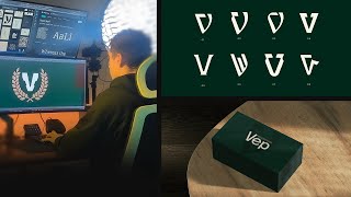
Jeremy Mura walks through designing a logo for a Sydney property broker, from discovery call through final delivery. The client targets affluent 35-45 year olds who are decision-fatigued, so the brand needed to feel refined, modern, and minimal-luxury. He shows mood boards, typographic concepts, multiple directions, and revision rounds before handing over the files.
Chapters
I'm back with another logo design process video. This is for a real client project. They're based in Sydney and they are in the property industry. So they're like a broker. They connect a client to a property group and then they find the best fit for them. And so I wanted to share my design process, how I came up with the final design. And you know, some of these videos don't get the best views, but I like just sharing my process to help out other designers that may be struggling with ideas or how to present or just doing client work. So the first thing, I had a call with my client and we jumped onto a discovery call. I always start off with a discovery call because I'm not going to go into a project blind. I'm going to go in with clear goals, clear ideas of the audience, the structure, the, you know, the buyer's journey, the tone of voice, the personality. All those key things are needed to do a clear and strategic brand identity. So here's my framework. I have my brand discovery. I'll just quickly grow through it. But we basically got the main details of the client. So some of the stuff was the business called VP stands for Valet S Posse, which means is to be willing is to be able. So it had some Latin elements which I will show you later how I sort of incorporated that into the design. And then the name was. It also represented the client which was Vargas Equity and Property. So that was another key thing. And they've been in the investment property business for a while. They got some experience. So this was key information that I grabbed from the client, which was key. We also broke down, you know, some of the values, some of the goals as you can see here. I'm not going to go into too much detail. We have the brand personality slider as well. So we covered this. They're going for a more refined, modern look and a bit more luxury, but on the minimal side. But they still want to have that authority. So this is always good just to get an idea of where that client's head is at. We got the clear tone of voice. So clear and concise. We want to be sound, experienced, confident, be like the guiding light, empathetic as well, not too salesy. And typically this is good for getting the brand voice. And because it's just one service at the moment, it's just a referral based service. They didn't have too much. So I didn't go in depth in the benefits and the features and products because they don't have. They're just starting out in with one service. So just keeping it really simple for this client. So the main thing, they needed a professional identity. And then we broke down the audience. So the customer, you know, 35 to 45, older, someone who's got money, they're just overwhelmed with too many decisions. And some other key insights here we just gathered all the insights, psychographics, the demographics, and this just helps me focus and hone in on the design. And then we also looked at positioning map and some of the competitors as well, which helped us position ourselves sort of on the premium experienced end. So after the Discovery phase, I jump into doing mood boards or stylescapes, depending on how I'm feeling. But mood boards, just a great way to just jump in and start getting inspiration. And I always add things like textures, logos, colors, fonts, anything that I'll basically put in the identity, I want to start off with doing that. So it just saves me a ton of time in the revision phase. So here was the initial mood boards. As you can see, I also came up with some taglines and slogans based on the discovery phase. So you can see here are some of my ideas. And I really liked this one at the bottom, bright. And then I also came up with another version as well, from Willing to Winning, which is just a really simple four letters. Whenever it's a tagline, I try and keep it under four words or else it just gets too confusing. So here are my initial mood board. Disciplined brilliance. Now this one I went for, you know, royal blues, golds. I always try and do golds when it comes to, like royalty, it can represent, you know, gold, kingship. What else? Authority Blue represents authority as well. Like we think of police and then we have played with some simple sans serifontia and just giving it really clean, just giving a quick idea. And then this logo here was inspired by Juventus. And because the whole meaning of, you know, vep, it has a Latin background, I thought, why not? For example, yeah, so you can see the Juventus logo. You can see it's got this sort of that style with like the line in the middle. So I tried to keep that idea here with the V and then have like a star as like where the guiding light type of thing. And I did go onto Cosmos and looked at different, you know, Latin inspired logos. I looked at V logos. I looked at like Latin crest design as well and tried to look at some ideas, even like Latin typography as well, just to spark some ideas. So this is one of the ways when I initiated the mood board before jumping in design. So that was one mood board. Then we had the quiet authority one. This was more green and gold. And then using like an off white. I always try and do like an off white that matches the color instead of pure white because pure white is very harsh. So if I, for example, you can see I always try and add a color that complements the main color or the main background. So you can see it's like an off green, it's an off white. So that's worked really well. Play around patterns. I took a picture, I just generated that in GPT of like the user Persona. And this one was more aimed at the female. This one was more aimed at the main customer, which is like an older male. And then the third one, calm confidence, added some leather textures, but a grain, more of a serif font, more like elegance. And then had this like sky gradient with like earthy sand tones. So this one was a bit of a different idea. And I like this idea of having maybe a seal or something with like a monogram. I just whipped it up really quick. I didn't try and put too much effort into like the logo because that was going to come later. And. And then we looked at competitors. So you can see extracting some of the colors just. I did a quick order of that and just put that in the mood board and then I presented it in a PDF over loom to my client. So that was Moodle 1. Now at this stage, usually I do a refinement of the mood board and just have that one revision in just in case something feels off, like we want to change the color or the font or something. And then we came up with these mood boards here. So I just expanded upon the directions 1. I sort of play with the idea of the logo in a different style, so more iconic, bold, as you can see. And then maybe an idea of having this reef. And in Latin Roman times, they did have olive tree leaves, represents like authority, victory, etc. And just in case they weren't satisfied with that, I did a extra mood board as well. This one so had like more of a seal and took some ideas. You can see some of these ideas like road and. And the mountain here, the kingdom. And I was thinking maybe we could make a shield or a badge or something like this. So those are some other IDs. After that, we jumped into the first initial logo design phase. So the first thing I did was use font base. Now this is my typography management system that I use for fonts. And I actually did a recent video on this. So if you want to check it out, I'll put it in the card. You can click on it or just go to my channel and you'll see it. But basically I can come in here and type in text. And so this is just a fast way of checking different fonts. So I can don't waste time like flicking through Illustrator or online. I can just go through here and see what fonts I had that could be potentially be used. So I did this and I'll just like screenshot it and then just drop it in here as you can see with the V's. And I really wanted to create like a V icon, mark, logo, mark. So that's why I put that there. And then I had some ideas of some fonts as we can see, some really nice elegant ones that more unique. I'm gonna start off with the icon here. So I just started playing off with some of the fonts. So I dropped, for example Michael is here and I dropped some other fonts and then I'll start customizing it. And I really like this ID of having this tick type of design. Then I had this design here, sort of like a cut inside the V. Also looks like a mountain if you like rotate like this. And then I created sort of this concept a vep, trying to keep it have those letters inside of the V shape. So I thought that was kind of cool. Then you can see just playing over different ideas and text. I really like this VP that with the sort of the meaning right there. It fits nicely. And that's why lowercase also feels more premium as well instead of doing uppercase. So you can see the process there. And that was the initial process. I was playing around some patterns and stuff. But then from that I moved on to the first presentation, as you can see. So I laid out the mission, the goals, the strategy elements there, mood board, personality, slider, the tagline and then logo direction one. And I used the same colors and elements from the direction in the presentation. Just works a lot better to show it in context of the client. So this is the first logo here. I did customize the letters. I moved the E and customize the P. As you can see, I think this just clean, it's simple. And you can see my thinking V letter, V P, mountain. You can see some of the unique parts of this. Got the colors, the fonts and then some mock ups here. Then we have direction too, which is this one. Went for more contrast, went for a lighter fontier, more serif. I came up with this mark Here it's a letter V with a wind windy path and a check mark and a tick. So I think this worked really well because they go through an approval process with their clients and, you know, they guide them on the right path to the right property group and then also has that letter V. So it's a striking mark. And it also, it also looks like a, like a horseshoe kind of thing as well. Like this shape here, which happened randomly. I was like, oh, that's actually a horseshoe. It's kind of cool. So it can represent, like movement moving forward. You know, if you're willing, you just take the first step. So I thought that that was a cool idea. And you can see here some other ideas with the older branches. I really love this idea. When my client decided they didn't really like this style, they didn't like this idea, I thought that would be really cool. But anything with like a bad shape or like a laurel or something is just fun to do. And so here's the final concepts. And then we moved on to round two, where I just generated a bunch of more concepts, just iterations, designing. And in the logo phase, I always have revisions just in case it's not perfect on the first go. Even though I can communicate to my client, hey, this is the best solution that I found. There's always, you know, other solutions. You know, there's not a perfect solution because you can always have other ideas. And if a client works with another designer, they have a different process, it will most likely be a different solution as well. So there's no perfect solution. There's just the best potential solution, basically. And so here were some other ideas as well. And then you can see, just putting on a few slides. I wanted to see the logo tweaked a little bit and then the option one font. And then I put some other fonts here in case they wanted to go with that, as you can see. And then from that we decided on the final direction and here's the final result. And then from that, the last phase, I packaged up all the files nicely for the client in a Dropbox and then chipped it off. And that's typically how I do it for a. Just a simple visual identity. Nothing too crazy, you know, throwing that pattern, throwing some icons, because this client is not public facing this sort of private. There doesn't need to be a lot of marketing materials. Maybe in the future if they do do that, but they're just a small business starting out. So thanks so much for watching my logo design process. If you do love these videos, please hit the like and share it with the designer. That might help them also drop a comment as well. It does help the channel. If you do want to see another video where I design a logo for a different brand, you can watch this video right here.