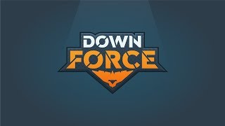
YouTube walkthrough by Jeremy Mura (posted Aug 29, 2019) describing his logo design work for a mobile game called Downforce. He recounts the project origins (concept work done around 2016), the brief (space-racing, tech/retro neon aesthetic), and demonstrates multiple Illustrator artboards exploring bold typography, monograms (D/F), custom letterforms (including a spaceship-shaped W), UI mockups, color experiments, and final treatments (3D overlays, textures and glow). The video is framed as an experimental side project with lessons learned about needing more strategy, and ends with a subscribe/call-to-action.
Chapters
Foreign. Hey, it's Jeremy here. I want to be showing you a logo that I did. I was working on this project a couple years back, back in around 2016, and it was for a game. My friend, he's a coda. He likes making games and apps for iOS and Android and stuff like that. And yeah, we're working on a game called Downforce. It was like a racing game. And I'm just going to show you some of the art boards and some of the designs that I did for it, which is pretty cool. I don't know if the game we actually, the partnership ended up not working out. And I'm not sure if you continue with the game or not, but it was just a fun little project on the side and yeah, I learned a lot from it. So you can see we were going for like a techie theme. Obviously it was for like a racing game about spaceships, sort of like a Star wars vibe, but using retro colors and neon colors. And it was pretty much you go through these gates really quickly, which is pretty interesting, and you set times and lapse. So you can see I went for like bold neon colors here and it was called Down Force. So we're focusing on using like abstract typography and fonts. Playing with colors here, as you can see, using fonts that were very bold and modern and just pulling some elements from some other logos I did. You can see he's playing around with all different lockups, seeing how I could just use maybe a monogram or just use the word itself. And then as I'll go through these other artboards, you see the iterations and how it evolved. So you can see playing around some other ideas. This one was pretty nice here, as you can see, with the D and the F. Playing more with the D and the F here, using a lot of shapes and stuff, using a lot of form, as you can see here, and some more playing around with different colors, high contrast colors. Just pretty interesting. Jump to the next one. I think this one is pretty similar as well. You can see here I was playing around. See, I like this one with the F and the R. It's like it's going through the loop and that's what like the game is about. So. So I really actually like this mock up, this lockup here with the font. So just subtle cues to really show what the game is about. As you can see here, it's looking nice. And even this one, we try to make the W look like a spaceship so you can see the actual spaceship within the W. There, which is very interesting. It also sort of looks like a star. So I really like cutting up the type and just really playing around with it and seeing what subtle cues we can put in there using different fonts. You can see he making it more utilitarian, cutting it up. And then it evolved even more of had some UI elements, which is interesting. You can see I started playing around with this having down a bit smaller, playing over the colors here. So starts to look really cool. Started incorporating like a little like a spaceship thing using different shapes and then just started experimenting doing all this random stuff. Yeah, it wasn't. We didn't really do strategy. So the logo was more of just. Just playing around and trying to see what stick. But then eventually came up with this. I really like this at the time. So you can see it's like really got. It's really got a game vibe to it. So I made it look 3D. I use like overlays and multiply to make it look 3D and pop out there. And I customize the type and added a bit of a shadow there, which was really cool. So I was really happy with that. You can see like all the different designs there. And I think it was. This is the last final one. Yeah, this was the final design. As you can see there, black and white. And with the effects there, you see you got some texture and some patterns, which is pretty cool. They added some glow effects which I thought was super cool. And you can see the actual spaceship change as well. So yeah, that was a bit of my process of creating a logo for a game, for an app, which is pretty interesting. It was fine. I learned a lot. But yeah, needed to focus more on the strategy and it was more of like a side project. So. Yeah, anyway, I thought it was really fun. So cool. Thanks guys for watching. Let me know if this was interesting or not. If you want to see more logo design process videos, leave a comment below and hit subscribe as well because it will grow the channel and let other people see this awesome content. I really appreciate you watching and I look forward to making a line for you. So I'll catch you in the next video.