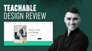
This content was created by Jeremy Mura. This content was uploaded by Jeremy Mura. This is a YouTube video titled "Teachable Site UI Design Review 2020" created on June 21, 2020, featuring Jeremy Mura reviewing the recent rebranding of the Teachable website, discussing its design elements, layout, and user interface improvements.
Chapters
Hey guys. In this video, I'm going to be reviewing the teachable website. They've recently gone through a rebrand. I just want to talk through it and see how we can review it and get some tips from it. So their teachable site is still the same teachable.com and they've sort of redid their logo. If I go back to their old logo, teachable logo, you can see they had sort of this, you know, very basic, the circle, the T and then like some serif font here. But they've recently changed their logos by typing 2020. It should have the new one. Okay, maybe not. But you can see the new logo is this. They've sort of changed it to like teachable with a semicolon. So really like this. I like the navigation. Very clean and they use these nice lines. First up with the new colors, I feel like it really resembles it. Really nice. And they've got the new favicon in the corner. Share what you know, very simple, very clean. Then sign up. So the sign up thing I think is really good because you want people to sign up so they can get free courses or a free webinar to help them, you know, transition to teaching on teacherwall Master out of hand lettering out of. So they're using like testimonials. This color, the green is very, very vibrant on my screen. But overall there's contrast there with the dark text. So I feel like that works and it's not too overpowering. It's got some nice space there. And I like how they've sort of broken this grid and they're using, you know, the square, the rec. Long rectangles here and breaking up that grid. Then you can see they got like an embedded video. So that's very cool. They're like embedded video. Really nice, clean there. The body text. Got some links showing the testimonials. I like how they lay out these steps to really break it down and simple for people. So this is very cool. It's got a like nice little stroke, the headlines and just making it really digestible. A lot of white space. You can see they're breaking up the sections with like that white color. I think it's a bit off white. And then they're using multiple. The green colors. I like this dark palette with the green here. They've sort of got like this slider, automatic slider thing happening. That's kind of cool. Let me go down here. Not too much of a fan of this. I like how they're using this sort of this element of this stroke to balance it out and pretty much set that layout in stone. Then you get down to here, discover, and you can see this. They're using this semicolon from the logo as a recurring motif or theme. They're using the pseudos like art, business, food. So it's like the categories, right? And then they're using the stroke to break it up. I like that they're using that, just a thin, nice stroke to really break up certain sections. So this is really, really cool. Quick start Webinar. This is a nice shot register for webinar. So really clean. The button doesn't do anything when you hover over it. So I think they could have made like, maybe animate this stroke to like go across. That would be really cool. Let's go down here and then get started again. So the call to action is always the same. It's always like, get started, get started in the top right corner. And then the bottom footer is really clean as well. So, like, if you click get started, it'll take you to the back end of the thing. And because this. They just updated their branding this week, they're doing a rollout. So not all of everything's changed. I think if I go to features, though, this page is good as well. So I love this imagery here. Really showing natural people, everyday people that want to make money doing courses. I like this new layout they've got here. See the text, they're really, really cool. Breaking up the space, keeping the. The leading of the body really, really long or wide. Just scrolling through here and it's showing. They're clearly showing the features using imagery and then putting, you know, rectangle and the design on top of an image. So it's not just like a plain color. So they're sort of mixing it up. I like this layout here. It's a really nice page and they're just keeping everything really simple. And I think if the pricing page is decent as well. So you can see the prices. You can see, you can slit. This button is really nice. Very clear. They probably should have used this sort of button on other pages as well. But you can switch it. Really nice. Got the select pan, the hover button that's easy to use. Clearly states what is included in each bundle. And I like the use of these ticks. These ticks. Really nice. And that green color is really bold. That's really cool. I think the blog, yeah, the blog is the old branding. So you can see the old branding, it feels a bit outdated, but the new branding is really nice, so they're slowly rolling it out. But this is just a quick review of the new teachable page and I think it's really nice. Just something different. If you guys like this type of stuff me reviewing maybe websites or logos or things like that, then let me know. Be really helpful. Thanks guys for watching. Remember to subscribe and like this video if you found it helpful and I look forward to creating more tutorials for you.