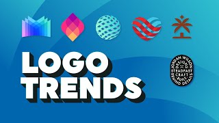
A short YouTube commentary by Jeremy Mura that walks through Logo Lounge’s 2021 logo trends report. The host names and briefly describes the leading trends (e.g., asterisk, off-jog, splice, electric tape, stacked/dog tags, layered transparency, variable fonts, etched/vintage), offers personal reactions and examples, and asks viewers for feedback.
Chapters
In this video, I want to show you the top 20, 21 trends from logo Lounge. What's up? Hope you're having an awesome day. Every year Logo Lounge releases a logo design report of the top trending logos. So I'm just going to go through with them and look at what the trends are this year. So I'm on the website. You can check it out@logolunge.com this video is not sponsored. I just love Logo Lounge and I actually got my logo featured in the logo book 12, which is really cool. So just scrolling through, they've got, you know, just an intro text. Cool quote. People in branding are hired to tell stories and create meaning. Make the drama matter. I like that. Make the drama matter. As Lego designers, you know, we need to make sure that we are creating impactful designs for our clients. So it looks like I'm scrolling across here. These are all the top ones. So you got asterisk. You got off jog. Splice, electric tape, stacked dog tags, plenty of different ones. So I'm going to scroll through and I'm pretty sure they're going to show it. So number one is Asterix, so we can see a few examples here. I think it's more of a creative symbol for me. I haven't really used the asterisk as much. I love using like ampersands and like different symbols and stuff. Stuff. I think that's really cool. But this looks like an interesting trend. That's really cool. Number two is off jog. Never heard of that before. This what I want pointing out elusive in definition. So we can see. It's like the. You see how it flows on the opposite sides and creating like a negative space sort of thing. That's pretty cool. Interesting shapes. I like this red one. That's pretty cool. And the bricks, that's pretty, pretty clean. I remember seeing that on LinkedIn. Those like they shared the design. I think logo trend. Splice. Cbc. Exploding pizza. All right, cool. Splice like chopping up these shapes so you can see how they're cutting up a lot of these shapes. A lot of circular, circular forms. Half quarter ellipses as well. I think that's really interesting. Sony Publishing. That's really cool. Haven't seen that logo before. Electric tape. Step forward or backwards. When designers media choice is a roll of electrical tape. Interesting. So it looks like this is more of like a stroke form, but it's more like squared and a bit thick. Thick lines, you know, trying to represent like tape. When you get tape and you stick it in like do layers. I think that's what they're trying to go for. I think that's interesting. Trans flip, Hypnotic mesmerizing and spell binding will come to mind. Gazing into these facet faceted bubble logos. Rhythmic symmetry in a light being flipped. Embedded on itself. Layer transparency. I'm a fan of layered transparency. I love these ones. I love this one. This is. This is cool. The gradients and like the overlay. Typically in Illustrator you just go. Or Photoshop you can go overlay or multiply or color dodge, things like that and you get some cool effects. But yeah, I'm liking the overlapping here. I think that's always very popular, especially with the gradients as well. We've got stacked. Stacked is cool. Pretty straightforward stacking icons. Or here you got. You can see in the city church one here they've got like icon, City church. Think that's really cool. Nice and tight. Clean and simple quads. There's nothing showing there, but we'll just skip. Number eight is chains. So from point A to point B is a straight line. Chains. Okay. Okay, I see. You see these? How they connect the two semicircles? It's like connecting. Like a chain has links. So it's sort of like creating links. So I think that's. That's pretty interesting. Janice. Variable fonts have made as much of a contribution to shift the design landscape over the last few years. It's true. I've seen it a lot, especially with Pentagram Studio. They've been doing a lot of this stuff, creating, making type move, making it more fluid. So you can see here a lot of the zooming in there. You can see the different elements are like thick to bold. And playing around with typey like that one's an interesting. The Brazil one, like, that's like. That font looks so different. The A and the S super awesome though, because motion is so popular these days. We've got merger at number 10. Merging is what is it, right? Gravity magnetism draws elements together. So you got these connecting sort of circular shapes. Connecting, leaving like a flow or residue together. That's interesting. That Solara one is interesting. It also can sort of feel like a DNA or like a droplet, something like that. So we'll go through here. Oh, really? That's an interesting name. There is probably no more foundational shape for a design than the circle. So basic sticking to the circle, you know, you can't go wrong with that. But obviously using like these weird gradients colors. Think that looks cool. Like this 3D one. That's nice. Next up is Swingers. Swingers dispel Sir Isaac Newton's law of motion. And object at rest will stay at rest. So you can see the creating sort of this illusion, moving parts. As you can see there, it's like a window opening or this one like a flipping exclamation mark. Like pages and a paper flow here. I think that's cool. Make it a more dynamic movement, more flexible. Dog tags, number 13. I love this style. I just love badges and typography like this. Just playful and fun like this one. Jordan Wilson Design. I think that's dope. There's a charm, beauty and finality that attaches itself to the idea of cramming all of your vital stats into a small metal lozenge with a limit of 72 characters. It's true. So it's all about stacking and compiling all this text, great fonts into like, you know, shapes. I think that works really well. 14 is etched. Now, etching comes from a vintage way of doing things where they used to, you know, the old school way of like creating stitching and etching with ink and things like that. So you can see here, like this one, they're using a lot of lines. It's a lot of detail. You can see the dog there. Hopefully if I zoom in, you can see there's a lot of detail. So it's more like the heritage and vintage type of design work there. And I think there's one more number 15 is rods. So it's all about perspective. It's all about creating these offbeat strokes with a different thickness. As you can see here. Look kind of interesting. I don't know if I like this one, to be honest. Looks kind of boring. But anyway, I think, you know, there's a top 15 trends, so let me know what you think. What's your favorite one in out of this 2021 logo trend report? And I'm excited to see what next year's will be. You know, it's always changing, it's always evolving, but, you know, I think it's really, really cool. So that's it for the 2021 trend report. Hope you guys enjoyed this video. Leave a comment below if you like the logo trends this year and remember to smash up subscribe button because I create graphic design content and tutorials every week. So I hope you have an amazing day. Talk to you next time. Sam.