How To Create Incredible Final Expense Ads In 5 Minutes (FREE Canva Tutorial)
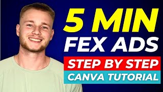
Learn to build final-expense ads in Canva using the 1080x1080 template. The creator walks through three examples: a diabetes-targeted burial program, a local Charlotte ad, and a casket-themed telesales version. Use Montserrat font, add human faces, and grab free stock images from Pexels or Pixabay.
Chapters
In this video, I'm going to show you how to use a free software called Canva to create final expense ads that could generate you tens of thousands of dollars in annual premium. I'm going to create three different ads and show you the exact process I use. And no, I'm not talking about the bullshit, gimmicky garbage looking ads that a six year old could design. These are going to be professional, attractive looking ads that you wouldn't be embarrassed to show your family. Be sure to stick to the end of this video because I'm going to show you every single tip, trick and hack that I know so that you can use Canva to its fullest potential. So let's jump into Canva and get started. All right, so the first thing I'm going to do is I'm going to click this purple button that says create a design. And I'm always going to go with an Instagram post square. That's going to be 1080 by 1080. And the reason I do that is because if you look at a Facebook feed, the square dimensions takes up the most space on the feed, which gives you the highest chance of somebody clicking on your ad. So the first thing I like to do do is I'll pick a background color for my ad. A few colors that work really well are like a super bright red like this. I use this a ton. You can use kind of like a deep purple kind of like that. You see this pops out also like a yellow. This is a really good one as well. This first ad that I'm going to create is going to be an ad for diabetics. And the way I always like to do it is I'll have one ad here or my background here and then I'll put like an image in the middle. So, so let's just say that this shape is going to be the image just so you guys can kind of see like what the framing is going to look like. So we have this part at the top, we have this part at the bottom, and then we have the part at the middle which is where our image is going to go. So at the top I like to put like an attention grabbing headline and then at the bottom I like to put a call to action. And then obviously in the middle goes the image. So what I'm going to do is I'm going to look up diabetes. Canva is usually really, really good with photos. But what I like to do is I like to have things that have human faces in it. Makes it more relatable I don't want to put stuff with blood or like stomach fat just because that's going to give me a higher chance of getting reject. This right here would be a great photo to use.
All right, so I'm going to use this girl right here. Obviously, attractive females perform well on advertisements, so I'm kind of following along that same principle here. I'm going to drag this out, make it a little bigger. As you guys can see, I have an image right here. I have this top part, I have the bottom part. I want to make this image actually pop a little bit more. So I'm going to click on Edit image right here and it's going to give me all these different settings. Going to click see all and I'm going to add a little bit of contrast here. And as you guys can see, it starts to pop a little more. So this is before. This is as I'm dragging the contrast up, you can see it pops a little bit more. Maybe add some brightness, maybe not too much, maybe a little bit of warmth, some vibrance. The way that you need to view this is the eye test. If you close your eyes and then look at the ad, does it catch your attention? And if it does, then you're going in the right spot. So you're looking for like, hey, does this catch my attention on Facebook? And at the current moment, it looks like it is starting to do that. Next thing I'm going to do is I'm going to grab some text. To get the text, you click on this left hand side, it says text. And to get to any of the images, you're going to click on elements. And then I can go all, I can go graphics, photos, videos, all this stuff. But here I'm just going to go to text, click, add a heading. I'm going to drag it up to this top part here. You can use different fonts, however, my personal favorite font to use is called Montserrat. It's a free font in Canva. I'm going to do Montserrat Classic because it's a little easier to read. I can just say something like, Breaking State approves new burial program for diabetics. With this, you can put any number. You can put 35,000, 25,000, whatever your program does. So Breaking State approves new $35,000 burial program for diabetics. Okay. And so what I'm trying to do here, like, is I'm trying to make it fit up in this top part here. But the first thing I'm going to do Before I get into all that, I'm going to make it all white just so it'll pop a little more. What I am going to do is I'll click on the text, go to effects lift and then I can add some of that in the background which will make this pop more. You guys see how there's like a little bit of a gap between the top text and the bottom text. I want that gone. So I'm going to go here to spacing and I'm going to drag line spacing down. I'm still thinking that this is like a little hard to read this yellow. So I might for this I might just use the red one. There we go. Honestly, I think that looks so much better. Again, it's all back to the eye test. So I'm using the eye test to figure out what's going to look the best, what I'm actually going to do so that it's symmetrical. I'm going to delete this top part of the text. So I'm going to have this bottom part here and then I'm going to go back and just paste this. So now what I can do is drag this across the top so that it's symmetrical. With my other text, I'm going to put breaking in all caps, change it to white and then add on that lift, maybe make her a little bit bigger. I'm thinking about maybe like adding a little graphic here on the left. Like let's think about what we want these people's eyes to be drawn to. So I'm breaking state approved new $35,000 program for diabetic. I can underline diabetics. That way people that have diabetes are going to have their attention more drawn to it. I could also change the color of just the word diabetics so I could make it like a super bright yellow. Then this next part, and this is super simple, I'm just going to copy and then paste. And now I can just drag this down. I can keep my exact same formatting that I have and just use it on the bottom part. So I'll just say click learn more. Kind of the format for this headline at the top, kind of explaining what it is. And then I have a call to action at the bottom. So click learn more to see.
If you qualify. And we already have an ad that's kind of starting to come together. Maybe just put a little dot, dot, dot. I want to add something to kind of like make it pop right here. So I'm just going to go back here. I'LL go to graphics. And obviously, like, if you guys get Canva Pro, what is that? I think it's like 10 bucks a month. So if you, if you're going to be making ads, like it's going to be worth it. And you could do it without that. You could do it with it. All right, so I got my little insulin bottle right here and then I can go in and like mess with the color, you know, play around with it. Right? All right. And as you guys can see, we made a super professional looking ad in five to seven minutes total. Just throwing some things together. So what I'm going to do is in the link down below, you guys are going to be able to get access to all of the ads that I'm going to make. But this is the first one done. Now for ad number two, the second one, I'm going to make a face to face final expense ad. And then the final ad that I'm going to make is going to be like a telesales ad where you can generate leads in just about any state. All right, so for the next ad I'm going to create, it's going to be an ad for a local like three face to face final expense campaign. We're going to use, you know, the exact same format we just used and we will find a random US city to make an ad for this time I'm going to use like a purple color. Purple right there. That'll pop. We'll do Charlotte, North Carolina. First thing I'm going to do, I'm going to go to Elements and I'm just going to type in Charlotte. We're going to photos see all. Now it looks like all of these photos are going to be premium, which is good. So let me show you guys something else. You guys can use this website, it's called Pexels, a free stock photo website where you can get stock photos of just about anything. So I'm going to type in Charlotte, North Carolina. Let me just find one that's kind of like of the skyline that would be recognizable. All right, we'll use this one. So I'm going to upload this into Canva. We'll drag this out here. So we got our photo of Charlotte and I'm going to follow the exact same format. So I'm going to go add a heading. I'm going to go montserrat Classic. I'm going to say attention Charlotte seniors. I'm going to make this white. I'm going to add lift to the background and then let Me just make this smaller and drag it up here. Actually, I'm going to rephrase this. Let's say attention seniors living in Charlotte, North Carolina. So again, I'm going to drag this out so it's kind of like better formatted. I'm going to go to spacing. I'm going to decrease the line spacing so I can fit more and then drag this puppy out. Might make this photo a little bit bigger just so we can see that skyline. Then I'm going to go edit image. And again, back to the eye test. Let's add a little bit of contrast here so it pops more. Maybe some saturation. Looks cool. It kind of looks like a vintage photo. I actually really like this. Might add a little. Make a little bit of warmth to it. Just make it pop a little more. Might add a little bit of brightness. Can't help myself. Perfect. And then I'm going to go here. I'm going to add an arrow. Like point to the city just so they kind of like it like sticks out. Make this red. Detention seniors living in Charlotte. Oh, wait, that's Charlotte right there. Cool. Maybe I'll underline Charlotte and see. I'm just going to copy the same text. Move this down here. Actually, what I'll do is I'm going to go back to my diabetes ad and I'm just going to copy this text here. I want to add a little bit of context for like the burial thing. You burial.
Like here. So they see Charlotte, they see the arrow and then it's like, hey, there's a new $25,000 burial fund. Click learn more to see if you qualify. What may happen sometimes is Facebook doesn't really love arrows. I just like because it kind of like draws their attention here. But I could do something like that. So attention seniors living in Charlotte. I have my skyline here. New $35,000 burial fund. Click learn more to see if you qualify. And I mean, honestly, guys, like this ad would kill it. Like if you are running face to face in Charlotte, use this and tell me how it works because I know it will. And then like if I was using the pro version of Canva, which I actually have recommend you guys to get, if you're going to be making ads, just go to Charlotte and see. I've noticed like these work really well. You could do like a closer one of the skyline. And I have paid Canva. I just wanted to use an account of mine where wasn't on there just so you guys could like see. Because the title of this Video is obviously to use it for free, but there you go. So we have our second ad already made. We'll just call this Charlotte local ad. And now for our final one, we're going to make a telesales final expense insurance ad. So again, we're going to go back here. We're just going to go. And we'll make this one like a royal blue. So what I'm going to do for this one, this is just going to be like kind of a casket ad. Scroll down here looking for some casket photos that really, like, pop and catch my attention. Honestly, like, this would be kind of funny if you use like a King Tut image or something. You know, tell you what, I might actually do that. I think that would be creative. You want to be a little creative with it. Not like too creative. I've seen people go a little bit too far out of the box, but if you can add some creativity in there, definitely work. So I'm going to go to Pexels here. I'm going to look up casket. I think this would be funny. Oh, here we go. Perfect. I'm just going to use this one to keep it super simple. What you could do is just be like, attention seniors is literally you just copy this and paste it there. Or I'm just gonna change diabetics to seniors, obviously. And I think it's a little tongue in cheek. I think people will appreciate it. And then I'm just gonna copy the same. Learn more. Click here to see if you qualify in the bottom. The key is gonna come with making this image pop more because it's a little, like, dull. Add more contrast, maybe some saturation. Oh, yeah, there we go. Make some vibrance, a little bit of warmth. Warm this thing up. X process. And now, like, if you guys notice this blue now is blending in some needs to run this and let me know how it does. I think it'll kill it something kind of out of the box. And then like for your ad copy, you could go like, we don't all need a king's funeral, but at the very least, your family needs enough to bury you. Or some. Something creative like that I think would actually do really well. Here is, you know, we'll just call this like Egyptian burial ad. And then tell you what, I'm just going to do another one. Basically the same of this, but just like with a casket photo. So you guys have both. But I thought this would be kind of a fun bonus to throw in there. So just duplicate, make a copy and like, as you Guys can see these are all following the same framework. Just color the background, add in a photo, add in your text, add the lift to the text and make it pretty. So we'll just go casket. Actually, we'll go to Pixabay inside of the course. I give you like eight different of these websites. So if you go to a couple and you can't find like a good casket photo, you have plenty of options. So if you guys haven't already checked out the course, there's gonna be a link down below in the description. It's our course secrets of 77 Facebook leads. You guys will get a ton of value from it. I don't think I've ever gotten a bad review super conf into that product and we've had a ton of success stories come through that. All right, so I'm just going to use this photo here. We'll add it in, drag this puppy out, shrink it a little bit so I can still see. Click, learn more and then just edit the image. Remember guys, the eye test Brightness doesn't look too good. Contrast, that's too much. Let's add some saturation so it's a little more colorful. That looks good. Let's add some vibrance so it's a little more colorful. That also looks good. Highlights and I don't know if that's really doing much shadows.
And then let's just make this dark green. That looks okay. I like that. And there we go. Ladies and gentlemen. That is how you create ads in canva that convert like freaking crazy. Test it for yourself. I'm gonna have all of these ads linked below in the description. Tell you what, I'll give them to you guys for a dollar. If you guys just click the link down below, you can get all four of these ads for only $1. Test them. Let me know how how they do. Thank you guys so much for watching. If you haven't already, click that subscribe button for more valuable content like this. If you guys want me to make a video about how to make converting video ads, drop it in the comments. Just comment video and I'll be sure to put that out for you guys. But without any further ado. Thank you guys so much for watching. I will see you in the next one. Peace.
We.