How To Make A Really Good YouTube Thumbnail [PicMonkey Tutorial]
Learn how to design YouTube thumbnails that get clicks using PicMonkey. The tutorial covers color choices, text placement, and testing strategies to improve your click-through rate while keeping your branding consistent across videos.
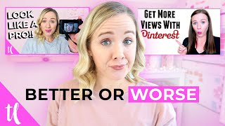
I have gone through quite a thumbnail evolution here on my channel from when I first got started to my most recent ones. So can you figure out which of my thumbnails is actually helping me get more views? Well, if you are ready to find out and learn the three do's and don'ts when it comes to creating YouTube thumbnails plus a behind the scenes look on how you can make better thumbnails for your channel. Hit that like button and let's get started. Let's jump into the three do's when it comes to creating thumbnails for your videos. Now understand that your click through rate is how well you're getting people to click on your video based on your title. And your thumbnail isn't based solely on your thumbnail, it's a combination of your title and your thumbnail combined. Now if you want to test specifically how well your thumbnail is doing, you can use an A B test system that Tubebuddy has. I test mine occasionally to see how well my thumbnails are doing and if I need to change them. In this A B testing you're able to test two different thumbnails. The reason why you're able to see which thumbnail is performing better is because the title remains the same or while they test the two thumbnails for you. So when we are talking about a click through rate, just be aware that the thumbnail in the title both combine to your click through rate number. But when it comes to do's for your thumbnails, here's what you need to do. First, show your face. I have found across all channels that it is pretty much a higher click through rate when you do show your face because people want to know who they are going to be learning from. They want to be able to trust that person if they can see the whites of your eyes. It has been known to increase your click through rates. Now a lot of you are probably wondering well what if I don't want to show my face or how am I going to get photos? After every single video that I film I then turn my camera on self timer and just do a couple poses. I know it seems weird and awkward and it's just something that you can do to be able to get a better thumbnail photo for you to use. If you don't want to get all awkward and weird, just smile. Okay? That is better than using stock photos from what I've seen in the data in other channels. The second do is add color and shrink it down. So when people are Looking at your thumbnail on YouTube, they're either looking at it on a white background or if they're in dark mode in a black background. So when you use white as a heavy color on your thumbnail or black as a heavy color on your thumbnail, it tends to blend in. We found this out with my previous thumbnails. I was using white thumbnails because my branding was just a more muted branding with white and black and blush. But when we added the pop of pink, this is where the whole blue, bright pink color came into. When we added that pop of pink, our click through rates went up by 300% just because we added a little extra color. So if you can add maybe a pop of blue or yellow or somewhere in your thumbnail so really stand out against a white or black background, that's really going to help your click through rates. Also remember your thumbnails are going to be shown on mobile device as well and so they can get pretty small. Shrink your thumbnail down, see what it will look like on a mobile device. From there you can determine the Is this actually going to grab people's attention? Is this going to make them want to click? And the third do is what I talked about earlier is testing it. Like I said, TubeBuddy has a great A B test tool inside of their system. You can also leave a Thumbnail up for 24 hours, track its click through rates, and then change that thumbnail for the next 24 hours. Track it, change it for 24 hours. You can do it manually as well to see how well your thumbnails are getting clicked on. Because remember the the title is staying the same. You're just going to be switching out that thumbnail to see if you can increase click throughs. All right, now let's talk about the three don'ts, the things you should not do on your thumbnails. First, don't just repeat the title of your video on your thumbnail. People are already going to see the title. And you don't just want to copy that title on your thumbnail, you want to use text that's going to complement that title that's going to grab people's attention. In fact, you probably want to minimize the amount of words on your thumbnail to about three to five words max. Because remember those thumbnails are going to show up on mobile device and they're going to get really small. So it's going to be pretty hard to read that text if you're putting a lot on it. So again, just think about three to five words that's really going to scream out to your target audience. The second don't is just slapping up any old thumbnail. Don't let a thumbnail be an afterthought. Think it through. I really like to think about what my thumbnail is going to be right after I come up with my title. So if you follow any of my videos here on my channel, I really talk about the process I go through and, and the very first step in my process is coming up with my video title. And the second step in my process is determining what's going to be on my thumbnail. That's really going to help that click through, rate tie into the video content. Because once you know what's going to be on your thumbnail and what your title is going to be, you can really start crafting your content for that person that's going to be clicking on that title and thumbnail. Okay, now if you want to hear more about how I do that, make sure you watch that video that is linked right up above right after this video and I will also link a couple of them best videos to watch as well to help you start creating this process. But let's move on to don't number three. And that's don't clutter it. Try to keep that thumbnail as simple but stand out as possible. Remember, we want some color, we want you on it, and we want very minimal text. Try not to throw on a bunch of emojis or a bunch of words or a lot of things that are happening because it just distracts people from actually looking at it. Also, don't put anything down in the right hand corner. I think that's right because if you look on YouTube, a lot of the YouTube icons will cover that side of your thumbnail. It's also timestamp with how long that video is. So try to keep most of your images and text to the left side of your thumbnail. All right, let's move over to my computer and I will walk you through a tutorial on how I use PicMonkey to create thumbnails for my channel. So the first thing you need to do to create your thumbnail is to make sure you have a photo of yourself. I don't make this super complicated. I just take a couple photos, photos of myself on the self timer after I shot my video. You can see here are a couple faces that I made for this thumbnail and then I will just figure out which one that I want. I'll pick one. Let's just go with this and I'm going to go ahead and download it to my computer because then we're going to upload it to one of the programs that I use to make my thumbnails. So there are two websites that I recommend using for your thumbnails, especially if you aren't a Adobe user. So if you don't do Adobe Photoshop or anything like that, PicMonkey and also Canva are, are great places to get started. The reason why I like PicMonkey a little bit more for thumbnails is because it has more photo editing options, which I'm going to show you here in a second. So something that both Canva and PicMonkey already have inside of their program is templates for YouTube thumbnails. So you see right here under templates you click YouTube thumbnail and they have ones that you can use from. So you can scan through here and get an idea, especially if you're just getting started what you kind of like. So if there's any here that you might like, you might feel drawn to you. You can get started here. And you can see the difference between the PicMonkey templates and also the Canva templates. You see, Canva is a little more text centric and whereas PicMonkey looks a little bit more like the thumbnails that you do see on YouTube. I'm going to pick one of these. I'm just going to go with this one right here. Super simple. And then PicMonkey has these different layers. So you see this is a text layer and on top of that it's a text layer. Here's the brushed heart. So you can click on all these to change that. So let's say we want to change the heart to maybe a black color. So there you see it changed over here which blends in with our hair. But we want to change the photo first. So let's go in here and we are going to replace image and I'm going to choose it from my computer so the image is replaced. So now what I like to do, since this is highlighted, you need to make sure this layer is highlighted. I go to edits and one of the first things that I like to do is go to sharpen and strengthen the sharpen just a little bit so that it stands out on YouTube. I will apply that. I also like to go to exposure and brighten it just a little bit and give it just a little bit of contrast because remember, you want it to stand out on YouTube and then this is the one that I love. I go to colors and I saturate this sucker so that it really pops. And you don't want to get it too saturated because then it starts to look unnatural. So I'll get it to a point and then I will cool it just a little bit with the blue because I like my thumbnails have a little cooler temperature. We're going to apply that. The next thing that I want to do is I want to blur this background. I make sure that the photo is clicked on. Then I'm going to go over here to the effects and down to basic and I'm going to click on soften and you'll see that makes it blurry. So what I want to do is click this panel paint button right here and I want to click this paintbrush up here and reverse the effect. So what's going to happen is I now have this painter tool to blur this out just a little bit. So you can see if I take it over this calendar how it blurs. But if you minimize the strengthen just a little bit, it will change it. So you see how that. And so you're just going to find like a good area to just blur your background out just a little bit. You can make the size a little bit bigger too. You just remember you want to get close to your head and just start blurring this out just a little bit. Again, I don't have it set too high. I have the hardness at 14 and the strength at 12. And I'm just going over this whole picture just to blur it out a little bit so that I really stand out in that photo. I'm just going back and forth, just kind of basically looking like I'm coloring it right. So we have that blurred out just a bit. The next thing that you can do so we're going to apply that is possibly make a white background around yourself. So what you want to do here, I actually go to the teeth whitening in touch up and I'll click the teeth whitening and I will ramp up all the strength because I want it to be a white line. So this is just a little trick that I use and I got to make it pretty small so that I just want a small outline of myself. Then I will zoom this in. So plus will zoom us in and you see that you can move this around to where it needs to be. And then I take my little tool. I still think it's just a little bit bigger than what I want it to be. Just going to go around here and trace around my head. It doesn't have to be perfect because this is going to be pretty small. All right, so now we have that all outlined. You can also airbrush yourself. So if you are just concerned about your face, you can go in here and airbrush yourself. Obviously, I don't want to overdo it or it will definitely look small, super tacky. So I'm just going to pop that on right there, airbrush myself just a little bit. Those wrinkles in that forehead just give myself a little bit of an even look. And I mean another thing you can do as well as lip tint if you want. You want to make sure that you apply what you do. And you can always add lipstick on yourself if you want. That's why I just like pick monkey a little bit more. It can allows you to play with it just a little bit more than Canva lets you. So let's just say we go ahead and add some of my lip tint tint on. Again, this is just a little bit of a bigger brush. And again, you can mess around with that as long as much as possible. But here's the key. We talked earlier about how you do not need to repeat the text of your title on your thumbnail. So what you do want to do is make sure that your branding colors are consistent. So let's say you are wanting to use this Potson font. Use this pots and font in all of your thumbnails. So let's say you do want to use this red. Use this red in all of your thumbnails to make it consistent. You see, I already have the ones that I use all the time. This is my pink. This is the same font color I use all the time. You want your thumbnails to be as consistent as possible. So we can easily make this easy thumbnail. You can drag that tutorial. Maybe we move the easy over here and down here. Maybe make this just a little bit smaller so it's not covering my face. Same with this guy. Just make this a little bit smaller. Or you can change the spacing. Sorry, that's what I was changing. Here is the font size. We can go ahead and change the font size and instead of hearts, maybe we want to delete that. So you can either click on it and hit delete or you can go to this and hit the little dots and you can delete. Or let's say you want to duplicate the same thing. You can go in here and duplicate layer all just a bunch of things that PicMonkey allows you to do inside of their editor. Hearts don't really go consistently with my branding or this thumbnail. Again, you want to think about what is going to get people to click. So let's go ahead and delete these hearts. Maybe we go in here to graphics to see if we can find maybe a camera graphic. We can change the colors of the camera graphic to make it fit your brand. So if we're going to go ahead and keep it my brand, let's go ahead and change these colors to my brand colors. Tilt this just a little bit. You can tilt this. And I think I really want to make it stand out with a background. So I'm going to add graphics again. Basic. I'm going to add shapes this time and I want to just kind of put a graph shape behind the text to make the text really stand out. So again, we're going to now see how that is in front of the text. All you need to do is take this layer and move it behind all the text. You see how simple that was? That's what makes it really easy to use. And now I want this black box again. So I'm going to go ahead and hit this and I'm going to hit duplicate layer. And now I have another one and I want to take it, move it behind the thumbnail text. I actually think I need to move the thumbnail text down just a little bit. And we're going to need to tilt it a tiny bit more to make it look just right. And if you can't get the right angle, go ahead and zoom in. You'll be able to really tweak it a bit more that way. Now when we zoom out and we can see what that looks like again, we can move this around if you want, however you want to do that. One thing you might be wondering is how do you get that shadow? So if you go into this text and you go over to effects, you'll see it's just a drop shadow. You'll see down on the tutorial right here, if you just add a drop shadow, that's where you're getting that kind of outline. A simple way to add a border. So if you're really wanting your thumbnails to stand out with a border, you can go over here to frames. You can go to simple edge. Let's say we want to make it this pink and now you have a border to make your thumbnail stand out even more. So again, PicMonkey just has a lot of options. But the thing is, do you know if this thumbnail works or not? So I want to show you how we have been testing our thumbnails to see what is actually working. So for me to say, yes, text always works. No, text never works. Color works. Color doesn't work. I use a tool called TubeBuddy, and we do a B test on our thumbnails. Now, remember, if you're testing your thumbnails, you just want to test one thing. So you see in all of these thumbnails, the text is the same. We're just changing the image. So do thumbnails where I stand out and we kind of blur out the background, get more clicks, or do they like the more natural look? So we tried this light pink one against the natural look. Then we tried this pink one with the natural look, and again, the text is still the same on the thumbnails. We're just testing different ones with this one, the variation one. So this one won for this particular test, and on this one, the variation one. So what we got is our audience doesn't like this bright pink because they're more likely to click on this, but they do like the light pink because they were more likely to click on the light pink than no pink. You can see down here. A while ago, I tried a regular photo versus a branded photo, and people actually like the variation better. So this is really what's going to help you figure out what to put on your thumbnail. So just start creating some thumbnails using PicMonkey or Canva. Use the templates to get started, and then start testing what's actually working and which thumbnails are actually getting higher click throughs. All right, I gotta know. Do you think it's gonna be a lot easier for you to create thumbnails now? Let me know in the comments if this video and tutorial was helpful for you. Now that you have really awesome thumbnails for your videos, let's make sure you're saying the right things in them to get people to watch your entire video, to really skyrocket your channel's growth. Watch that video that's on your screen right now where I walk you through exactly what to say in a YouTube video. Click that video, and I will see you over there.
More from Trena




Why Every "Business Guru" Suddenly Went All-In on YouTube (And What NOT to Copy)