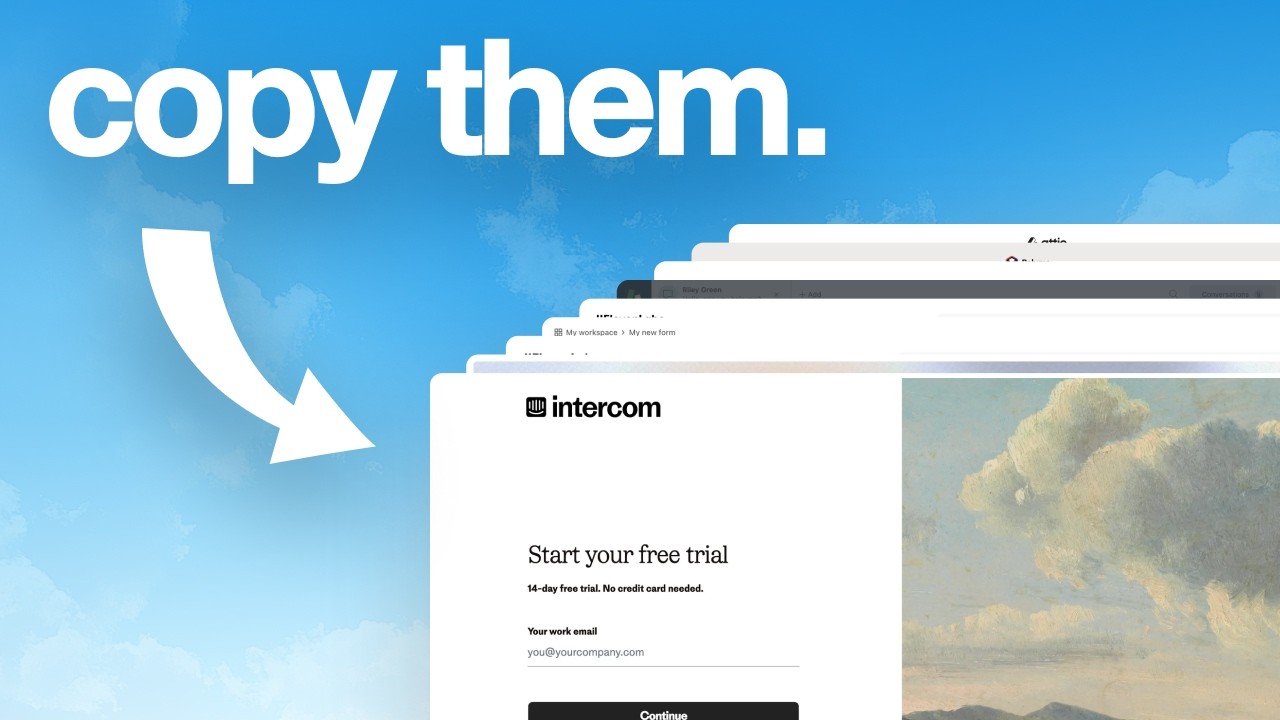
In this 9‑minute instructional video, Charles Postiaux argues that a product’s onboarding flow is critical to its survival and outlines five core principles for creating an effective onboarding experience: (1) Simplicity – each screen should present a single, clear task, illustrated with FaZe (good) vs. ElevenLabs (bad); (2) Trust – reinforce that signing up is the right decision through social proof, benefit statements, and early value cues, with examples from Clay, Origin, 1Password, and a contrast with Contractbook; (3) Predictability – set clear expectations about free trials, pricing, and timelines, highlighted by Contractbook’s 14‑day trial notice and Origin’s trial‑reminder flow; (4) Navigation – make the flow easy to understand and allow users to see progress, skip steps, or go back, demonstrated by Tailscale, Origin, and Typeform; (5) Personalization – tailor the post‑onboarding experience to the user’s stated goals, exemplified by Origin’s goal‑based landing pages. The speaker stresses that optimizing these elements boosts activation, retention, and reduces churn, and concludes with a call to action for viewers. The video also includes a brief YouTube CTA at the end.
Chapters
If your product doesn't have a good onboarding flow, it will die. So I'm going to give you 5 ways to improve, optimize, and create the best possible onboarding to increase user activation, user retention, reduce churn, and subscribe to your product. So I'm on mobbin.com right now, and I'm going to walk you through good and bad examples of the 5 principles that I've outlined for this video to give you some examples of what's good and what's bad. And the first one is simplicity. It needs to be simple. On what to do. There needs to be just one specific goal or task for each screen. So for example, here for FaZe Onboarding, you can see here their email is just one task. There is just one thing to do is to enter your email account. Same thing here. There's only one thing to do is to set up your account. A not so great example would be ElevenLabs where there's a lot to do here. You can sign up with Google, read all of that text, email and password. There's also some checkboxes to go over. You can sign up, you can sign in, and then they also have this section here with pro tips. It's a lot when all you want to do as a user is just to create an account. It needs to be like a children's book where it's just one very small specific idea or action that is required. So it's easy to go through and to digest and to scan. Because again, they are first-time users. They probably don't know much about the product. They want to try it. They have a lot of goodwill. to go through all of that. And I feel like we have to make it super easy and super rewarding for them. And, you know, keep telling them that what they're doing is the right thing to do. Another good example is Origin. Like here, for example, they ask you to select only one thing that matters to you right now. So you have this list and you just pick one. And once you select it, based on that, they're going to ask you to connect like my accounts. So again, there is nothing else, no distraction, just focus on that. The second step is trust. Trust can be shared in multiple ways, but it's always about reinforcing the fact that what they're doing is the right thing. Creating their account and signing up to your product is what is the best thing for them to do right now. So for example, you can see on Clay, they show relationship and trusted to Clay, and they show this huge number. That's also a great social proof to have. We saw it earlier, but Faye also does that with testimonials from people. So all of that is kind of trust and It just makes you feel at ease and peaceful with you sharing your information with the product and you taking the time to sign up. Another thing you can do from origin again is to show the features and the benefits. It's like, what can you do? You probably signed up because you know what you can do with the product, but you can reinforce that here. You have this headline, you can show the app or the product that you have, and then you can show some of the benefits. You can even show what they're going to get out of it. All of those things are valuable for people who sign up to origin. And so they just show it very early on. Like you can see, just try Origin for free. And as soon as you are ready to create an account, they show you everything that you're going to get from it. It doesn't have to be just on the first screen or the first part of the onboarding flow. Like here, they talk about you signing up for free and they'll still show you like some social proof, loved by over 100,000 members. That's another social proof at another specific point in time that's going to matter to the users. Something that's not super good is Contractbook. They don't show you much. They just tell you to start your free trial. Then you confirm your email. Then you have to enter a lot of information while seeing the product. That's already a lot to take in. There is no social proof. There is no motivation. You don't re-emphasize why you're doing all of that, why you're spending probably 10 minutes trying to fill this out. And then they just drop you off in the wild. Another product that's pretty good in showing you the benefits is 1Password. So you can try for free. So you have to pay no matter what if you want to keep using the product. So it's super important for them to reemphasize that you get all of those benefits and it's also trusted by a lot of businesses, by a lot of people. They have to reemphasize a lot more right from the start because you have to pay for it in the beginning. They cannot really build that trust as much as free products. And again, they reemphasize it in a different way when you're on the model to actually add your credit card to it. The 3rd step and principle for your onboarding is to be predictable. What they're doing is the right thing to do. And also to reassure them about free trial. If there's a free plan or if you need to pay for it, when will they pay? And if you do that, you need to show them ideally a timeline. What Contractbook does well here is that they say start your 14-day trial. And then at the bottom, they say no credit card needed. And that adds this kind of predictability and this peace of mind in a way when they can, people are just freely able to enter the information, complete all of that. And they know that they're not going to be charged for the next 2 weeks. Origin is doing also that pretty well where they show you the process of trying it for 1 week free. They show you like when you get instant access today, then they're going to have a trial reminder for you sent to your notification and then they're going to send a reminder of your trial that's almost ending, and then you will become a member by subscribing. And you can also cancel anytime. They show you how much it's going to cost after that, and they also show you like what you're going to get out of it. So you get kind of like this mix of trust and predictability. Then the next step is navigation. Your navigation needs to be super easy and straightforward so that anybody can use it. One way to make navigation easy is to just tell people, you know, how long it's going to take, like here from Faye. It's going to take about 50 seconds. And then you use that simplicity that we talked about in the beginning where you get one idea at a time, one task at hand per screen. And it's a lot easier to onboard people, to tell your story about your brand and to show them why your features and your product is the best. Here you can see it doesn't really tell you much about that navigation. You cannot escape it. You cannot leave it. There is no way to do anything if you don't complete that and you don't even know what's coming next. There is a back button, so that's still a win. But yeah, Tailscale does it well where they show you how many steps are left in the onboarding. So it's very easy for you to know, okay, I'm here, the steps are pretty simple, so it's not going to be very long for me to finish the onboarding. Origin also does it somewhat well where you always have a back and next button, except when you need to pay. But when you need to pay, you have the X arrow at the top. Obviously they try to minimize everything so that you pay and you subscribe to it. Like there is a business goal behind it. And even here you can have next if you select one, or you can just skip it. And you see throughout the whole product, you can always go back, you can skip, you can explore. There is always a way out or a way to go back. And I think that's really reassuring for users to have that option. And I feel like a lot of products, you know, a lot of designers and products, they feel like they always have to show how many steps there are left. I think it's usually a good UX practice to have. I would say the only moment or only rule where you don't really have to use it It's only when your onboarding is only 1 or 2 steps. This is the only rule I would say to apply on that. Typeform also does it well where they show you how many steps there are in the onboarding flow where you are at. It's also an easy way to create momentum for the user because creating an account, it's already like you have to do it when you sign up. So that's already 1 step done. You can use that first creating your account as a step and be like, okay, you're already like halfway through the whole onboarding process. So It's super easy to keep going and you're almost done. And then they do that smooth transition between you filling out the survey pretty much, and then right into the product. Like, okay, here are 3 things you can do right now. It's super clean, super simple. Just pick one of the 3 options. So super smooth transition, super simple and clear onboarding. And then they hook you right into the product, into getting that first activation and understanding the value of the product super fast. And the last step is personalization. I feel like it's super difficult to find products that do it well. And after looking at a lot of products, I feel like the only one that does it well is Origin, where what you say matches with where you're going to land. So you say you want to manage your spendings, and then it sends you right into the spending page. And I can imagine that if it was to track your portfolio, then it would send you to your portfolio page. And I think that's like kind of like the idea we want to have. The product needs to kind of repeat back what the user says. Because when you go through products and I've reviewed a lot of products, when you do the onboarding, you always get asked the same questions over and over again, but there is no real benefit on your side to answer those questions. It's usually just for the company, but you don't get anything back. And so being able to finally have some personalization where what you say matters for the product experience you're going to have for that level of personalization, it's super rewarding as a user and it makes you want to use it even more. This is like the last step because this is the final thing that you should work on and should focus on once you've figured out all of the other elements that we've talked about here is how do we make the product special to the user? How do we make it personal? How do we make it unique? Because if it's unique, if it matches with what they want, with what they said, they're going to stick a lot more to the product. They're going to engage a lot more. They're going to reach that activation point a lot faster. Like an onboarding is very specific to a product. And I feel like this is more of a north star to follow is how do we simplify the onboarding flow, but at the same time, make it personal and customizable for the user to like reach activation point as fast as possible. Because if your product onboarding is not optimized, you're losing so much money from people who drop off, from people who don't recommend your product, but also from people who don't get it. That's the end of the video. I really hope you liked it. Make sure to leave a like and subscribe. Also, YouTube thinks you will like this next video. Video. It's honestly one of the best videos I've made, so go have a look. Bye!