Watch Me Fix a SaaS Design in 2 Hours (Step by Step)
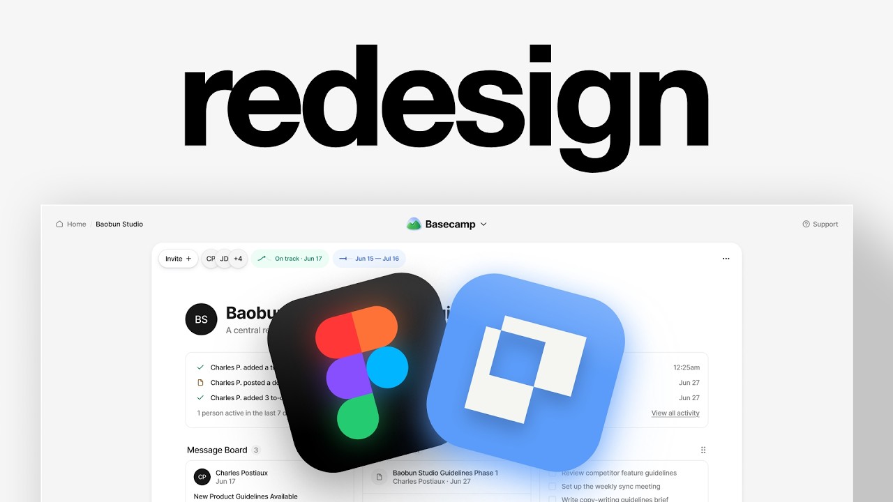
In this 2‑hour live redesign session, designer Charles Postiaux selects Basecamp’s dashboard as a redesign target, critiques its current simplicity, and outlines a strategic plan to add visual polish while preserving its lightweight feel. He demonstrates an AI‑assisted workflow: using Cloud Code to generate a base design from a screenshot, importing the result into Figma, and then manually refining the UI. Throughout the process he builds a design system on the fly—defining color tokens, drop‑shadow specifications, icon libraries, spacing, corner radii, and auto‑layout constraints—to ensure consistency and responsiveness. Charles explains his judgment calls (e.g., moving the support button, adjusting button sizes, deciding when to keep or remove backgrounds) and emphasizes the importance of iteration, component reuse, and visual hierarchy. He also highlights the difficulty of teaching design judgment via video and promotes DesignLab’s structured learning programs as a way to develop that skill. The video concludes with a side‑by‑side comparison of the original and the redesigned interface.
Chapters
In this video, I'm going to find a random script online and we're going to redesign it together. And if you don't know who I am, my name is Charles Postiaux. I've worked with companies worth about $200 billion on their products like Booking.com and Slack, and I've earned over $30,000 a month as a solo designer. So let's just look into products and see if there's anything that could work. I think Canva could be nice because it has that balance between it's simple and light, but I feel like there is some potential in terms of having a bit more energy in the UI and even the UX a little bit. Another one could be Buffer. for because I never really liked the design. Even though they've been pushing to have a cleaner design experience, I, I, it just doesn't look super good to me. So it could be a good opportunity to redesign it. Now Higgsfield, I think is just too much. Like it just looks like it's everywhere. There's everything everywhere. Basecamp could be cool. I've known Basecamp for a while, but I don't like the design. It just feels very simple, basic. I guess it's okay for so many people, but I think it could be fun to explore and redesign. Like maybe their dashboard. Board homepage would be a pretty nice screen to explore. All right, so I'm going to copy it and drop it into Figma and resize it to 1920 by 1200. And I already have like created a frame for it. And now what I'm going to do is to duplicate or to have that design in Paper and use Cloud Code to build it instead of having me having to design all of it. All right, so Cloud Code has finished creating the design and I switched the branding as well. Otherwise, I just had to tell it once, like it didn't do a good job. I just told it to improve the design. But so I think what we can do now is use that design and push it back into Figma. And then we can explore on there, like what could we work with? Now, while the AI is working on adding the design we have in paper into Figma, I want to take a little bit of time to think about strategically what We want to do here with this design. I really like the simplicity of Basecamp. That's kind of like the big thing that I don't want to remove is it's very simple and light. I just, I think for me it's just the UI polish that is lacking and I'm wondering how we could work on that. I can imagine that this is a project and then within that project you have those components and including the tasks, events, bookmarks, and notes. I don't know what this is, Things Plus, if this is like a new feature and this is like their way of indicating that or if it's Something else. One of my thoughts was, what if we move support up here? Because this way you get kind of like one key action item around the page, and then you get the centralized dropdown and then centralized navigation. And it kind of feels low friction update or change. So that's why I wanted to move support there. I'm not sure if I want the page to actually look like a page. I'm not sure if I want the cards themselves to stand out against the background versus having the whole page stand out. But the only problem I guess is Up there and especially here, the timeline. If we were to break down the skeleton of this, the logic is that you show the most up-to-date, the most recent updates on this project. And then you have this kind of an overall like summary of all the activities or the most important activities. And then you have a button to see all of them. So either a way to better use that like horizontal space to have maybe add a bit more spacing. I feel like it's really close to each other here. And that's it. I think that's a pretty solid plan. All right. So The AI has finished duplicating the design from paper into Figma, which I think is a downgrade. Like you can see a lot of stuff is not right anymore, but we have at least have the structure. So I want to use that as the foundation. I have 2 free icon libraries. I have Cool Icons and I have Phosphor Icons here. So we can do a little bit of cleanup and then we can refine over time what it looks like. What I want to do first is get as close to the design as possible. At least for the basics. So we have home, we have Basecamp here. Now I might try to do the support at the top. Go, we keep it centered and anchored on the right. Let's do 32. And we have the top section like I wanted. We might actually just do 2. And I already have tokens in place so I can start using them. I have a video about it if you want on tokens and designing with AI, which end up being very easy to implement into code as well. Then I want to work on this bottom section. I think it's an interesting one for like that dock. Now, pings again, I'm not sure what it is. You can see it here, pings for you. And here's the thing about redesigns like this one. I do my best to give you the tips and the behind the scenes so you can do the same. But one of the hardest things to teach through video is judgment. Knowing why this version is better than that one. You don't get that from just watching. You get it from doing the work, from having someone better than you tell you where you can improve. Which is what DesignLab is built around. They provide you with structured lectures, which also include live sessions taught by working designers, hands-on project work, and weekly small group sessions with people learning with you. They also cover what's moving fast right now and could be a real advantage for your career, like advanced Figma training, prototyping and live coding with AI, and designing AI-powered products. Over 25,000 designers have already been through their programs. Including people now working at Google and Shopify. So if you're interested, click the link in the description to get $100 off any course and see their upcoming cohorts. Thank you to Design Lab for sponsoring this video. And back to the redesign. What we could do is first, it's going to be exactly the same size between the buttons here for tasks, the navigation here, and pings. So I want to figure that out. We can remove the fill. And the stroke here, how do we do for that? What do we have? 16, 20. Let's try to do that for all of them. Now the problem is that if we remove the background here, it's going to be very hard to read those. So we need to have them together inside of that dock. We need 2 things. We need a button for each of them and then we need the dock itself. So for that, I'm going to try 8 by 8. It's 100 corner radius, kind of fill. And then we can put that as muted foreground and this one as primary color. We might also need to add a background. So I could use muted probably. You can see it's already not— so 14 might be good. Then for that we can have 0 probably. Then we add the dock. I think we could increase a little bit the size. I think that's kind of like what works well with Basecamp is that it doesn't feel like you have to have a magnifying glass to look clearly at the details. And that's kind of like what I want to have for this one. First we need to make the constraints nice. So like anchored at the bottom and left and right, and this one should be anchored at the top and then left and right as well. And this way we can increase this and have the height to hug the content. And let's do 16, I guess. Now those 2 are going to be— yeah, they are off, but it's okay for now. I just want to focus on this. I had something— where was it? In the dailies. I guess I have it here. This one. I have 3 drop shadows that I like to use. Muted is like F5, border is E5 if you want to take note on that. The drop shadow that I use is This code here, 12% opacity, 1, 1, then 2, 4, the same thing and 10% opacity, and then 4, 12, same color and 10% opacity. That's the drop shadow. And then for the primary color, I use 17. That's how I design stuff. But I don't know if I like having another drop shadow and this feels off, but this feels cool. You see, it looks nice, but the problem is that it's going to look weird as soon as you have content because you removed the background on here. Actually, I don't even know if we need that. It's just the profile. Which should technically be that size of the button. So let's do 44. It's at 20. So let's do 20 and then 1620 minus 2 medium. And here, probably just ping plus with the dot. So I can just reuse that. Pings plus. So we have 2 ways to do it. Usually it depends on how it looks, but what I like to do is either have a frame just like I do for icons. For example, if I want to have this icon, let's say. And I drop it here, it's going to— the frame should technically update depending on the height or the size of the icon, right? So let's say it's 20 pixels and the icon doesn't look good. It looks good like this, but the problem is that it would change the height, right? If you had like this, it would change the height. So I would have to drop it in size to 20. But now I feel like it's too big or like it's too small or whatever. What I like to do is put it inside of a frame like this. And then what I can do is pretty much update it however I want. I could even unclip content and increase the size. And it would still be inside of that 20-pixel frame. And that would make it super convenient to stay consistent with the design pretty much. And so I'm going to grab their color. It depends how we want to do it. We could do it like this where we might have something like this with the frame instead of frame, or we remove the frame and we add a bit more spacing. I think that works better, but at least you kind of know now how, like what are the 2 options to make it work. Bottom right, 20. This one we keep it. Yeah, I think 32 is nice. Check everything. Good. This one is good. Okay, nice. We can focus about that a bit later, but at least we have kind of like what I wanted with having an item everywhere. And even this could be muted. Oops, 73. Now for the main content, do we want to have again like what they do with that card? So like fill, and then we can add back those drop shadows and then have like, I don't know, 28 and have it go past it like that. That could work. It looks pretty nice, I think. I don't know if it's just the color or not. Then we could change or update the— I don't really know what they have in terms of size. I don't really trust the AI, what it has done. Okay, so about 1400, pretty much like this. Center. You can push that either to the— I guess to the edge, yeah. So that could be it. Cool. So next we want to focus on the content itself. So like I said before, we have kind of like 3 things. We have this kind of action bar at the top, top bar. We have the project description, and then we have the board with all of the cards. Actually, what could be pretty fun to do is to have its own action bar above it, kind of like an editor. Again, simple. We reuse those elements, push this one close to the top. If it doesn't look good, we don't do it, by the way. And then we need those things. So we already have this user icon, so we can have it here. We can have another one next to it. Stack it, then we can do -16. We could maybe add— I don't know if it works— drop shadow 0, and then we can do 2, 100 like that. Because this way we don't increase the size, because if we add the stroke, I guess it's okay. We have the height already in place. Max height, we can do outside. I need to slightly change that. And for the button, the benefit is that everything is consistent in terms of height, so we don't really need to worry so much about it. And here we could add Invite with a plus. We change this one to primary, then here probably 4. And we should also change because again, there is a lot of empty space here, right? Like 4 pixels compared to here where it's pretty much next to it or 1 pixel difference. So we just want to update the right padding to maybe 12 so that it looks visually equal. And then we want the tracker and the timeline. For those, I'm not sure how I want to do them. It doesn't look super good on this, but it's kind of funny how it is. So we might do something like that. Something I still care about is to put it inside of the same kind of component, like container height. It's super important when you work with auto layouts and what you want to have is a design that's as clean as possible. You really want to make sure that everything is kind of like the same height just so that it works well together. It's also responsive when you want to change the breakpoints to like mobile, for example, where it's really important as well. And then you can add all of that stuff inside of it. And here we can go back to 16. Change this here. I actually have like a dot. I usually, I usually do use like, I think it's dot symbols online and it has like a library of dots and I just click and I select one. It's really convenient. And for this we don't need, I don't know if we need the outline or if we could do muted for example. Ooh, it's kind of cool. And then we do the same for this and then we have the 3 dots. So for the 3 dots, we can reuse, I guess we could reuse this, the button and just change the container. Then we need more 20, probably 1.5. And then we need a fill for this one, remove this and then remove the fill. I can Option Command B to disconnect or unlink the component. And then I can select all of them. I can move them by 1 pixel, for example, or however you want it to be. And I think that's much cleaner. And move it to 8. That's the goal. Then I guess we can finally Shift+A. Actually, we can move those inside of that one. Push that up there. Gap should be auto. That could be an option. Now, is it a good option? That's the question. So we could duplicate it. Every time you have a new idea, every time you have like a diff slightly, even if it's like a tiny detail, just duplicate the frame and throw it there so that you have a history, a visual history of the evolution of design, which is one Great to show people you work with your thought process and all of the trials that you've done, and you just just didn't like show up five minutes ago and design something. You actually put thoughts and strategy into it. And second, it's really good for your portfolio, for your case study to show again the process that you went through, and it's not again just random thoughts. So I think that's like a really good benefit to have and habit. But I think just on its own, it looks pretty cool. All I care about at this point is like making sure that. The corner radius on both ends work. And you can see that it's clipped and I don't want that so that the drop shadow feels more natural. But now that it's inside of that page, it feels too cramped. So I want to make sure first the constraints, it should be left and right so that no matter what I do, it's always within that page design. So if I scale it, it scales as well. And I want to increase the paddings slightly. Now that's cool. I think we are into a good start. And it's funny, I didn't really want to have that page, but it looks really nice with it. So I understand why they went with that. Cool. So now what do we want to do? I'm not super convinced about that. Let's try to center it. Okay, it's going to be a really poor example of that, like this. And we want to have the same size for both, 32. So that should be there. And yeah, it works. Oh, 16. Okay, there. And The color, I'm not sure about the colors yet. Let's keep it like this for now. Now what do we want to do for the rest? We have those 2 elements left. Now we have the project overview with what it is about, and then we have this history. For this, it's the most straightforward section, so we can work on that. Again, for this one, top and bottom, have this there. We need to update again all of the text. It's okay. Medium, and this one probably bigger, but we'll see. So it's centered on this. Hmm. I'm trying to think about what do we do with the profile image? Do we remove it? Do we keep it? If we keep it, do we make it height-based on this? Actually, we would also need to change that. That would be good. Or we could have another one and this would have the border and no fill. So this way we can remove this or it could be inside of that. That could be interesting. We duplicate that. We add this 32. We group those 2 together, maybe even 4. 8 is better. We change this to muted. We change this to maybe ring. So this way we can remove this one. We keep it clean. Have that as nice. Why is it 70? Is it because of that? Oh yeah, 68. There we go. Then this one maybe. Oh, that's too much. 24, 24, then centered. We could try to make it round just to see how it looks. I think that could add a bit more personality and still stay in the same style as the rest. Should probably be a bit bigger like that. So 72, but I do like having it slightly smaller. Nice. But now it's a little too small. Okay, now let's add the tokens. Very simple and easy to do. 32. This one, we should maybe change it. 16. All right, the colors are clean with a nice design. And I think it still feels and looks like Basecamp. Now we need the timeline. We could still keep it simple because technically it's a history. It's not really a timeline. I don't know if there's anything. For this, on Mobbin, timeline and history. If there's any good inspiration that we could use, that's nice. I like this one. Oh, it's Perplexity again. I guess this is good too, this section here. This is pretty nice. I like Perplexity's timeline. So let me try to figure out how we could use it. I think that could be nice. Like that's what I talked about, like trying to use as much of the horizontal space as possible. You could have that and 45. Let's push to 80 as well. Nice, much better. Let's just try to give it more space. Okay, so for the timeline, Yeah, I'd like to use that. I think it looks cool. It's not the same size. That's unfortunate. All right, let's try. We have those here. Let's update. Medium minus 2. That's supposed to be a document. Okay, let's find a document. Nice, this one is good enough. How much was the size? Oh, for now let's just set it up so it's there, but we'll have to work on it. Let me auto layout this and then we can— oh, have content. And then we can change this one to be vertical stacking. Let's just make sure that everything is its right dimension first. So I'd like to see this being at the end, like Perplexity has, because my bet is that what's important is the task, not so much when it was done. It's still relevant, but when you understand the logic that this section here is always showing the most up-to-date first, then it doesn't really matter so much if it was at 12:25 or like on June 27th. I guess that's my bet on this. So it could be worth trying it. I'm wondering if this could be better in fill and then having Border instead. Yeah, maybe. Let's keep it like that for now. And for edge case purposes, we can add like plus 4. I'm going to add— I already have the documents. I'm going to delete the circle. It's on height. Same for the check. Nice. What is it for this? I'm not sure. 1% active. We could try to use just a user icon. 1.5 and those 2 like that. Those could be green and this one yellow. We'll see. Or maybe we could have a tag like this. It works like this. It could be interesting to have that. Other one would be, then we can change the color subtle. Oops, I didn't do it on the right one. Nice. Oh, it's pretty nice. I prefer it like this. Let me duplicate that again. We keep a track of what we worked on. And I guess honestly, we could, it should be all of them that are inside of that frame. We just don't show that frame like that. It's pretty much the same. It just looks cleaner. And we can even try to reintroduce the circle. So we keep that same feeling without necessarily adding too much. This one, the problem is that it's the right size, but it's just too big. So like I told you before, we can add a frame and inside the frame we can easily change the size of it without having to destroy everything. It's still 20-pixel icon frame. And for this one, we can reintroduce the username. 32. Is it better or not? Oh, that looks so weird. Why does it look different? Nah, I'm not a big fan. I think I preferred this maybe, or we keep it super simple, but I think it's okay, but I don't think it's great. This might be better. That's pretty good. I think we're going to keep that for now. So we have added this. Now we just need to add the overall board grid of it. Let's do it one row at a time so we can add it on here. We need to add fill container for the cards. We will have to change all of that. You can have the border, add the drop shadows, should be white. Okay, I clip the content. That's too much. Maybe this, change this to Yet it maybe we need to remove the paddings. Doesn't look super good. A little bit of padding. Why doesn't copy? Okay, already have the document icon, so that's good. I also want to find like some sort of consistency across everything. I see. So should it also be 32, for example? If we try to add a little color, they should have the truncate on. It doesn't look so good. I don't know what's the problem. Let's remove that. Maybe it's paddings and spacings and stuff. You can see it has some breathing room. So that's kind of like what we're missing on this. This should also be much bigger. What's the size of the card? But it's technically almost a square. Let's do 400 by 400. Let's try to— let's do something crazy. Let's update all of those text to the same size font. 16, 20 minus 2, medium. And then we can see from there what needs to be done. And we can also update the colors while we are at it. And there are a lot of colors. For those, we can update paddings, gaps. We have so much to update. It's not a good idea to use the AI actually. I feel like it does really doesn't do a good job at translating stuff. I mean, it's good for context, but besides that, I'm not sure. I guess we need to update that. Let's make a frame centered to 4, 12 weight. Good. That's better. Move that. And then daily check-in items. Is it in here? Oh, check-in item list. That's more like the title than anything. Probably don't need that. Then we could have this at the top. Reuse that frame. Something is off. 16, 20 is good. Wait, does it? Okay. I think we should reuse that. Then this one also 20 and 40. Should change this to 12. Same for this. We can remove the paddies on this and have it here. I'm wondering if we even need the border or not. And for this one, we also need giving it a bit more space, a bit more room to breathe is important. 16. Nice. I don't really like that. I don't know why. Let's just do phase 1. I think it's okay. We need to also update this, all of that stuff. We have the dots for that. It's all about like trying to figure out a system that you can reuse throughout everything. The paddings needs to be the same, the spacing needs to be the same, the sizes of the like previews or images are the same. And this way things stay consistent and that looks good. And it's, I think, much better down the line. We could use something like this on this one, have it centered, 12. Or 16, actually, similar to the spacing that we have here. And here we see view all messages. And then we could say 3. I think that's a nice little detail to have. And maybe I'm going to try— we'll see if it works or not— we could have a slight fade there. We anchor it at the bottom, left and right constraint, push this up, have this like 80. Does it work or not? That's okay. I wonder if it's better without it. I think it's better without it. Oh, and maybe we should try to have this be like they do either like this or what do they have? No, I think it's pretty much stuck with it. We can even— oh, that would be nice. We could even go through different items like that. This should be filled. This should be a content. And this one could be, I don't know, business check-in and maybe not fully, but like here. And this one could be green. That could be cool. I like that. We can just add 80 or something and then you could click through them and go through the different to-dos. That would be really fun. All right, it's okay. But if we add back the— I think that's— yeah, it's pretty good. Oh, we could add this to like grab it and move it around. It sounds like this. I mean, I could just duplicate it, or this one. We can then Command+Option+B to disconnect it like that. Then we center it. Now fill container auto. I think that's pretty fun. It makes it more interactive and like really like a board you can move around and iterate on. I don't know if there's a better way to— I'm not a big fan of this. It has to look like this, right? To stay like consistent and reusable over everything. For this, I'm wondering if there's a way to have this be like that. And this way we free up that. That could be interesting to have. It takes more space, I agree. Then for this, do we want— is there a way to update that so that it kind of looks cool? This. And then I don't know what The rest says these document outlines. Okay. I don't really like these document outlines. I'm wondering if it's enough to just show this. Yeah. I guess that's simpler this way. And here we should also maybe have that like that. Or another version would be to reuse that. I mean, we don't even need the paddings. We just need 24 and 24. Yeah, that looks pretty cool. It looks better. I feel like showing the number like this makes it too visible. And that's not necessarily what we want. We want to be here. To be informative, but not take over like, oh, 21 items. Doesn't work here. Do we make it appeal when it's too much? It's not, we're not there yet, but it's getting better. Even this, that's a problem. I think it's too big. Or we add back those. Let me duplicate and see if it's better. Oops. It's not the right one. It still looks cool. I like both. I think both are really nice. The benefit with this one is that we can maybe reduce a little bit this and It takes less space. I think we still keep this one. It looks better than the original, but it's not as balanced as this. And now the last section would be the calendar, chat, and automated check-in. For calendar, we don't need this. For chat, we do, but there is nothing. And for check-ins, we could do 4, which I think is still relevant. I'm just going to move them up so we can work on them more precisely, and then we flip them back to where they were. So I did this for a previous redesign that I did, and I think works for the calendar, so I'm just going to iterate on it. All right, so we've got a simple, nice little calendar. I think the chat, there is nothing. Maybe we could say messages yet. We could try to reuse already the components that we have. Should probably be flipped. Good. Let's do fill container, fill container, container as well, content. And I don't know if this one we change it like this. That looks pretty cool. That looks pretty clean. Now there is no color compared to this, which is a bit more colorful, I would say. Here it's lacking in that. So I mean, that's That's how it is for this redesign concept. For this here, I'm not quite sure. One idea was to do that where you can have like an effect here, layer blur, progressive, and you could do something like that, which I think could work. Otherwise we can have the drop shadows. So remove those. Oops. And we have it for this. And here either we go primary like that, which is okay, or the other one. Now I'm not sure from the screenshot. I'm not sure if there's nothing selected. So technically it should not have any focus state. It should all be standalone like this. I'm not sure for this one if we can figure out something slightly better, like if all of it should be like that. Maybe that's better, a bit more colorful. That works. That's pretty nice and easy for people to notice. I'm only worried about this. It feels like it's in the middle of everything. I don't know if we need to have like a padding on that. Let me try like 20 of paddings. And then we had the border radius, the border plus the corner radius. That could work. And we can even connect it together. I think that's pretty nice. Maybe 40 and this one a bit more, 28. And you see that compared to the original design, like we, we pretty much have the exact same space. So it's not even taking extra space for nothing. I would probably like have that 68 maybe because we already have some extra paddings right here. So visually it looks a bit better this way. I think that's pretty cool. I'm still not sold on the colors on this one. Maybe that's better. Oh, I like this one. Cool. We have this as well. I don't know if that could work. I like it. I don't want to over-add this effect, but it feels nice. It feels more interactive, which I think works well with the Basecamp brand. Just want to see if we have all the colors. What is this? Oh, it's the orange here that I don't have, which is okay. Give it a bit more breathing room. Even 12 actually works better. But every element looks nice. It looks polished. All right, so this This is what we started with. And this is the redesign. Thank you so much for watching this video. Make sure to leave a like and subscribe. And thanks again for DesignLab to sponsoring this video. Bye.