Watch Me Fix a SaaS Design in 2 Hours (Step by Step)
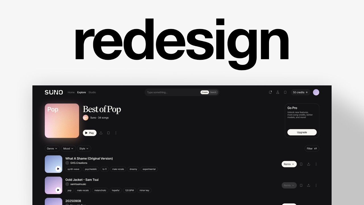
Charles Postiaux redesigns Suno's music generation interface in two hours, moving from a generic dark UI to a cleaner layout with better discovery. Key changes: top navigation tabs, AI-generated filters for genre and mood, a unified player, and simplified actions. He uses Figma's UX Pilot to speed up component generation.
Chapters
This is Suno. It's an AI platform for generating original songs from simple prompts. They've been in business since 2022. They've raised $375 million and now have 400 employees. But here is the real problem. While the product itself truly is incredible, the interface just isn't. It looks like every other dark mode music app out there. It doesn't have the hook that shows how cool the product is, and it's making people leave before they can experience what it is. So in this video, I'm going to redesign one of the key screens to create a stronger first impression, make discovery better and ultimately get more people to stay on the app. I'm Charles Postiaux, founder of Baboon.studio. It's a product design studio that helps businesses scale by making their products stand out in crowded markets. So let's review Suno's screen and see how we can improve it. So I'm on Figma. I have the design right here. First of all, I'm going to start analyzing what I can improve and what's the game plan here. It's something I advise anybody to do. It's not just jump into design, but first take a step back. And wear the strategic hat and decide what we want to do and why do we think it's a good idea. To be fair, I don't think the product is bad. I really like the branding and aesthetic of it. That's super clean. What I think we could do is maybe try a different take on the navigation. I was thinking of having maybe like the navigation be at the top. Like, I think that could be pretty nice. And either the search could be here, or maybe we could have like a variant between studio and library, or this could be like some sort of toggle system. Now, I don't know. To the full extent the product. And so for me, it's just going to be based on my own impression of what it should be or what it could be rather than what it is. So the navigation could be nice to push at the top. This way we get a lot of extra space for the content itself. For this, I do kind of like the thumbnail design here. I'm not a big fan of the timestamp. I don't know if it could be somewhere else or if it makes sense to have it here. The padding is not right either. The title makes not a lot of sense, but it's still good to have one, I think. The creator also is important to have. This here, the kind of the description/metadata, doesn't make a lot of sense to me. It's nice to have it when it's tags, for example, like a set number of tags. But when you're just looking at music like this and you just see like random— I mean, it's not random, but it doesn't help you much about it. It's not super relevant. Then here we have a lot of actions, whether it's for the playlist itself, Or for each individual songs. I'm not a big fan of having the active and inactive state or disabled state be different width. I would rather have a Chevron for the disabled one and just make it disabled. This way everything stays more consistent visually. Now, how relevant are the like, the comment, the share, and the dropdown menu? Also, why do we have like and dislike here, but here we only have the like? We can comment on the song, but we cannot comment on the playlist. I would say that there is a little bit of a size difference between the play button and the share. So it's more like, how do we refine that as well? How do we take that opportunity to change a little bit of that? And then for the player itself, it's pretty big. I'm wondering if we should even like push those to be here. And why is the volume so far away from the rest of the controls? That's my opinion, what we could improve. I do like the GoPro like this, but if we move all of that up, It's going to also be the question, or do we need all of those information? How do we structure that? But that's kind of like my game plan. So let's duplicate. And I think first of all, we could just work on the navigation. So I'm going to, do we go dark mode right away or do we make it? I think we're going to make it just white. So it's easier to like almost like wireframing. So it's easy to know what we want. So I'm wondering like for tabs, what do we need for like, I was thinking main tabs would be on the left and then the kind of secondary tabs would be on the right. And in the center it could be search or it could be about creating something. And I think this way could make it a nice little balance. So Home would be like a core tab. Explore, in my opinion, would be a core tab. Create could be a core action. Studio could be a core tab. So these could be like tabs that you can go through. Then Library, Search could be a core action. Library could be secondary. Hooks, I'm not sure what it is. So it could be maybe secondary, but there is a Create. So I'm wondering what's the difference between Create and Create a Hook in terms of like, can't we create a hook inside of the Create tab or the Studio tab. And Notification secondary, obviously. Labs could be secondary. More, I'm not sure what it is, but maybe it could be tucked inside of the profile. And then we also obviously have the profile as well. Upgrade could be its own little box. I would group Create and Hooks together if it's something that they really care about, and then that would be a separate thing. But for now, I think it's okay. So that could be nice. Oh yeah, actually the search bar could be either a search bar or prompt bar. And then it's super easy to just type something that you look for. And you could just say, actually, I don't want to search for it. I want to create that. And that could be really, really compelling and unique. So we would have type something and then it would be create or search. So I have 2 icon libraries for projects and redesign. I have Cool Icons right here, which is more general icons. And then I have Phosphor Icons, which has a lot more specialized icons. So plus, it could be cool like this. It would make it maybe easier for people to add more credits. And I think that's a nice little mechanic to have both for the business and for the users. And then it could be when you want to add or buy more, I don't know how it works, but if you want to buy more credits, maybe there's like an upsell to subscribe to a higher tier. So for now, that's kind of like the game plan. I can remove for now the upsell just to focus on the actual core elements. We can remove that as well. We can push this up. Already that feels really nice. Then we have this. So I'm not really disliking this. I don't think there is a need to have more stuff here. Maybe actually, you know what could be nice? It would be to, again, like it's all about making it easy to discover and to search. I think that's one of the core fundamentals of a music platform, whether it's to listen to music or to search and create music. You have to be able to search and search as quickly as possible to find the right thing, right? That's kind of like the core engaging element in a product like this. What I don't see here, and I believe would be really helpful, would be tags. And they have like probably a really good AI. I don't know if this is user input specifically, if there's a mix of user input and AI, but based on the song, based on what the user used to make the music, we could come up with like tags or filters to some extent here that people could toggle to have specific music show up. And this, instead of having this unhelpful to some extent text, we could have again the tags here. I'm wondering if this could move up. Maybe this also moves up. And then we have the settings instead of this at the bottom. So we have Best of Pop, we have metadata here, and then we have the filters right here. And you can easily toggle through them and move them. This, I like those 2. I don't really like the like and dislike because, okay, Like and dislike, what does this represent fundamentally? It just tells you what people think of either the playlist or the song. Is it the only way, the only data to know that? No. The core data is do they listen to it and how long do they listen to it? That's kind of like the best way to know if a song performs. And that's probably how the algorithm works to put some songs at the top is this one is the one that people listen the most to, so we should put it up. And the ones that people listen the least to, We should put them down, right? It's all about click rate and how long they listen to the song on average. So I don't really believe, at least at the concept, that we need those elements. Now we could still have the search, and I believe that save would be a much better also indicator. I don't really know how to have a save here, and then we could have the share, and then we could have the 3 dots here. I think that could be a much better indicator because if you like it, you're going to save it. If you don't like it, you're not going to save it. I kind of like this idea more. Okay. So we've got the taxonomy here. Tag could be auto-extracted. So manual, no manual curation required. It's just based on the song and what you've used to create the song. I think that could work. Then page-level filters based on genre, mood, era. Song-level filters could be vocals, tempo, duration. Okay. That's really nice. I think that would be much better than what we have here. And discovering context filters. I'm wondering if this should be also on like the page level, if it should be on the search. Okay. We are in a really good spot. So we're going, we can use genre, mood, and Maybe era or style for here. So here, what did I say about it? Oh yeah. So play, share, save. I think that's enough. I'm wondering if we could have them be the same size as this. It's different, but it could be fun. So let's try. So it would be play. I'm just typing now. I will maybe find the icons later. Okay. Maybe we need to like clean that up first, like step by step. But like this one, we're getting somewhere. I like the direction of this. So we have this cleanly. Do we work on the navigation right now? Probably. That's something. So here, another option would be, let me just remove the auto layout for a sec. We can have like 0, we can maybe do 4 or 8 on radius. Would that work better? I'm not sure. I think this maybe, this might work better, but this looks cleaner. What do you think? We have both, so that's good. Should it be like this or should this be here and this here? And then we could have filters, like more filters here with a little, not settings, the other, this, the slider. I don't know if the size is correct or not. This one is very dense, so update this. I'm just afraid it's a little too small for all of that. But then here, what did we have? Play, share, save, and then more. And then we can have the songs. Oh, that looks really nice. And for the player, maybe you can have a floating like this. We could have a floating player here. I think that could work really well. Okay, so we're moving places here. Let me just check. So what do we have for this? I'm going to ask the AI if it could replace all of those descriptions/keywords with actual tags. Cool. So I've got it. Now what do we do for that? Do we keep it this height? Do we need to? I'm wondering if this could not be like more of a square. Then we can have the title. We can have the creator using the same thing as Suno, for example. And then we could have the tags here. The only problem with that is the height is quite big compared to the buttons. That's my only concern. Something interesting would be to actually push the corners on this. I think that could be like a unique branding formula. I don't know if that's what we'll go with, but that could be nice. And then we need the text. So we have shame, then this, and then the tags. Maybe we could reuse this one. Maybe I'm copying the tags the AI came up with just to show that we could systematize everything and we'll make the search so much more powerful. And even to some extent, like creating songs will be even better this way. And then for the The buttons, do we— we need the remix as well. Most AI design tools have a big friction problem. They live outside Figma. So you're constantly switching, copy-pasting, and consuming tons of tokens for honestly not much. UX Pilot is the first one that I've used that actually feels like it's with you when you design. They have an AI design agent called Nutty that runs as a Figma plugin. So no back and forth between windows. But the bigger thing for me is the output quality. Most AI tools create generic UI that doesn't match your product at all. With UX Pilot, you import your own design system directly, your components, your tokens, your patterns, and Noddy builds from that. And if you want to push the fidelity even further, Max Mode and Deep Design are 2 toggles that tell the agent to build a detailed layout with advanced UX patterns. So the output becomes a fully viable product foundation, not just an empty concept mockup. It's a fantastic design assistant that helps you design faster, faster and better, giving you full design control over what it generates while saving you a lot of time. Over 400,000 designers are already using it. Teams at Apple, Spotify, Amazon. It's free to try right inside of Figma. There is no credit card required. The link is in the description. Back into the video. But play, maybe we already have it here, so we don't need there. We need share. Maybe this could be minimized. We just need one for Remix. And then a shove run, which we had, or we have here. Could we not have an icon for this one? Like we sacrifice the icon, but does it work? Okay, so we have the core elements, we have the core features here. I think that's all. And then we need the player. Otherwise we have everything. It's just by updating maybe the text size, updating a little bit the spacings or like the outline, maybe fixing that. And then we need the player, but otherwise we have everything else that we need. It doesn't look so much cleaner. I mean, it's just one song, but doesn't it look— doesn't it feel much cleaner this way instead of that? It feels really messy here. Like there's so much information everywhere. You have a ton of Like navigation here, it's much simpler. It's like a Cosmos or Mobbin kind of style, even Pinterest to some extent. It's not about the navigation, it's about the music, it's about the songs. The goal is to either create or to find stuff. It's not to become like a content manager, like metadata manager of analyzing everything. It's about finding what you want. I'm even wondering if that could be maybe— oh, we need to change the constraints here to be anchored at the right bottom. Should we push it even further? For now, let's keep it like this and then we'll see if it makes sense or not. I think I'm hesitating on a space simply because the outline is really visible and that adds more space than there might need to be. Okay, let's work on the— we can keep this one because I'm not going to do any adjustments on this, on the rest of the experience except the song for now on this screen. So it's okay. I'm just going to move that up behind. So probably when we play something, we will have maybe the stuff here. But what do we need? We need the info. What do we need? I think we need those 2 things plus the image and then the CTAs. We need to be very critical with what we have in terms of space. We don't have a lot of space and I don't want it to be super chunky. Play. I mean, play, we already have that here. Then we need next and before like that. But do they have another one? I'm not a big fan of, of this. Another option would be to have this be pushed. Could be better. And I don't even know if we would need to just have it sized normally. Maybe this would be pushed here. That could work even better. Yeah, probably like this better than that. This one is nice. Okay, I think we go with this one. Much better. And so we have kind of like the core information. I mean, the core— we have core actions here. We just don't have— squish it up— we don't have the name of the song. We don't have The artist and we don't have the core actions. So my take would be something like this. Or maybe we just have this. Like maybe we don't need more actions. That could be interesting. Another one would be without the tags and then we can minimize all that. We don't need this and this would be 56. That could be an option too. It might add a little bit more space and I don't know how we can work with this to not like to still be visible even though you have all of the songs underneath it. But that's an interesting option. Or we can add content and then center, because otherwise that's pretty lonely like this. Or we do that. Oh, that's cool. Like, that is pretty nice. We can even shorten that slightly. How does it feel? Container 2 and then 8. Okay, no matter what, we've improved a lot. We've improved a lot on pretty much everything. So that's option 1. And actually, with this one Let me push that aside as well. Let's change the player. Oh yeah, now we need to figure out what the correct action is on this one. We can truncate, that would be an option, or it could just be this. I think that's cool. I think we're in a good space right now. Now we can work on refining the design elements, combining everything together, and then we can move to dark mode and have something really awesome. So for the CTAs here, I'm wondering if 16 pixels might not be better. Okay, so we're in a really good spot now. So what do we do next? I guess we could change the colors now. So let's change everything. Let me grab their color palette a little bit. Oh, it's not F. Okay, it's a slight gray. They have this one, like a blue. They have this here and that's it. So F should be— oh, an outline. Do they have an outline? They have this one. I think that's good enough. I'm not sure for the buttons. I don't like the outline this way. Nothing. Do we? Okay, that's good. I like it. Now the tags, I think we will use that. Because they might not be super visible this way, but still good. Oh, maybe that's too small. Yeah, like that. Do we do it like this or do we do a bit bigger? But if we do that, I probably need to lower it down a little. Do we want this to be white actually? Maybe better. Because the hover state is technically they would have this fill state. So I think that's okay. I think we're good on this. For this, we can do fill container. And then here we're going to add 32 of spacing so that we have like a max width max limit. It's more like an edge case, but, and especially I think it works more when It's like you have a smaller screen. This is still 1920 width. In other design, it would probably be— I mean, we could try about 1440 by 900. You can see that it still shrinks a little. It's good to be mindful of it. Speaking of that, let's add another layout on this. Fill container again, we do the same thing. Here we are going to have 12 of gap. This way, this always stays centered. It's not centered, but it always stays centered this way. We just push this on here. And we just need to resize that. I will add the paddings and stuff later. We can increase this so we have a bit more. You know, it feels a bit better to type stuff. Let's Shift+A for those. I don't know. Do we want a divider? Wait, which one is that? 34, maybe. Do we need a divider or can we live without it? Because that's a lot of buttons otherwise. That's better. It feels much simpler now and still understandable. Let's keep that at the top. 24, 24, and 24. Is it all? Oh, here. Then 6. Feels good. And this one too, maybe. Medium. Yeah, medium is the way to go. This one we can— I think it's still interesting to have the creator name. Let's center that. And then we can create— we can add more songs. Actually, we can just add 3 and then we might ask the AI to try it. Jacket. Oh, we need the tags as well. I just thought about it. Let's just clean up the design so it looks nice and cool. Then we have some that are not remixable. So like that. This way we stay consistent. I think Remix is a pretty important core action. So we have this option here. Another one would be to actually change the background of the core CTA. And then another version would be reusing that. Let me just Shift+A on this. And this way we can add it everywhere. It will be much easier to edit. Ideally, it would all be components and then you can make the change yourself. Now, do we need dividers? Oh, that looks pretty good. That's an option. Another one would be without the dividers. I think the dividers make it work a bit better, but then we would probably need to increase that. And this too. Maybe this. I think it gives a more structured version with the dividers, but without it's maybe a bit more freeing. Okay, like this would be cool. Do we make that actually bigger? And we can add a padding here. Yeah, like that. Copy. Add the little logo here. Cool. I'm just trying to create like my version of it. That would be good. I can minimize that. Actually, 16. Oh, that's good. Much better. Oh, I can remove pop. Copy the image. Remove this one. Put it here. Even better. That looks super nice. I don't know what you think, guys, but that looks really, really cool. We could add maybe some subtle drop shadow. I mean, subtle. It needs to look cool. We can Shift+A, keep the height the same. Gap. How much did I do here? 48. So maybe 48 or less. Then we can select all of them. Fill, then maybe 32, 12. This we can push 80, 20. Remove that. 38, uh, 48, not 30. This is— we can maybe put it either 16 or 20. Maybe 16 is good. Then let me try something, not guaranteed it works. Duplicate that group, Effect, Layer Blur, 24. Select them. Push them here, detach, push them in the background. Cool. Then we can increase it a little bit more. It's just for the coolness effect of the video. Or is it too much? Or maybe it should just be for the pop because technically the other stuff would be pretty tough to figure it out. Blur. Very good. And finally, maybe I can try to come up with a better font for this. Oh, like this. Okay, this one, it's nice. All right, so this This is what we started with, and this is the redesign. Thank you so much for watching this video. Make sure to leave a like and subscribe. And thank you so much to UX Pilot for sponsoring this video. Bye. Bye.