Watch Me Fix a SaaS Design in 2 Hours (Step by Step)
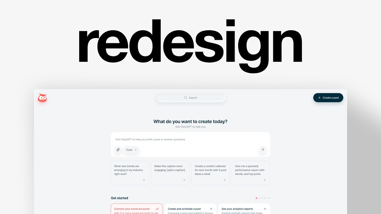
Charles Postiaux redesigns Hootsuite's cluttered web app in Figma, simplifying the navigation to three core actions and adding a bottom nav bar, compact search, and glass effects. He shows how the polished marketing site clashes with the messy product, then rebuilds it with consistent spacing, restrained colors, and reusable components to create a calmer interface for social media managers.
Chapters
This is Hootsuite. It's a social media management platform. They've been in business since 2008. They've raised $300 million and they have over 1,000 employees. But here's the real problem: their website feels modern, polished, and premium, and then you open the product and that feeling disappears. The gap between what they promise and what the users experience inside the platform is costing them trust, retention, and the ability to charge more. But that gap is fixable. Our chat postural founder, Baboon Studio, is a Product Design Studio that helps businesses scale by making their products stand out in crowded markets. So let's review Hootsuite screen and see how we can improve it. So I'm on Figma, I have the design ready, and all I want right now is to analyze the screen and kind of like build a game plan of what I want to change and improve. I think the product does not look bad, it's something I want to point out. It just feels like it could be better. It's a really crowded market, and so my goal for this video in this reason is to create a concept that pushes a different experience of the product, and that's going to help stand out a lot more. So looking at this, the navigation could already be something that we could work on. I think it works in many different ways. Like, it's very easy to understand what each of those are. The icons make sense. The navigation makes sense. I'm not a big fan of the More tab. It's probably because they don't have enough space for anything else. I'm assuming the Hootsuite logo is the Home, but it feels a little misaligned. They're also taking a lot of space at the top of the page for pretty much nothing. Create a post is relevant, and I think it's like the core action. You have also like create here, which I think could be probably related to any of those here. But like creating something is what you're here for, in my opinion. But it just takes a lot of space here. So how do we help with that? We also have the profile at the bottom, which I think works really well. It could also be at the top if we remove some of that stuff. And then focusing on the core canvas here. We have the Getting Started, which I think a lot of products don't do it right. They overwhelm the user with unimportant tasks and steps to go through. But here I think it's a nice little way to onboard people. They tell you exactly like what you need to do. You need to connect your social accounts. You can create and schedule a post. You can see your analytics reports. You can see your calendar. It's all around making better content and optimizing the process. In my opinion, this is a really strong Getting Started. model and a great first step to learn about the product. I'm just wondering, can we simplify that? Can we make it slightly differently so that it doesn't feel so much? Like when you look at this, all of these are really essential and important in my opinion as a user. It feels a lot. And because I've, you know, used so many different products and I've onboarded so many times, for me, getting started is almost like noise. And I, by default, don't care about it so much. And so if we can simplify the design, if we can change how it looks like, If we can change the packaging but keep the message, I think it can be in a really good spot to have a really good product. And if we can rearrange or redesign the navigation and combine that with that really smooth and simple onboarding process, so like getting started with the key 6 actions, that could make the product really unique and at the same time super simple to use. And then at the bottom you have listening, which I guess is like the trending topics and then some social performance score, which are both probably in empty states. So we will either use an empty state or we can look at other screens from Hootsuite and figure something out. It would depend on how we go with the rest of the product, but that's kind of like my direction. In terms of color palette, I think they've already done a great job at it and it works really well with their other color, which is like the, their brand color, the kind of like red orangey color. And so that creates a really good combination between the two. So I don't really want to deviate too much from that. I think I really want to emphasize that actually. And maybe adding a bit more depth to the design, to the interface, a little bit more differentiation in the product. Because that's also the big problem is there are so many different tools for social media management that if you make a product that looks like every other product on the market, how do you stand out? It might either be in lowering your price and that's just a race to the bottom, especially when they're like a company like them, they have over 1,000 employees, that's just really risky. Or you just invest a ton in sales teams. And so they just permanently sell, sell, sell to get new customers. And that's also costing a lot of money. So if we can make a product that naturally stands out, it's not going to necessarily replace the sales teams. It's just going to help them sell a lot faster and better. So what I'm thinking about is, let me duplicate that and start laying out a little bit the foundation on this. So what we could do is lay out the foundations on this. So the navigation, I'm wondering if there's a way to identify like the 3 core actions that people will always take with the product. And then if there is anything else that could be added that would be unique to the product. So first of all, I want to simplify the navigation. That's one of my core goals with this redesign is just how do we make all of this that can be pretty overwhelming for first-time users, how do we make that smaller? Now it's going to sacrifice some stuff, and that's the point of the concept design, is just to have a different direction that the user could take. So my first goal is going to be about simplifying the navigation. So we have a ton of elements on the left, and I'm wondering, is this even relevant? Now, my idea and my— the concept I want to go with is to really simplify, maybe push too much, push too hard in that direction of simplifying, but I just want to like focus on the core actions of the product, remove things that are not relevant for a first-time use case, or, you know, that could be one click away. So for example, maybe add, listening, inbox, They might not be the core actions that every user takes. I'm trying to figure out, okay, how do we make a really simple and cool vision product? The homepage, I think, is really important, especially if we can have a lot more power into it where all of those elements are summarized, or we have a little bit of those inside of that homepage once the getting started is completed. Planning could be really good. Create, I think, is the core, and we can reemphasize it here, but it's the core action we want the user to take. Inboxes could be good. Analytics, in my opinion, might be better. And so it's all about let's have a homepage that summarizes every tab. Let's have a create button and then let's have analytics. The rest in this concept is going to be pushed 1 or 2 clicks away. The rationale behind it is that there is more. Like that's what the scary part, because it means that they either will add more in the future as well. Like it's just a really no-brainer way to keep adding more tabs, keep adding more tabs into the navigation and overcrowd it, which is what's happening now. And so I want to stop that. What I always talk about in my videos is if everything is important, then nothing is important. And that's kind of like the goal of those recent videos. And the goal of those concepts is just let's put some prioritization on the features, on the navigation, on the interface. Now the problem, if I remove most of those, how do we find them? The home is going to help with that once we have done with the getting started. But I think having like some sort of search bar would be really helpful because then you can just search for something like that. And so you're 2 clicks away, 1 click to open the search and type something, and then 1 click to access other sections of the product. So the way I'm seeing this is I would like to have maybe like a centralized navigation anchored at the bottom of the screen with the 3 key actions. Then I would like to have a search bar at the top here, which I think would look really, really well, maybe smaller because the main navigation is what matters. The search is still relevant and important, but it should maybe be smaller. Then I still want to keep the logo. I think it's a really cool and unique logo. It might need to match with the aesthetic that we go with to some extent, because I think it could be fun to also add some depth to the logo as well. And then I think what's still relevant and might be useful, especially in this day and age, we still need the profile somewhere. And maybe we need like an AI, a little drawer here, a panel that opens up when you click on it. I think that could be unique, especially if we can have a max width here instead of having a full width that takes the whole space on the canvas. Maybe we have a max width. And so this way it's a lot easier to then open up a drawer on the side to chat with the AI. And that could be really nice. So maybe we could have also that at the bottom here. And so we either add like a create button at the top here, or it's going to be more of a depending on the page you're in, because obviously this is the homepage, so they have created posts, but maybe in the inbox, maybe in the analytics, it's going to be different. So having a space that's left empty for whatever the core action of that page is really smart because again, we're going to remove so much elements on that page are going to be so much cleaner that this button is going to stand out a lot more and that will help drive engagement. That's the goal ultimately, is to create an experience, a layout that is helping the user know based on where they are, what to do. We remove all of the noise, we deprioritize so much that now it becomes easier to know what should I do on this page. So for this, I'm going to push this at the bottom and then we could try to come up with something. So I'd like to try with the They have this effect here that I really like, and I think it would work really well with this design overall. I think it works nice with that bluish color. And actually even we could use their background here. And so we could come up with something really unique and cool. 24 pixels at the bottom, make sure the constraints are anchored at the bottom so that when you scale your page, it follows. Because if you don't do that, for example, we keep it at the top like it's by default, then it's going to disappear. And so then we could have a frame here. I'm not sure exactly of the size. I think They have a good point with making it really big and obvious. Still having enough space for it would make sense. And then we could have that focus or selected state here. And then we would have like 3 maybe icons like I've just talked about. And then we can auto layout the whole navigation. And then that creates that specific branded component that then we can reuse for all the other elements that I've talked about. So like the profile would be here as well. I'm just going to make it white so we— actually, I'm not going to. We're just going to keep it like this. Oh yeah, we need to also update the paddings. It's just like, you know, I'm just exploring, but obviously you need to make sure everything is consistent. Then we'll make sure it's always 24 as well. And you see like something like this anchored at the bottom right, and here is the bottom left. We keep that powerful interface experience. It's a lot cleaner now. You get all of that space, and it doesn't mean we have space to fill it up with more features and more stuff. It just means that it creates a lot more Simplicity and calmness in the product. It gives room for us to create those posts, to schedule them, to iterate on the copy. That's the core of the product. We don't want to overwhelm the user with noise everywhere when they're probably also spending a ton of time on social media where it's super noisy. You want that space to feel clean and enjoyable to use. And I think they're already like, to be fair, they're doing already a good job at it. Everything breathes, but it still feels pretty crowded. So if we can push on that a little bit more, I think we can get into like a really nice space. So let me add some logos around here and we can see how it looks like. For logos, I use 2 libraries. I use Cool Icons, which is great for like general icons. And then I use Phosphor Icons, which is perfect for those more like specialized specific icons. All right, so I've added the icons and I've also been adding the glass effect from Figma. And that looks really nice. I really like that direction. And I think it still works well with what they have in terms of aesthetic. It just pushes the concept. Further. I think what's missing, and I feel it's a little hiding, we might need a drop shadow to make it stand out. This is like a nice little drop shadow to have. It feels a little bit more ambient. Let me add that to the other elements. Perfect. So we've already got the bottom navigation. This is going to be the user profile, like here. Then you can access all your settings. You could even hover, have like the notifications and the help. Maybe it could be customizable. I think that would make a really good case for power users to be able to customize the navigation and add whatever matters to them the most. And then the AI panel drawer that could pop in when you click on it. But we still need the search bar. So when you run a design studio, your time gets split between a lot of different things. Design work, client calls, strategy sessions, reviewing projects, and managing timelines. And if you're not careful, you end up spending most of your time on smaller tasks instead of doing the actual design work. For me, the goal has always been to focus on the work that really matters. Product thinking, the strategy decisions, and ultimately helping founders build beautiful products. So whenever possible, I try to delegate some of the execution work. Recently, I tried hiring a web designer through HostDime, and the experience was actually really smooth. What I liked is that freelancers publish offers with a clear scope and price. So instead of posting a job and waiting for proposals, you can just browse and pick something that fits your projects. Once I hired the freelancer, the communication was clear and straightforward. We discussed the requirements, shared files, and went back and forth on a few iterations until the results matched what I needed. Payment is held securely by HostDime, so the payment is only released once the work is delivered and approved, which gave me a lot of peace of mind. Overall, it just made outsourcing a lot easier without taking more of my time. Now I can stay focused on the design work while other parts of the projects get handled smoothly. I'll leave the link below if you want to check it out, and thanks again to HostDime for sponsoring this video. We can put it at the top here. Something like this would work. Then I can remove the other 2. We could maybe expand it a little bit more, like 424. We anchor it at the top for the constraint, make it centered, 4 of gap. Like, it feels really, really big right now. So we still need to change that. So I might just update a little bit more those paddings so that it feels still visible but takes less visual space. So I think 8 could work. It's still applicable for your space. It's 56 total height compared to 76, so 20 pixels less, but it still feels nice and, and like really visible as well. So we're in a really good spot. Now I think the last thing element would be to add the logo. So let me get that. So I added the logo and I also created a ton of like little effects on it to create that sense of depth and floating element and kind of like ambient atmosphere to feel similar to the rest of those like navigation elements. And I think it feels and looks really nice. It's the same height as the search, so perfect. It's slightly smaller than this, but I think it's still completely okay. And so we've got the overall navigation. Now maybe we could also add a little T at the top here, but for now I think we can keep it like this. So next I want to design this Getting Started card. The good news is since I use the same background as the actual product, it might work. I don't know if they have a drop shadow. I think they have like a very, very slight drop shadow. So maybe we'll add one, maybe not. But it's great that they already have a nice color palette. Now I don't think I will be able to get their visuals. So bear with me on that. I think they look great. And if I were to work on this vision project, I would probably not change the visual because it looks nice. But I don't have them. So I'm going to duplicate this so that you have like a history or a track record of every step you went through. That's great for a portfolio. And that's just great to like, if something doesn't work quite well, you can kind of rewind back and reuse the previous design. And I'm going to search for some design inspiration that I think could help maybe with like the max width element that we want to have and making it still nice and actionable. So I've got those from Manus. I think it's a beautiful product that they've built and What I think worked well is the fact that they kind of have those cards within, like, on the background. They don't have a white background. They only have it for like this input bar. That could be relevant for us and for our use case. And they also have this max width, right? And so you can see exactly what I'm talking about. It gives space for what matters, but it doesn't feel empty. It doesn't feel you cannot do anything with it. So that's what I want to explore. A bit more for this product. So how much do they have on this? $972, probably something like that. So what do we need in terms of elements? Let me just copy this. Something that's really cool is like this little connect your tools right below the prompt bar. And so maybe we could have that for the trial ending soon. I don't know if that could work or if it could be literally just connect your social media accounts. It could also work here. Now we have a couple of ways to go about it. The first one would be to just have one action at a time right here and just say, do this one and then we can move on to the next one. Another option would be to say get started at the top and then we would have a little navigation here with all the actions and with some little arrows. And then we could have more space at the bottom to showcase the listening, the social performance score. And ultimately with this vision, we could also showcase all the other ones that we are not showing On the navigation. So that could also be really nice. It depends on the goal we want to have with the product. Do we want this to not always be there, but still be a core element of the experience where maybe there's new information, maybe there's an update to do, maybe there's a reminder. And so that becomes almost like your little to-do list to work on to keep being at the top of your game for your social media accounts and presence. Or do we just have that as like a list of things to show like they have? I still think that no matter what, Being able to have this simple, clean homepage. I mean, I would use it 100% if you have a design like this, honestly. It just feels really nice and really light. It could even be divided in some ways where it doesn't have to be just one full row. It could also be 2 cards. So how do we go about it? Still not fully sure. I think we can explore and iterate on that. And you see, it's so good to have this track record of designs because I can just literally retake the clean screen without all of those sketches. And I still have the sketches as well, and I don't need to do extra work. Let's try to design some ideas here, some elements, and then we can see if we can improve anything. So getting started, we could do 32 and 40. We could have a smaller version that says 0 out of 6 explored. For now, I want to keep very simple, basic colors. I don't want to have too many colors. Like you can see, I don't have a lot, and that's perfect because as soon as I have a good design, a good experience, I can easily change the colors and create something a lot more personalized and branded. And it also doesn't slow me down when I want to iterate on the designs in the wireframe or exploring phase. And then we could have 6 of them. So I could just create a frame, make a fill, duplicate, Shift+A, make them fill container. Then we center it, minimize. Not sure how much we want it, maybe 480. And then we can duplicate to have 6 of them, fill container. We can reuse that to maybe 6. No, maybe that's not good. So let's create a frame, white. We could have 12 for now. And so what do we do with this? Do we have connect your social accounts? Do we do all of them? That could be one way to have it. We could also have this as well. We have 6 of them like this. That could be one option. Another one would be to have those pushed on the side, getting started. And then we could do something similar to this here. We could also maybe have something like this. It feels a little less like you're getting started. It feels more like actions, like pre-written actions. So I don't think it works so well. We could have something a bit more actionable like this with the headline similar to what they have. Like 3 could be really nice. Then we get 6 and it's done. Much nicer and actionable. Could look clean to make it just a white background. Now what else do they have? They have this listening and social performance score. Actually, let me change this one as like a completed state so we can see a little bit more of what it could look like. Maybe like this, subtle and still visible. You can connect the dots between the checkmark color and this, so it's very easy to, to get. Then I'd like to reuse the same design for listening and social performance score. And you can see like they all have this CTA. I think this one should be also horizontally aligned, but it's just because there is not enough space, it's being pushed at the bottom. But Maybe if we can have a little logo, like an arrow to redirect to like the page, the actual tab where this is located in, like this. Then for this, I'm not sure if there's— if it would be like a list maybe below it. And here you can still have the quick search, but I'd like to try and see if we can maybe have like, maybe like a double column here. And this could be fixed and they could fill container. And I'm not sure exactly the size. We could go with 292. I feel like this way it looks pretty nice and complete. And then we would have right below it social. Performance Core. Something I'm realizing in terms of consistency is that this headline here and what they have on the product, they both have the first letter that's capitalized and the other ones don't have it. So I think I will just keep what the rest of the product has. So for here, I have no idea what this is about. Let's see. Oh, nice. We have a lot more information here. So let me bring that here and we can delete this one. Funny enough, I really like the simplicity of those cars. We might still need the search, but otherwise that's cool. And this one, search from just Core. Oh, that's an empty state. Okay. So we have social media score and then social accounts. I think we're going to keep it as one and then make that an empty state. And we still don't have a button actually, now that I think about it. Going to keep that centered like this. They have a very bold CTA. I think that works as well. Maybe not exactly what we would go with, but it could be nice. For this, we could have that little search and we need the button. So we can flip those. So this would be maybe the secondary button and then This would be the primary button, but they have a different blue. That looks great. For this, we can have search, maybe reusing what we have. That could actually work. Maybe this. And then for this one, we need that here. We could reuse those or what we have here might actually work. Then we could have a button here, move this there, maybe this one, or we keep it simple, clean, small like that. I prefer the— I feel this is too much like what they have, and so it kind of kills the goal of This video, I think it's better to push for different design, but it still looks nice. Then we could have that anchor at the top so we can scroll through them. And we still have this category. Do we want it or not? Maybe like this could be unique. Then we could create a little subtle fade to content so it feels better. This one we could reduce the opacity maybe. Then we have the add social account. We have this one here. So we already have the structure overall of how we want to use the product and push it at the bottom. But you see, I don't know, it feels like we're missing that core anchor. And I'm wondering if we could reuse this from Magnus for like to create that input with AliGPT. Maybe let's duplicate that, copy those. Is there anything else maybe here? Oh yes, like this. Ask AliGPT to help you. Maybe a little bigger would be nice. Then we could reuse the prompts like we have here or answer questions. Perfect. Then we make it an auto layout so it's easy to then auto layout everything together and it works well and the spacings are correct. Then we can add icons, tools. Let's change the outline to 1.75. This one we can update. Actually, we can update all of them. And this one specifically, we do 8 spacing and then this one auto layout, auto for the gap. Then we can auto layout everything, 16 all around. This done good. Then we could include For these, I don't know, do we go with 20 sample prompts? Could even reuse that arrow, or maybe we keep it simple. Let's add them to the overall auto layout. Then this one I can push at the top here. 80 of spacing can be good. This one we might actually need to— there. And maybe we again change this, or we remove it altogether. 12 headings. We maybe improved a little bit the success state to get started. We could add a little Maybe drop shadow effect. We can slightly improve the corner radius and the paddings to be instead of 16, we could do 20. Maybe for this, all we need is outline. Improve the spacing for the listening card. We could push a bit more on that getting started reward, visually rewarding. This could maybe even be that like this. And I want to see if it makes sense to have a create a post. It's okay. I think we could have it there. Now let's update the color palette a little bit and we'll be good. Do they have a black color for this? I'm wondering if we could go with the dark blue instead. I kind of like it, but then we need to also update those to be slightly bluer. Yeah, like that. Just a very subtle blue shade. And actually, maybe the 6 is a little too much. And for this one, yeah, something like this. Then we can check these drop shadows, update that as well. So this is the design we started with, and this is the redesign. And look how cool it looks with the designs that I've been able to get from the freelancer on HostDialer. I have so many different options, so many different ways to embed and to present the design. And if we can have something really cool like this, then I'm very happy as a business owner. And so that's the end of the video. Make sure to leave a like and subscribe. Thank you again to HostDialer for sponsoring this video, and I'll see you for the next one. Bye. This is Hootsuite. It's a social media— social— this is Hootsuite. It's a social media platform. This is— this is Hootsuite. It's a social media management platform. Why do I smile? This is Hootsuite. Why am I laughing? Why? What's funny?