How I Design For Client Projects (Everything You Need To Know)
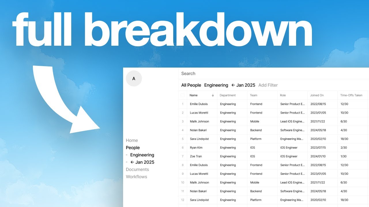
Charles Postiaux walks through his full design process for client products: market scan using Mobbin and Curated.design, rapid iteration in Figma with one idea per screen, and navigation as the core structure. He demonstrates with an AI HR tool delivered in two days, using just 3-5 colors and a lean component system.
Chapters
I work with companies worth over $160 billion, and I'm going to tell you today how I usually approach designing for those projects, for those clients, and my process that goes with it on how I iterate, how I explore the design options, and how to move fast while still documenting your progress. So the first one is going to be market scan plus product scan. So what that means is you're going to scan or look for the industry the product you work for is in. So for example, if it's an AI product, you're going to just look at AI products in general, the market. If it's specific, like, I don't know, it's about finance, an AI product in finance, then you're going to look deeper into that specific niche. But you can also look at AI products in general and see how companies manage, design, and create the experience around to introduce their AI features or make the AI product work. And you can just take screenshots of those, of the flows, the whole flows, specific states, specific screens, what The market is like. What are the usual features? How they usually present those features in the product? What's the navigation like? What's the user experience like? That's the moment where you can notice gaps and opportunities. So what are some companies doing right? What are some companies doing wrong? And especially for the product that you work with, it's like what's missing? What are some low-hanging fruits? What are some like big concerns that you have? Or if you notice opportunities for the company, and that's going to also lead you to. Doing a strategic overview. So basically strategic overview is the lessons that you've learned during the market scan and during the product scan. And you're going to just highlight those into like another page, another section of your project. Basically just brainstorm everything. So you'll notice that the onboarding flow is too long. There are too many screens. So here are ways that we could optimize that. We could combine multiple screens into one. There are questions that don't bring any value to the user in the beginning. We could maybe move that for later on. The activation process is too long. Maybe we should add more clarity to the dashboard. You know, like all of those things, you're going to do that after the market scan and the product scan or in parallel to those so that everything stays fresh in your mind. And it's a lot easier to one, figure out what to work on, what to pitch to the client, but also just being seen as more of a strategic designer than just a designer that is paid to design what the client wants to have. Here you bring real value and real benefits to you being there. How do you find those products? Well, the first page you can use is startups.gallery, which for example has a lot of all the recent startups and top companies that have raised money, that have been funded, and depending on also the specific industry that they're in. So for example, if I'm looking for a product in AI, then I can just go like on the AI tab and then look through all of the AI products And first of all, like this is super cool when you work with clients, but it's also very cool when you just, you know, want to improve your design thinking and stay surrounded with good quality designs because your design taste is one of your biggest differentiators. And if you don't have a good design taste, you cannot probably make good designs. So being able to surround yourself with like quality products, beautiful products, both in terms of UI, but UX as well, is a huge habit for you to build. The next one is Mobbin. It's really good to get screenshots, get flows of products. And again, like AI, for example, they have it here. So I can just look at here, Mistral.ai. I can also look at the flows here. So again, if I want to optimize the onboarding, I can look at this, how they handle their onboarding flow and figure out, like, for example, how the dashboard is going to look like for a first-time user and see what they want to push first. And then the last one is Curated.design. I think it's a lot more design-focused, but it's also a great resource to have. Just again to improve your design taste and to see like what is actually doable as a designer when you create websites or products. And so I usually go through all of those 3 and scan as many products as possible. So again, just like here, I would take the screenshots, I would copy the page, go on my Figma page, and then just add it here. And for example, if I like something, I could say like, really love the overview for first-time users. And I can just add notes, add another trend here, and I can Have another point here to be they make help plus resources easily accessible. It doesn't have to be so design focused. Like I really love this the way they design this. It can also just be in terms of an experience. Like here, I really love the way they push for helping people and and making sure that they get the right resources as quickly as possible. And by the way, real quick, if you are a tech company that wants to improve and optimize their product, you can work directly with me at baobab.studio. We've worked with multi-million and billion dollar companies, and we are both work with you several weeks to improve. Improve and optimize your product, whether it's for a discovery phase or for a more long-term collaboration. So just click on the link in the description and I can talk to you there. Okay, so now I'm just going to walk you through the type of process that I use and I go through when I design. So what I like to do when I design is just to iterate a lot. I'm typically going to have a lot of iterations, a lot of designs, a lot of explorations. So for example, what I like to do is focus on one idea per screen or one new idea per screen. So for example, if I have a navigation here on the side, just like a typical sidebar. And I'm like, maybe a top bar would be better. Then I'm going to duplicate that and have another variation of that at the top here. And then what if it was a bottom navigation? I'm going to again create a new iteration and have it here. And it's the same for everything inside every element. So I would be like, maybe you could have a table view here. Actually, maybe the table view does not work. Maybe we could just have sections. Maybe we could have both. Maybe we could have a tab here and then we would have sections there. Right? Like, and that's how you usually iterate a lot on those ideas. And you can see it quickly adds up because you're going to usually try to apply what you've done here. And you're going to try to create another variation here and then put it there and be like, oh, okay, it doesn't really work that well here. So maybe I could do it horizontally instead of vertically, or maybe it could be a grid. So you're like, okay, this is a horizontal one. Then I could have a grid instead. And you see, you just create so many variations so quick. I mean, quickly, this is just, these are just rectangles here, but it's just to show you that. Every idea you have, every new idea, every new thought, every new detail you want to change, just create a new screen. It's very good because first of all, that's like a piece of portfolio case study you can show. That's a piece of content that you can make. Like you can just make all the screens, make a GIF or like a time-lapse just to show the process you've been through to create the design. And it's also really good for you to go back to an idea that you really like because again, like you combine those things. So you combine the design inspirations that you've got. Like here you found some design inspiration that you really like, some screens. Elements that you love, you put it here, and then you really like that part, you put it inside of your design. Then you combine it with something here as a screen that you really liked. And you see, like, you create, you transform, you shape the product screen by screen, iteration after iteration. And that's how I like to design. And also really good for the client, because if you share some of the screens that you've done, some of the design explorations that you did, then it's a proof that you just didn't suddenly land on the perfect solution, and the client doesn't have to take your word for it. You the client all of the process, all of the steps that you've gone through. I think you should always have several directions that you want to go towards in the beginning, and then you kind of focus back into specific ones. So for example, it could be, I'm going to explore 6 different directions because I think there could be different ways that we could approach that product and that design experience. And then I'm going to refine it with you. I'm going to share with you the directions that I liked, and you're going to tell me which one you prefer out of those. Maybe they're going to also have a new one that's going to be created that's going to mix Some of the explorations that I did. So that's a really interesting way to collaborate together, show that you don't just think about one design direction or one screen, but you explore as many options as possible to create the best experience, the best product for them. Once you have figured out with the client the directions that you both want to go with, then you're going to refine those directions, craft more screens, adapt the designs to the specific directions that you liked. And again, go back to the client and ask, okay, so we have these 2 directions that you really liked here, how the design changes and inside of those directions, which one Which one do you prefer? And then once you have that mix of ideas, mix of directions that the clients liked, then you just solidify one. You go all in on the one. And in terms of how you design those and what you need to focus on first, I would say, and you can see it in my other videos, but what I like to focus on first is the navigation. Because the navigation is, you know, it's like the veins in our body. It connects everything together. If the veins are not here, the organs don't work. It's only because you have the veins that everything works together. And that's pretty much how I think about navigation and why navigation is so important. You need to have a strong navigation to have a product. And then the navigation is going to also help you figure out the layout of the product, because if I go with that double panel, double sidebar navigation, then it's going to kind of dictate a little bit how the product needs to exist and what kind of features we want to have. Like, probably what I'm thinking is for this screen that I redesigned, this links page has this links collection on the second sidebar, and maybe on like the planner page is going to be all of the upcoming posts that you've made, like the post from the past 30 days, the post for the next 7 days. And you see, like, that's how you think about the rest of the product. It's how the navigation is going to impact the layout and the whole experience and where features are going to be and how they're going to interact with each other. And for me, if you don't have a good navigation and a good layout, the product is probably not going to be very good. To kind of make sure that you get the most out of this video, I'm going to walk you through a design course that I'm doing with Open Purpose, a very cool design studio. And basically I'm going to show you everything that we've just talked In the video about, I'm going to show how I'm applying it to this design course and this design project pretty much. So the first thing is the market scan, what I've talked about. We don't have a product scan because the goal of this was to design a product, an AI-powered HR product. And so I don't know anything about HR products and HR in general, only the bare minimum. And so the first thing I did was market scan. So like I told you, I went to like Curated the design. I went to startup.gallery. I went to Mobbin. And I just also typed HR products on Google. And I found a couple of products. And so I took screenshots of their landing pages to understand, okay, what is an HR product about? What features do they have? What do people value? What does the platform look like usually? What do people care about? And you can see that I looked at a lot of products because again, that's what we want is to have as many sources of inspiration as possible. Not just one product, not just 3 products. But as many as we can. And that was helpful because I've been able to understand, okay, so I can see that some products are very specific and very niched while others provide everything. Like for example, I remember that Remote, they have everything. They just provide all of the HR-related features that you would expect in a product. I think Deal also really does that a lot, but some products are a bit more specific or a bit more niche. Like for example, I think Cocoon is mostly about leave and absence and how to track that. You can see Ben is mostly about well-being and health and rewards. Then I also went to their YouTube channel because they have this process of first exploring, then experimenting, and then executing. And so I wanted to also follow that and understand the way they— like the level of details and the level of exploration that they go through for each phase. And so you can also learn that by looking them up on YouTube as well. And then I just looked, I went again on like startup.gallery and on Mobbin. And I just took screenshots of as many products as I could. And so the goal was to like figure out the navigation, like I told you, navigation and layouts. So navigation first is going to impact the layout and the layout is going to impact everything. So I wanted to figure out different types of navigations and layouts that I could use for my design of the product. The first step is not to design at all. That's something I also say in my videos. First of all, it's the strategy. So like market scan, strategic planning. And then you move on to like, okay, what are we going to do? What's the plan? And you can see here, it's not even about HR products anymore. It's just about navigation and design. You need a lot of design inspiration and a lot of design resources because you need to pick those specific things here and there to like create something new, unique, fresh, but that still makes a lot of sense for the users. And so just to take examples, I saw like Capital where they have like this interesting bottom sidebar for navigation, which was really cool. OpenAI, they have this like kind of like almost a page navbar sidebar where when you click on something, it opens up a submenu and that submenu is a sidebar and then you can go back. So that was cool. There is this one here where it's like a big sidebar and it's mostly just content that is floating like cards. You have also Apple that has an interesting store navigation where you have a very visual navigation with some cards. Because the goal is not so much to make something unique every screen, it's to have that predictability for the user and to make a layout that is consistent. Consistent throughout the whole product, throughout the whole experience. And so if I go with the design like this, the benefit of those cards is that you can see they're being used everywhere and they just have different states, different evolution of the product, but they are not different. It's not shown on the screenshot, but it's also a card very similar, but they just change a little bit. It's just another variation of the card. Then the classic sidebar, then the full screen. Uh, yeah. And you can see some of them are pretty much not even designed. It's just like, again, the vibe you're trying to go with. It can be abstract. It doesn't have to be purely design focused. So a great place to go for those kind of explorations and design is Cosmos, which I think is a really cool like visual focus. It's like Pinterest, but more design focused. I feel like Pinterest is very broad for anyone, but Cosmos might be more design driven, which is cool. Then I thought about, okay, maybe we could have a table view. Maybe we could have like a graph. Then what if we had like a, like my mind where it's, you search, it's a search-based experience. Then what if it's kind of like a CRM social media style? And And so that's just the goal is you just try to get as many inspiration as you can and just identify small features, small design elements that really make sense for you. And so once I had all of that, my goal was to create directions. Like what do I want to have? What are, what are the directions that I want to take the product towards? So the first one was this kind of like top navigation bar, very low footprint, which I think was pretty cool. Another one was this kind of human ambient design. I like the boldness of it. I like taking the space in a very purpose-driven way. We also had the classic sidebar, which I think, you know, like no matter the design you go with, it doesn't really go— like you cannot go wrong with a classic sidebar. Then I thought about this almost full-screen experience or top navbar that opens up on hover. Then I thought about a query-based search. Where you just, it's just a blank page and you just ask stuff and it just gives you whatever you want. So if you search for, I don't know, employees that are on sick leaves, then you can, it just shows you that. There is no interface. There is no navigation. It's just you ask, which was very interesting as well. And then a double sidebar where you have like this core icons navigation, and then you have more of a per case or per page sub-navigation. So I just did that. I just created the directions. Okay, here's direction 1, the double sidebar. Here's the input-based navigation. Here's the web-inspired navigation, et cetera, et cetera. And so then once I had those things, I tried to focus on 3 different experiences. And so you can see here again, a ton of design examples, a ton of design inspirations everywhere. Like you can see, usually I try to have my screen in the middle like that and iterate. Again, like I said, you need like ideally one new idea, one new iteration per screen. And then I have like What I want to do, what are the key flows or pages like here. So I want the directory page, I want the profile page, I want the documents, the dashboard. Then I have my style guide, and I think looking back, I just used those two or just two versions, two texts. So you really want to stay very lean, remove as many distractions, and by distractions I mean details in your design. I just use one or two and that's it. Same for colors, you can just use black and white. You use zero, you use six, that's like your black and gray, like here zero six, and then I would probably. Recommend to have like a white, so just F, then maybe like a slight, a very light gray. FA is a nice one. And then you can use E, for example, for the outline like here. And that's it. Like just 3, 4, 5 colors max. And again, 2 or 3 text sizes is also all you need. And something that really helped me was that I used some of the designs that I did, and you can find them on the channel as well, like the Linktree design concept that I did with a double sidebar, but also have the square design with the table view. And I think the table view, a great use for me because Because my design direction is very geometrically driven. I don't know if that's an expression to use, but I just use a lot of geometry and very sharp corners and lines. And so having that table in mind was really helpful. I also did this redesign here where this was ideal for a table view, but it didn't quite match what I was looking for. The complexity of HR tools is, you can see here, they have a lot of columns, and so it can quickly become difficult if you have a lot of paddings on the sides. And also if you do not have those dividers per cell, it's also going to be quite complex to digest the information as a user. And so you can see here, the exploration was with having the top navigation and some filtering systems. Then I tried to figure out the filtering system itself, like what is it? How does it work? What it is about? Some of the top navigation, and then I tried to put it in here. And so that's a great way to go back and see how I did it. Here I was trying to do the double sidebar. I was not sure what the third exploration was about. I was not sure which direction I wanted to take. And so I preferred focusing on the ones that I knew I wanted to take right away, just to make sure that I was already figuring it out, the content, the design, the experience first, and then trying to focus on the last navigation. Because what we want to do is have a different navigation, a different kind of almost layout, but we want the structure, the layout, the consistency of the features themselves to be the same. And so if you are stuck at some point with a design, you're like, I'm not sure if I should go with this one or this one, just focus on the features, focus on figuring out the core layout, and you can just, you know, put the other thing you're not sure about aside until you have more clarity on the product. And it was a lot faster and easier once I had that clarity. And so here I did that sidebar. It's really good to redesign to create concepts because You can reuse them for your own projects. And I tried to also figure out the different design for that table view, which didn't work that well. So there is engineering here. So it's the engineering department and then some key actions that you can take. And then I just populated the page with the table that we saw in the beginning. And I just added a ton information to make it more realistic. And just with that, it's super easy. You just have to use like ChatGPT or any AI you want to use. And you're just like, okay, here is my table. Just populate it, add random people there. And that's really good for that. And then I tried with just the filters. Then I tried with just the title. And then I was still not sure for the third direction. So I just kept going with those 2 menu directions that I had. And I just tried to improve it, refine it. So I'm like, okay, so first we're going to just clean it up. So I just cleaned up the navigation, the buttons, and the filtering system. And then I thought about adding that because We needed to figure out, okay, what is the profile of an employee going to look like? And I'm sure that, you know, we think, oh, we can just have a sidebar that's going to be on the right. And that's just going to be very easy, very common. And I wanted something a bit more different, unique, but at the same time that is very powerful. That's like the core recurring feature that you can have and use and interact with throughout the whole product. And I think that's a great challenge. I'm going to make another video about it actually. So a little spoiler, but it's a great Exercise to like stretch your muscles, your design muscles, because you are in this project that was very time constrained. I basically had two days to design everything and to figure out what am I doing, and also just trying to push your design thinking as far as you can. Because it's not just about designing the screen and not thinking about the experience and you know how everything is going to interact with each other. Like if I just design the screen and I post it and it's that's it, like a redesign on YouTube, I don't care so much about okay what is this? Experience going to look like? What if I click on select a category? What happens? What is it going to look like if I'm on documents or on the workflows? I don't care so much about that if it's just one screen. So taking that bold approach was both risky but also high reward, because if I make it work for many different pages, many different features, it's going to be a super cool and powerful element in the product, which I think I did. I went back to the top navigation And I tried to focus on documents because you had the design for the employees and design for documents. And that's also a challenge because how do you create a design system and design language and components that look the same and have the same kind of experience, but that serve different purposes? So it was an interesting also thing to do. I tried to add some layout buttons to change the design, which I did in the future. And then I tried to have like that hover state, which I think was interesting to like have a quick overview of what this is about. And if you want like some quick actions, like download contract or create a new contract, which was cool to do. And then I just iterated on reusing that design feature. I think it's a design feature that I did before for the employees and how it would work for the documents. And then I just applied it on both screens and that's it. And so then I just grouped them together, prepare them to make sure that it is clean and clear because the main problem when you design a lot, when you have a lot of iterations on your design is one, it's going to get messy really quick, and 2, it's going to be confusing which screen is the most up to date. So what I like to do is just, once I'm done and satisfied with those, I just move them somewhere else. And that helps me to either iterate more on those or just make sure that, okay, this is the current most recent update, and I can use those next day to like iterate on that and design more screens. So I had those that were done, and you can see it looks similar, it's just the navigation that's different, and that's the And then I figured out that I wanted to do the kind of ambient bold design navigation. And I really liked that idea because it has its own unique style and identity, but it's a very, it's an interesting mix between the boldness of the navigation and the filtering system with the granularity of the table view and all of the information that you can access. And so then again, I just applied the design that I did before to this different navigation. But it's not over yet. Because then the next day was the final day where I had to design probably 8 more screens, which was very difficult again, but amazing to like stretch my design muscle, making sure that I go fast in my design, but I stay consistent and focused. And so again, the next day before designing, I just again searched at a lot of design inspiration and design examples to like figure out, okay, what is interesting and how do I make those designs work? Just to get like an idea. Of what am I doing? I stayed with the design that I did the day before the final navigation. I tried to refine it, so add a bit more detail in the colors. I mean, colors, just grays, but it was still cool. Added those like grid versus list views, and then I just refined the experience for that. I don't even call it a model experience. I don't know, but you're just refining the details on here, understanding and refining the logic behind. What does it do and how does it evolve throughout the product and based on the user input? Like what happens if I click on contact information for that user? Then it's going to show me the details of the user for like the contact information. There is a way to close it and pretty much go back there. So I always try to have like those double navigation systems. And then again, how do I add new employees? So it's just the same experience with buttons on the right and then the same kind of format to add new employees. Then I did. Decided to design a grid view, which was a little difficult because we need to stay consistent with the design. So if I have a very grid-heavy design, I want to also have that for the grid view. So it was a bit difficult to figure it out, but I still did, which I think looks good. Then again, reusing that same strategy, the same experience for the documents. What happens if you click on agreement details where you're going to see agreement details? You can close, you can go back and you can see the details with the same layout and experience. What happens if I want to upload a new document? I can just upload a new one here, and I can also have a dropdown to select a specific employee. And that was really cool to do. And then it was like this interesting transition between how do I go from tables to like something more practical that can be used and that can be reproduced throughout the whole product. Not just people, not just documents, but also the dashboard or the homepage and the workflows and the settings. That's what I try to focus on. Adding a spacing, adding kind of like an invisible divider between sections, having titles instead of having filters. I can just have titles for the sections. And again, we're using that table detail and design for all the information. Same thing for the workflows. Like again, HR, it's a lot of processes and workflows in place. We need to figure out how it looks like, what's the experience like. We're able to filter out specific workflows. We're able to see who's inside of actual workflows right now. And we can also reuse the same experience that we use use for people and for documents that we can reuse for workflows. Like, how do I create a workflow? How do I create a step in the workflow? Or how do I update? And then the settings. So again, we're using that table view for the settings. The things are pretty much combining everything we did before. So table design and experience combined with having the navigation instead of filters, having that document underlined to identify which element is the one that is active. Or synced, and we're using also the document design for things that can be downloaded or reviewed. I think I've talked a lot more than what I talked about earlier in the video, but I think it's still valuable for you to get an idea of how to get from nothing to a full product, because here it's pretty much a full product, right? Like it's ready, just need to be implemented. So my biggest advice for you just to end the video is pick a product that you want to redesign. You define the core flows that you need to redesign, and then you just do what I did. Market scan, figure out a lot of inspiration, understand the product and the features, combine a lot of inspiration, whether it's from design or not, together to like get those unique ideas. And then you just make the flows and you try to use as little text sizes and color styles as possible. And you try to reuse as many components and layouts as possible and focus a lot on navigation first. If you have any questions, let me know in the comments. I will always reply, and that's it. Good luck designing.










