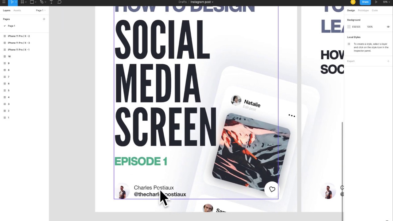
In this live, step‑by‑step Figma tutorial, the presenter recreates an Instagram‑style social media screen that he previously designed in Adobe XD. He starts by setting up an iPhone 11 Pro frame, then creates the main content rectangle with rounded corners and a drop shadow. He adds secondary rectangles for the post image, profile picture circles, and small UI dots, using precise dimensions (e.g., 315 × 380, 255 × 250) and corner radii (40, 20). The tutorial covers color choices, opacity settings, and the use of the SF Pro Display typeface for usernames and UI labels. The presenter demonstrates how to copy‑paste and mask photos, apply a layer blur (45) with 60 % opacity for a soft background effect, and insert a heart icon using the Feather Icons plugin. He groups elements, aligns them using rulers and the Align Vertical Centers tool, and follows a spacing system (70 px top margin, 30 px inner margins). Finally, he shows how to duplicate the whole post, adjust spacing, and export the design, encouraging viewers to like, share, and comment on future tutorial ideas.
Chapters
Hey everyone, welcome to this new video today where we're going to design a very simple social media screen. I already did this tutorial in video on Adobe XD and I'm going to do it on Figma. And also, yeah, I created a post, an Instagram post, so if you want to check it out, you have my Instagram name here and also in the description of the video, so you just have to go down there and you can See it right away, and so yeah, I created explanation tutorial kind of with the. So yeah, if I feel like you know the video is good because you can see it live, but you might not understand or remember the sizes, the corners. So having it right under you or like on your phone where you design, it could be very helpful. So yeah, I have everything listed here, and yeah, I'm going to just. Redo it again here, kind of like that for you and on Figma. So first video on Figma, and yeah. So the first step is to create a rectangle. I'm not going to do the drop shadow because we don't really need it. But yeah, basically you press F, you go on the phone. We take this one right there. Where did it go? Okay, very far. So yeah, it's basically this one. You just need to take the iPhone 11 Pro. And X, and you are good to go. So we already done the first step. Now we can do the 40 corners. So the corner is right there. You do 40 to make it, you know, kind of cool. Then what you need to do is create another rectangle. So now we're going to do R, press R, Shift to kind of create a, um, I don't say a cube kind of, and we're going to unlock this Constrain proportions, and we're going to just put the size right there, 315 and 380. Perfect. Color white again, but now what we're going to do is add the drop shadow for this one because, well, we don't see it otherwise, right? So we just need to add the drop shadow right there. Oh yeah, and we need to do the corner as well. Totally forgot that. Corners, you go to FX. Drop shadow is already put it on, so just there you follow right away. It's just written right there, the effects. So 100, then you copy the color here, 6C7797, 15 opacity, 10 X and 20 Y. Perfect. We got it right there, it's here. I don't care about the— let's not care about where it is right now, where it's located. We are going to do that later. So now what we're going to do is create another rectangle. So that's perfect, 3, 115 and 3, 180. Wait, it's exactly the same one. What did I do wrong? Oh boy, I think I got it wrong. Oh no, that's so bad. Okay, my bad on this one. It's this one exactly, 255 and 250. Ah, okay, 255, 250. My bad, my bad. Um, yeah, so we got it. Now we're going to do Oh yeah, okay. What? Why is it? Oh yeah, because there is— it's zero. Okay, perfect. So we got it. Um, 20 corner, we got it as well. Perfect. So now we're going to do, um, a circle. You press O and we're going to do 60. Since we kept the proportion locked in, then it's going to— whatever we switch here is going to adapt. So it's very convenient as well. This one we're going to keep it this color right now just because it's easier to notice. And another one is going to be 40, 40. So the same thing here, just put once 40. This is going to be our profile, profile, that's all. And now we're going to do 5-pixel big circles. Perfect. 1, 2, 3, 4, 5. Control C, one, two, three, four, five. No, got it wrong. So, three. Okay, we got it. Control C, control V again. Perfecto. And this one here, we're going to group them together. So it's Command G or Control Control Command and Control G. And we're going to switch the color to um um um. To 0.5, 0.5, 0.5. Perfect. So now we're almost done, halfway through. Now just to let you know, the typeface I use is SF Pro Display. So you can just go on the Apple website on the designer— they have a design section, I think, or something like that. And you can just download for free the SF Pro or just the San Francisco font. So it's really, really convenient. So now what I'm going to do is just do Natalie, which is going to be the username, and Edit Post, which is going to be like kind of like the user, you know, you get it, you edit the post. So it's going to be bold 20. Yeah, it's going to be the same dark color as this one here. So T to put the text, you do a left-click and you get it. So Natalie, perfect. So we said 20 and bold, and it's not the right color right now, so it's 0505. Okay, perfect. And now we need to have also the edit profile, uh, edit post, right? Not sure. Edit post, yeah. Regular, 14, and 20 of opacity. Regular, 14, and 20 opacity. You just press, um, it's kind of like on Adobe XD, which is very good. You, you just press the button which number you want, and you can reduce the opacity right where you see it here. I press 3, I get 30. I press 2, I get 20. So it's very convenient and useful. Okay, perfect. So we got that, and now we need these 2, um, photos here. So what I'm just going to do is Ctrl+C on this one, go on the small one. It's the small one here. Whoop, uh, no problem. We're just going to make it 40. Perfect. But usually when you have a photo, you just Ctrl+C, Ctrl+V, and you take the form and you have it. And you— well, it doesn't work here, but last time— next time— last time it worked. Okay, so Ctrl+C, Ctrl+V here. No, here. Yeah, so it's 255, 250. Okay, 255, 250. Perfecto, we got it right there. I can remove the other one. So we got this one as well done. Now, add the final result. So we are going to duplicate the photo here. So we take the mask group, Ctrl+C, Ctrl+V. We take the one at the bottom. Now what we're going to do is reduce the opacity to 60. Then we're going to have the effect, it's going to be Layer Blur, 45. Perfect. And you have this pretty cool blur in the back. Make it very soft and pretty cool and aesthetic. Now what we're going to do is add a heart icon. So you can either do it by yourself. You need to have a rectangle like this. I do it very— it's going to be very bad, but you know, just to show you how it is. And then we need to do kind of like 10 here, and let's do, I don't know, Nope, it's the other one. This one, 5. Ctrl+C, Ctrl+V. Yeah, it's pretty ugly. Let's do like that. Sorry for the— just going to show you. Okay, so now what we're going to do is just reverse that. 5, 0, 10, What have I done? It's 10, 10. Don't know. Okay, perfect. Then we group it together, Union Selection, and bam, we got it. Well, this one is a bit not good. Let's do 20. Oh my. Okay, 20, 20. Perfect. You see, you can do a heart very easily. But we're going just for the— it was just to show you. So now what I can do is go in Plugins. I already have a couple of plugins and the one I love is Feather Icons, where I can get a lot of beautiful icons. So I can type heart. Okay, perfect, got it right here. Now what I can do is take this one here, take the— I can just take the vector, I don't really need this one. Ungroup, perfect. So I'm going to just group it together. The goal is to get 18 in between. So maybe it's going to be a bit difficult because it's live, so I can have some trouble, and I don't want to waste too much of your time as well. Well, okay, let's Let's go with that for now, right? Okay, let's let's do that. Not the best, but it's okay. Okay, kind of kind of good. Okay, so now what we're going to do is let's follow the steps. Up up up up. Okay, perfect. So now we're going to assemble everything together. So you can see here and you can see on the Instagram post that. There is a space. You have all the space here, so it's very easy. Usually 30 of difference and 70 at the top. And here I think it's 40, but I didn't add it because, you know, you can do whatever you want after that. You can just copy paste it and switch photos and, and names, and you are basically done. So what I'm going to do is first order all the things here, so 70 and 30, and then 30 inside as well. So let's do that. What I like to do sometimes is you do Shift+R and you have the ruler, so you can do 70 right here. You take this one, bam, snap it, center it, 30, perfect. Now you take this one, you center it as well, 30, 30. You got the bottom here, it's not 30 yet. This is 30, so perfect. Problem here. I didn't do that for here. Okay, perfect. It was my bad, I should have grouped them together. And always rename your file, it's very important. I don't do it because again it's a tutorial. Okay, so perfect. Now I'm going to take the photo here and I need to have 30 as well. Perfect, so let's do that. 1, 2, 3, 4, 5, 6. Perfect. This one 30, and he's 30. Perfect. What I need is take this one here, put it right in the middle of, of this one. So we can Shift-select the 2 forms here and click on this one to get the Align Vertical Centers. And I'm going to move that away to the 30 as well. Perfect. So now I just need to have Natalie and Edit Pose together. I don't know if I've added the— come on, perfect. I don't think I've added the— no, I didn't add the distance. It's kind of, you know, you just by eye. I think 12 is pretty good. Let's lower that to here. Let's see, I'm going to remove the Scrollers, Shift+R. Okay, perfect, we got it. And then the art, the last final piece. This one we're going to put it up. Perfect. So it's 15 and 15, half of the size, so it's pretty good. The art is perfect here. So it's not really centered. I'm sorry for that. I hope you do not mind. I don't know if I can, you know, like kind of like that. It looks terrible. Okay, and if I do— no. Oh boy. It looks terrible, right? Yeah, it looks terrible. Let's forget about that, shall we? Okay, so now, sorry for that, we put the heart here. Did I add a drop shadow? No, I didn't add a drop shadow, right? No, I didn't. Okay, so you got it. Perfect. You have your Instagram post done. So now what you can do very easily is just to take all of them together, Shift from the bottom to the end of it, and keep Shift pushed on, then Command+G or Control+G. You have it here. Then Control+C, Control+V to copy-paste it. You make it slide, you do Option on macOS, 40, and you have it here. And you can switch photos and names, and you can duplicate it. And here you have it. I hope you liked this one. If you liked it, make sure to share it with anybody who might also find it interesting. Make sure to like it as well and subscribe for more videos like that. And let me know in the comments what you want to see next. Bye!