How to Design Better Navigations Than 99% of Designers
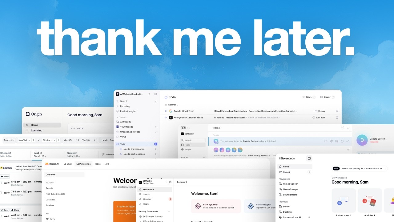
In this solo walkthrough, Charles Postiaux examines the navigation designs of a wide range of SaaS products (Origin, Fei, Kayak, Clay, Patreon, Groq, Mistral, ElevenLabs, Deidoo, HoneyBook, 1Password, etc.). He begins by stating that navigation is the connective tissue of any product and that a poor navigation will eventually kill user adoption. For each product he points out what works (e.g., clear onboarding in Origin, minimal sidebars in Fei and Clay, dashboard‑driven navigation in Groq, search‑centric layouts in Kayak and ElevenLabs) and what fails (excessive padding, inconsistent iconography, over‑crowded menus, low contrast, unnecessary items). Throughout the critique he proposes concrete visual tweaks—adjusting spacing, icon size, corner radius, background blocks, hover states, and grouping—to make the navigation cleaner, more scannable, and easier for first‑time users to understand. He also discusses higher‑level strategies such as using onboarding to direct users, leveraging a search‑first approach, employing the dashboard as a teaching tool, and allowing customizable or context‑aware menus for multi‑persona products. The video ends with a reminder that good navigation should be simple, consistent, and focused on the core actions users need, and invites viewers to like, subscribe, and watch related content.
Chapters
Navigation is one of the most important parts of your product. If your navigation is not right, the whole product sooner or later is going to die because navigation is the connective tissue between all of your features and that links up your entire product together. So I'm going to look for some screens on Mobbin and we're going to review it together and figure out what's working, what's not working, and maybe light designs on How to make it better. So just start with the first one, you know, just going through them. For Origin, their navigation is basic. It's simple. I think that's one of the key things. I'm noticing that they didn't remove the clip content. They didn't remove it. So you can see the drop shadow stopping here. They might need to fix that. But anyway, otherwise the navigation is, it's simple. It's just, again, a dashboard. There's a ton of stuff happening. The first time user is the less likely to actually do any of those. But you have the typical actions at the top, the profile, notification, help, a big invite card even though it's at the top. You get onboarding here. A lot of things are happening. What they do well, however, is their onboarding because in their onboarding they show, they ask you here one thing that you really want to do with the product. And once you reply that and once you tell them what you want, they send you to the specific page about it. So that's, I think, pretty cool. What I don't like about the navigation is it looks very ugly. I mean, not very, I'm over Reacting a little, but probably the text should be here, and there is too much spacing, too much padding on the side. Like the icon is probably 28, maybe, and there's a lot of padding here. 17. We get home. We could do. We could try to adapt a bit more to what they have. 20, 24. Actually, 20 and 20. Then 8, and then we could do 8 and 8. Slightly different. 36. So they do probably 10 and 10. Then we do that gray. We have probably 8 or 12 of corner radius. Did they do 10? We can do 8. Then we can add our background here. Where is that? 32. It goes all the way to there. Could do like that or even push this a little further. And then we have that line here. So here we could either push it all the way to 16 there, which would work, or just have the icons and probably make it bigger as well, like 52. Center that and just have the icons here. Then you can push that. You can have the logo right here. Push that maybe up, then 16, 16 here, and you go all the way down there. And maybe you can put those here. Account, maybe it can be there. You could have help or notification, or maybe you could have the plus account to add another account. And this could be just different like that. And this you just expand it, and there, that would be a lot better and simpler for people to understand. And so on hover, you can just see what this is. And so then you have a ton of more space to add to To either expand that, add more stuff, maybe not add more stuff, but make it look better. And yeah, I think that would be pretty cool to have that. So you can see what they have and what it would be. Yeah, I just think it's cleaner. That would also free up some space here. So probably those 2 cards could go up there instead. The spending could go here. All of this then becomes background. And it's a lot cleaner now. You can even expand it. Yeah, like make it a little bit bigger, maybe, maybe up to here. I think it would be much simpler and easier for people to just get here on the platform for the first time and be like, okay, I understand where I am. I understand what to do next. I get the value of the product right away. Cool. Let's try another one. This one, I think this one looks cool. So I get it. Like it gives you this idea of being powerful, but, and you probably get access to everything under one click. I'm just wondering if it's really worth it. That's filters, right? This is an interesting one from Fei because they have a very different design or navigation experience. And for me, I think it's really fine and very easy to go through because the impact on the interface of the product is so small that it's extremely easy for anybody to just jump in and know, okay, so I just have like those 7 things to go through and that's it. And if I'm not sure what to do, I can just search. So it kind of goes back to my idea here of Making it super easy to digest and and go through. And you know, I feel like most users would know just looking at the icons what these are, and it's also very low friction for people to discover. There are not like when you compare with plane, and I don't know how many of those are built in, but when you go through, when you arrive here, like what do you do? There is so much learning to do in order to know what this is and where to go to get what you want versus. Here on Fei, where it's just there. All of your product and experience is right here. For me, Kayak is like, let's make it super easy for people to search what they want. Same thing here. If you want to see recent searches, you can easily see the dates, the, yeah, the type of bookings that you have in your trip, and you can easily start a new search. It's just not done very well in my opinion. But in terms of navigation, I think it's still Really good because all the focus is on that, on that hero section. They have the hamburger menu to hide the navigation. I think that's really smart to have that. And so overall, it's really good. It's just not very attractive to me. It doesn't look very, very good. Even UX, it's just not super enjoyable to look at. Now from Clay, that is a really nice and easy navigation to have. You just have the logo, your company probably, or profile. Search, home, people, and then you can create groups. And that's it. You can add people here. You can have the AI conversations here. And that's it. The rest is about the product and the features. Again, super easy, super light. They understand their users. Like everything is really clean and simple to use. I feel like usually you can see it on Kayak, like, oof, that's a lot, right? Who wants to use that? Like seriously, it's so much everywhere. And the drop shadows don't really help. But you can see here, they have to address so many needs, so many types of customers, so many scenarios that there's just stuff everywhere for all of them. So that's why having a very clear, specific, focused product like Faye, like Clay, you know who your target user is, you know what they care about and what they want to do with the product. You just remove everything else. Patreon is pretty good. I would say it's at the limit of being overcomplicated and too much, but right now it's still all right because the navigation is still pretty clean, even though I don't understand why there is so much at the bottom, why not at the top or even like here next to the logo. I'm also wondering if the create here is the same as this one or if it's just a preview. But otherwise it's pretty good. What they might have to do later on if they plan on adding more things, probably to tuck some things away or to group them together. Because like payouts could be in the settings, notifications could be in the settings, community could be with audience. I don't know exactly what these are, right? I'm just trying to imagine here. But yeah, simplicity might be something they want to care about later on. Groq is pretty cool. It's pretty clean. I really like the simplicity, the homepage of the dashboard, super clean and cool. And I think what they do well is that all of those sections on the navigation, all of those elements can be accessed through the dashboard. And right here, I would imagine most of them or all of them, right? Looking at the icons. And so the benefit of that is it teaches the user what these are and you can already connect the dots by saying, oh, the key's here. So the key is there. So if I click on that, I'm going to access this. Or you click on the card here and it's going to show you that you're on this specific page. And you're going to connect the dots and understand what each is. And so using the dashboard as a way to educate users about the navigation and where they can access what they want is another smart way to do it. And again, the goal should not be to overpopulate the dashboard and add a ton of stuff, but the way they do it here, super clean, very easy to scan and go through. Icon, title, description, indicator that they're going to go somewhere else with that little arrow. It's really good. They have a simple search bar at the top. Not super overcrowded top right section with your user, team, and then the theme of the page. So really good. I think from Mistral AI, I think that's a pretty solid navigation. You have like the core navigation at the top. All of the information about the user is stored right there. There is nothing else on the navigation. It's purely focused on the chat platform, docs, and API. Super simple. And then once you dive into a specific section, Then you get those like sub-navigations. And again, the design treatment on this makes it very easy and light on the eyes and very easy to scan through, which helps also again educate the user on where to go and what to expect. But I wouldn't say it's a bad navigation because at the end of the day, you still need to give people what they want and what they're searching for. You should not hide just for the sake of hiding. ElevenLabs, I think it's super clean. I really like the navigation. It's simple, it's light, easy to scan. If there are some things that probably have more To them, they are tucked away. Account is just the account. Notifications right below it. So it's perfect. All of the space at the top is freed up. And I think that gives a lot more room and focus to the actual product itself. I think maybe the only thing that they don't seem to have is a search. But if you have a question, you can use the AI. So I'm wondering how that works out, if there is a way to balance that out. But otherwise, very clean. You have like, I think your core action items here. So the home to always go back and get quick actions right here. Voices, if probably it's the voice assistant. That you use or that you want to create. So that's like the core fundamental of the product. And then you have ways to explore the product and the features. Super easy, very similar iconography, which I think helps. Simple navigation and wordings. I'm wondering if there's a way to toggle those, like if there's a, if there's a chevron to hide those or not, like this audio tools, that could be interesting. I don't think it's necessary just because there are not that many things, but just an idea to explore. Deidoo is a little saturated on the navigation. I think the colors don't help a lot. They're very pastel, very difficult to go through, and I feel like they tend to mix a lot together. Like, I think this is pretty pink and this is more on the orange side, but when you look back, you might not know the difference. So everything kind of blends together on the dashboard, and that does not help remove some of that weight to the navigation. And here is just a lot as well. Logout, settings, help, support, invite collaborators. Do we really need all of those to be right here? We probably don't want the users to log out super quickly. The settings could be accessed from here. Invite collaborators, probably don't need that here. Already we've removed all of that, which gives a lot more room to that upsell opportunity, full access activated. Let's actually move that there. What did we say? We remove all of that and this can just be there right away. That's it. Already that gives a lot more emphasis to the actual upsell. That your trial is going to end very soon and you need to buy the subscription instead of having a ton of things here. The other thing I'm wondering is in terms of usability, if journey frameworks is something you can add and create stuff, but building blocks are not, then wouldn't there be a point where you have so many journeys? I don't know how many they would have or edge cases on that, but there would be so many that you don't see your building blocks. Now, how important are the building blocks? That's another question. What could be nice is. What if building blocks was more of a hover state chevron like this? So then you can take that, you can hide this. And so you can hover building blocks and then you get that dropdown right here. You don't have to click on it, anything. It's just there. You can click on it. So journey frameworks take all of the empty space because you can create as many as you want. And building blocks stays at the top at like that core foundation of the product and the navigation. That could probably make more sense and that would free up a lot of space. And now it's, you see, you breathe a little bit more. Right. Compare what they have right now to this, there is so much less pressure as to understanding what's going on and what do I need to do and so many information to filter. It's just the core of the product, upsell, the foundation of your frameworks probably or templates. Then you have your own journey frameworks that you're working on and that's it. Oh, actually they have invite here. I just noticed it because I'm so used to having like a create CTA. Why do they have it here? Maybe these are the only CTAs they can create? I don't know, probably not because there are so many templates. But anyway, you can just remove all of that stuff, free up so much space, give a lot more peace of mind to the users, and the users can, at the end of the day, they can just use the product much better and focus on what they're paying for. HoneyBook is fine. I feel like here the problem is just branding and colors. Like, what is that? Can you choose those colors? Because wow, did you try to check the contrast on that? And it's just very— it's okay, I'm criticizing more the design here than the navigation, but like Look at that. The buttons are a toggle, but look how different design is from the buttons here and how different these buttons are from here. Like everything, nothing really makes sense here. Why is the chevron so big? This one is even bigger. And then on the navigation, there are these tiny little ones. What I would like them to do probably is what if they use the same navigation as Faye where they could just have something here, like a little floating island right here, and all of those could just disappear. So this way you remove all of that stuff and just focus on the task at hand, the calendar. And I'm wondering if that could be a good option or not. I don't know. Like there seems to be a ton of things in the dropdowns. So probably not, but it would make life so much easier this way. My mind, I think it's a pretty good navigation because you have everything. So probably the homepage, spaces, probably what you have, like your groups and serendipity. But otherwise it's pretty clean as well. I think I would just update the design system or the aesthetic. Like the icons don't look super good. So I'll probably just change that. Very easy to search. I think that's the core feature of the product. So search is at the center of everything, which I think removes a lot of weight from the actual navigation. That's why it's so nice and easy to know what these are and to go through them. So it's good. 1Password, it's a lot. I did a redesign on that design concept where I tried to clean up as much as possible. Actually, I have it. Like this, where the menu is just the core items that probably the user could change based on their goal with the product. I think 1Password might be like we talked about earlier, where like Kayak, if you have so many different types of users, so many different goals to achieve, so many markets to go after, you just end up with a ton of features and a ton of things everywhere, and it doesn't make anyone happy. So if they had a much— either they could have a much cleaner navigation and menu, just the core items, and the rest can be tucked away in other pages. Or if you go inside reports, maybe inside report it could be insights, there could be activity log, these kind of things. So you can group them together, or you could customize that. So you could say, as a business owner, I just want to see groups, people, and vaults. That's it. I don't care about the other things. And that could also help free up some of that space. For me, that's just the big problem with what they have right now. It's too much. You spend a good 2 minutes just trying to look for the right thing to do. And you're like, what is the difference between insights and reports? You're going to go through insights, you're going to load, you're going to try to find what you want. Oh, it's not in insights, it's in reports. Let's go to reports. 5 minutes have already gone by and you're paying for that. When you pay for something, you should easily find what you're looking for and you should get what you're paying for. Another design from Mistral, another navigation from Mistral. I feel like this is a little less good. It's not bad, but it's just less good than what they had previously. I think it was their documentation platform actually. I don't think it was the product. But this looks a little worse just because everything has the same weight. And you might argue that, you know, each section here is smaller to reduce that weight, but what they do is they increase the darkness of the text. And so that gets the weight back on, if whatever I'm saying makes sense to you. And so then it becomes a bit overwhelming. Luckily, there are not too many things, but it's still a lot. So what they could do instead is just like what they did on the documentation navigation where they just lowered the opacity of the sections, maybe increase a little bit more the gray on the hover or active state. And I think that would already solve some of that overwhelming feeling. I think that's it for this video. I tried to go through as many as I could, give you some insights. I didn't plan the video. I just went through screens that I thought could be interesting to review. I hope it was helpful for you that you can craft better Navigations, and that's it. Thank you so much for watching this video. Make sure to like and subscribe. If you like this video, YouTube thinks you will like this next one as well, so make sure to have a look. Bye. Bye.