I Redesigned a Music AI App From Scratch (Full Process Walkthrough)
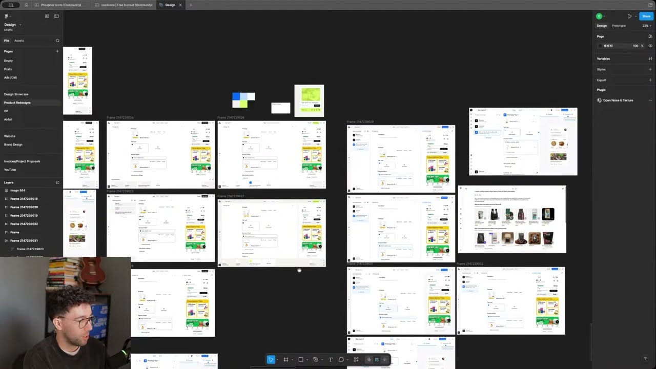
Charles Postiaux walks through redesigning a music AI app from scratch, showing his actual workflow in Figma. He uses Claude for brainstorming, Midjourney for visuals, and explains practical techniques like drop-shadow effects and auto-layout for faster iteration.
Chapters
Hello, hello everyone. Can everyone hear me? Is everything good? Good afternoon, or good morning, or good evening, depending on where you are. We are live. Hello, Jay Hadi Hassan. Welcome. Finally, we are live again. Last week I was not live, unfortunately. But yeah, I have my little like livestream agenda on the on the right side of the screen. I have you guys. On the left, so we're pretty good. We're pretty good for like a nice little live stream together. Hopefully it's going to be a good one, nice one. Yeah, I have a couple of things I want to like go through with you guys, and as usual, if you have questions and things like that, always happy to chat. I mean, that's the goal of the live stream as well, is to chat together and you know have a nice little time. But yeah, like light. Last livestream, I was not able to make it simply because I pretty much had no— on like Monday morning, I had no Wi-Fi whatsoever. Like my home Wi-Fi just went down and I was like, no problem, it's fine, I have my mobile data available, I have the mobile provider, I am saved. Unfortunately, the mobile provider was absolutely garbage and I could not Load anything. I could not download anything. I could like sometimes have twenty thirty minutes with no internet, and so luckily the internet went back on Wednesday lunchtime, and so I technically had some time to like make a live stream. But I did not have. I didn't had. I didn't have. Yeah, I didn't have the recording for the Friday redesign video, and so I pretty much had to only do that. And sacrifice the livestream with you guys, unfortunately, and focus on the other task at hand. So it was a pretty, you know, pretty tough start of the week. But finally this week everything is good, everything is working. Super happy to do the livestream again. So pretty nice. The video for Friday, we have a video already. Almost done, I think. I still have a lot, a few visuals to add, some stuff to refine, but overall the video is done. It's not going to be a redesign video this week. It's going to be a— what's the video? Oh yeah, it's going to be about how to get higher-paying clients. I'm trying to be strategic with the video and try to give you as much content as possible and value as well. But hopefully it's going to be a cool video. I think it went— the recording went well, the editing is cool. I've also figured out a new way to record redesign videos, so we might be able to improve the editing as well on those. We will see. I need to, to like do some more tests and see, but you know, could be nice. So yeah, that's pretty much the schedule. On Friday, the video is going to come out exactly at pretty much this time. I'm doing the livestream right now, so whatever the time is for you guys, that's going to be the, the time of the video on Friday. So, you know, uh, but yeah, it's pretty cool. So that's done. I'm done on that, on that list as well. Um, we have some new reasons as well on Mobbin, which I think is pretty cool. Um, I'm still like, I have no idea literally what I'm going to redesign next week. Uh, you You know, whenever I design, I do those recent videos. I like obviously because I've been doing that for a while. I kind of know like some screens that I might want to do and stuff like that. But I've not redesigned them or anything. And so, like I have generally no idea. Like I have no idea what kind of screens I want to redesign or even looking at the previous ones. I don't really know. There was one that I've talked about before. I think it was the Instacart one. I think it's interesting in terms of e-commerce kind of story and. I think it's an important screen, like maybe this one or this one could be nice to redesign, but it's like, it's not a lot of things going on, so it's just box. I mean, it's technically always boxes, but yeah, I'm wondering. But they have new ones that just dropped, so I don't know if there's anything that could be interesting here. Roxy is really cool, but I mean, like, it looks already solid. I, I don't really have anything else to, to add on top of it. That's the problem sometimes is the— I mean, the problem, it's a good problem. It's they show really cool products as well. So how do I add my own spin on it is the difficult part. But otherwise, yeah, maybe this actually could be cool. It's pretty compact, pretty dense. So that could be a nice little screen. Maybe Todoist? Are they still a thing? Maybe, I don't know, not sure, but that could be pretty cool. Or Salesforce. Salesforce is the— oh yeah, maybe Salesforce could be the one. It's super old and like a massive product, so like I think that could be a nice little like pitch. I don't know which one, I'm not going to spoil myself and you guys on what screen to reason, otherwise it's like The the pitch of the video literally is just I have like two three hours. I don't know the screen I want to redesign, and we're going to figure it figure it out together. So that could be a nice little thing to have. But yeah, I hope you guys are doing well. I hope the week you're having right now is pretty good and nice. Today the weather is so good. It's been so good for the past like three four days. Super happy with that. It's finally a little bit warmer. Some sun feels really nice. And yeah, like something else, let me switch it up to here, Figma. Nice. This is the redesign that I did for last week. Actually, like I did a week ago. And I don't know what you guys thought about this redesign, if you've enjoyed it or not, if it was like an interesting video, interesting redesign. I know some people have mixed feelings about it. I mean, people always have mixed feelings about redesigned videos. It's always people who are like, that's really cool, I like the things and I learned a lot. And then you have like people are like, yeah, you pretty much didn't do anything about it. Um, this is the final screen and members of the YouTube channel, they have access to the Figma, uh, Figma design as well. I've just did this little update on the screen actually before the live stream, like looking at Everything. I think that adds a little bit more balance to the whole design instead of just having like a white screen with some dividers. I think that's a nice little thing and just cleaning that up a little bit. I really like the drop shadow. I don't know what you guys think, but like I've been reusing that same like drop shadow details. I don't know if you can see it on the screen, but like this kind of mix or variation of the little drop shadows, it makes it like a super nice soft and clean, like a little drop shadow, and I really like that. But honestly, I think that's a pretty cool design. I always— I had a bit of struggle with the, with like the focus state. It's, you know, it was, uh, I mean, actually I have all of the— I have everything here, but it was all black and I think it looked kind of nice, but, uh It was okay when I looked at it. I just feel like when you design something, you iterate on it, and then you have this kind of wireframey kind of look. It, I don't know, it feels okay. Like, oh, I can figure it out later. And then once you start working on it, you're like, oh, actually it's not that good. So you're just iterating on that until you get something kind of good. And I think this is something that worked well. I also did the exact same process, just like different colors and opacity this time. Um, what's your technique to make those kind of shadows? It's not really a technique per se, it's just, uh, pretty much you just stack drop shadows. You pick like a color that's similar or somewhat similar. Like, I think this is the— this color is, uh, maybe this one. Are similar, kind of similar to that. I don't remember which one, or maybe it's from a previous project. But you, you have to kind of have a shadow that's— that share that similar kind of dark color with the rest of the design, not just a zero, you know, like black. Otherwise it's going to be too sharp compared to the rest. And pretty much you have to start from like the ground up, just like, just like real shadows, you know. Like if you Like if you have your hand and then the surface, the closer it is to the surface, the sharper it's going to be. And the further away you go, the blurrier it's going to get. And so you kind of want to do the same thing here. But yeah, pretty much the same thing where the closer it is to the surface. So like this section here, the closest it is, the sharper or darker it's going to get. And then as you get further away, it's going to be blurrier. And so in that sense, you have like a very subtle little outline kind of drop shadow. Then you add like a slightly blur, like a transition between the two. And then you have like a slightly wider and blurrier drop shadow. And that's like almost my go-to drop shadow kit or bundle. Yeah. And technically you can also like create an effect style. And I think that's And just do that, and I could reuse it forever. But for tutorials and redesign videos, it's good to just show it every time because of new users— or new viewers, not new users. Um, but yeah, that's, uh, I went about it. I hope you guys liked the redesign video. I think it was pretty cool. I think we landed on something nice. It doesn't really add too much complexity or too much confusion. I I think it's not too far away from what they have on the actual product. Where is it? Oh, this one. You see, it's pretty similar, just a bit of cleanup. I think my only problem kind of is like the buttons and the text like this. They always look kind of similar. I mean, similar to other projects and other redesigns. It's not a problem. It's just like I only have so much time to really work on everything at the same time that I default into that. But yeah, I'm wondering if there's a way to— is it the same height on those? 40 pixels, 40. Okay. Yeah, nice. And I really like this. This is so cool. I worked on it at the end, like this kind of metallic kind of texture to it. I really like that. And again, the famous drop shadow to make it look cool, but that's super cool. Hey, Lazar, welcome to the stream. I don't think you've ever been on the stream, right? Welcome, welcome, man. The reason I was sorry, the only thing I changed is the steppers in the top navigation. Build, share, currently they look like tabs more than steps. Yeah, and I think, I don't know if I kept it in the, I think I kept it in the edit, but my point was that it didn't really felt like steps in this. Like build, share, results, report, it's not really steps. It's more like tabs. On the page. Step would be, for example, step 1, define the block. Step 2, define the settings. And then step 3, review and publish. But here it really feels like different standalone things. And so that was my rationale behind having this almost tab navigation. Or maybe it's just an excuse because I really wanted to have that cool drop shadow. I don't know. Maybe. First time on the livestream? Well, welcome! I hope you enjoy it and find it valuable. You have access to the, to the, to this, all of those, uh, process, uh, the, yeah, the reason file. And yeah, if you have any questions, feel free to ask as well. It's a nice little cozy stream. It's just me reviewing design, talking about stuff, and then anytime you guys have questions, I just— we can chat about it and Answer questions and have like a good hour, hour fifteen, something like that. And then we can go back to working hard. But yeah, it was really nice to work on this. And for this one, it's pretty much just almost the same colors every time. It's always a little bit difficult to like you know get the the textures right. Sometimes you have to be willing to make it look ugly. I think it In order to get it look good, because you're like starting to build it and you're like, oh, that does not look good. And the subtle thing is just to like have those like sharp, sharp like light colors. And I think that works well. Yeah, I don't think it's really on brand at all. Like, I don't even know if they have a logo here. I don't think I have their logo, but it's really not on brand. Yeah, you can see like they are more like kind of like this, very clean greenish colors. But I don't know, I just liked it a lot. First time on the stream. Welcome, Jay. Welcome, welcome. Happy to have you here with us today. That metallic effect is cool. Yes, I agree with you. I'm very happy with that one. Like, I think honestly it's a good, like, kind of like a good lesson as well, is anytime you have like some opportunities to, you know, try something different, something new, have some fun with the designs that you work on Even if it's a boring project, even if it's something you keep on the side for yourself, just to learn some skill, just to have some fun as well. I think that's always a nice little thing to do. And ultimately, like, the redesign videos is literally just me having fun redesigning stuff that is like— I'm not being paid for it, and I know some people are going to dislike it, but it's just, you know, just pretty cool. It's pretty fun. And that's hopefully like a good. I don't know. It can maybe help you guys do the same and be like, you know what? I could redesign this thing. I know the process. I know how to do it. I mean, maybe you don't know technically how to redesign it, but it could still be like a nice little. I don't know. Fun thing to do. Fun thing to try. So yeah, I really like. I think that the idea of this floating thing came from. The shop interface. I think that's pretty cool. Like, I can imagine the future of like shopping being similar to that, where you literally just ask what you want, then it gives you option, and then you just like go through it and that's it. And you can just do everything from that one specific screen. That's kind of like what I did with the travel platform. You can see it on the website, on the case studies. Was it Serco? Yeah. Or you basically don't leave the screen. You stay on the same screen and just say, I want to go here at this time. Or you don't even have to say it. Usually, like, you imagine the future is just an event pops up in your calendar and the AI is going to just say, okay, based on your calendar, this is where you need to go. This is at the time you need to go there for this meeting specifically. And you can go back at this time. Do you want to book it or not? And you're just like, yeah, let's book it. You already know what I like, the hotels that I want or that I'm allowed to book. you know, the flight fares and the kind of company rules on how much price I have for this. And that's pretty much how, how you can do it. And I think that's really cool, at least for business professionals. Like, for leisure booking, it's really nice to do it yourself sometimes, of like, you know, comparing 20 different hotels and options. But yeah. Do you have any advice on how I can practice product design? Recently I started redesigning screens that have potential and trying to think rationally about how I can make them better. But I don't have anyone to give me feedback. Do you maybe have a mentorship program, or how does it work? How long does it last? How much does it cost? I mean, I don't really have anything. The only thing I have is one-on-one coaching. It's $100 an hour. You can access— actually, you can access it in the description on this livestream. It's like more links, the last one, the last line, and there is like a one-on-one coaching you can do. And here we could literally just go on your Figma profile or Figma page and just review your stuff. And that could be a nice little thing. Otherwise, something else, not on this stream, but other streams, I will post a link. And you can probably find it in the community tab of the channel. And you can fill it out with a link. Usually like a web link, not Figma, because it can be difficult sometimes to access everything. So like just a web link, you can put your visuals, your design, and then I can review them on livestream. So maybe next week we could do that with everyone here or future viewers as well. And I will just post it in the live chat. I will pin it so you can just access it and you fill out the form and then I can review it during the livestream. And it's a nice little like feedback session for everyone. And that could be cool too. But practicing product design, like I always say, you need to like what you're doing, redesign a ton, practice a lot. But the problem is that volume, when you don't have the right skills or you don't really know what to focus on, it's always difficult. Actually, I could even go full scam for this. Whoa. But that's my advice usually. It's really difficult to like design for the sake of designing when you don't really know like what skills to improve, how to get better at it, what to refine, and even why you're doing what you're doing. So I think you're still doing the right thing, it's on the right path. Then surrounding yourself with better designs is always a great way to improve as well your skills. Like looking at design inspiration, looking at what I just did with like really cool products that you like, analyzing them, not necessarily redesigning them, but just breaking them down, understanding flows, because there are also some platforms have flows as well you can review. So I think that's a great habit. Ultimately, like the best case scenario is you're working under someone who's more experienced than you, like a senior product designer or someone like this. And that's where you can learn from them. That's how I've been able to learn a lot as well, is I took on multiple projects. I worked under senior designers and pretty much after the work, I would just like grab everything they worked on and we worked on together. Put it into my personal Figma file and I would just review everything, like understand why you made those decisions, why those like dimensions, how is the design system made. Um, it's just like the extra work. The benefit is that I was paid literally to learn stuff, and I think it's like the best possible opportunity to have. So if you have that, that's great. If you don't, you could work for free or like work under someone. Uh, yeah. I hope it helps. I'm looking into what options I have. I've saved some money that I'd love to invest in myself. That's good. I think always make sure to save money, guys. Have a stash of money just like emergency stuff like that. It's always really good to have because then you can be a bit more aggressive with your decisions. Um, just warning, not financial advice, but it's always good to save. Uh, that's good. Nice. I'm happy you like it. I'm a web designer trying to move into product design, mostly because I enjoy working on UX more than UI. That makes sense. Yeah. And especially for web design, I think web design is— the structure is pretty similar overall to— I mean, I feel like it's the same as product design. But yeah, I can understand why UI would be more valued and aesthetic would be more valued in website than product. Because product, you can have beautiful aesthetic products, but if the UX and the like the flows are not good, then the product is not going to work. You need to, to some extent, have like a strong, solid product and UX experience if you want to have a chance. So I can understand why you're making the switch, but you must have some, still some like good foundation to make the switch and to do that. Yeah, like ideally I would advise you to like find like maybe a job or part-time job, something flexible, Maybe even work at an agency. I know many agencies want— actually, I talk about it in the video on Friday. But agencies, they always want new talent. They always want new designers to work on their projects because the problem with successful agencies is they have more projects than they can handle. And usually when it comes to designers, there are a lot of designers, but not a lot are good designers. And so if you can be a good designer, a good asset for them, you could find like some agencies that need help. Maybe not full-time, maybe not like a job as an employee, but even part-time, flexible, uh, that could be like a nice little opportunity to have. If you don't have it and you're ready to like, you know, work no matter what, working for free for a short amount of time could be valuable depending on the project. I think it's more like a per-case situation rather than just working for free. But yeah, I think that could also be pretty nice. Otherwise, I think that's about it. I'm trying to think about how I've been able to improve my skills and literally the only way was just working more on the right stuff. I can see the difference between when I worked as a designer for companies and I didn't have enough skills. Like I could feel it, the block. And it was just being able to work with more experienced designers. That was the only real unlock for me. And then just as soon as I knew what to work on and what to improve, I just did a ton of it. Yeah. So I hope it helps on that. If you have any more questions, don't hesitate. But yeah. Oh, and then speaking of agencies, I also did this for a potential agency to work with, Airfoil. It's like a design test with them. And I think it could be pretty nice to show you guys the process because I literally went through the process. I'm very small, like on a smaller scale, but I went through that process of going from, okay, what are the screens and features I want to design? And how do I make something that's good and that makes sense and that's visually cool but also understandable for in the UX side of it? And also mobile, you know, first time ever. I mean, first time ever, no, but it's really rare that I do mobile design these days. And so it was a cool exercise to make some mobile designs. Thanks, man. No problem, Lazar, no problem. I started posting content on LinkedIn to attract potential clients and earn money that way. Could I ask you to take a look and give me your opinion on my current skill level? I mean, you can do it like, uh, I don't know if you can find the link on the community tab If you— it's not that far down, but it's, you know, like where I post like new video dropping soon or stuff like that. There's a link for this and you can fill it out and next, next live I can review it. Or you can wait next live next week, next Wednesday, and I will review it as well. So whatever option is good. And yeah, this way we can get a look at it. But yeah, it was pretty cool to work on this. So to show you guys and teach you, I mean teach you, walk through, walk you through my process. I usually all of this like top section writing stuff is a mix of me and working with the AI to like figure out okay what are the core flows and core features on those screens? What are the key flows, the input output considerations to have? It's like a well-being kind of meditation. AI making music app. That's a lot of words, but it was a cool process as well to go through. And then some potential directions for branding, because I didn't want to just make a wireframe UX-focused app. I wanted to make a fully fleshed potential product. And so then it was each screen through the flow. Like Suno? Yeah, pretty much, but focused on meditation. I guess Suno can do that as well. So this was the screens. Each screen, the flow, some notes or dropdown— not dropdown, a list of features to have on each screen. Some of them were left out because it was not part of the scope or I didn't have time to work on them. And then The fun part, just looking at inspiration. That's where it comes super handy. Like I talked about it in many videos, it's just like build yourself a library of design references that are really interesting to you, that you like to have, whether it's a branding, a visual, a photo, a design, whatever it is, build yourself like that little library. You just, as soon as you see like a nice visual, you can either save it on the account on wherever you're seeing it, or you could Grab it and put it on a Figma page. And so literally, like most of those, I already had them for a long time, or I already knew about them, and I could just you know pick them up again. But it was a mix of like mobile screens, mobile experiences, interfaces. I think this is from Cash App. Sad news for Cash App and Block laying laying off 40% of their workforce. That's. That's rough. Some Airbnb as well. Really cool screens as well. Some like redesign from, I think it's Microsoft AI. Yeah, I think it's the new branding for Microsoft AI. And then some altered screens like from Mobbin that I use or like that I've seen on like recent videos, some mobile design. And yeah. And then pretty much I'm like, and then some like more like visuals. Like I found it on, I found them on Cosmos. And so you're going to— then it's like, okay, how do I mash all of that together to create something out of it? So then it was more like designing the screen. So like figuring out, okay, what kind of screens do I want to have? It's a pretty normal screen. It's just sign up, create an account. I think then it was input screen, like asking the AI to create music for me, create a song for me. And then I had pretty— I had a lot of fun designing the, the disc on this. And again, like, it comes from, you know, you just try to make it as realistic as possible to have some cool effects on it, and then iterating a lot. So that's always what I'm saying, is as soon as there is a new idea, a new iteration that you want to do, you duplicate the screen and you try something else. So like, every screen has a different kind of interface or design. Different interfaces as well here, different location. And the more you're going to try, the more you're going to come up with new layout ideas, new almost features, and new visual treatments too. And that's part of the process that I really enjoy, is just getting as many ideas as possible out so that then I'm like, okay, which one is the best? Which one makes the most sense? So you can see here, for example, the transition. Like, I started initially having the kind of the commands, like, you know, pause and timeline and save. And then the timeline visual at the bottom and then pushing them up at the top. But then I'm like, okay, but that's a little— I mean, that's not weird, but it's difficult to access all of those things which are still pretty important. And so what if actually we remove like those elements and we push them at the bottom? And now it feels a lot cleaner, simpler, and still really powerful UX-wise for the user. Everything is at the bottom. It's easy to access with the thumb. So I think it's a really nice combination as well. Cosmos, I don't know. Let's check those images. So good. Yeah, Cosmos is like— I think Cosmos is like— I have to dig a little bit to get everything, but Cosmos is really artsy. It's like Pinterest but more artistic, I would say. That's how I would define it. So it's always really good for like those like vibes, visuals, colors. It's really, really cool for that. But I, I don't know, like maybe it's also for this specific— I mean, screens and design experience, I really wanted to have something like with that disc. I don't know why, I just wanted the disc no matter what, so I just stick to it. And then I added this, uh, did I add it here? Yeah, I added it. So pretty much it's, uh, it's a layer blur now, which is pretty heavy on the computer, so you need to be careful with that. Because in the end, I did like layer blur. I have this like Apple Glass effect, so you just stack a ton of effects on top of each other. I did some noise as well here. So it's just really, it's a lot. It took a little bit, a little while to like move everything at the end. But yeah, like step by step, you iterate on it, you improve. Then I thought, okay, this space is pretty empty. How do we combine that experience of music and iterating on the music with the AI? And so I thought about, you know, you could add that, like, that conversation with the AI. Something like, what kind of visual treatment do we go with? Do we go with the AI being promoted visually, or do we go with our conversation being promoted visually? And then how do we balance it all out? And then how do we add that branding on top of it? So that subtle little, like, atmospheric kind of atmosphere background. And yeah, a bit, a bit some of the features as well. And then ultimately that's what I landed on as well here, the 4 screens that had to be designed. So you have that signup screen and then the input screen, which is the homepage as well. How do we make it super easy and focused for the user to like get started, build that momentum, reach that activation point? Stick to the app and really see the value through it. Something that would have been cool also to have is like a loading screen, because with the disc, with the colors, you know, like that could be— we could make something really nice with that. And then how do we brand it as well? So again, the atmospheric background subtle colors are really cool throughout the page. They could also change depending on the kind of style and music you create, and you could adapt them As well here. And pretty much that's the whole thing. How did you create that background on the welcome screen? Looks so cool. That's pretty much— so funny enough, it's the— I think it's— which one is it? It's this image that I've used. I've just used this image and then I added a lot of blur to it. Layer blur 240. That's the strategy. And you can see, that's it. So layer blur, noise to make it a little, you know, cooler, and then just updated the visuals like saturation, temperature, tint. It's Pinterest on crack. Yeah, pretty much. Uh, you didn't know about it? It's a— I think it's a cool platform to add in your like toolkit as a designer. Even again, like talking about taste, I know now taste is like with AI, everybody says you need taste, you need taste. But, you know, I think it's a really cool way to improve your taste and find really cool visuals as well. Hey, MV Photo Mag, I entered a little bit late. Is this made manually or generated with AI? Thank you. It's all made manually. It's all handmade, as we say. Yeah, everything is made manually. I think with AI, and I think I talked about it before as well, usually AI, the thing is when you ask it to create something, it's going to create an average of everything it knows because it's taking sources from everywhere. Now it's going to obviously move towards whatever you're telling it to do, right? If you want something clean and dark theme, it's going to move towards that, but it's still going to create an average of it. Then through iterations, you can come up with something that's more unique and special. But usually with AI, it's still going to be the average, which is not bad. I think it's a really good starting point to create layouts, to find new ideas and brainstorm some cool new features to have. But for me, at this point, I only really use AI when I want to jam on something specific. Like, let's think about a different— Because when you design, you tunnel vision into a specific idea sometimes, and then you kind of lose some sides of whatever new ideas could happen. And so AI can really help break that, in my opinion. It gives a different perspective, a different angle on whatever you're working on, which also, by the way, can be solved with having a design buddy or working with a team or a manager who's always criticizing your work. But it's, I think, a really nice asset to have on top of it. I don't know. It's a fun process to have. I enjoy designing those cool ideas. I don't want to delegate it to AI. Now, if you don't care about design and you don't care, or you're an engineer and you don't really know how to design well or how to design accurately, you can use the AI to help you with that. That's completely fine. Sick. Thanks, Mr. Predator. I appreciate it. But yeah, that was a really cool project I did. When did I do it? Last week. Yeah, last week. And I wanted to show you guys a little bit of it. I think it's interesting to show you the whole process. So again, first you work with the AI with this kind of— oops— with understanding the core product, the features, the flows, potential directions. Then you break down each screen of the flow that you want to work on, what specific features, elements, steps are required for the flow to work. And then you come up with as many— not as many, but with multiple directions and variations in potential visuals, in the brand, in the aesthetic, so that you have really good and solid reference points And even to some extent, you have some directions to propose to the team, to stakeholders, to the client of like, okay, this is the direction that we want to go with. Are there any of them that are interesting to you in the product? And then once that's done, UX-wise, you focus on the structure of the app. You make sure to stay consistent throughout the whole experience so that the user is not lost from one screen to another. Like you can see here, we keep that same actions at the bottom of the screens no matter what. We keep a very nice subtle color palette and everything is tied all nicely together. Same thing with the colors, with the typography, with the heights. And then every time you have a new idea, you want to iterate into something different, you just duplicate the screen and you do that new idea so that you keep a visual track of what you did. And this way you can come up and create new ideas with no fear whatsoever of like Oh, did I miss a screen? What did I design before? And I think you can create some cool stuff with that. Which AI tools do you use in your daily workflow? So if I were to jam on layouts and design, it would probably be Figma Make. And then overall, if I want to have some, maybe jam on some cool visuals, I would probably use Midjourney. And then for product understanding, for brainstorming ideas, understanding features and flows, I would use Claude. And overall, that's pretty much the AI apps that I use the most. Yeah. But for example, like if I work on an AI product and AI flows, I would try all of the products to just see like what are the different experiences and directions that I could take. I'd love to see in the future from you if you can, if you can, a short auto layout tutorial. Very helpful. An auto layout tutorial on how to like auto layout all the elements together? I guess I, I mean, I do it on, you know, the recent videos, for example, but it's pretty fast, so I, I, it can be difficult, I guess, to like really get it. But it's super simple. Pretty much like technically auto layouts is just a container inside of a container, but you don't have to care about it once it's done. It's just for consistency, right? So all I do is multiples of 4. That's the base. It's just multiples of 4 all the time. So I don't need to think about what kind of spacing I need. I just— that's it. And it's just cleaning. Everything stays nice and clean. But I don't know really how to explain it. It's just organizing stuff. That's it. Now, not everything you can see is auto laid out. Like the screens themselves are not auto laid out. But just inside, like elements are nice and clean. And overall, the auto layout is great for you as a designer to stay consistent, but it's also really good for engineers to know, okay, how do I actually implement that? And how is the product actually working or isn't working? Show AI workflow with Figma, please. Please show AI workflow with Figma. I could do that. That could be nice in another video. Like maybe we could ask the AI for like a redesign video. We could ask the AI, you know, to like create something, create like different layout directions and we compare it with what we want. No, that's actually like, that could be a good idea for like a, like an AI segment, and you can teach you some stuff as well. I mean, it's really not complicated. You just talk with the AI. I think the key when you have, when you work with AI is to, is to know what you want. And I think that's also the key in like, that's why you need good design taste. That's why you need to know how to actually design products without the AI, because The AI is going to follow your intuition and sometimes mess things up. And so you need to have a deep understanding of the product that you want to have, the experience that you want to have. You need to have the standards because the AI is not going to have the standards or it's going to use the standards of what's average. You are the standards of whatever you're working on. Nice one. Thanks, Jay. But yeah, I hope it's helpful on this. If you have any more questions. But it's a really interesting, uh, thing and evolution of how the product can evolve in the future, like how product design can evolve. And I think that's a nice, you know, like kind of side skill to improve and work on. Um, I think in my opinion that's, uh, that's going to be more and more accessible for everyone. And so if you can find that like right balance between what you work on. And it's always difficult because we— it's, you know, it's like the circle of when you have bad clients, you're just busy working on bad clients and you don't have time to improve your skills and find better clients. It's kind of the same thing here where it's like if you're busy doing the same thing and following the same patterns and processes all the time, you don't have time to discover better patterns to improve your workflow and your process and ultimately become a better designer. So it's good to take the time to also think about, okay, how do I actually become a better designer? What does it mean to become a better designer? And so testing out different AI products, testing out different processes can be really good. Just like me testing out, like, it's a different thing, but testing out like a different way to record videos, right? I could stick to the same thing, but if I want to make better content and improve and make it more enjoyable for you guys to watch, then I have to also do the work. To figure it out. Did you manually create that city? Yes, I did. It was actually not that not that difficult. It's pretty much like a frame, a circle. You add like a fill here, and then a stroke to like add a subtle like little. You can see here a little light color, and then on top of it you just stack a ton of shapes. And in the center you just add that like kind of color. You know, like the Like when the sun goes through like a glass or something reflective, you have those like a big, like a wide spectrum of colors. That's pretty much how you do it. It's just, it's just a lot of colors. That's it. So instead of using the, the Figma interface, you are going to go in the design itself and add more colors through it. But just add those colors. Then I think it's just circles, a group of circles. Then you hover them, you maybe add like some blurs. I think some of them maybe have some opacity or like appearance differences. Um, yeah, I think that's pretty much how I did it. Yeah. And then here is just shapes, like some visual shapes. Some of them are like some subtle layer blurs, some are more layer blurs, and then you duplicate them together, then you add like some— again, like you, you try a lot, you just test out some different stuff. Until you land on that like right thing. You can see it's very subtle, but yeah, it's still nice. And that's it. And literally, I think this exact is exactly the same like shapes as this one here. I just like move them a little bit, and because two is okay, but you can see like there is a bit too much darkness on the on the left. So it's nice to have like the three colors. Now it's not exactly right. Like Like technically this should maybe move a little bit like on the side here. Uh, but yeah. Please show basic project workflow with AI and Figma. Uh, I mean, that's what I just did, no, with this project. Now in a video that could be different, but that's literally what I've just shown you guys here. You nailed that sun hitting reflective surface effects. You choose all the colors manually. I mean, the colors here are like, it's just the color, like light spectrum colors. So you don't really have to do too much. But like you can see, I'm reusing exactly the same colors over and over again to some extent. Like if something is a little weird, like for example, here it's maybe the, like here it's a light blue because there is lightness. There's a white next to it. So you make it lighter. And here because it's gray and dark, you make it darker. But that's pretty much it. Then it's, uh, you know, it's just some sense on that. But otherwise, literally the same colors over and over again. It's like maybe 3 colors, 4, maybe 5. Yeah, wait, I like this. That's super cool. And you see, like, that's why I don't know, I could do it with AI to some extent. I would say, can you make like a realistic disc texture with like a black, like dark theme disc, something like that? But it's so fun to make those cool little projects and little disks. And yeah, that's pretty cool to do that. And you can see it's just stacking a ton of texture on top of each other. And finally I accessed those. Can move them a little bit like that. Yeah. But yeah, it's really cool. So I don't really want to delegate, like I only want to delegate the AI work I mean, I only want to delegate my work to AI when it's something where I need knowledge that I don't have access to. So for example, knowing an industry I don't know, knowing what the features of most products are. And when it's something like I need help to ping pong ideas, I need help to understand something, that's usually how I use it. But for cool stuff like this, I don't want to delegate it. It's fun. Have you tried Nano Banana? And if so, how does it work? I've never tried Nano Banana actually. No, I don't create— like, the thing is, I personally don't create a lot of visuals myself. Like, you know, like, yeah. So I don't really use it too much, but I keep an eye on all of the AI stuff happening. I think even as a designer, if you don't use it, it's always good to keep an eye on it to see what's happening, what's— how everything is moving. Hey Cody, welcome to the stream! Hope your day is going well. I hope— did you finish the project, the web project? Hope it went well, or it's going well if it's still working. It's, uh, still a work in progress. Um, but yeah, that's pretty much all of this. Now, do you guys have any questions left? On this, that's why I think we're pretty good on that, man. It's so good to have a chat with you guys. It's it's been a while. It's literally yeah, it's been two weeks. So pretty happy to go back to that that little that nice little routine. And yeah, I'm still I think yeah after the live stream, I'm probably I probably have to work on editing the video for Friday. Um, but, uh, yeah, I'm happy with that. I really want to make like something super cool. Do you guys like the, the transition that I, I didn't add it in the last video because I didn't have time, but did you like the, like the transition you like, which like I'm telling you what's happening, like redesigning the screen or finding inspiration? Is it something that's relevant to the visuals or you don't care at all? Or I'd like to know your feedback on that because I like, I thought it would be good, but It's taking so long. Yeah, I can imagine. It looked really ambitious when I saw it, so I can imagine it's a lot of work, but it's a really cool project. I hope they're paying you well, Cody. I hope they are paying you well. It's a lot of work. I learned a thing or two. Okay, that's cool. Nice. You know, the stream is no pretension or goal of teaching anything. It's just chatting. But if you can learn a few things, that's a win for me. Are you keen to delegate video editing? I'm already delegating to some extent video editing, actually. Yeah, so still improving that. And I think that's also a great thing is I'm able to delegate that and focusing more on the story. How do I retain viewers longer? Because we're looking at stats, most people watch my Reason videos for like 3 minutes and the video is usually 15 minutes, sometimes even 20, 25 minutes long. So it's like, how do I, you know, make it more interesting to watch and keep people to stay longer? So it's nice because I can delegate, spend more time on the, on the big picture stuff. I'm also going to delegate a bit more on like, uh, more content. Came along Oxide's website and got depressed. I never saw Oxide website. Is it Oh, it's the same product as the one you're working on? Is it better looking or stuff? Can you try to reason all the things like landing pages, mobile apps? You did a lot of dashboard, maybe you can try new things. Yeah, that's the— that's the— how to say— like balance to find, because it's like I want to also do like those like cool little like website mobile apps redesign. And I— that's also, I think, an interesting way I did it last week for the Airfoil as well, the mobile app exploration. But it's also not my expertise. And so for me, it would take a lot more time to make those work, like mobile and web apps, mobile and landing pages, and probably not have a super good result, or it would take me a lot longer. So already, like, redesign take me 2-3 hours to record, then probably 4-8 hours to edit. And so you can imagine that on top of everything else, it's pretty rough to do it all. And so for me, that's why I like dashboard. I mean, dashboard in general, it's not specifically dashboard. I think it's usually like web apps that I enjoy doing because it's slightly easier to do. I'm saying slightly because it's still work and I don't know What I'm going to do when I start recording the video. I don't know like the redesign I want to go with, but yeah, like I'm trying to like understand first. I think the goal will be to make better content, like better videos, and then how do we diversify a bit more on the redesigns? But yeah, I like I get it. I get the I get your feedback on that, and I understand why it's it can be repetitive as well of like ah another web app redesign. We get it, man. It's kind of the same project from one I'm working on. Should check it out. Okay, yeah, I'll check it out. But I hope you can find like some differentiator. I don't know if the product itself has differentiators or not, like features. It's always difficult. It's when you have When you have exactly the same product as the competition, how do you stand out? And the, not logical way, but the obvious way would be like, well, we just make it cheaper. But that's not super sustainable. And so I think that's also a great exercise because it's how do I figure out a way to stand out? How do I make the product feel more premium? How do I find the angles, the gaps that the other product doesn't have, has, the gaps the other product has? And how do I fix them with the product that I have? And this way you just become a natural, obvious choice for others. Yeah, that's pretty much it, Lazar. To stand out against 5-same products, it's just different branding, different product experience, different UI, UX to some extent, not just rethinking the whole wheel. Yeah, and then you make it premium. I mean, premium, it's mostly going to be branding as well, but the product, how it looks, how it feels, because you need to realize that a lot of products look very average. And so if you can have a unique UI experience, that's already really, really good. Honestly, that's pretty much it. Like I talked about onboarding, like doing the Lovable's onboarding flow. And to some extent, that's kind of like the lesson as well here. It's, uh, Lovable's onboarding flow is really clean and simple. And so it's all the tiny details then. It's like if you have a better onboarding flow than everybody else, then people are going to have a lot more goodwill to pay for your product, to recommend it over someone else. And ultimately, you need to realize that most users only go to your product for 1, 2 things. They don't go there for everything you offer. And so if you can figure out what is that one thing that they really care about and they really want to do with your product and you just make it all about it, just like the mobile app I did, it's like they want to create a song. Let's just let them create a song. Let's not show 10,000 options, 100 prompts and option inspirations. Let's just let them create something. And if that's the goal, then perfect. So it's not really— there is no one way to really solve that. It's a lot of like 100 tiny little improvements and refinements that you do in the product. But honestly, if you do everything like that, I think you're already standing out a lot. Do you do design reviews? Uh, I did in the previous videos design reviews. I mean, technically the lovable flow is almost like a design review, or do you mean like reviewing your design specifically, or really reviewing, uh, product designs from random products? Or yours. I mean yours, everybody, the audience. But yeah, I think that's, uh, I mean, I, I really like, like, thinking about how do we make the product stand out, how do we refine those tiny little details. I think it's actually, that's something I've, I come to appreciate more. It's when I started out, I was like, oh, I need to figure out that one niche that I really love working on. And like, I love travel, I only want to design for travel projects, it's so cool. But then I also appreciate the fact that no matter the industry, they all have different problems. And your job as a designer is to solve those problems no matter what they are. And they can be super small, super big, very specific, or unknown. And I think that's where the fun is as a designer to some extent. Now, some industries are super boring no matter what, but you kind of love the journey more than you love the— The vehicle. You like something I made and your insights on it? Yeah, absolutely. Like, that's something I do sometimes on streams. Uh, I did it 2 weeks ago and I probably will do it next week. So in the community tab on the channel, there is— if you scroll down a little bit, there should be like a link, a form. But I will also, for next, next stream, if you're here, I will also pin like a specific link that you can— with the form that you can fill out. And you can give me like, okay, here is why I did this. Here is what feedback I want and link to your work and I will review it on stream. So that could be pretty cool. But yeah, otherwise you also have the one-on-one coaching. I'm not the one. I'm not here to like sell you guys on it, but it's still there if you want like one-on-one experience. It's in the link in the description. You have like, you know, like the baboon.studio/charles, and you can get the one-on-one coaching if you want. I'm not like telling you to do it and forcing you to do it. Yeah, otherwise you can wait for next week's stream and that would be good as well. And yeah, I think that's why I think I really like design now. I mean, I actually like design, I really like design for solving those specific problems. And just having fun designing. That's it. You know, work is like 3/4 of our time. If we do boring work where we're looking forward to Friday and we are getting depressed for Monday, it's— I don't know. Is it really how we want to live our lives? Or should we have a little bit more fun and enjoy a bit more our work? Now, design doesn't mean it's always fun. There are a lot of stuff that I don't really enjoy doing or working on, and I have to. That's part of the deal. But yeah, and that's why that's also kind of the point of the video I'm going to drop on Friday. It's like, let's let's work on designs that you actually want to work on. Let's show design projects that you want to work on, even if it's a fake design project. I think a fake project, as long as it's good, is going to be much better than a bad real project. And if you have the time, if you have the energy on the weekend after work. Or if you don't have work, perfect, even better. Just work on like the ideal projects that you want to work on and that you want to have. Designing projects that you enjoy working on is always the best. Sometimes I'm like, I'm on calls with clients or with the team and I'm like, I cannot— I'm getting paid literally to be on this call to have fun and I would do it even if it was free. It's pretty much what I'm doing with the redesign videos on YouTube. It's— I'm really making not a lot of money on this But it's fun. It's fun to chat with you guys. It's fun to help you. It's fun to make those redesigns and have fun creating concepts that are nice. Now, the concept, people like it, people don't like it. That's sort of the kind of the curse of a redesign, kind of. And I think it's completely fair. The goal of a concept of a redesign is not to say this is the truth. It's just to be like, okay, this is one potential option. Some of it might be good, some of it might be bad. That's it. There is no nothing going further than this. But yeah, it's been a pretty cool chat with you guys. I think that's pretty much the end. Wow, we are at the hour mark. It went by super fast. Yeah, if you guys don't have anything else, that would be pretty much it for this stream. Enjoy the rest of your day. Good luck for the rest of your week. Make sure to have fun when you design projects. I think it's what matters most. Make sure to save money. For Lazar, who you saved up some money, it's good for everyone to save money. Don't go spend it recklessly. It's always good to save money because then you can act more boldly. You can take more risk. You can do more stuff. I think that's a good financial advice. That's the only financial advice I will give you guys is just to make sure to have some money saved up in your bank account. It's really important. And yeah, that's pretty much it. Make sure to tune in for Friday video. Yeah, make sure to tune in. That would be good. And yeah, thank you so much for being here. I really appreciate it. Everyone who participated in the chat, everyone who viewed and listened to the stream. What's really, really cool, and I'll see you for next one. Thanks, thanks guys. Bye.










