I reviewed your design portfolios live. Here's what I found
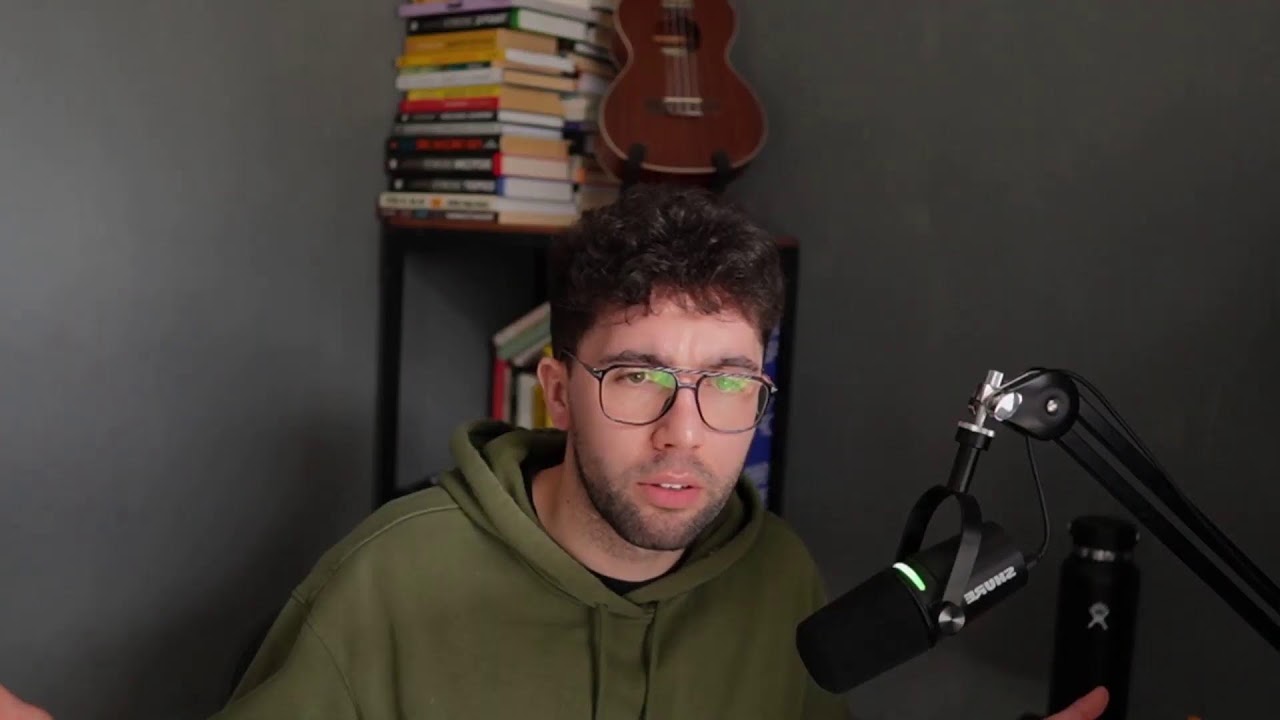
Charles Postiaux reviews designer portfolios live, critiquing UI consistency, typography, and case study storytelling. He shares advice on product thinking, client negotiation, and scaling a design business, plus personal stories about burnout and how he built his own.
Chapters
Hello, hello everyone. Are we live? Is it working well? I hope so. I need to, I need to add a little link in chat as well. Can we go Welcome. Yeah, all right, I think we're good. Let me know if you are here, if it's working well. I need to add the— yes sir, we're live, all good. Um, let me add this, then I can pin it. Nice. So if you have like designs that you want to submit, work that you like and you want me to review it, even if it's like a portfolio or something You can just click on that link, fill out the little form, and, uh, and I can review it during the live stream. That could be nice. I need to set up everything, make sure it's all right and working well. What is my top books? Uh, what specifically do you have? Like, uh, is it like a— not a theme, but like something specific you want to know? Because one that I like is this one at the top. This one, The Almanac of Naval Ravikant. I think it's a really, really good book. It's not that long and it has a ton of like good information, like build a business, uh, understand like kind of like marketing and all that stuff. I think it's a really, really good book to have like anywhere. Advice to— yeah, I advise on, on this one. I think it's my favorite one. I'm trying to think about it. Basically, I've read all of the books except this column here. This one here, I have never read it, but never read it. But the one other behind it, and then the rest here, I've all of them read it. So it's pretty cool. In psychology, I don't have anything in psychology. It's probably one of the things what I've— I am not super into psychology, so Unfortunately, I'm sorry about that. But otherwise, yeah, I think, you know, I don't read that much now, but when I started out, you know, with business and design, one of the first things I wanted was like, I need to step up my like mindset game and my knowledge game because I was literally like, I didn't know anything about anything. So it was a really rough, really rough moment. And so I was like, let's just buy, like as soon as I started getting more money and Working on projects, and so I was like, let's just invest as much as I want and on like books and as many books as I can. So I just basically went on a rampage and bought a ton. Hey Jay, welcome on the stream. Happy to have you here today. How do you improve your product thinking? Product thinking, I think I mostly learned it from other designers and then just practicing a ton and working on projects. I think I've learned that It's mostly about slowing down. Before, I wanted to really prove myself and being like, almost like a status game where it's like, I'm going to design the best product the fastest. And so as soon as they say something to me, like the next day it's ready. And then I've realized that actually it's probably not the smartest thing to do because good design takes time. It doesn't mean it's going to take 6 months, but it doesn't mean it's going to be ready tomorrow. And so Yeah, it's both in terms of copying what better designers than me did, and then realizing that I should probably not design as soon as I start a new project. I should probably think about it first, understand the industry, the features, the product, and do something meaningful, not just design something for you know being cool and designing fast. That doesn't mean it has it doesn't have. You know, a place in that. It depends on the clients that you have and even you, like what kind of work you like. For example, if you design very you know run-of-the-mill average product experiences, you don't really need a ton of strategy because if you've redesigned hundreds of products, then you already kind of you are in a way the strategy where it's like I know that this navigation should be like this because I've done it so many times and the layout should be like that, right? And then it becomes like a. Second nature, but otherwise, yeah, just take your time and learn from better designers how to think through products. I think it truly helped that it's more like product design is not just design, it's also strategy. And like, if you take that much time to design something, you should probably take as long to think about it and build something meaningful and cool. So I hope it helps on this. And yeah, I think today's stream is probably— I don't know, it depends on if you have guys' questions or not, but I can review some of your work. I think that could be pretty cool. There's a link pinned on this chat. And then I also have a new video coming on Friday, so it's going to be pretty sweet as well. It's a new Format. It's a new process, so both things are like new. So I've had a bit of a struggle recording it. The video is probably going to be shorter than usual, like maybe like eight eight to ten minutes long. But it's going to be about website this time. Finally, I'm doing a kind of like a different redesign type of video. It's not going to be about product or web app redesign. It's going to be about hero section redesign and how, you know, you could have— how a better hero section can help you down the line make a better onboarding flow and have a, you know, better product outcomes for your, for your business. Um, and I think that could be cool because a lot of you are also designing websites. And so, you know, that could either be good for you to improve the hero section on your websites and the project that you work on, or it could also help you maybe pitch Or get better at onboarding flows and be like, okay, this is kind of like the top of the funnel with the hero section. We could work together on like an onboarding flow sprint or a project. And so that could be interesting. We'll see how it goes. We'll see like how people respond to it, the watch time, how many people click, watch, all of that. But feeling good about it. And it's also much, much shorter to record because that probably takes me like 30, 40 minutes to record versus like redesign videos that takes me 3 hours to do, and then on top of that, another like 4 hours to edit. So it could be cool. Hey Lazar, welcome, welcome! I'm happy to be here and want to know one thing. For now, I'm just drawing, collecting pictures of how my next project should look like. Very cool. Yeah, that's— you're, you're doing the right thing with like the strategic thinking into it. It's not just diving into the, diving into the work, just like understanding like how it works and trying to, you know, get a good foundation on it. Have I ever felt burned out in design? Yes, many times. There are moments where— so something that happened, I think, when was it, 2 years ago, like 2023, the end of it, I pretty much worked on like— I talked about it before— I worked on like 3 projects at the same time. And I pretty much worked nonstop all the time, every waking hour almost. And I was like, that's too much. And so I could see like the work getting worse. I could see the quality not being as good as I would like to. And I just didn't have the time or energy to work on it. And so that was the moment where I felt pretty burnt out. And luckily or unluckily, all of those clients dropped at the same time. And so I ended up finding myself with no work whatsoever. And so I was like, okay, let's take a little bit of time to just rest. And so I went on a really cool 2-3 month trip in Asia, in Korea and Japan, where I just reflected, worked a bit, and mostly just rested. And it was so cool. So make sure to— and that's what I'm trying to do now is building systems and having people help me work on stuff and Delegating and having a routine that's like simple but still efficient so that, you know, I am able to not burn out anymore. Waiting for the next video? Yes, I hope it's going to be good. I still have to— we still have to work a little bit on the editing, but yeah, I think it could be an interesting video. Again, it's like the V0 of this idea and format, so we'll see. If it's interesting or not, if it works or not. Just like like the first redesign video I ever did on this channel, it was not that good, but people liked it and it kind of made all of that happen in a way. Like all of this channel is because that redesign video worked. Like that's crazy to think about it. But last year, I was like, I looked at my videos from five years ago. Don't watch them, by the way. Just ignore those. But I watched them and I was like. Wow, it's been 5 years since I posted this video and I have not made any content, like anything, even like a 5-minute video. I have not made anything in this timeline. Let's just record something. And so I just literally just— you can see it in the intro, I'm like dead inside. It's just, I was like really, I don't know, almost like depressed by myself for not doing anything out of it. Um, so I just recorded that redesign video, quickly edited it. No fancy editing, no retention, nothing, knowing like nothing. And it's for some reason, I don't know how, it just got a ton of views. And that's how this YouTube channel pretty much, uh, got to this point. So it's a really weird thing. Is it destiny? Who knows. Mobid is the GOAT. Yeah, Mobid is really, really cool. Uh, yeah, I really, really like the— this product. It's not sponsored. It's never been, although I would like to, but it's never been. But yeah, it's a really cool product. What were you talking about before I came? Not so much, Lazar. You came pretty early on this. It was just talking about the schedule of the livestream. Maybe we can just chat, answer questions. Maybe also I've added the— I've pinned in the comments the link to fill out the form so that you can maybe get your work reviewed. So if you have like a project you're working on, if it's a portfolio, maybe a case study, something like that, I can check it out. Or even if it's just a design, like if you have posted these on like Twitter, on LinkedIn, on Dribbble, yeah, that could work as well. And I can review the design. How you get leads? Getting leads is fairly difficult. I feel like in business you only have 2 constraints pretty much. You either have the constraint of getting enough leads Or the constraint of having too many leads and not enough talents. And so it's always like a balance between the two. But leads, from what I've seen and understood, everybody has a different take on it and a different experience getting leads. I think the only thing that really is important is to get seen by the right people. And so first of all, it comes from who are the right people? Understand who are your type of clients that you really want to work with. I've talked about it in the last video, right? Yeah, I talked about it in the last video, so you can watch it as well on YouTube, the most recent video. I've talked about it, how to get like your ideal clients. But pretty much you need to find out who your ideal client is, then you need to have like the right portfolio that matches with this ideal client, so that even if people know you and they see your work, if it's not something they want, then it doesn't really matter. But then again, it's just iterating a lot on like different platforms, different formats, so that people, the right people, see your work and then the working with you. And then you need to have like a kind of attraction offer or like a lead magnet to some extent, whether it's free, whether it's cheap, that just gets them through the door and you can build some relationships, some connection and trust because trust is extremely difficult these days to really build, at least from zero. And so that attraction offer, that intro or that lead magnet can help build that relationship and that connection between them. And so you may not make a lot of money from this first deal, this first little project, but down the line it's going to help. And an example I always give here is that I've worked on this project with a company I've never worked with. It's a $1 billion company, and they just found my work online. They like the style, and they like the design that I did specifically because it was matching their industry and niche. And so we worked on like this short project for a week. And yeah, it was not a lot of money, but then a year later they worked with me again on their website, which was maybe 5 times more money than the first one. So it was— the first one was like $2.5K and the second one was, I think, $12K, something like that. They didn't even see— they didn't even see my case studies, more designs. They just trusted me. And I think that was like— that's a really good, like, example of how Having different tiers of offers can really help. You're not doing different offers. It's not the point. The point is to have the same offer, but only a little bit of it you just deliver. So imagine your main offer is like this, then the attraction offer is probably something like this. And maybe the lead magnet is something super tiny. Do you have experience working on enterprise company as a lead designer working full-time? I've worked on enterprise companies as a lead designer, but I've mostly the past like two years I've mostly worked with actually I've worked with enterprise companies and startups, and either lead designer or just like pro like senior product designer or product designer. It depends on like the teams. It depends on the clients. I have submitted my LinkedIn profile. Okay, that's very cool. Nice. I will look at it as well. How do you learn how to negotiate and sell? What have you read or listened to? Mostly something that I think is like accessible for everyone. I really, it really helped me like The Futur with Chris Do, if you know them. Chris Do, it's D-O, and The Futur. They were a design agency and now it's mostly like selling courses and like memberships and stuff like that. But they have a lot of videos about negotiating and understanding the client and And that's how I've been able to do it pretty much. Like, even the first ever deal that I've had, the first ever project was for an app. I was able to get $4,000 on this, even though looking at it now, I'm disgusted by it because it's absolutely garbage what I did. But it's still like, I'm still proud of it. And ultimately, the client was happy with it. So that's what matters. But just like, you know, I've gained a lot more skills and knowledge from since then, so that's why I'm like like that. Our voice is low. I need to maybe move it a little bit more because the the the chat is right here, and so I'm like I'm trying to move forward to it. Is it better now? And so yeah, that's how I've and so for this first ever project, like I would have never been able to price this much because of Like just myself. I had to like learn some skills. There's also Never Split the Difference, which I think is good. And then ultimately it's just practice. It's like, it's really just a game. It's whoever has the most leverage that wins. And basically whoever has the most leverage is in a way whoever needs the deal the less. Actually, I'm going to move that a little bit more like this, and then I can be a bit closer to the mic. And then I can also increase it. So that's my like ultimate advice for, for you for like negotiation. It's just if you really need that offer and you make it feel like you are in need of it, probably you're not going to need it. Why is my camera burning so much? Let me move a little bit. Uh, So many things happening. But yeah. But ultimately, that's how I've been able to negotiate. Then just practice. But it really is a mind game in a way. It's like negotiation is always going to be like that. Even if it feels very natural or normal, there is always negotiation happening. My advice also is be prepared for it. Write down as much as you can, homework, study their products, study everything about them and your offer and how we can work together. And then just ask questions, understand as much as you can. This way you're going to get almost ammunition so that you can go into the negotiation with a lot more leverage. And be ready to like get away from it, like end the thing if it's not working for you, even if you really need it. That's a good key. I'm submitting my portfolio. Okay, cool, looking forward to it. How do you plan to scale from your current position? In terms of service or like as a whole, like the business. Because scaling right now is, like I just said, it's either not enough leads or not enough talent. Right now it's as a business, it's not enough leads for me. And so scaling is always going to be about I need to get more people's attention and the right people's attention to me. So that's pretty much it. That's the goal, is just how do I get more people to know about me? So I'm doing more LinkedIn content now. I'm still posting regularly on YouTube. And so it's just going to slowly take time to grow and for me to get leverage from it. But that's pretty much the strategy, is just that. And then obviously it's always a balance of input and output. I only have so much time, efforts, energy to do things by myself. And so how do I get more output from myself without doing more work? So that's why I hire other people to help me with that. So that, for example, one video, I can record a video and then I can delegate it to someone to edit it. Obviously, I will still have some stuff in it, but I will still work a little bit on it. But Ultimately, it's like they work on editing the video and then there is someone else working on summarizing that video in a business context so that I can also post it for LinkedIn, but not for designers, for example. So it's like, how do I keep doing that in a good way? That can also be applied for services. If I like, okay, this is what I do for a service. I do the strategy in the beginning, then I can do wireframing, I can do the UI, I could do the design system, I could do the prototyping. I can do like a sales deck to present the work, then I can hire people to do all of those steps. Now I also enjoy working on those, so how much do I delegate? I think it's mostly going to come from when I have too many leads and I need to delegate more work. So it's— but yeah, like you just said, it takes a long time for everything to compound. It just takes a long time, and that's why you need to be extremely consistent and That's why I also say that you need to have a very like small routine that's still impactful and powerful, because if you have to do 10,000 things every day, you're not going to do it. At least for me, I know that I won't do it. So that's why I'm like, okay, I just need to do the 3 things every day. If I can do them, I'm good with the rest of the day. I can either keep going and continue or just I'm done and it's good. What are the bad habits that the designer must avoid? Well, like I just— I said earlier, it's like jumping into design right away, uh, probably having too much ego, like my designs are the best, the others are not good. That's not super good. Uh, not communicating well, that's a big problem as well. Um, I think it's mostly communication because when you— it depends. If you work with a team, then it's going to be probably communication, like organizing your files and your design so everybody can Work together on it, and just being open to more stuff. I think you're going to hear some of the noise from there is a neighbor that's doing renovation, and so you might hear a little bit of buzzing. Hopefully not too much. But that's usually the that's usually the bad habits for for designers. Does AI can replace high fidelity work? I think AI can do a lot of things. I think it usually does the average, so the average of a niche or the average of an industry. I think it's really good for brainstorming stuff. And ultimately, like, I'm— we're talking here as designers, and I think as designers, still enjoyable to design and to work on it. But for people like— okay, cool, thanks Jay. Um, but like, for— you imagine like small shops that don't care. They don't care. They just want a website. They just want like making some flyers. It's good enough for them. And so that's— there's always a use case and there will always be a use case no matter what. There is always a use case for AI, for cheap labor, for premium labor. Like there's always going to be those things. It's just going to be slightly different, just like music, right? Like music is kind of like that as well, where before you had to like spend a lot of money to record songs, and now anybody can make music from their bedroom, right? So it's pretty much the same thing where before you had to always like know a lot about design, spend money on like agencies or like professionals to get work done. Now you can just— anybody can do it. Does it mean music is dead and you, you don't have like major big artists being really well known and making money? No, but it's just diversified a lot. Good to see you live. Good to see you as well on the live. Happy that you're here. What is your process when a company assigns you to design a feature? What steps you take from start to finish? Okay, that's a really big question for a live stream. That's more like a video almost. Actually, you can watch the previous stream, the replay on the channel, and I went through kind of like a little test project I did for an agency for like a mobile app. And I walk through exactly all of the steps that I've done for it. And I think that could be like a nice little explanation for it because it's short, but it encapsulates the whole process. It's kind of like the redesign videos I make. Right. I know some people complain that it's not the best solution, or actually the UI should be better, or the UX is not that good. But you need to remember that this is like an extremely compressed version of a design project. Where the redesign video is like 3 hours, where the redesign projects is, it can be like 6 to 10 weeks or 9 weeks, but it can also get a lot bigger to like 6 months, 9 months with like multiple sprints in it. And so that's why it's like also the same here. Pretty much the same. I need to have a maximum of 2, 3 things per day. If I had too many things, I can't focus on the most important stuff. Yeah, exactly. Like anything, you know, like people who have so many different interests and hobbies, or, you know, they want to do so many things, it's— you have to cut down some stuff. Like, at the end of the day, if you want to be great at something, you have to cut down some stuff. And if you do too many things during your day, you're never going to be able to focus or to— like, you imagine someone who just does that one thing every day. I know there is like this famous YouTuber, maybe, you know, like he recorded— maybe he doesn't do it anymore, but he used to record himself live, like studying for like 12 hours a day, every day. And you imagine that as a designer, and you doing, for example, 12 different things during the day that are maybe not always related to design versus him just doing that for like 12 hours every day non-stop. Who's going to be the best designer, or who's going to get the most opportunities? Probably the one who only does that non-stop. And so, and you know, in a way, like, I'm also losing to a lot of designers because I have to balance the design work and also the business side of it. Ultimately, I think I'm going to be better off, but short-term, short-term, that could be a weakness as well because while I have to divide my attention between 2 things, designers can just focus on one thing. They can get a job, they can work at a design agency, and they can just do design all the time. Let's get off topic. What is your dream car? That's a really, really off topic thing. Actually, I don't have a driver's license. Fun fact. I don't know if you guys have a driver's license. Driving license? Driver license? I don't know the right word. But yeah. Now dream cars. I don't know. I like the fancy ones, like a Rolls Royce or some of the Ferraris. I think that's all like cool dream cars. So if I ever have a car, it's probably going to be this one, something like that. I don't know yet, but it's expensive. Holy— it's like I saw Rolls-Royce like half a million, something like that. Ferrari might be a little like a quarter of a million, uh, but that's some cool cars. I think it's more like a trophy car than a like day-to-day car. I mean, Rolls-Royce, you could probably sleep in it, it's so comfortable, but Yeah, actually the Teslas, like the new ones, you know, like with the bar in the front and the back, they're really cool as well. So that could be like a nice one. Can you please paste the link here? I mean, you can see it. I don't know if someone has the link, but you can, like, it's literally the last stream as well. Same here. Okay, Jay, we're not alone here. I mean, I live in like maybe in the U.S. Like if we were in the U.S., it would be different because it's like they you have to drive anywhere. But like in Europe or in France, I you I live in the city center. I don't really need a car for anything. So that's the convenient part of it. But if I if I have a car, it's just going to be to show off. It's like I've made it. I don't care about anything anymore. I'm just going to drive a fancy car. Just going to live a little bit, spend some of that money. 13 pixel or 14 pixel font size? It's going to be 14 for me. I don't really like the, like, those like weird, like 11, 13, 17. I'm like, uh, no, no thanks. Usually multiples of 4 if you can, ideally, but sometimes I get that you want some more granularity, and so like 14, 10, these are still good numbers. Tesla has awesome UX. That's true. I think it's, uh, yeah, if I actually— yeah, I'm really like so many cool electric cars as well, cool brands. There was like Polestar, is that— I think that's the name. They make some beautiful, like, interesting cars. In the US there is also Rivian, that's pretty nice. Hey, Smith Pandya, welcome to the stream. I'm doing great, I'm doing great. Unfortunately the weather here is not that good. But otherwise, doing really good. Happy to be on live. It's always a nice little time with the crew here together on the livestream. Always nice. I'm looking to buy a new monitor. Do you have any recommendations? I have like a Dell. It's like a super widescreen. You cannot see it, but it takes— it's over a meter long, something like that. Like maybe 1.5 meters long. It's like ultra wide, which I think is great because I used to have 2 monitors, but I didn't like it so much. Now I have like One monitor, but it almost acts as three monitors. So it's really, really cool. Otherwise, I think if I wanted to buy like a new one, I use a Mac, so I would probably buy like the new like Apple monitor or something like that, or even if like an iMac if if I didn't want to use like you know like a desktop. I mean, I I bought it like three four years ago, so I. I don't know anymore what the name of it or like the link of it. If you'd have maybe like Dell Ultra Widescreen, something like that, you could maybe come up with something. I don't even know if they sell this one anymore, if it's like a new version. I really love your work. Thank you so much. That means a lot. I'm happy about it. I hope you like the redesigns as well, the recent videos. But Lazari, it's not— I mean, it's expensive. Everything can be expensive, but it's a good investment for like work. I think it's like €1,000, maybe a bit more, something like that. So there must be like other screens. It depends on like your needs. But yeah, I spent a long time like even for like the, the chair that I have or the screen, I spent so much time like reviewing like YouTube reviews of like different screens to figure out the right one. Gray neutral cool or gray neutral warm color in UI? I'm more of a gray neutral, but if you have like the right color palette, neutral warm could bring some cool like feeling to it. I think that could be like a— it depends on the product. I want to get a job as a product designer, but problem is I don't have a degree. I'm 21 years old, learned through YouTube blog. Does I have any chance? My country doesn't offer better degree or any bootcamp. Well, I have to tell you that I've never went— I never went to school for like design. I didn't watch that many YouTube tutorials to learn about design. I don't have— I didn't study design. I don't— didn't do any boot camp. And I got my first projects or like opportunities when I was 20-some, 20, 21, or even 22 to some extent. So you can do it 100% if you can. If you can speak and sound American as much as possible, and you have the right skills and portfolio, and you keep practicing, and even if it's for the first few projects working for free, if you can learn some stuff out of it, I think it's possible 100%. I've done it. If I've done it, I was really— when I look back at when I was 19 and 20, I was really dumb, didn't know anything about anything. I still don't know much, but I was able to. When you come to Serbia, you have dinner from me, bro. Thank you. I've never been to Serbia, but it could be cool. Your videos are awesome. I learned to work fast. Interested more from you. Thank you so much, sir. Thank you for watching the videos and And enjoying it, finding it valuable, it means a lot to me. So I'm happy about it. How old am I? I'm 26 right now, almost 27. We're getting closer to the 30s. The pressure, the pressure. But yeah, hopefully I try to reassure myself that life is long. But yeah, and also my tip on saying your age Is that when you're young, you should probably not tell your age because people might expect you to be like, "Oh, he's too young. He's not going to do a good job." And so they judge you based on your age, not based on your portfolio and work. And so if you have good work, you should probably not tell your age, except if you're like you're forced to it. Yeah, it's probably going to be. It's going to probably do more harm. I know, like for status game, it's like, "Wow, he's like 19 years old and already successful. So cool." But Someone hiring is probably not going to be as into it. I'd be 32 then. 32, that's good. I hope you will have a good birthday with like some of your favorite food. It's the best time, you know, like a birthday. A birthday is like so good for like having your favorite food and having a good time with family and friends. I think one of my best birthdays was actually by myself. I mean, no, with someone else. And I was in Korea. So it was so cool. I had like a massive, massive chicken, all of a chicken with some potatoes. What a dream. It was the dream life. I'd love to make a redesign video on mobile as well. That could be it. The new video dropping on Friday is going to be hero section redesign video. I mean, redesign, strategic redesign kind of. So it's not going to be super long. I'm trying a different format and a different recording process so that it's not always my little face here, but it could maybe zoom in and zoom back to a little face. So that could be cool. I will see if it works. And if that works, mobile could also be an interesting thing to do. So maybe. So I hope you guys will enjoy the video on Friday. Make sure to show up on this time. So have we got any— anybody submitting their work? Yes, we have. So we could do that as well. We have a few, so I'm just going to line them up. On my screen, and then we can I can share it and we can review it together. Let me. Are you going to review portfolio today? Yeah, I'm going to review. I mean, doesn't mean portfolio like it could be a project you work on. It could be a design that you like. Like if you post it on LinkedIn, on Dribbble, Twitter, whatever, you can just post it and when you know I can go through it. I'm going to submit my work next week. Yeah, no problem. Take your time. I will be here next week as well. Every Wednesdays. Uh, yeah. So we have this one from Lazar. So I don't— we have this. I think I don't even know how to use this correctly. Can we open it up like that? Oh yeah, we can see it a bit more, but now it's too big. Zoomed in, zoomed out. Well, I think zoomed in, zoomed out, you could probably do like, uh, different posts on it. Or you could like— it's one screen, maybe you could have, you know, like sometimes they have like a gallery of multiple photos. So I think you could also do that, just like, uh, optimize— make sure to optimize the frame. I know it has like a specific height that you can do for LinkedIn to like get as much real estate as possible. And you can post like different, uh, so that could be like one post or you could post like multiple ones. For the design itself, it's a little blurry, but I think it's pretty good. So that's a website. Um, oh, that's the same, uh, the same one. Yeah, I think it would have been Maybe better to— I don't know, maybe it could have been 2 posts because, you know, like, it's going to be kind of like your catalog almost of work. And so if people like one of your projects or like one of your designs, they're going to check your website and then they're going to see more of the designs that you've done. And so, um, that could be good to focus on that, like, let's grab people's attention right away on that post and then it opens up to different things. But it looks pretty nice, uh, from afar and a little bit blurry. I think it looks pretty nice. Maybe like paddings, corner radiuses here, spacings could be improved here. It's mostly like the, the status, like just now feels a little floating and pretty small compared to this. So you either reduce the size of like that little notification title or you wrap it up inside of a frame for like the just now. I submitted my portfolio. Okay, Smith, perfect. Do you know which dimensions I need to use for LinkedIn? Also, I need to get a better picture. I don't remember which one. I think I have it on— so it depends right on your strategy, because if you, if you post just one design, it's going to be like the full screen. But if you post multiple photos, it's going to be probably like a gallery layout. So the one I have that I use for one screen, you know, like when I post my redesign post on LinkedIn, it's 1280 by 1610. That's the dimensions I use, 1280 by 1610. And this way it takes really like as much space as possible in height. That post was about poster on the street effect. You have more in captions. Okay. Poster on street. Oh, okay, okay, okay, I see. Subtitle in the footer, that's cool. I would probably like— you can see like the logo here is a little bit different from the, from this one here. So probably make it like the logo, but I like the, the idea. The color is good too. I don't hear— is it like a spacing problem? You can see the— it's not aligned on the left, the Lorem Ipsum, and then text of the printing and typesetting industry. Like there is a little space, so probably try to fix that. And I would probably— actually, we could maybe We could probably review it on the— like that. Perfect. You know, like, I don't know if it's centered or not. It does— yeah, like, I would probably try to center it a little bit more so that it feels better, because here it feels slightly too Too low compared to the text. So I'll probably try to fix that a little bit. But otherwise, that's a— oh, this one also, it's not aligned at the top, which like product is slightly lower. And this I would probably like the ask about AI, like ask AI about Flow. I'll probably maybe put it here with the socials. So that everything is well aligned and, you know, in columns. And I would probably lower the size of the headline a little bit more. I don't know how much is it if it's like 18, 20 and this is maybe 14, 16. I'd probably either the same size with different opacity or slightly like 2 pixels lower. But otherwise that's a cool one. And then maybe one last floor. It's, yeah, a little pixelated. Oh yeah, you can see like 800 by 490 pixels. I would usually, when I export my visuals, my design, usually, you know, you have like the multiplier at the bottom before exporting. And so it's, you can do like 1.5 or 2 times more. And that usually makes your design better. And then you can even compress it. Like for example, when I post my design on my website or for like case studies and stuff, I usually export them pretty big and then I compress them online. I just like, you know, image compressor, something like that. No specific platform. And then it's just, it's like good quality. It's high definition, high resolution. But at the same time, it's not super heavy. Do you know which one? That post was about Post Arcade Core. But yeah, so that's my advice on this. Otherwise, I like— I think it's— I like the outline, the style of it. Turn post demo chaos into clear path. I think that's cool. I just— the problem is that you, because of the restriction in width, you see a lot of the navigation and not a lot of the product. So I would either not show the screen itself, I would show only like the specific feature related to whatever headline is about so that you have a clear understanding of what it is about. Because here, if I just look at it, I'm a bit confused. I see the navigation, I'm like, okay, I can see I can do some stuff, but it's not super clear what I do. So that could be a nice little— did you explore, like, did you iterate a lot on this hero section? I think that's always a good thing is just to like try a lot of different layouts and variations so that it's, you can see, like, find the best one. Because the more you're going to design, that's always something that happens as a designer, but also on project. Like the more you design, the more you kind of create, have new ideas to create new stuff. Quite a lot. Okay, cool. Okay. So that would be my feedback on this. Maybe a little lighter, like a little smaller headline. There's also the difference, like you can see here, the difference between the subheadline and the headline, like it's cutting off at different moments. I would try to maybe like tighten things up here so that the, again, it's a bit difficult because then if you cut it, then it's going to move up and it's going to look a little weird or like 3 lines instead of 2. Yeah, but just a little bit of refinement on the copy, on the typography could help. Then we have Rovich. Is that how you pronounce it? I hope. Or Rovic. That looks a lot like Design Me Agency, something like that. Yeah, no problem, Nazar. Okay, um, I'd probably try to keep— to stay consistent with the buttons. Like, for example, here it's like work with Rović and it's a very slow effect. And then here is like book a call, get started, and it's super fast. I would try to find that, like, reusing the same components as much as possible, it makes it, you know, easier, like it makes it safer for people when they look at the website. Like every little detail is going to be like a trust signal for them. And so if there is inconsistency in the, in the experience, in the UX, in the UI, it sends some warning signs. So if you can stay consistent with that, for you making the website and keeping it, you know, up to date is going to be much easier. And for people watching it, it's going to be like, okay, he's professional, he understands how it works. I took inspiration from them. Yeah. Makes sense. Case studies. This is also a little— I don't even think you need like, uh, you know, hover effects on those. And this one you have like a black background, maybe it's just the Figma thing. And here is the white background. I would try to stay consistent with that. And case studies, it sends to the work, but there is no hover effect on this. Again, like, let's stay consistent on all that. See, I have agency Scale. Okay, that's a cool little, that's a cool little case study design. I would probably remove the checkbox like emojis. I think it kills a little bit the professionalism on this. I like the screens, enough size, it's big enough, it's focused. That could be, you know, they could add a little bit more text on like what's happening or what it is. The solutions or like problem overview could probably be like in the description. And then the solutions could be for each screen. So like the overall case study explanation is like, this is the problem that they came up with. This is what we worked on. And then every section of the, like you showcase design is going to be, okay, this is the solution that helped with solving that problem. This is solution 1. This is solution 2, how we helped with it. And this is solution 3. So that's going to connect it a lot more. Like what was the goal and the pain point of the lead, of the client, and how each of those designs that you're showing help solve that. So you see, like you build a story around it. The designs are— I like this interface here. I think it's pretty nice and clean. Chatbot settings, prompt refiner. I'm wondering if this could be maybe like little Tabs at the top here. I like the navigation. It's nice. I like the spacing and paddings. It's good. Send feels a little unprof— I mean, not unprofessional, but could be probably refined. Like nowadays you don't even need the send anymore. You can just have like a nice little arrow. Refine. That's good. The problem here is like the cursor is— you get the hover state on the refine icon. But the cursor is on the updating prompt. So I would make sure that it's logical here. But otherwise, that's nice. I like the colors. The colors on this are nice too. You see, static is nice. I'm wondering if there's a way if you could also prototype it, even if it's just loading state. You can see the loading thing of the enter prompt because it looks like it's loading, but here it feels a little too whitish. And so it's like, is it loading? Is it normal? Is it a problem? So maybe a prototype could help solve that. Or in the description here, you say like, this is when it's loading or it's working on it. No need to show all of the states, all of the instances, all of everything. You can just have like that one screen. Quick question. What do you think about my quality? Am I ready to go on the market in your opinion? Um, I think it's good. So you all— you would probably only do websites, right? The logos are a little too big here, for example. Like, some of the logos are like super big, some others are a bit too small. It's always pretty complex. I think you only show one, at least by scrolling, it's only one website. I would try to diversify it a little bit more. Like, try— even if it's, you know, like random stuff or redesign concepts, like try to like show more of them. And, uh, because right now if I just ask someone if I need a website and I look at your work, I'm like, okay, that's cool, that's one website. Or what? That's a different one. Yeah, that's a different one, but it feels stylistically— it feels the same. So I would probably try to find like a different thing so that for me, again, like trust signals you are able to navigate through different prompts, through different projects, through different styles. If you can do that, okay, you have 2 right now. On the weekend, on the side, you can explore, iterate on some ideas. Because if you have a lot more, I mean a lot more, I would ideally say like 4 to 6 is a good mix. Then I know that you are professional, you have a good process that's consistent throughout the different projects you've worked on. Then for me it's like, yeah. And if you can have a website, maybe website is a bit different compared to product design for prototyping. But if you can have cool, clean, like I always talk about for case studies, you can see it also for the members video, a nice little website, case studies that look good, I think you're ready for it. And then have that attraction offer and that core offer. That would be perfect. It could be even a lead magnet. At your stage, it can just be like, let me help you work on your hero section. Let me review your website, whatever it is. Yeah, I didn't think of it. Yeah, product is a really good way to bring more of that storytelling. So refine that, remove some of the spacing here. I love this icons. It doesn't look super professional. It also adds a bit more space that's not needed. I would much rather have you write a little Like have like a headline here, subheadline, like short subheadline or description, and then you see, you show the, the visual, and then you move on to the next, uh, the next part of it. And that would be a lot, lot better. That's nice. Uh, that's too big. I think that's not interesting to have that background. Uh, not, not like all of this should not be here. All of this should not be here as well. All of that, you should cut all of that. You should just stop at feedback and then maybe a CTA, like work with me, done. But yeah, cool. Probably don't need, you maybe add a little too much fun. I don't want to be the Grinch here and kill your aesthetic and style, but it feels a little too Funny, you know, in a way. I think that's good, the headline here. It just feels inconsistent because these ones, they don't have a logo, for example, which is okay, but none of them have that like highlight. And so it just feels unbalanced. But otherwise, that's good. So it's about you, right? So that's a little, again, like I'm like, you know, I would guess that this is your LinkedIn and this is your— what's that? I forgot the name of this. Discord. And this is yourself, right? Like, I can already like stick the piece together. Like, this is maybe too much space and a bit too long. I would probably tighten it up a little bit. This is good, but again, it's like Okay, that's nice. It's a little too small. I don't know if I would want it, but I guess like it's too— there's too much white space here, so it feels a bit unbalanced. But it's like you have the— what happens? You can book a call here, you can see the work on Figma, you can see the case studies, you can contact. You see like you have too many things going everywhere. I can fill out the form, I can book a call, I can see the sample work on Figma, I can read your case studies. Like, that's a lot. For doing exactly the same thing, right? It's just reach out to me and see my work. That's the two things that needs to be done. So decide like what is the next step for the lead and how do they see your work. Charles, do you have any leftovers that I could turn into a website and animate and maybe try to get a no word? Any leftovers that I could I don't think I do, because usually the work, it's only between me and the, the client, so I don't have like, uh, any leftover for that. But you could do it. You could create the leftovers for yourself and get the award. Makes sense. Uh, yeah, could you click on my sample work on the hero section? I have a collection of designer-created sample works. Let's see. Oh, it's okay. I'm not a big fan of the of Figma like this. Okay, that's nice. That's a little too. The button here feels a little. It's okay. Why is there a background here? I feel like the The background on the sign-up screen makes sense. On here, it doesn't make so much sense. Yeah, that's okay. The next update is a little too small. The dark theme feels a little too light. I'll probably darken a little bit more the things. The logo is a little too small. The image here should be like the design. The interface itself should be a little larger as well. Start now. You should probably not add an icon here or here. You should be like an arrow or nothing. Like you know, like a short run or like an arrow. And I saw that also on Lazar. It's like 5.0. It should probably be just five. Like five is always going to be five. It's not going to be five point something. And so we should always just do five and. But here it's gonna be like 4.8, but just 5 is enough. This is too small and this is maybe too big and it's probably not stylized enough. I would probably like— this is also too big, the headline here. I'd probably work a bit more on the typography and maybe the fonts, the font that you have. I know that when I do my redesign, I always use the same font, the Inter font, but that could be cool to have like maybe a different font here. This is too close to the camera. Maybe lower it a little bit more. Yeah, it's okay. I think it's a good starting point. It's probably a— maybe sometimes it's too small or too— like here, the padding is a little off compared to— I know it's the box. You should have the container. And then inside the container, you should add a little bit more padding for the text and the elements here. Because here it technically it makes sense. It's like yes, that's the same padding, but visually it looks like the text is taking is like too close to the to the border. And then we have Smith. Thank you, Zazel, for insight. Yeah, no problem. Happy to help on that. For Smith. Any, any of them that you'd like me to review? It's mostly mobile. That's a cool, uh, mockup. I think that's good, good branding. The logo is, uh, not the best, but I'm like, I'm not a professional brand designer on this, but it feels very thin and hard to like notice from afar. Even here on the preview, it feels a little— but anyway, I like the presentation overall. Now something I saw in a previous review of the website is someone who used the whole Behance image and put it as a case study on the website. Don't do that. If you make case studies on your website, it should be different from the case studies you make on Behance, which is extra work, but otherwise it just makes one look worse. Like the website doesn't feel genuine. It feels like you just pasted an image. So pro, yeah, good. The design itself, the import is really big. That's, yeah, that's the look. The sign up, the text is different from the sign up screen here and then the login sign up here. It's a different one. There's probably not enough. It doesn't feel super readable. It's either not dark enough for this container or there is not enough background blur. And then the text is a little too big compared to the headline is probably too big compared to the subheadline. And then here, yeah, again, it's like the CTAs on the images are too small and here they are big again. The text is different size. Here it's too big as well, the text. It could probably work on like a desktop, maybe not on mobile. Here is like, you can see like the College Maker, it's— the padding is not right. It should be centered instead of being anchored at the left. Like all of those are on the left. This— the images and the icons and the text is probably I don't do this. Okay. But then I think that's it for this. Meet Papples. The colors and the text is cool. I think it's a good move on this. The tags are probably too small. The colors and branding are nice. Login and sign up are pretty good. I would probably try to have the socials as well. That's too much. I probably won't read it. Okay, that's normal. Colors are nice. I like the colors. Okay, there's here. Okay, nice. I think the idea is pretty nice. I think it's mostly like the— just like probably for me, it's just the spacings, like the heights, the typography styles. The height of the text and the spacings together. That's probably what I would refine more. Even here you can see the create button here. It's too big compared to the dropdown. So probably try to work on this. But the idea is cool. The idea is really nice. Oh yeah, website. The WhatsApp website. It does feel like some of the WhatsApp branding. Which I think is cool. Like, you know, like there is some cool, cool stuff here. Like, this is probably not— this probably not work. Like, you would probably need like brighter colors for like those dropdowns and interaction. Like, that feels too close to the interface, so everything becomes one big thing instead of standing out. So that's where it's also difficult to design with different color palettes. That's where you don't see a lot of That's why most apps and websites, they're either white or black. There is no like that. There is Descript that now has this kind of purple or pinkish color to it, but it's still very subtle. So it's a different— it's a complex thing to do. I don't know if it should be your focus to get started on the project, but there is potential. I would probably just refine a lot more the text, the spacing, the heights, make things consistent and match everything together, that could be like a really good thing. Do you have anyone else? How long are we? 1 hour. Ooh, no, that's it for the submissions, so that's pretty good. Full cam, nice. What was cool, I think, you know, like everyone has potential. I can see like, like it's not there yet, but I can see like The work like starting to like I can see some potential there, so that's really good. So keep practicing and and focus on like really improving, like having showing more diversity in the work, staying consistent, having the spacing and heights. Could be really cool. There can be some cool work happening for you guys in the future. Yeah, no problem, Rovich. Happy that I was able to help. And obviously, like, if you want to see the replay, everyone here, you can see it always on YouTube as well. Uh, but already an hour, that went super fast. Wow. But I think that's about it on the— like, you didn't have anything else to, to mention. Make sure to watch the video on Friday, that would mean a lot to me, to leave a little comment. You can also leave a like on this live stream right now, that would be pretty cool. But yeah, that's pretty much it for me. Make sure to tune in on Friday. Have a great rest of your day. Let's work hard on those case studies, on those designs, improving our skills. Let's keep working on content, letting people— wow, what's happening with the lighting? Let's make sure that people know you exist. Portfolio and case studies is great, but if people don't know you exist and don't know your work, it's not going to do anything. And you can have the best website ever, but if nobody knows it, it doesn't matter. So that's always a difficult thing, and that's why a lot of people don't succeed. So make sure to keep posting your stuff, iterating on it, different platforms, different formats, so that everybody, or all the right people you want to work with, know about it. Work on your service, on your offer. Make sure it's like nice, tight, and crisp. Except if you want to work like as an employee. As an employee, you need to really have like really good case studies. That's pretty much it. But yeah, that's about it for me. As usual, if you have any more questions, you can always, you know, you can comment. The replay should be here probably tomorrow, the time for YouTube to process it. But if you have any more questions, follow up on this, you can always write a comment on the livestream replay. And I will see you guys next Wednesday. And that's it. That's about it for me. Bye everyone.










